Golden OPEN Acrylics

New Painting: Velocity

Happy New Year! I’ve been hard at work painting a painted turtle; it was a beast to draw and quite demanding to paint as well because of all of the pattern and detail.

I met this baby painted turtle (Chrysemys picta) while biking the Adams Homestead and Nature Preserve - I felt very lucky to have spotted its dollar-coin-sized stature along the trail!

This is Velocity, acrylic on basswood panel, 14x14x1.5”, 2021.

New Artwork: Emerging

An overhead shot of a Humphrey in the garden.

An overhead shot of a Humphrey in the garden.

Since I don’t get to do an artist residency this summer due to the pandemic, I’m planning on producing from home! Sioux City is rabbit central - the Eastern cottontail, to be specific. Sometimes on neighborhood walks here I see just as many rabbits as I do squirrels. In my former town of Leavenworth, seeing a rabbit was notable and relatively rare. Earlier this spring, I noticed a juvenile rabbit made a home partially in my backyard (he also hops through the fence to my neighbors’ garden as well).

I named him Humphrey and began to try to acclimate him to my presence, so that I could take some nice reference photos for paintings. I talked about him to family and friends, and at one point joked with my parents that I supposed there might be several rabbits all being called Humphrey… and wouldn’t you know it, the very next day I saw two simultaneously! Since I can’t really distinguish them individually, giving them more names seemed unhelpful, so they’re now the Humphreys, plural. It appears there’s a nest/burrow under my deck, and I have now seen three Humphreys at the same time so there are at least that many but probably more. There do appear to be two different sizes of Humphrey, both juvenile but one small and one even tinier. My neighbor says she’s seen the parents, but I don’t know if I have; I’ve not seen an adult rabbit in my backyard at all this spring but I have seen one in my front yard once. And again, rabbits are ubiquitous here.

I plan to do several rabbit paintings, but here’s the first! It’s tentatively titled Emerging, though the title Under the Deck is also in consideration. It’s a 16x12x1.5” acrylic on basswood panel.

New Artwork!

I just completed a new piece of artwork - the second companion piece to Pilgrim.  I had intended to do at least two from the start, but it took a while to find the studio time to devote to the second piece.

In this one, I wanted to achieve a real sense of depth in my relief without being cartoonish.  My aim was to maintain the possibility of illusionism from some angles - particularly that of the shallower sections.  With Pilgrim, there is a relatively shallow relief over the entirety of the sloth's body.  In this new piece, the sloth's body contains an area that is solely painted with no relief at all and then extremely shallow through rather bold relief.

I'm considering titling this one Outreach.  It's Quick Cure Clay and acrylic on basswood panel, 12x6x1.75", 2018.  Due to the dimensions of the piece, it shows up quite large below; if you click on it though it will open up in an overlay that depending on your monitor and settings will probably be smaller and more of a gestalt.

Below you can see a couple in-progress photos of the relief work before I applied paint.

Intercambiador ACART Residency Journal 5 - New Artwork!

Here's my first painting featuring a fox kit I met while in Portugal.  City Solstice, acrylic on canvas, 14 5/8 x 22 5/8".  I'm not 100% certain, but given the very thin margin I left, I think I'll be framing it (ugh, the cost though!).

Cerdeira Village Residency Journal 5 - New Artwork!

When I was shopping at the market across from the Mosteiro dos Jerónimos, I saw a few azulejos tiles of rabbits, and I bought myself one of them - it reminded me a little of Albrecht Dürer's work.

After I finished the turtle sculpture, I decided I would do a rabbit and a bird as a partner piece to the turtle and nest mostly due to that market experience.  When I started looking at various images of rabbits in order to find one to sculpt, I decided that proportionally and structurally, a hare would be more interesting than a rabbit.  And given that I had been thinking about rabbits and hares due to this azulejos tile that reminded me of Dürer, I decided to base my sculpture off of Young Hare.

It was really quite fun sculpting a watercolor painting, as it were, and one that I highly admire.  I started off again with a styrofoam and wire base and then added QCC and began to form the body and head.  

I added the feet in three separate parts, and finally the claws and ears.  After every part was added, I detailed the fur and added some jackalope-esque branches in front of the ears.  This all took several days to come together, and obviously there were parts I had to construct myself in attempting to realize a three-dimensional animal out of a two-dimensional painting of it.

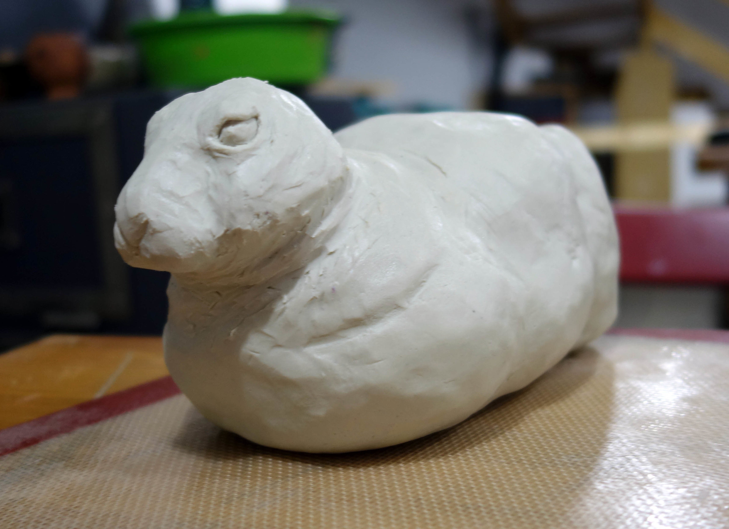
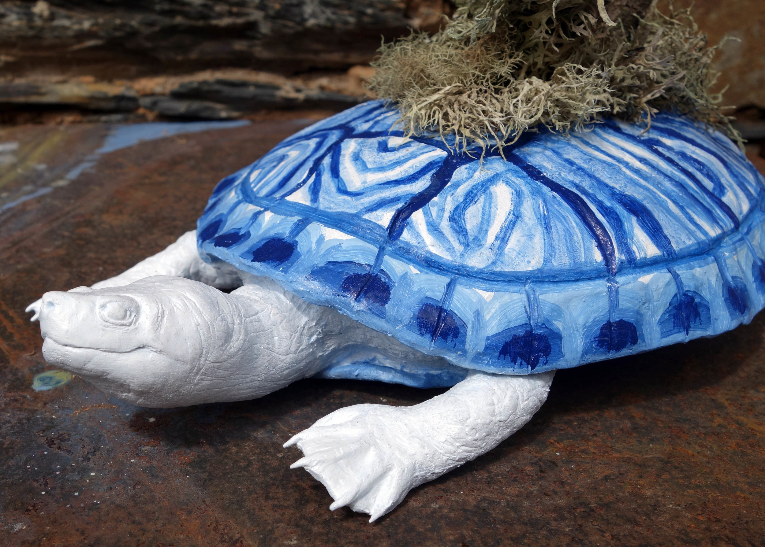
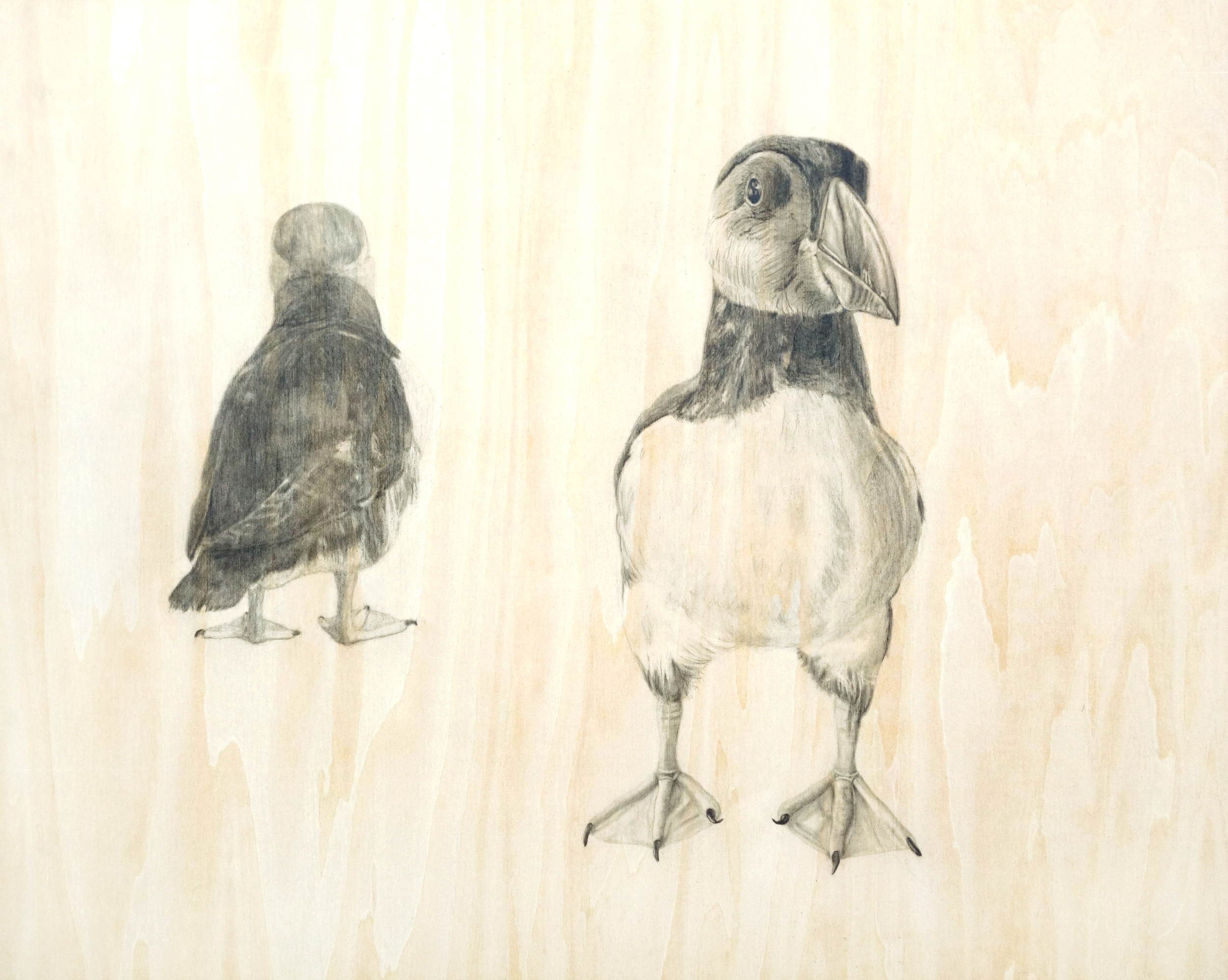
I had planned on sculpting a bird with the hare, but I liked the hare so much alone that I reconsidered.  As I was trying to decide what to do, I thought about how I would progress with the painting of the hare.  In the beginning I had thought about painting the rabbit in azulejos-inspired colors as well, but I realized when doing the turtle that the style that the shell and eggs looked quite good with it because they were fairly smooth, but when I tried to paint the turtle head and legs with various tints of blue, it got too busy and weird due to their pebbled surfaces (so I reverted them back to the clean white).  The fur of the rabbit is quite heavily textured, so I decided to paint it in a fairly realistic coloration through referencing Dürer's piece again but turning the colors just a little bit cooler in a nod to the azulejos theme and my own practice of using blue as a dominant color in my own work.

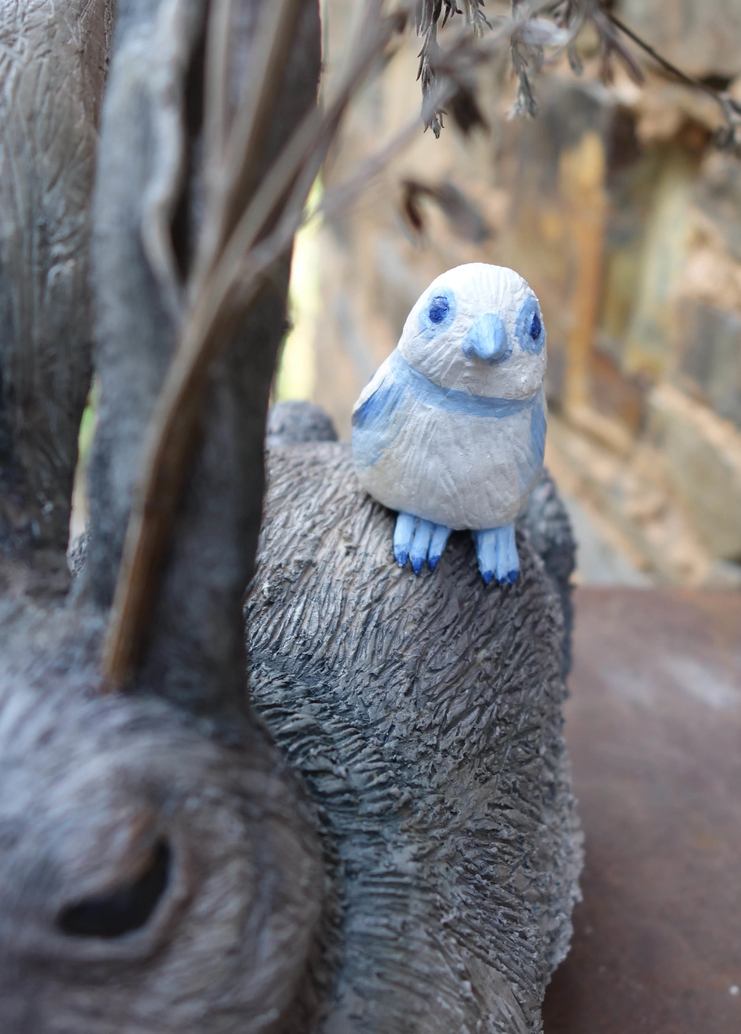
In deciding to paint it in naturalistic colors, though, I thought the two pieces wouldn't seem very related, so I figured I should do a bird - but a detachable bird, in case I ended up displaying the pieces separately as well or in case the bird didn't turn out so well.

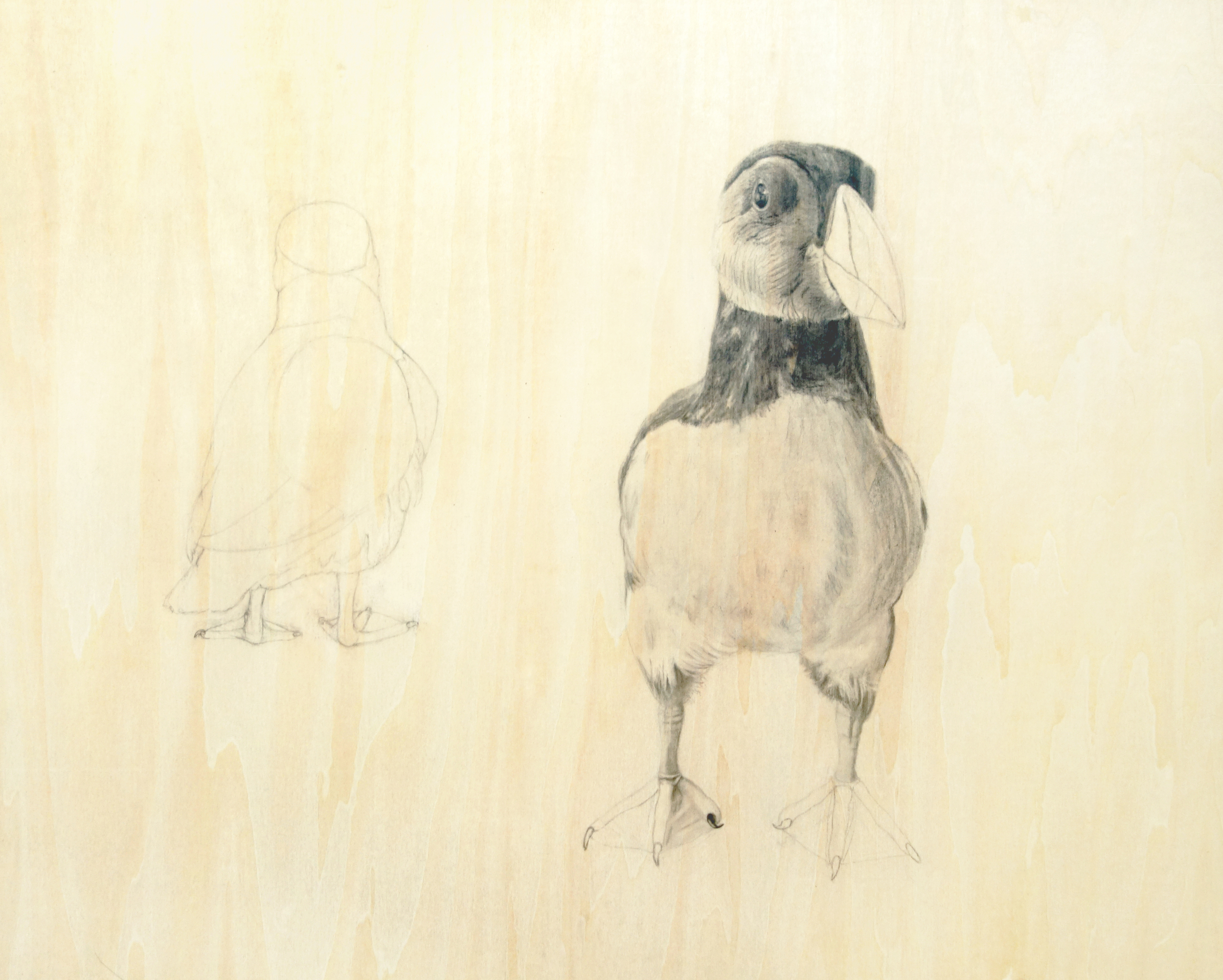
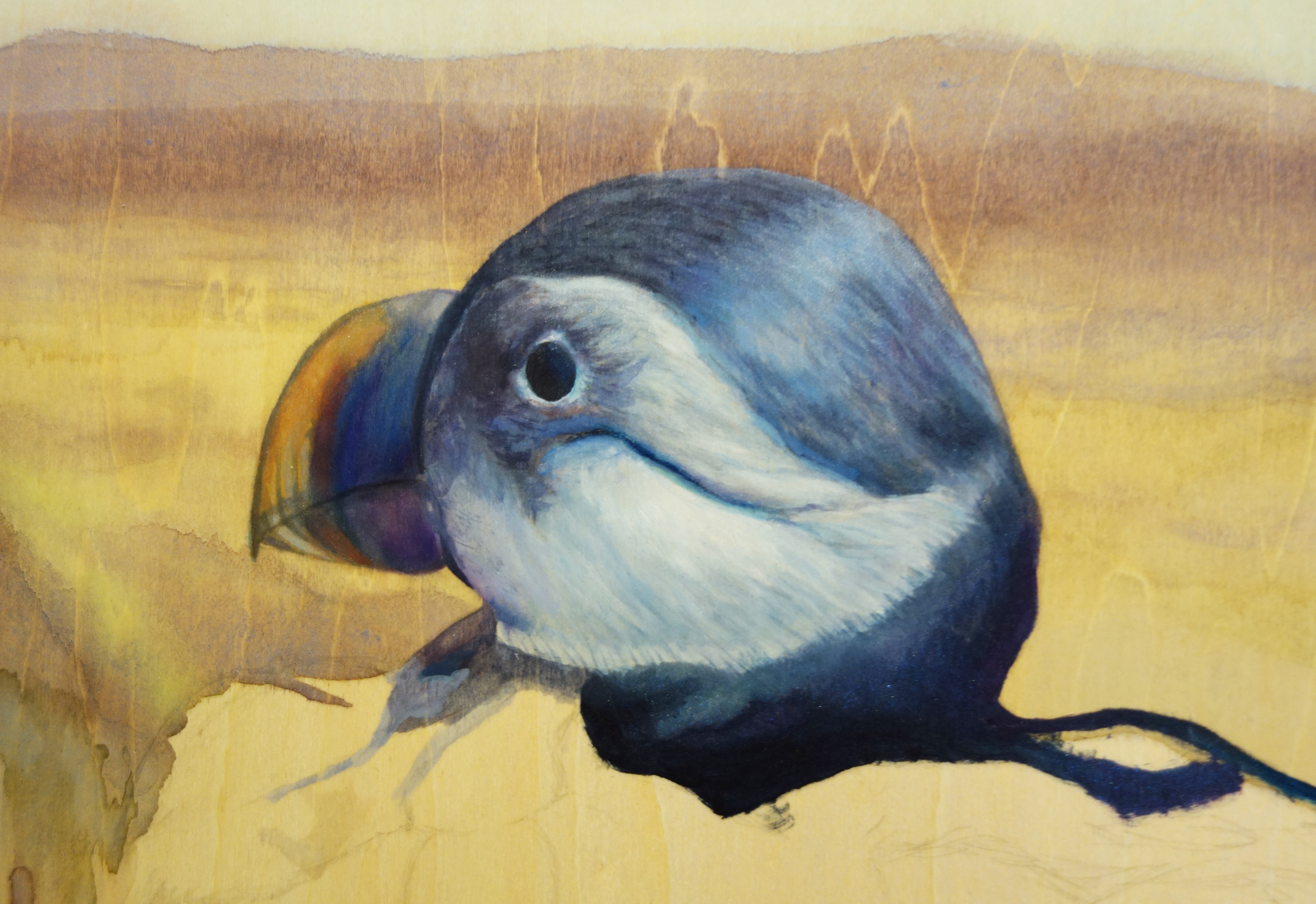
I knew I wanted the bird to be in the azulejos color scheme, but I wasn't sure if I wanted to approximate an actual species/patterning like I did in the slider turtle shell design.  In the end, I decided the bird should be even more clearly a reference to the azulejos tiles; then there would be this strong representation in the bird and the eggs, a referential-but-also-naturalistic one in the turtle, and then an almost entirely naturalistic representation in the hare.

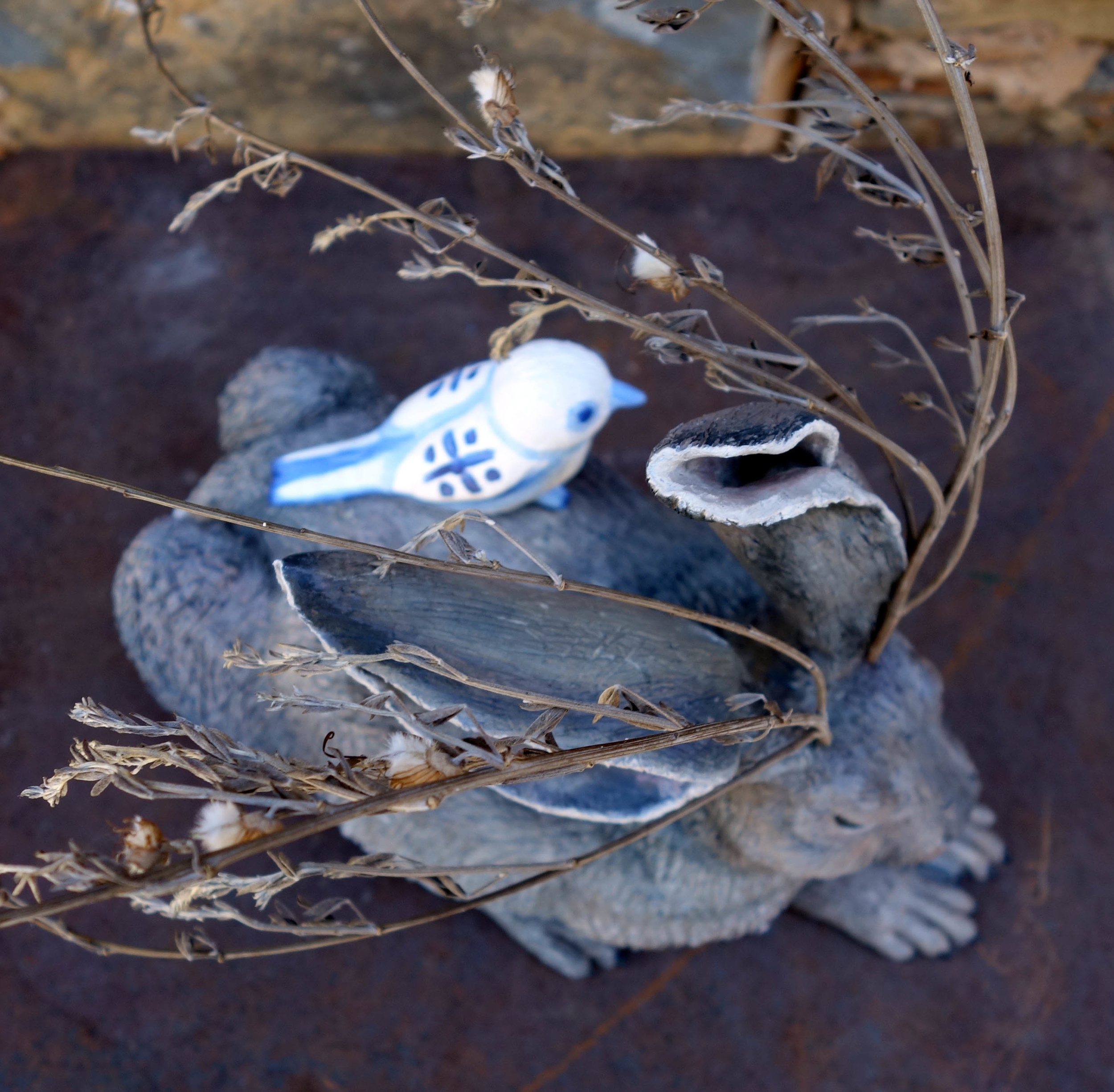
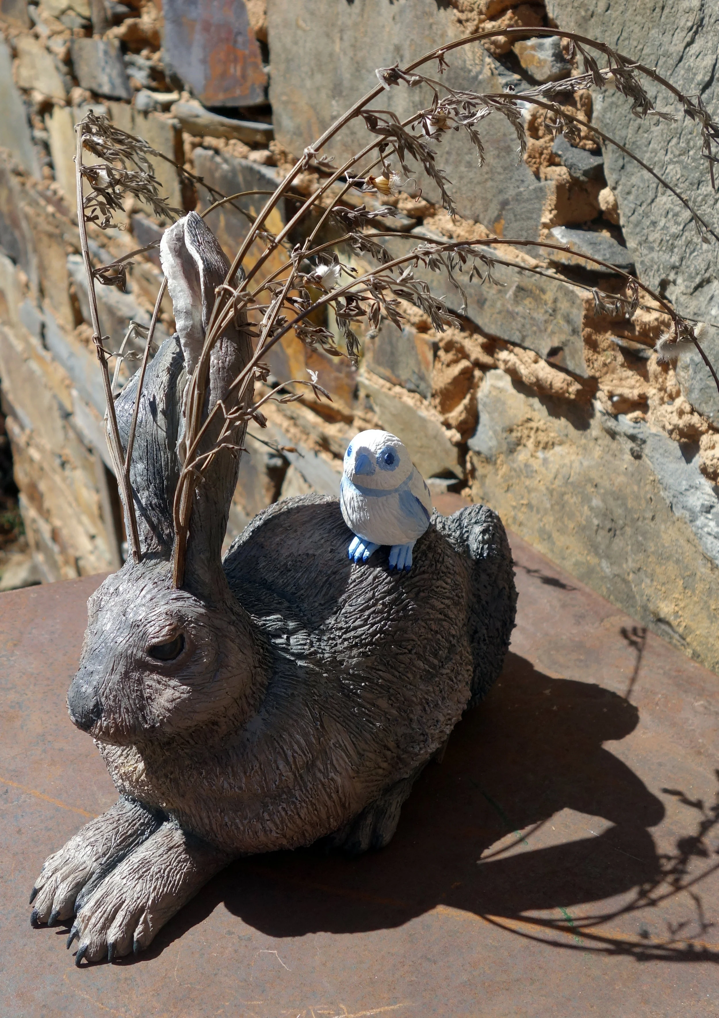
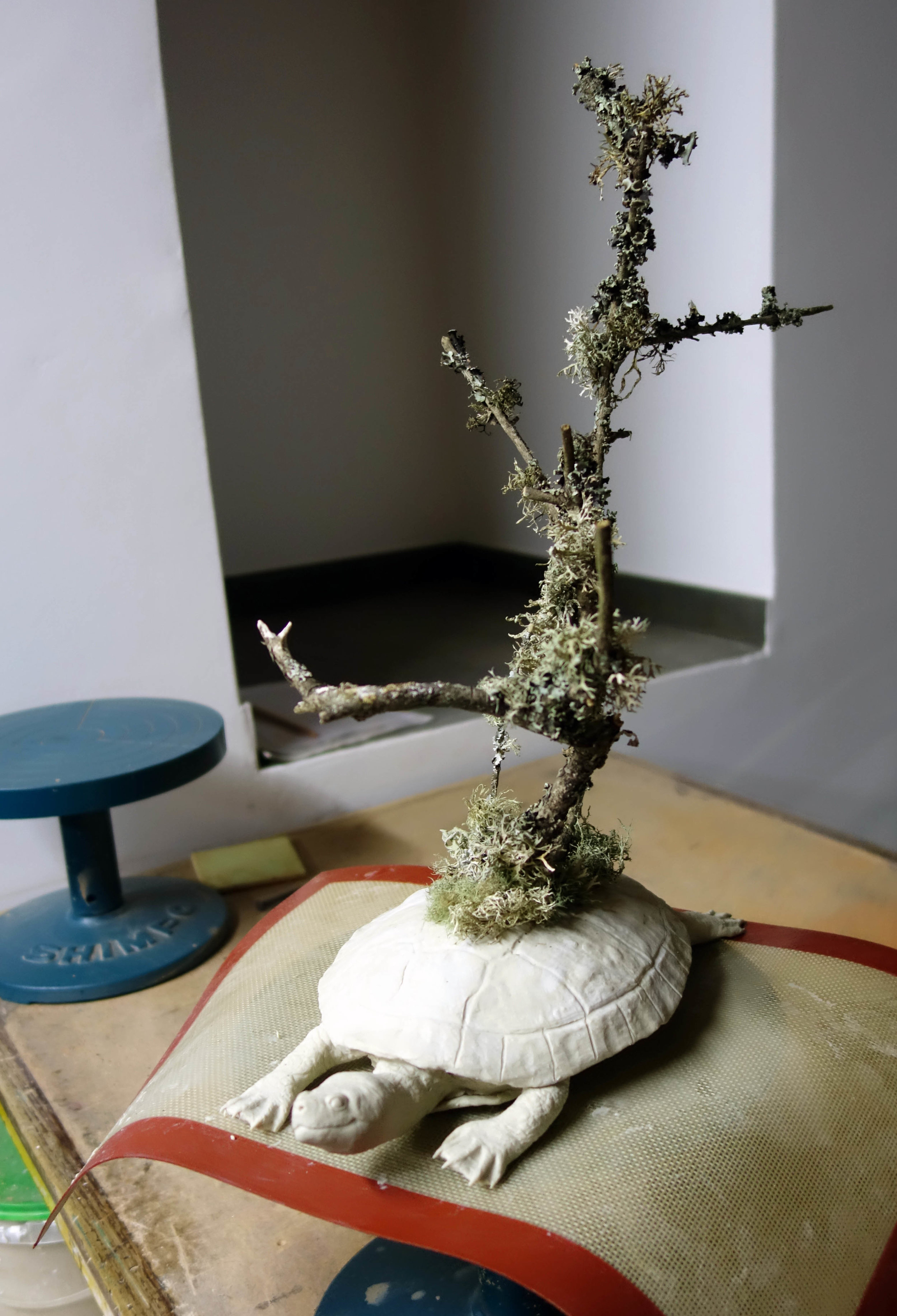
So here it is!  I also haven't accurately measured or titled it (though Young Hare will show up in the title somehow), but it is a mixed media ceramic sculpture including QCC, acrylic, and found branches.  Some of the photos below are of it in bright sunlight, so the cast shadows on the bird can be a little hard to parse, and all are against a brown/gray background which can make the branches difficult to differentiate too, but I will take photos of it in a white gallery space as well.

Cerdeira Village Residency Journal 3 - New Artwork!

When I woke up for my first morning in Cerdeira Village, I was still a little tired and quite sneezy - I thought I would escape from my Kansas allergies but there are apparently still plenty of plants I'm allergic to in Portugal!  I soon shook it off, though, and Julia and I made breakfast and started to get to know each other.  Next I went to set up my studio space; the atelier is downstairs and next door from the residency housing.  I took over two small pottery tables and a bigger workshop table and began working on my first piece.  

When I proposed my project for this very competitive residency, I took note of how ceramics-oriented the website was and my proposal was to make some fully 3D pieces out of QCC since of late I've been doing only relief work with QCC.  For my first sculpture, I decided I would create a slider turtle with branches growing atop its back supporting a nest.  I picked a turtle for a few reasons - 1) I'd sculpted two turtles a few years ago out of QCC but never felt I fully resolved their form and wanted to improve upon that work; 2) there is a multicultural myth that the world is supported on the back of a great turtle; 3) I hadn't seen very many animals in Portugal yet given that I'd only been there a couple days, but I had seen at least two different species of slider (red-eared and yellow-bellied) at the Estufa Fria in Lisbon.

I started the sculpture by carving a rough approximation of the shell out of styrofoam.  This was mostly to save on clay usage - I can only carry one bucket of it at a time due to the size and weight it occupies in my luggage, so I want to be smart in how I use it up - but also helps with the weight of the piece, which is important because I will have to ship my artworks back to the US and weight sharply increases the shipping costs.

Then I applied QCC in a relatively thin layer around the styrofoam and began to shape and detail it (hacking out bits of styrofoam as well if I needed to).  The shell took a lot longer than I thought it would to really shape properly; I did not finish it the first day.

I continued work the second and third days on the turtle.  After finally detailing the shell, I moved on to the head and feet.  I did them all separately so I could be very considered in my markmaking, and finally I assembled all the pieces and added a tail and other final detailing by the end of the third day.  I had planned to make the branches and nest out of the QCC as well, but I became enchanted by the local lichens that grow on the trees here and ended up pushing real branches into the turtle's back before curing the whole piece.

 Afterwards, I did add a nest and two eggs made out of QCC into the branches.

On the fourth and fifth days, I painted the turtle, nest, and eggs white.  I had got it into my head to reference the azulejos tiles so common to Portugal in the painting of the sculpture; the starting point was turning the natural light tan of the clay the bright white of the glazed tiles.  I had only brought one type of paint with me - my Golden OPEN Acrylics - which are great for normal painting needs but are really poor as a base coat due to their long dry time.  Here in Cerdeira Village, they seem to dry even slower - in fact, barely at all - and I ended up just going ahead and painting the turtle shell with an azulejos-inspired, painted-turtle-shell-based design on the sixth day here despite the shell still being faintly wet.  I also painted the eggs with a small decorative motif seen in the corners of some azulejos tiles.  The turtle and eggs took almost a week to dry, but aided by my eventual realization that I needed to put them outside in the sun to assist, they were handle-able by the time I needed to install them in their exhibition space the morning of June 2.

So here's the piece!  I haven't measured it yet, nor titled it (I've got some ideas mulling), but that will come.  It is a mixed media ceramic sculpture including 3P QuickCure Clay, acrylic, and found branches and lichens.

La Maison Verte - Artwork 3

My third piece is pretty much done!  It's titled Under the Bonnets and it's 3P Quick Cure Clay, balsa wood, and acrylic on a 6x6" birch panel.  

La Maison Verte - Artwork 2

And my second piece - again, I may tweak it further, but it's taking longer and longer between tweaks...

The Slightest Disturbance features a Rana ridibunda or the synonymous Pelophylax ridibundus and is a mixed media relief piece made out of 3P Quick Cure Clay and acrylic on a 6x8" birch panel.  

La Maison Verte - Artwork 1

I'm not certain this is completely finished yet, but it's close.

This piece is tentatively titled Every Side is North.  It is 3P Quick Cure Clay and acrylic on a 6x6" birch panel.

Puffin Painting #1 - Byssal Bird

And here's the finished first painting!  It's a conceptual, experimental piece - those are real Atlantic blue mussel shells (Mytilus edulis) adhered to the panel; I beachcombed some while I was in Iceland and was quite interested in their coloration and form and how I might use them to break the picture plane.  I wanted to explore ideas of illusionism, perspective, shaped or irregular canvases, cast shadows, organic versus architectural form language, and intertidal zone ecosystems.

I'm titling this painting Byssal Bird, and it's a mixed media piece with acrylic, watercolor, Atlantic blue mussel shells, and epoxy on a 16x12" basswood panel.

Byssal Bird.jpg

Puffin Painting #2 - Littoral Layers

I'm almost done with the first puffin painting - the one I gave you a sneak peak of - but in the meantime I'm potentially done with the second; I've been adjusting it over the past couple days and I may go back into it again, but here's where it's at now.  If I do go back into it, it'll be for minor changes at this point.  I'm typically pretty bad about taking progress photos (particularly in taking well lit/consistent lighting source ones, so please excuse the slight lighting changes in the thumbnails) but I'm trying to make more of an effort to document my processes.  

I'm titling this one Littoral Layers.  The final piece is graphite, charcoal, and acrylic on a 16x20" basswood panel.  I typically do start with a line drawing (after preliminary sketching, of course), but then in paintings where I add to the natural support media for the background, I usually paint in the beginnings of a background before moving on to the foreground elements and then go back and forth until there's a resolution.  This painting was different in that I really developed the foreground elements before addressing the background, though after that I did my normal switching back and forth routine.

Littoral Layers.jpg

New Series Started - Puffin Paintings!

I've started a new series of paintings on the juvenile puffin, Toti, that I met at the tail end of my residency in Iceland in 2014.  Toti was a puffling that failed to launch and imprinted on humans, so he is now a permanent resident at the Saeheimar Aquarium.  I wanted to start on these pieces sooner, but better late than never.

Here's a sneak peak of progress on the first painting!

Golden OPEN Acrylics

I am not a fan of using normal acrylic paint in a fine art context.  Obviously other artists use them well, but I find they dry way too fast and permanently for my liking and additives like retardant and unlocking sprays don't do enough to mitigate that.  I've always loved watercolor paints, and also am quite fond of oils, so I used to think I just wouldn't work with acrylics and that'd be that.  

Then I started doing short-term artist residencies.

While some of my residencies had subject matter perfectly suited to watercolor, others had subjects that seemed to call for a more heavy-bodied paint... but the timeline of the residencies meant that oil paints wouldn't dry prior to transportation.  I happened to have been gifted a full boxed Modern Colors set of Golden OPEN Acrylics at the 2010 College Art Association (CAA) Conference from a very nice representative, and so while on residency in 2014 when faced with one of these subjects that wanted a more substantial paint, I tried the OPEN Acrylics out.  It was a revelation.  These acrylics feel like what I always wanted the medium to be: they dry much more slowly than normal acrylics but much faster than oils, and yet still have the ease of normal acrylics, too - they can be thinned and cleaned up with water.

My previous dislike of acrylics was so strong that it took a while for this new world order to sink in, but there's really no denying it now - OPEN Acrylics are one of my favorite mediums.   

This is not a sponsored post.