environmental artist

My Obvara Raku Bowls

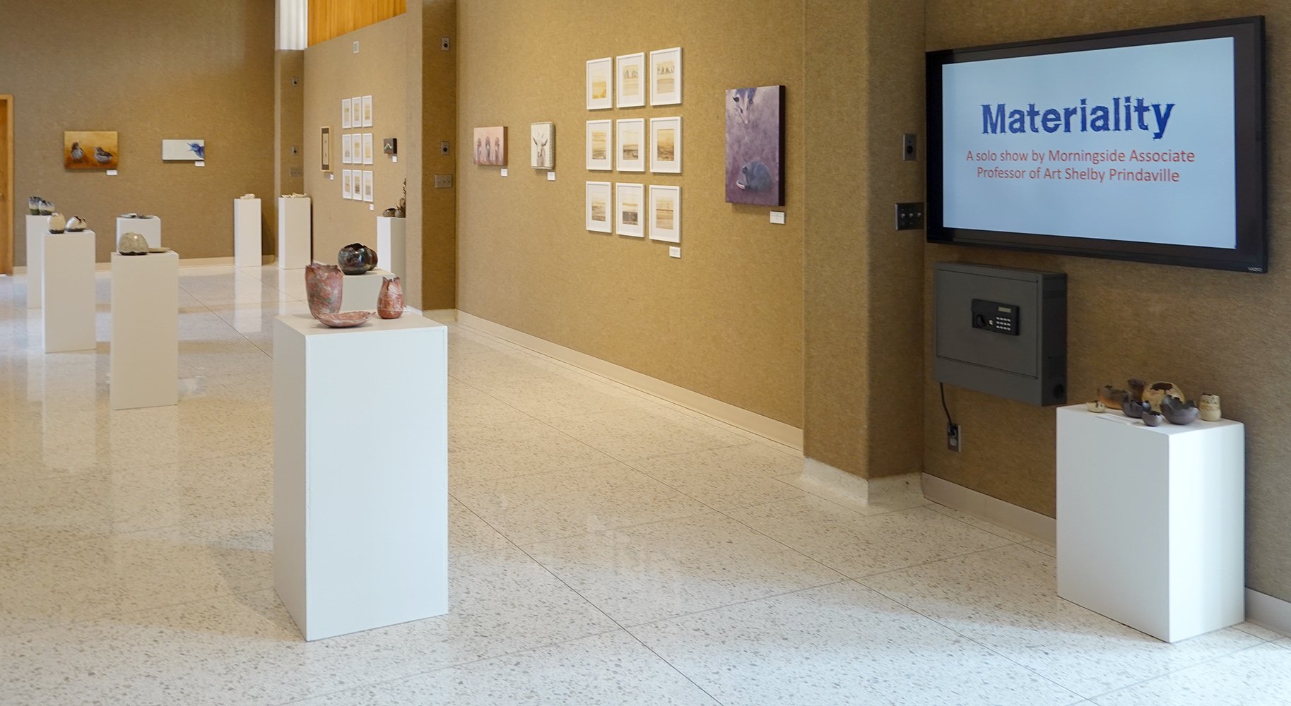
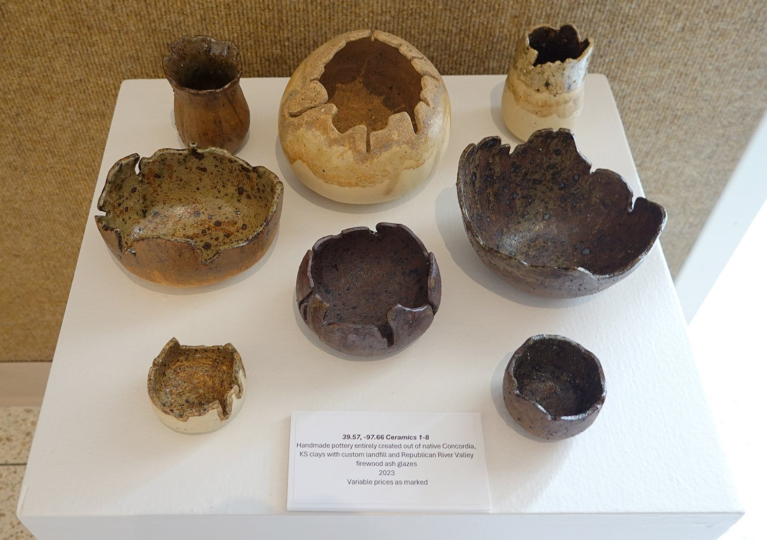
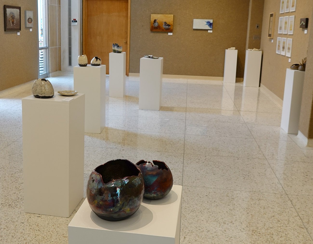
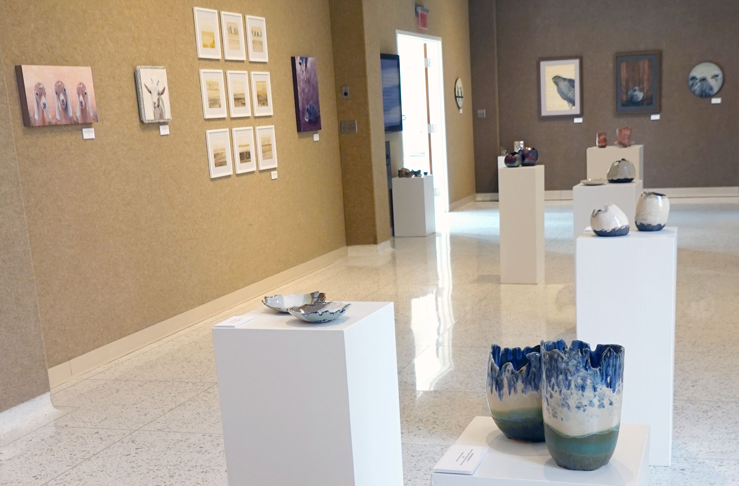
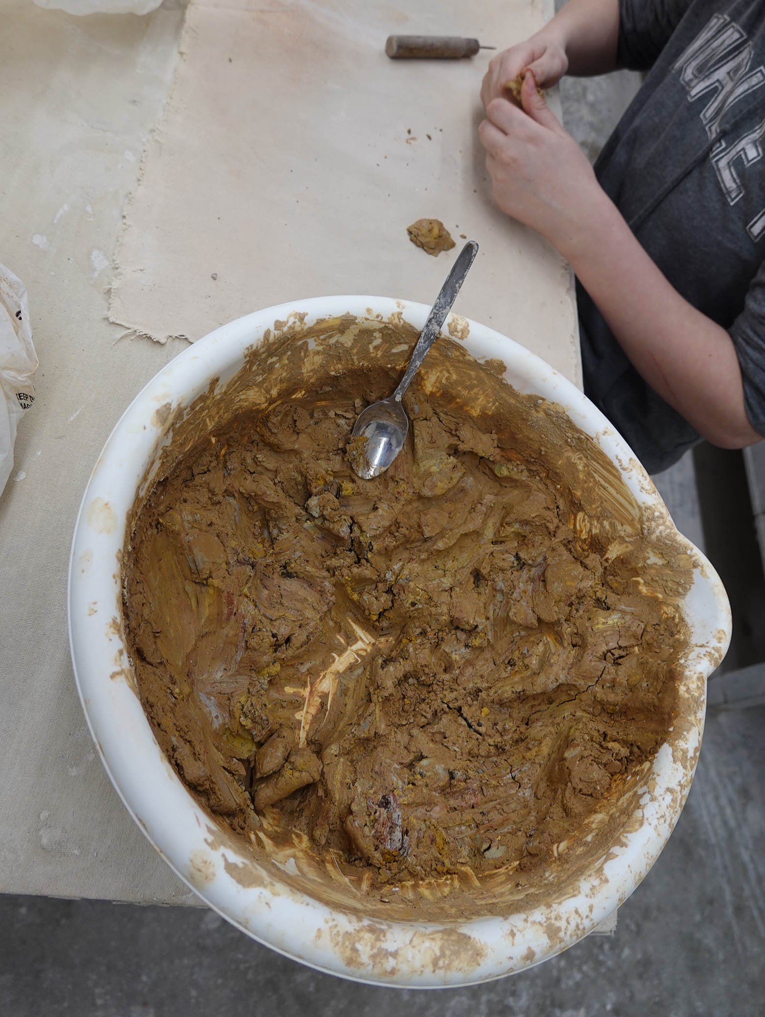
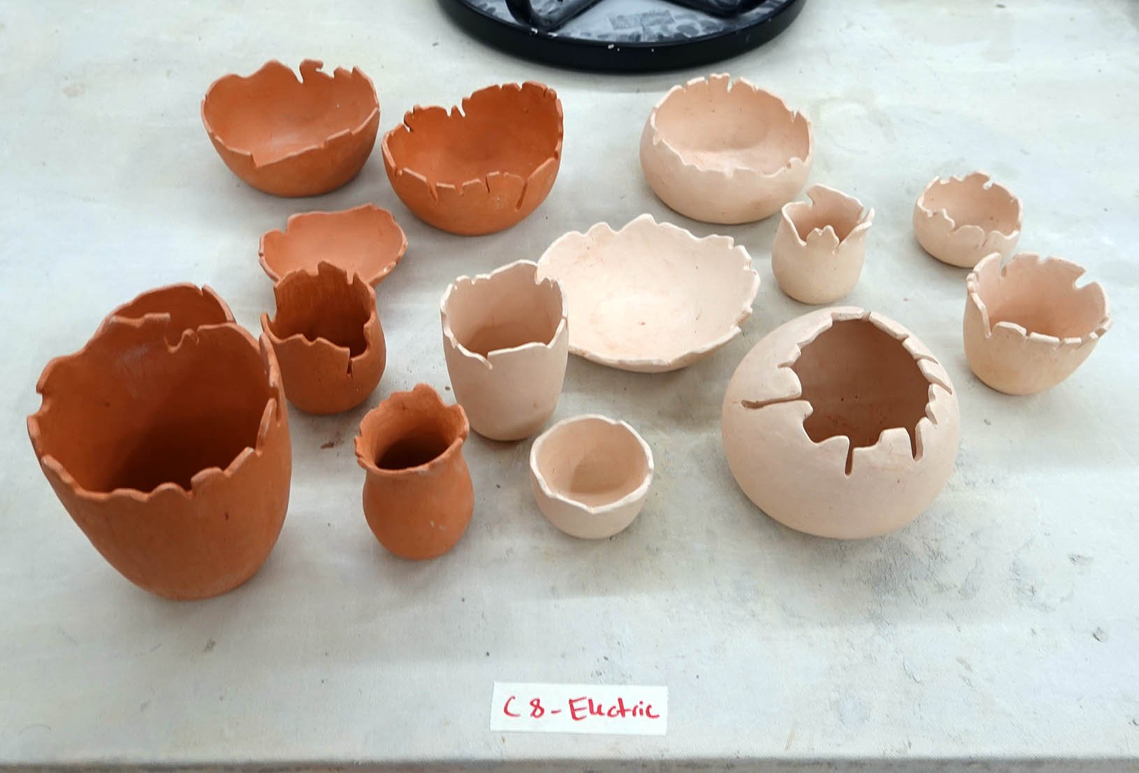
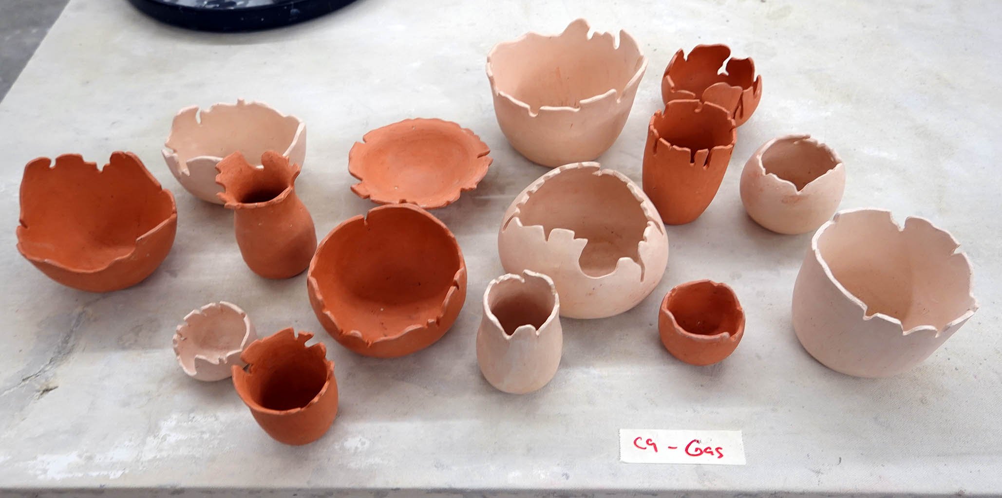
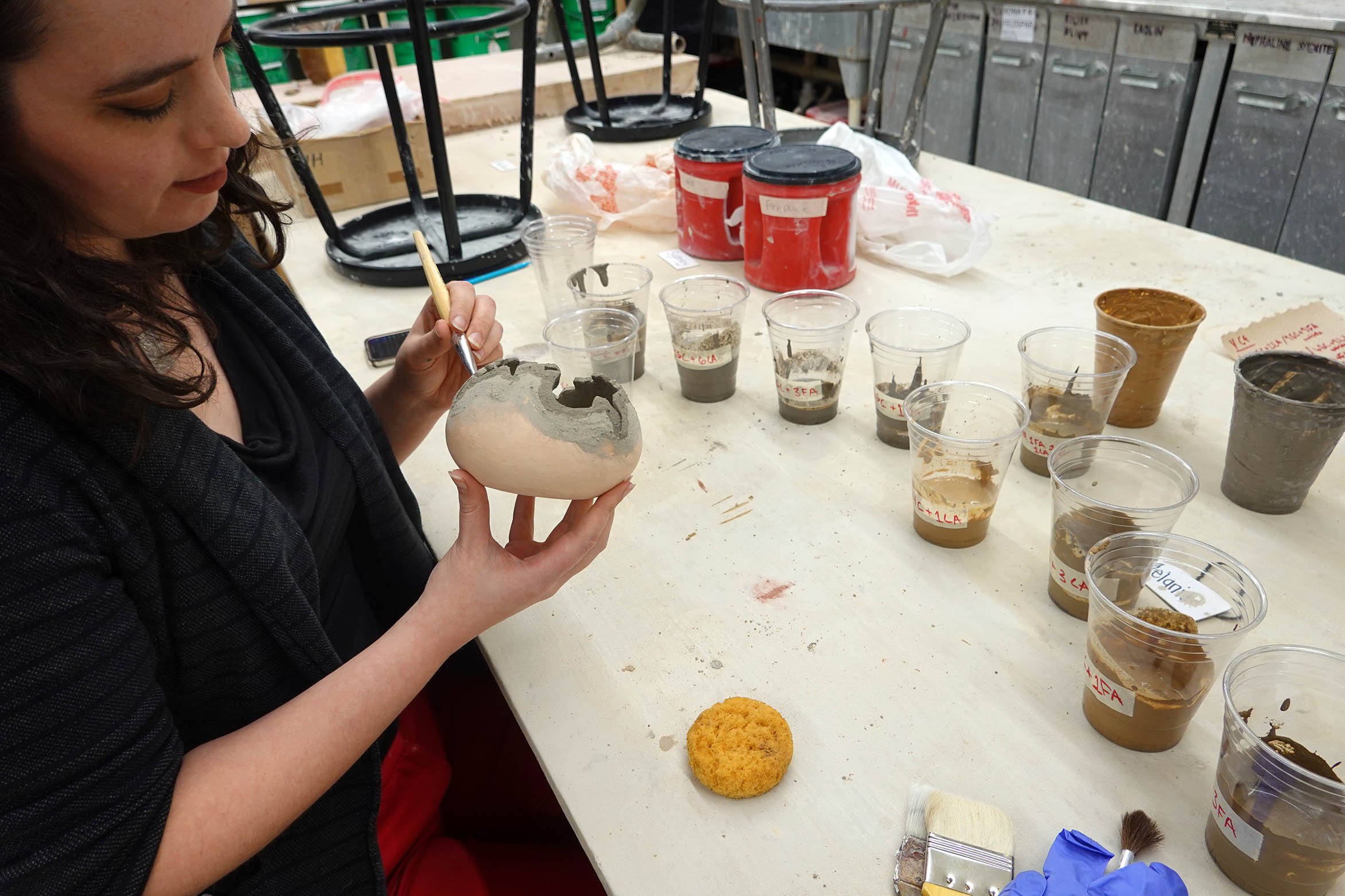
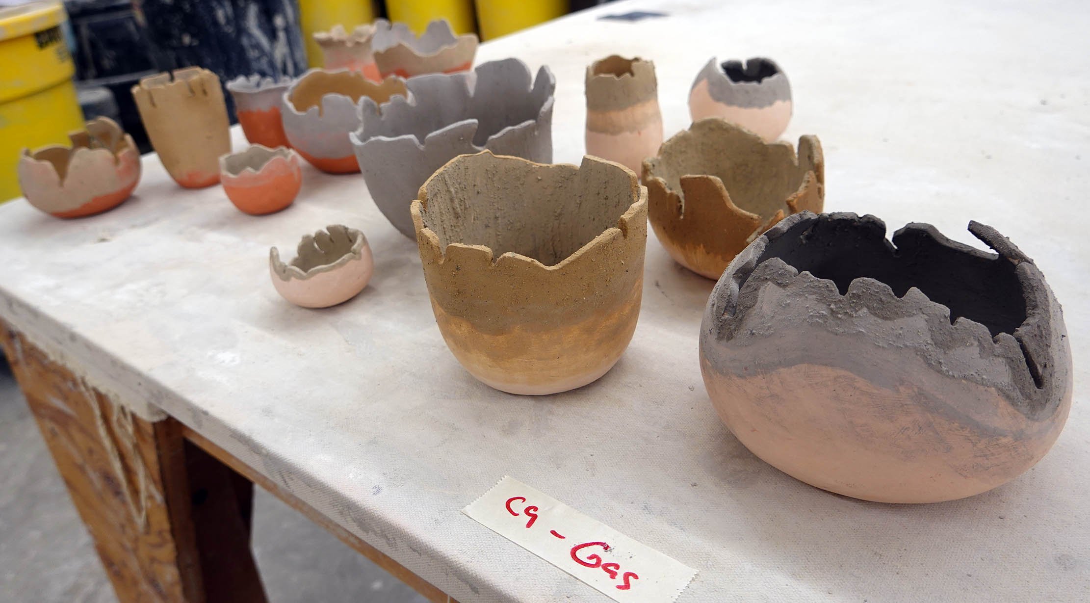
Here is the first batch of my obvara raku pieces from my Dakota Potters Supply workshop on October 21, 2023 - I made enough that I plan to publish three posts covering the artwork! This post shares my obvara bowls and bowl-like vessels.

Again, as background, obvara is a low-fire scalding-and-sealing process wherein you create a fermented sourdough/beer bath, plunge approximately 980°C naked ceramics fresh out of the kiln into it, wait for them to start to bloom with different tan-to-brown markings, and then arrest the surface carbonization process by rinsing the pieces off in a water bath.

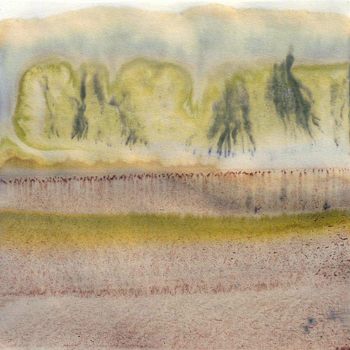
The obvara process itself scalds and somewhat seals the surface of the pottery, but I went ahead and added a thin layer of kitchen wax to these pieces as well for extra protection and sheen unification. All of the below images in each gallery row are of the same artwork from different angles.

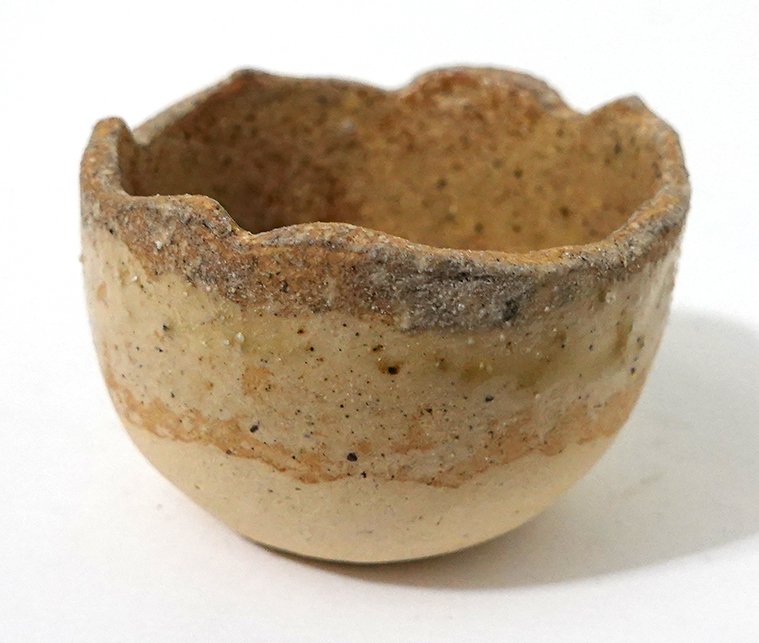
This first open bowl has a burnished-smooth surface!

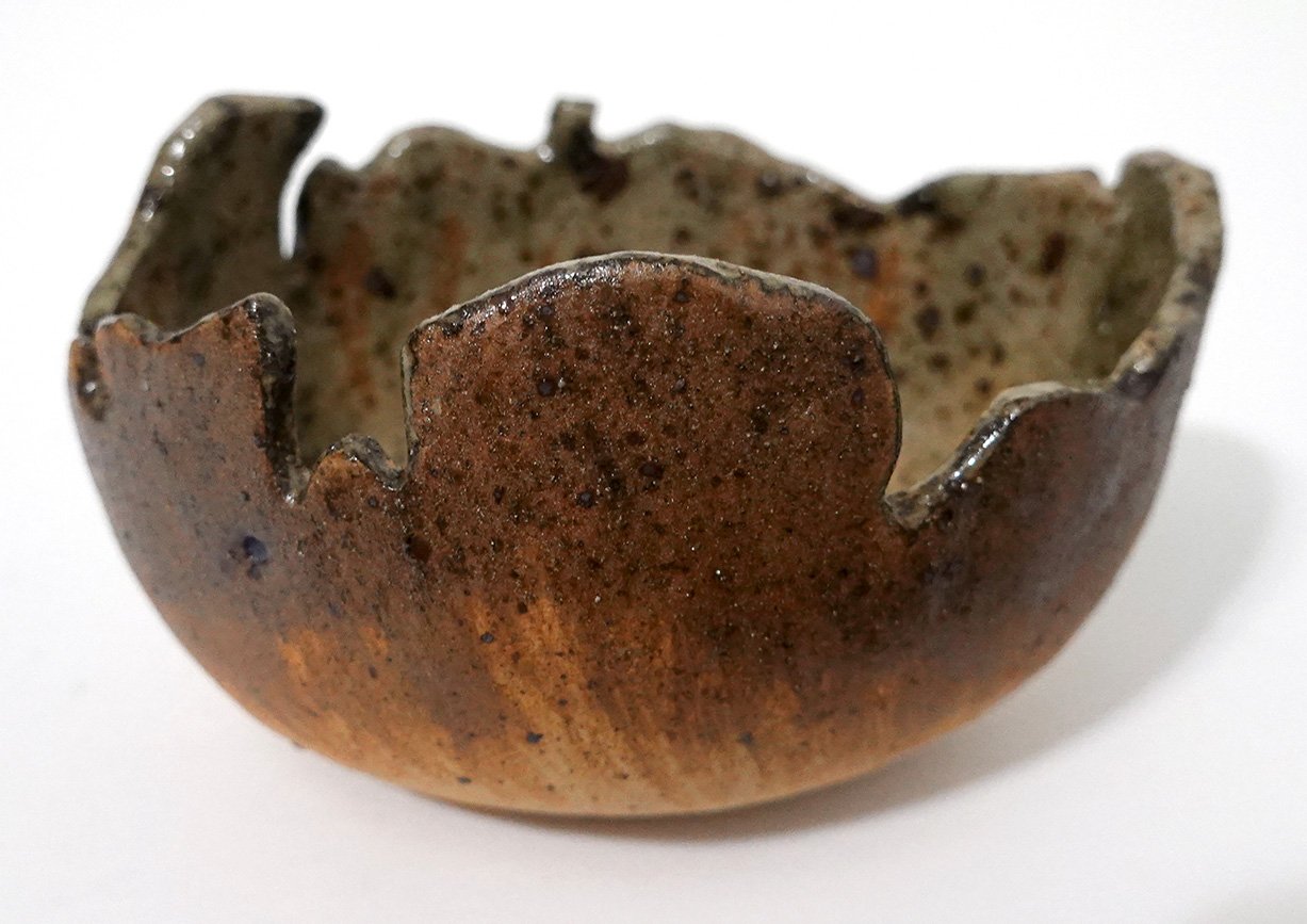
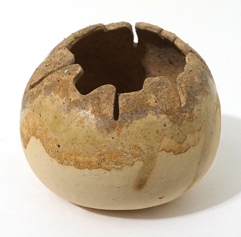
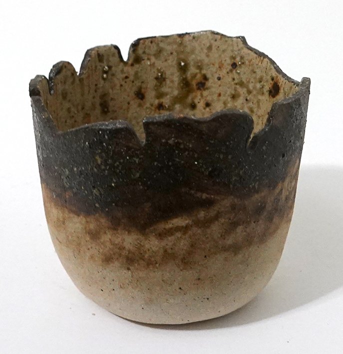
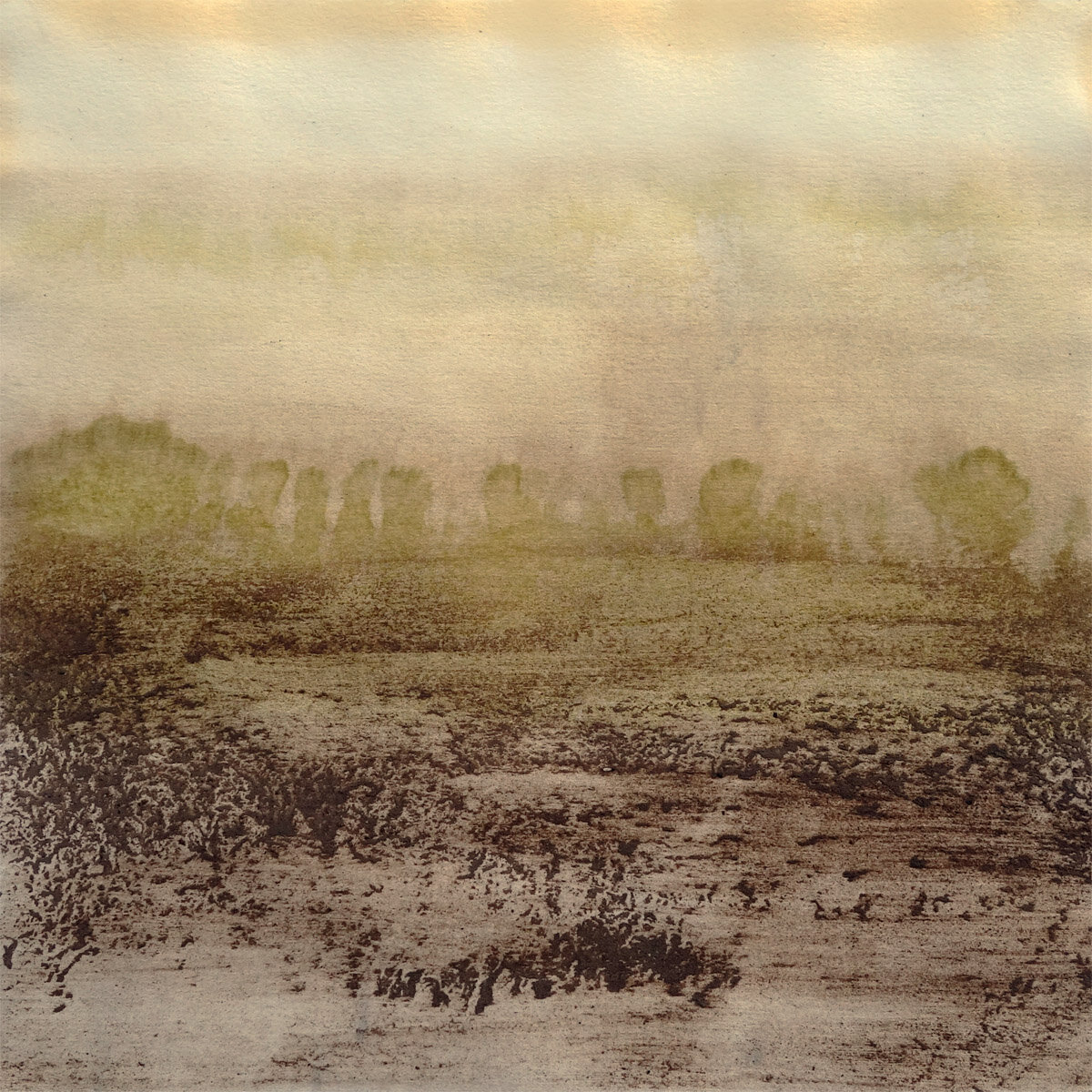
This second piece is another open bowl, but this time the surface has some light texture as well as a more variable form.

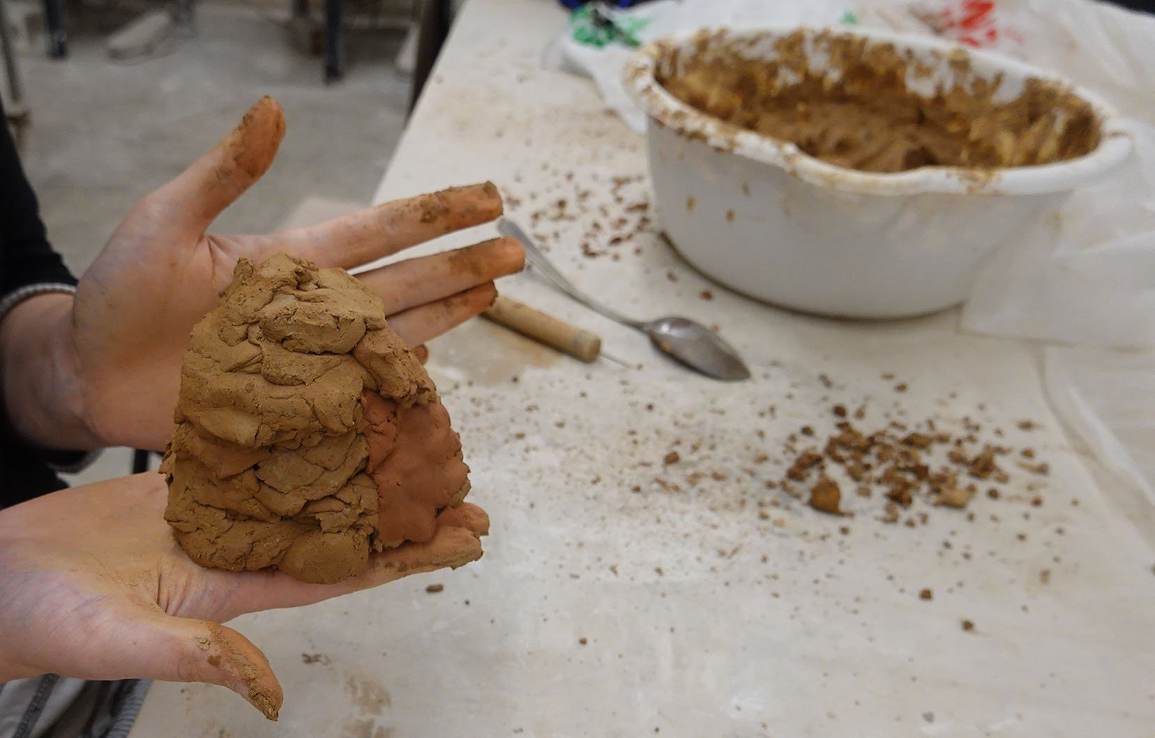
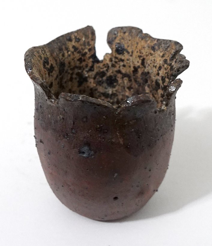
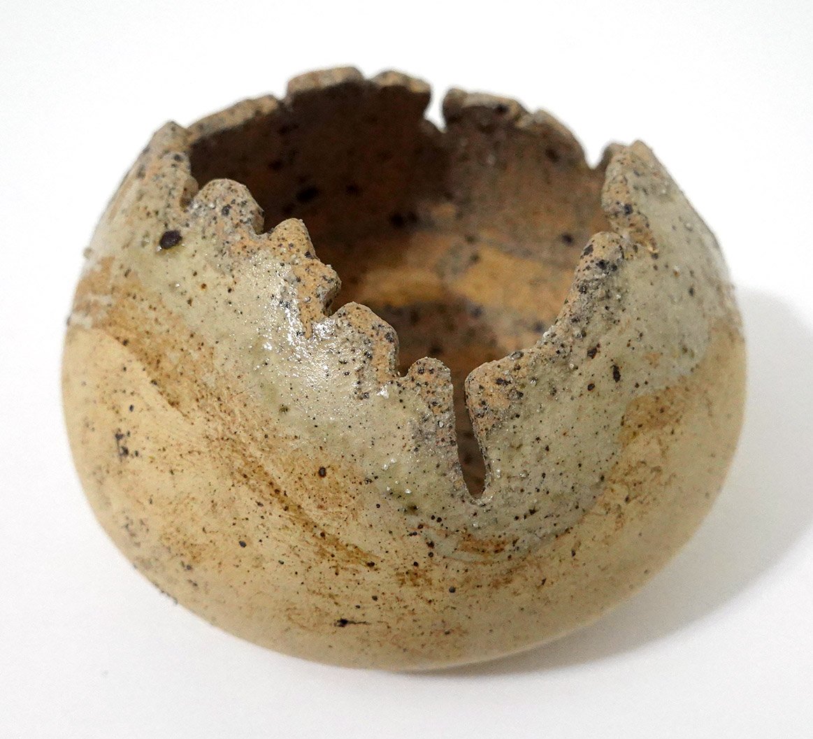
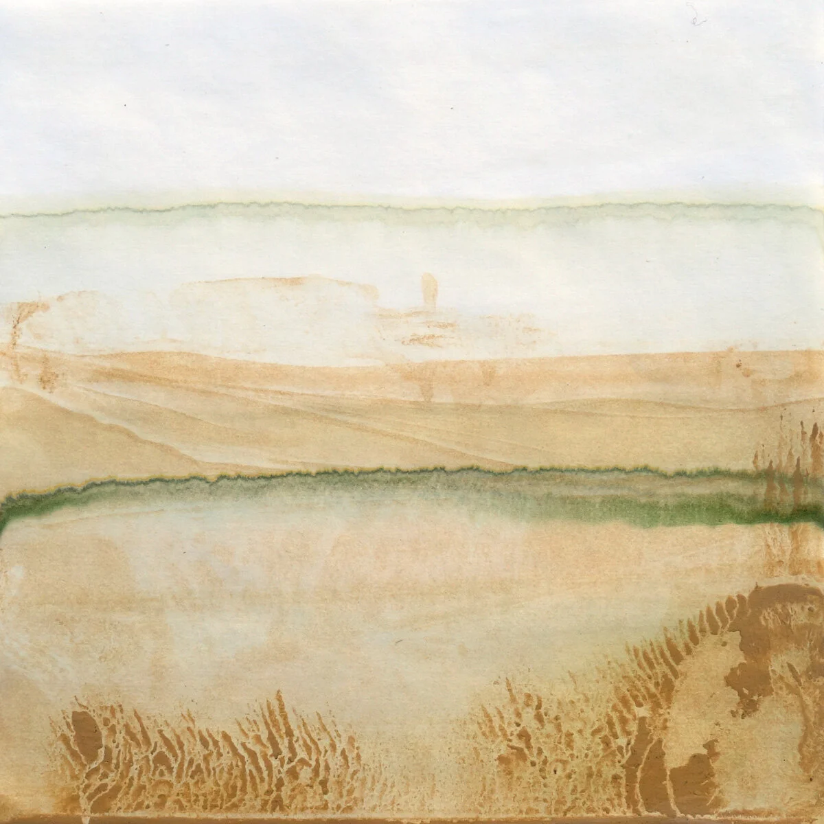
This third piece is burnished smooth and a bit more closed, though there’s a quite variable lip. All of the pieces I’ll be showing you are handbuilt, pinch-pot designs.

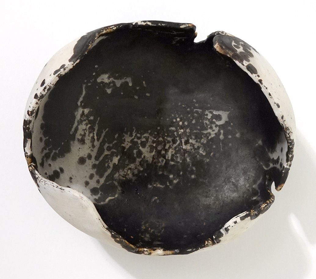
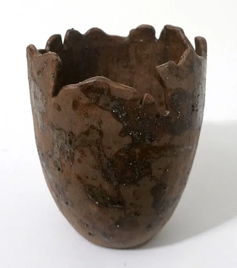
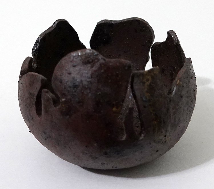
Next we have another burnished and even more closed vessel! This one was a favorite of my fellow workshop attendees; they loved how the obvara surface turned out.

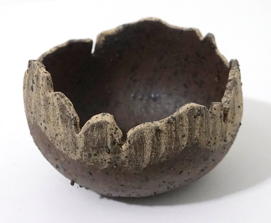
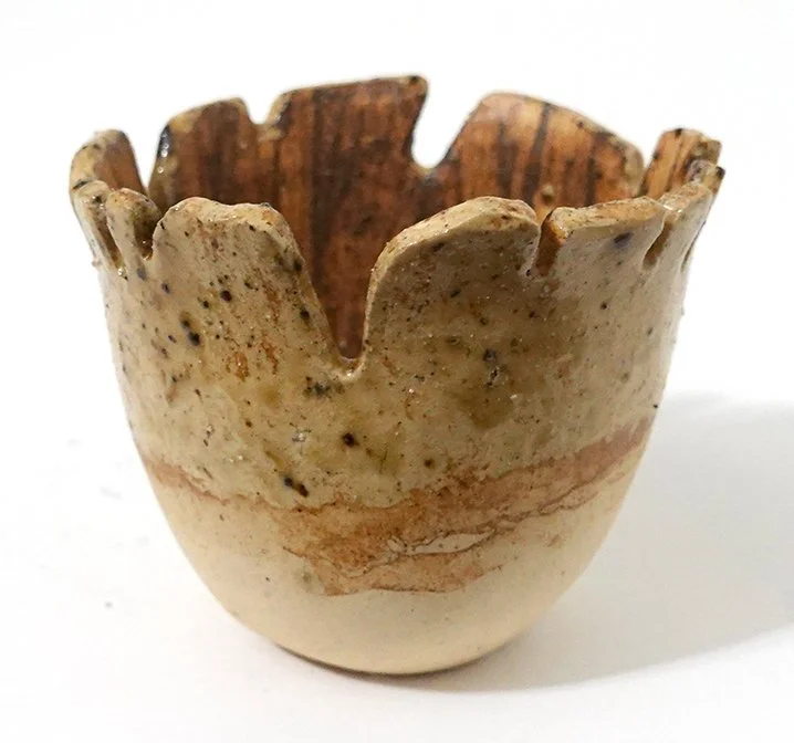
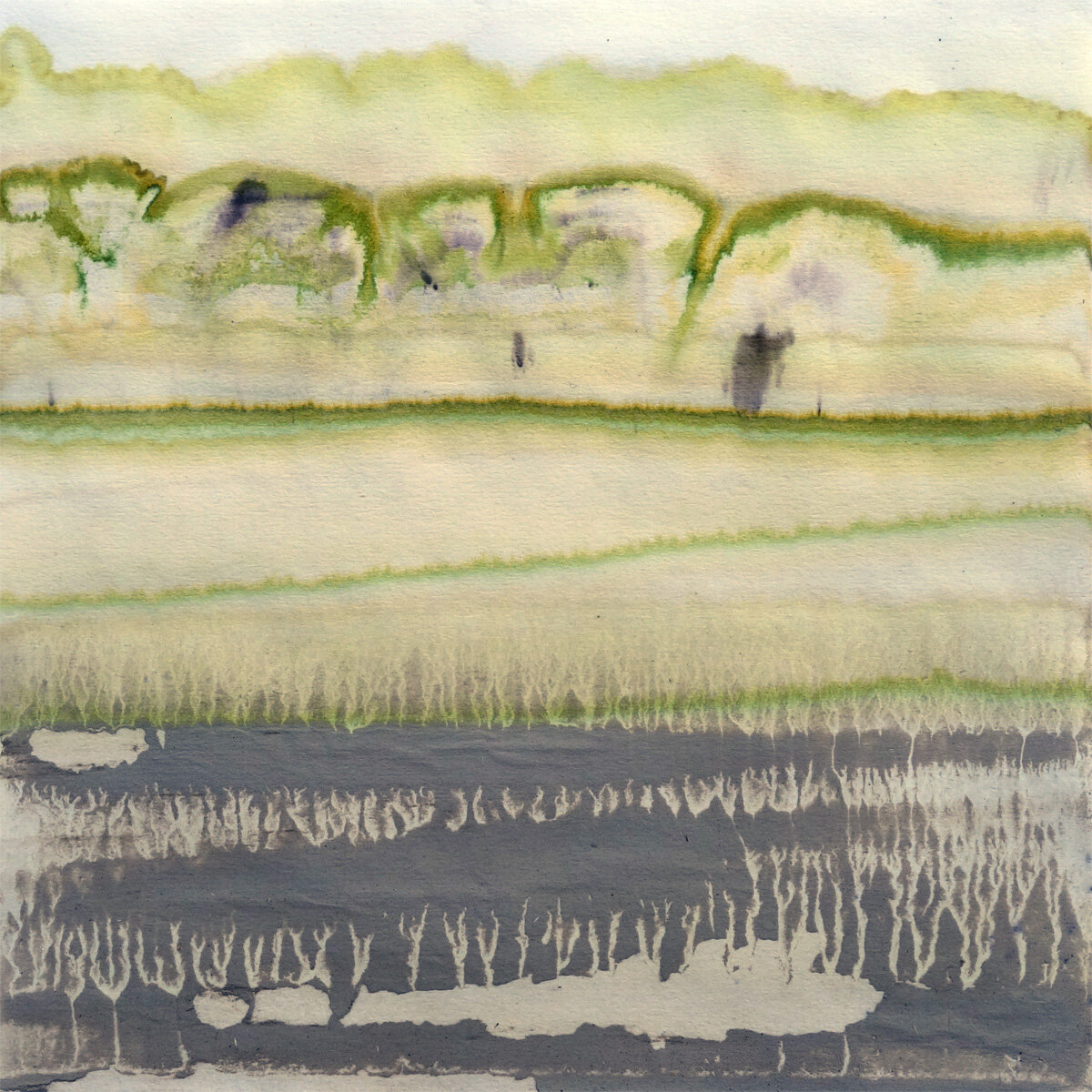
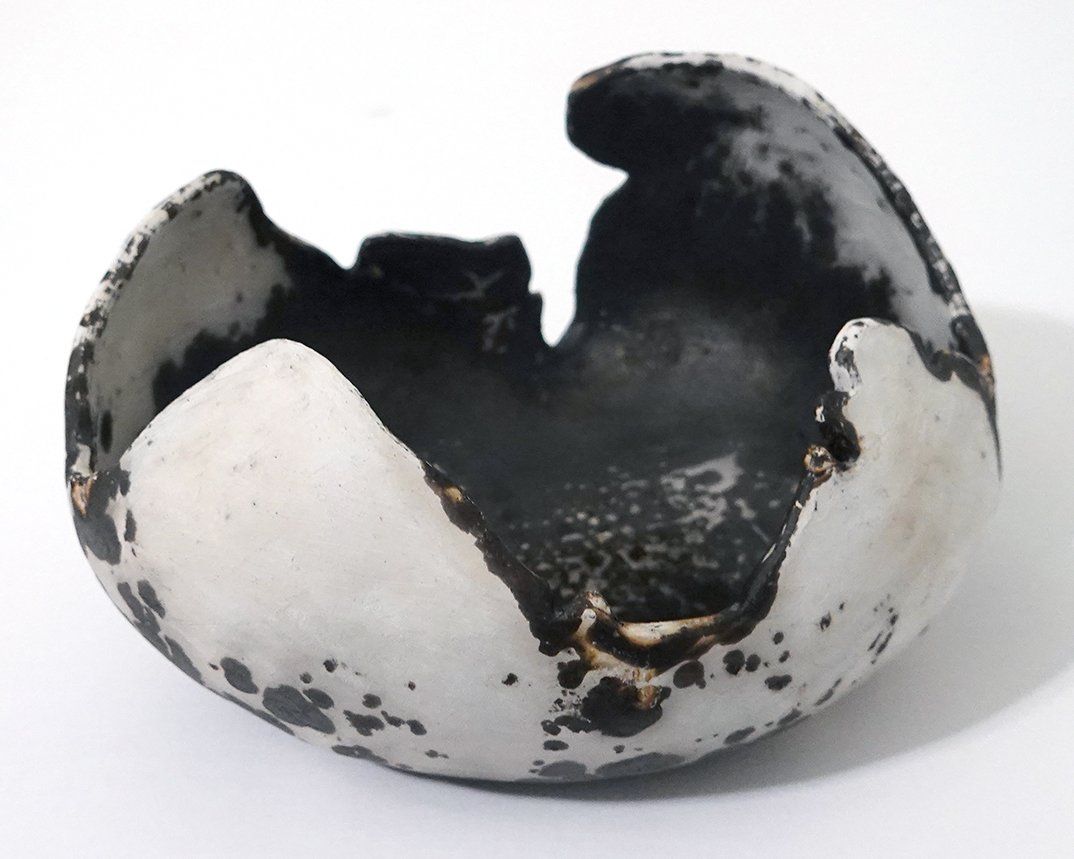
While you can click into each of the above images to see them larger, I want to close this post out with just one large image of the last burnished bowl I made!

An obvara raku handbuilt bowl by artist Shelby Prindaville.

Photos of My Solo Show "Materiality"

Whew, it’s a busy fall! My solo show Materiality has closed, and I’ve been hard at work with the aim of getting all the sold pieces from it into the hands of the buyers. Here are some photos of the exhibition and reception! I was very pleased with the show installation and flow, which was due to our amazing preparator Shannon Sargent. There was great community turnout for the reception - it was a fantastic event.

Phoenix Athens Residency Artwork 8

The wooden spool end before the mosaic and concrete.

I’m always interested in manmade constructions altered by the environment and time, and when I kept finding broken fragments of marble paving stones, concrete pathing, ceramic tiles, and so forth, I started picking them up. After amassing quite a collection, I decided I’d make a mosaic that referenced some of the artifact displays I’d seen in Athenian museums, so I took the angle grinder with a diamond blade to them to cut them down to at or below my desired height.

I then put one unique piece per type into the second recycled wood round from the electrical spool - this one had the upraised interior wooden frame with a circular outside and a square inside. (To block the holes, I had already cut and glued down a piece of masonite to the back - see the image to the left.) Once I found the layout I wanted, I put a smoother white concrete (compared to the previous large-grogged grey type I used in Realms) in and around it. I thought I probably wanted to paint it, but by this point my show installation was the next day so we just installed it in that mid-way state.

Once installed, my show was up until my last day in Athens, so I then took it down and brought it back to the US. Then I began to test out different possible compositions in Photoshop, and I settled on painting a couple rings of color - the inner gold and the outer blue - around the central composition in a design that references the mati aka evil eye charms. The three cool-colored mosaic fragments in the center are intentionally reminiscent of an eye as well.

After I painted the two rings, they looked too new, so I weathered them a little and made the blue border bleed into the white band inside to soften that edge.

This is Pathways, found marble, concrete, and ceramic paver fragments with acrylic and concrete on recycled wood round, 17.5x17.5x.1.3, 2023.

Shelby Prindaville's Greek pathways mosaic relief.

Phoenix Athens Residency Artwork 5

When I first conceived of a nine-tile piece (Marginated) and a five-turned-into-four-tile piece due to one of the pieces being destroyed at a sandblasting facility (though then one of the four remaining tiles broke into two during sanding, so it reconverted to five total pieces-and-fragments), I had planned to paint an animal on the larger composition and a plant on the narrower one. I imagined it might be a tortoise and an olive branch, and as time passed and I gathered experiences and reference imagery, both ideas resonated more and more strongly.

Athens is named as such because Athena and Poseidon battled out becoming the city’s patron god through each giving it a gift. Poseidon gave a salt-water sea, while Athena gave the gift of an olive tree atop the Acropolis. The olive tree was deemed the better gift, and so the city was named Athens with the patron of Athena (and was punished with insufficient fresh water by Poseidon). Olive trees are ubiquitous in Athens and Greece, growing in the ground as well as in decorative containers throughout the city. They are easy to identify due to their iconic appearance. Their fruit, oil, and wood are each major industries, and squatters can even gain land rights by planting an olive tree on contested parcels. The olive branch has become a worldwide symbol of peace.

I decided to paint an olive branch with immature olives on it, and atop the roughened glaze sections, I kept its coloration standard while on the raw clay body I converted it into a hot/burnt color palette that bring global warming, fires, and drought to mind (as I did to a lesser degree on Marginated as well).

Once again, this piece can be displayed variably, and/or in combination with Marginated.

Symbolism, acrylic on five partially deglazed 19th century ceramic tiles and tile fragments, variable display dimensions with core dimensions of 17.25x5.5x.25", 2023.

Shelby Prindaville’s acrylic painting of an olive branch on partially deglazed 19th century tiles, displayed in its core composition.

Shelby Prindaville’s acrylic painting of an olive branch on partially deglazed 19th century tiles, displayed in an alternative layout.

Shelby Prindaville’s acrylic painting of an olive branch on partially deglazed 19th century tiles, displayed in an alternative layout.

Phoenix Athens Residency Artwork 4

I am so happy with how this overall project turned out! The tiles fought hard to keep their slick glass surfaces and people kept trying to persuade me to give up, but after a lot of failed attempts, I eventually prevailed in removing the top-most surface but leaving most of the glaze, crackle, and chip defects (and adding more defects of my own in the process).

From conception, I had planned on a nine-tile ceramic artwork and a five-tile-and-fragment ceramic artwork. One of the whole tiles ended up completely ruined while at the second sandblasting facility, so I was down to nine and four. I was initially pretty sure my nine-tile square artwork was going to be a tortoise, but I tried out a variety of compositions… and confirmed that a tortoise was my favorite option!

This project is exciting in that it is an experimental fusion between ceramics and painting, and it also uses as its substrate antique tiles from the 1840s. The multiple components means that I can display this piece in infinite ways; the “core composition” is of course the most resolved option but irregular spacing and/or scrambling encourages additional viewer appreciation for the artistry of each tile in its own right as well as introduces additional room for conceptual narratives around ecology, encroaching human environments into the natural world, negative space, abstraction, and time.

The subject is the larger, presumably male adult marginated tortoise I met on Mount Lycabettus - at least one group of locals call him Petros. When I was thinking about what to title this piece, I realized that marginated also means “marked or characterized by margins,” such that the word describes both the subject and substrate and therefore seemed to me to be the perfect title.

Marginated, acrylic on nine partially deglazed 19th century ceramic tiles, variable display dimensions with core dimensions of 16x16x.25", 2023.

Shelby Prindaville’s acrylic painting of a marginated tortoise on nine partially deglazed 19th century tiles, displayed in the core dimensions.

Shelby Prindaville’s acrylic painting of a marginated tortoise on nine partially deglazed 19th century tiles, displayed in a more conceptual, open configuration.

My 39.57, -97.66 Ceramics

After I made my 100% wild, site-specific Whiterock Conservancy ceramic collection entitled 41.816, -94.646 Ceramics, I knew I wanted to add other geographic coordinates to my oeuvre. Upon discussing this wish with family and friends, my father suggested that I might be able to get some wild clay from the brick plant Cloud Ceramics in my hometown of Concordia, Kansas. We brainstormed different supplies of ash for me to create custom ash glazes with, and settled on ash from my parents’ Republican River Valley firewood and the local Cloud County landfill (they burn organics like fallen tree limbs).

Several calls and trips my dad took to fetch the requisite media later, I had two different colors of native clay as well as the two aforementioned sources of ash. The clay from the brick plant arrived in dry chunks, and it had a lot of rocks and different densities of clays embedded in the pieces. After trying a couple of other methods (sifting and straining), I ended up going back to my tried-and-true, low-tech solution for cleaning the clay: meticulously smushing little pieces of it by hand to remove the debris and equalize consistencies.

I began working on this series in late November. I had a deadline of mid-February if I wanted to include 100% site-specific ceramics in my solo show in the Frank Carlson Design Room. That’s a turnaround of less than three months! I tasked my studio assistant work study students with helping me clean the clay, which helped speed up the process. I also tried to keep the pieces relatively small to maximize the number of pieces I’d be able to complete.

Here are some photos of the process!

As you can see above, after we cleaned the clay I handbuilt 30 ceramic pieces (15 out of each clay color) and bisque fired them. I then separated them into two different firings: half went into a cone 8 electric kiln firing and half went into a cone 9 gas reduction firing. After sifting the ash and removing all the larger chunks, I created 9 different custom ash glazes: 8 using all possible combinations of yellow clay, grey clay, landfill ash, and fireplace ash in 1:3 ratios, and 1 hybrid glaze with 1:1:1:1 proportions of each. I wasn’t sure what any of the glazes would look like, so I ensured each color of clay and kiln setting had the full range of options and asked my work study students to take copious notes so that we could learn from the results.

Here are my 39.57, -97.66 Ceramics! I managed to finish these in time to include in my Frank Carlson Design Room solo show. I like them all, but I am particularly in love with the ones that came out of the cone 9 gas reduction firing. I’ve only fired a few times in gas kilns so far, and this is the first time I’ve gotten really good reduction - it’s gorgeous! I like them so much that I want to make more (and larger) pieces to add into this collection, and glaze with a little more intention now that I know what the custom glazes I created will do. The clay cleaning process is tedious enough that there is a limit to how long I’ll want to keep working with each wild batch of clay, but my interest hasn’t waned in the Concordia series yet.

New Artwork: Earth Measurer

An in-progress photo showing my contour drawing which underpins the finished painting!

I made the acquaintance of this inchworm at Whiterock Conservancy, and began the contour drawing over a year ago. I picked it back up this winter break!

The title of the piece, Earth Measurer, is the English translation of the Ancient-Greek-derived “geometer.” Geometridae is the scientific name for the family of caterpillars (and moths) that make use of the distinctive method of locomotion that is not only described in the family’s scientific name but also in many of their common names: inchworm, spanworm, looper, and measuring worm.

After spending a lot of time really looking at inchworm anatomy and learning terminology (FYI, they have true legs and prolegs), I am again impressed with the variety and richness of animal forms in the world; there’s plenty of alien to explore right here. This past summer, while painting mosquitoes from LSU Vet Med’s epidemiology department, I was surprised by how hairy they are upon examination. Similarly, on this so-called hairless caterpillar, there’s still a fair amount of hair, called setae! I included it in the painting as well, though you’ve got to get close to the painting or zoom in quite a bit to see it.

This is Earth Measurer, acrylic on basswood panel, 6x12x1.5”, 2023.

I Bought a Rock Tumbler!

I’ve wanted a rock tumbler for a couple of years, but not quite enough to commit. However, I have also begun to amass broken ceramics, from raku thermal shocks to glaze fusing with kiln shelves to squirrel casualties (they try to bury nuts in my outdoor container plant collection in the fall, and repeatedly fail while digging up my plants and breaking planters in the process). Some of the broken pieces were favorites, so I just carefully collected the pieces and held onto them. (I did try to glue one planter back together, and realized that just doesn’t work well enough.)

It dawned on me that given my now multi-year interest in ceramics, I’ll have a renewable resource for the rock tumbler beyond an occasional rock harvest. I’ve beachcombed tumbled tiles before and even used them in assemblages, so I know I like the aesthetic - and, of course, the conceptual power of the push/pull between man and nature that creates them. If I make them myself out of my own handmade ceramics, I could generate enough to use the tumbled pieces for magnets or mosaics! I can also use any rejects as top dressing for plants, and I have a near infinite need there as my plant collection is unreasonably large and continuously expanding.

I began to research rock tumblers in early November. At first, I thought I’d just get a hobby one like the entry-level National Geographic model. However, I learned it doesn’t cost that much more to buy a quality version. I decided to go with Lortone as the maker. I wanted a rotary style - vibratory models also exist, but for my ceramic purposes I need the rotary tumbling action as vibrations are more helpful for surface polish while tumbling is what knocks down harsh edges.

Most rock tumbling aficionados recommend a double-barreled design, but those were sold out and I imagined it might take several months for stock to replenish given holiday demand - I didn’t want to wait that long! I considered going for a bigger volume barrel next, but then I thought about the quantity of material I have to do at any one time and in reality, it’s not that much. I eventually settled on the Lortone Model 3A tumbler. While I think I’d likely have gone with the double-barreled 33B if it’d been in stock, I also think that running two barrels at once is more for those who plan to process mostly rocks rather than ceramics. With rocks, you need to go through several stages of polish to achieve a smooth finish; with ceramics, they start with a smooth glass finish and you just need to knock the sharp sides down! I can do that in just one rough grit tumbling session.

I’ve only owned my tumbler for a few weeks, so I’m still learning, but I’m having a lot of fun and have run through my backlog of broken ceramics already! In trying to find more fodder, I’ve realized I can easily recycle my ash test tiles I created when testing ash glaze recipes for my Whiterock 41.816, -94.646 ceramic collection, so I’m still working on processing those. I love that I now have a use for otherwise already-served-their-purpose ceramics like test tiles too.

Here are some photos of one tumble from start to finish! (You can click into any of the images to see them at a larger size.)


Lauritzen Gardens Solo Show

Just a reminder that I will be installing my solo show at Lauritzen Gardens (Omaha’s botanical center) today, and you can see the show in person from August 17-September 24, 2022! I’ll publish some photos from my installation and of the exhibition itself in a subsequent post for those of you unable to visit in person.

Screenshot of Shelby Prindaville's exhibition listing on Lauritzen's website

Sioux City Journal Feature!

A screenshot of the beginning of the SCJ feature

I’ve been getting some nice Louisiana press for my summer LSU Vet Med artist residency, and now there’s great local coverage as well - with more in the works! Here’s the Sioux City Journal digital article “Morningside professor participates in first-ever artist residency at LSU vet school” by reporter Dolly Butz, and here’s a PDF of the print version!

Whiterock Conservancy New Artwork: Surface

I just finished my second relief from my Whiterock Conservancy residency earlier this summer! This piece depicts an American bullfrog, Rana catesbeiana syn. Lithobates catesbeianus, floating on the surface of one of Whiterock’s turtle ponds.

Here are a couple of process pictures of the underlying QuickCure Clay relief. I began by sculpting the above-water portions of the bullfrog, and then added patches of algae as well.

After I finished the relief elements, I began to paint! I’m pretty pleased with the end result. I finished this piece with two coats of gloss varnish to contribute to a wet appearance.

This is Surface, 12x16x2”, QuickCure Clay relief and acrylic on basswood panel, 2021.

Whiterock Conservancy New Artwork: Attuned

This is the first figurative piece I worked on at Whiterock Conservancy - a relief portrait of a small species of frog I found in abundance at the river shoreline. The Blanchard’s cricket frog, Acris blanchardi, is an endangered or threatened species in three states so far and is listed as a "Species of Greatest Conservation Need." It is considered a type of chorus frog, and is one of the smallest species of frogs in Iowa. Surprisingly (to me, at any rate) it is also considered a type of tree frog despite being semiaquatic and therefore not having the toe pads of their arboreal brethren.

As always, I began with a contour line drawing. My goal with this piece was a stylized, squashed relief reminiscent of antique bronze relief doors, so after finishing the drawing I began laying in the QuickCure Clay relief. Here are two process photos showing the beginning of that QCC work.

At this point, I got too involved in the actual creation to pause, so we’ll skip ahead to the finished work! This is Attuned, 14x11x1.35", QuickCure Clay relief and acrylic on basswood panel, 2021.

Attuned by Shelby Prindaville, Whiterock Conservancy 2021 artist in residence.

New Artwork: Whiterock Conservancy 8x8" Chromatograms

I and my friends gathered many natural materials while on my Whiterock Conservancy artist residency - plant, flower, fungus, bark, lichen, soil, water, rock, and mineral samples - which I then processed into a pigment solution and “printed” on filter paper through chromatography.

I’ve done a version of this before on my BROTA residency with the Buenos Aires Botanical Garden; that time, I used fairly standard scientific 4” rounds and only used one plant species per round for individual portraits that also captured differing seasons within the botanical garden. This time, I sized up to 8x8” squares, and additionally made a handful of larger 23x18” pieces; with these my chromatography features entire ecosystems. This post will display my new 8x8” pieces! The first photo is just a process pic, followed by 19 different chromatograms. (I donated three others to the conservancy, Liz Garst, and the groundskeeper Amanda who shared the tree frog with me.)

I’m really excited by this series and am interested to see how these pieces age in terms of pigmentation going fugitive; I have sealed them and hope they retain their coloration for many years to come, but their likely degradation over time certainly fits with themes in my broader bodies of work about ecological conservation and loss. My Buenos Aires pieces do appear to have lost a little saturation over the past two years, but they still display a good range of color. In that case, each round made use of only one plant species; in this case, since there are mineral and soil components as well, I have hopes that those sections will endure even longer than the plant pigmentation.

My Artist For the Earth Opening Reception!

Well, Earth Day 2021 was quite eventful! I’ll do a separate post on the ART 225 Painting I project we took on earlier in the day, but this post is all about how my opening reception went for my Artist for the Earth solo show at The Block Gallery in downtown Sioux City.

First of all, I want to say a big thank you to the Morningside Art Department federal work study studio art assistants Devyn Reilly and Rachel Steinkamp for helping me to install the show. While I’ve installed many a show alone, it is so much nicer to have skilled help working alongside you! I also had Rachel take some nice shots of the show after we installed it, so I might add more to the blog later, but here are a few photos I took tonight.

The last photo in the grid is thanks to some of my lovely friends, who not only came out to support me at the reception but also gifted me with a bouquet of flowers and purchased artwork and reproductions. A bunch of wonderful colleagues, students, and community members also came through and many left with various pieces of artwork as well. It was a lovely evening!

New Business Cards!

I just redesigned my business cards and ordered a new set from Moo.  Since Moo allows printing of multiple back designs with a fixed front, I printed two different options.  I was concerned that the one with the Balancing Act snails detail might be too much, as it can look it when you see both sides at once, but in person it works quite well.  I'm liking both types enough that I may continue to order the mix... until I decide to redesign the card all over again, of course!