ecoartist

My Temporal Artwork: Chromatograms

Some artists primarily work in transitory media - their artwork dissolves, melts, is eaten, is a performance, and so on. Often the documentation of this sort of artwork in many ways supplants the original; suddenly the photograph or video is the primary way that audiences engage with the piece. Andy Goldsworthy’s work is a good example.

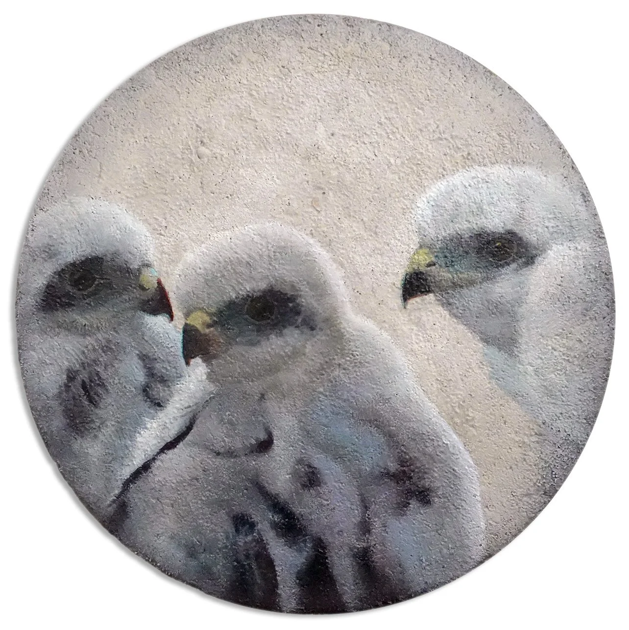
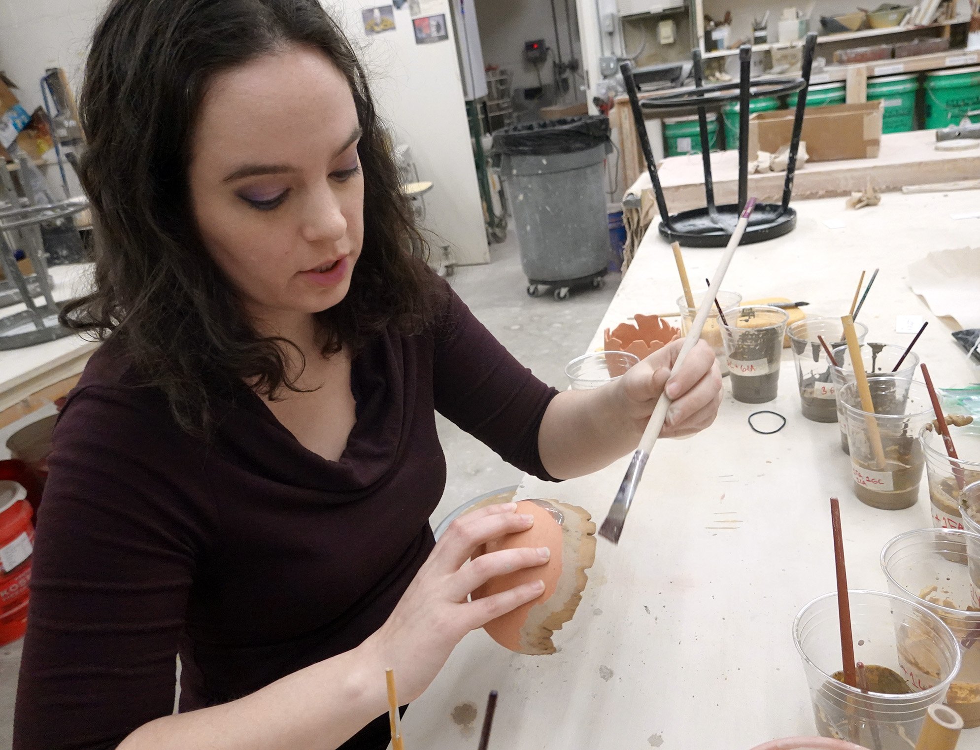
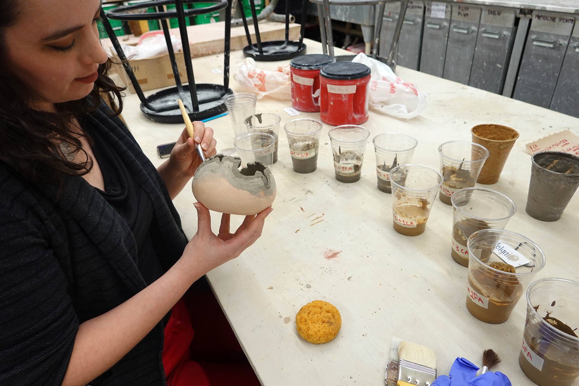
Most of my artwork is intended to be of archival quality - I want it to endure for centuries, if not millennia! However, some of my pieces do have a more limited lifespan, at least in terms of continuing to match the photo documentation I took when I created the original artwork. My chromatography series are in that category, and I discussed this in the artist statement I published in this summer’s Annals of Iowa journal (Volume 82, Number 3). Here’s the pertinent excerpt:

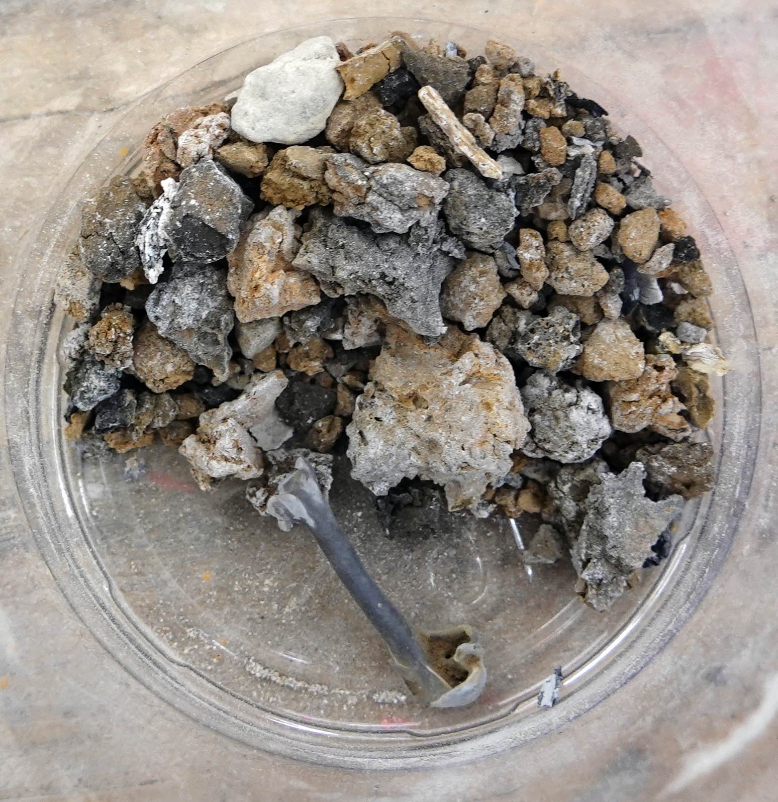
“Over time and exposure to sunlight, the less stable plant pigments in these chromatograms (the greens, blues, purples, and reds) degrade, while the more stable colors (the yellows, browns, and blacks) remain; my Literal Landscapes become more and more sepia as they age.  To me, this is a reminder that our natural world is vibrant but vulnerable, and that we should relish what we have while stepping up our interventions to improve our ecological balance for future generations… or the living earth around us will continue to dull.”

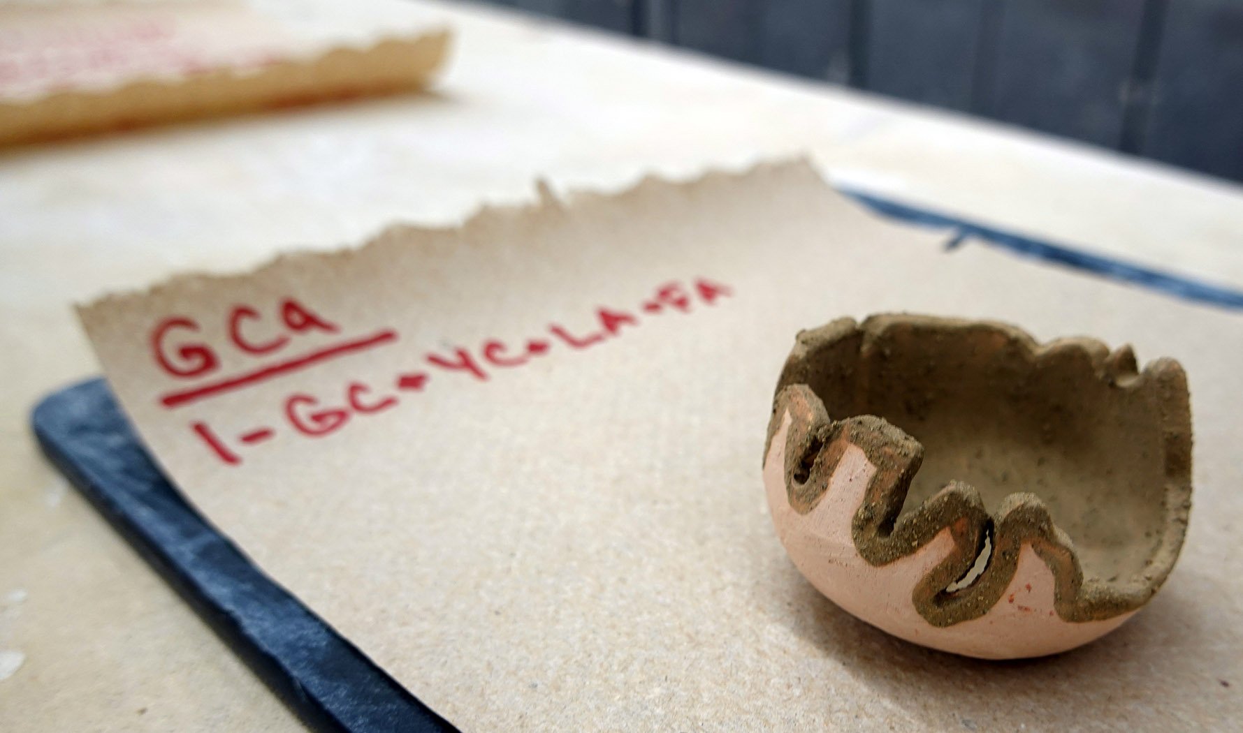
What does that change actually look like, you might ask? I thought it would be interesting to rephotograph one of the chromatograms to show you! Here is a side-by-side comparison of Literal Landscapes: Whiterock Conservancy 1, mixed media chromatogram including natural ecosystem pigments, alcohol, and gel medium on filter paper, 8x8", 2021; the first image was taken immediately after making the piece, while the second was taken over two years later.

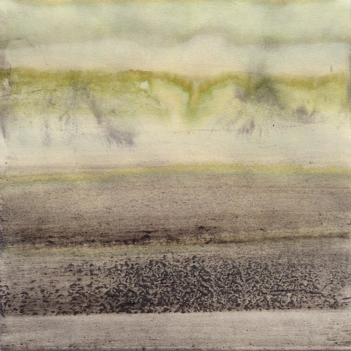
To be clear, I still find the current versions compelling! The aging process of these chromatograms unsurprisingly mirrors what happens in nature as plants progress through seasons. They’re currently evoking autumn to me, while their original versions were more spring/summer. I bet a photo taken further down the line would show continued movement towards the monochromatic, so I might repeat this experiment again in a couple more years to try to determine when they will achieve their final evolution.

Phoenix Athens Residency Artwork 9

Having that one hoopoe sunbathe in what felt pointedly for me was a genuinely amazing experience, and even though I think the pose is somewhat challenging for viewers, I knew I needed to paint it.

Each time I’d walked past or into olive wood stores, I considered if I wanted to purchase an olive wood slab to use as a substrate. There were a lot of slabs that had been made into cutting boards, complete with runoff depressions and handles, but several stores offered flush slabs (I imagine with the intended usage being cheese and serving boards). One day, I was in another olive wood shop and I decided to sift through all of their flush slabs, and I found one with a really compelling wood grain design that in my mind referenced the hot summer Mount Lycabettus landscape, and I could envision putting the sunbathing hoopoe atop it. It was a smaller slab than I ideally wanted, but then again, whatever I acquired would have to fit in my luggage… and size was important but so was the wood grain design - and this one was pretty perfect. I dithered about it for a little bit, and then decided to take the plunge and get it. Post-purchase, I went into another olive wood store to see if I’d immediately regret my choice by finding a better slab, but they did not have one that positively compared with mine so I took that as a win and stopped second-guessing it.

The hoopoe’s distinctive, high-contrast plumage is particular enough that on this and the previous hoopoe painting I needed to do a full shaded drawing first (rather than merely a contour drawing, which is what I typically can get away with). As I tell my students, time management is crucial to being a productive, well-compensated artist - the faster you can finish a piece while keeping high standards, the sooner you can begin the next. The only other painting in recent memory that I’ve done a full shaded drawing for is Velocity, my painted turtle painting.

The underlying drawing, which I think gives you some insight into the difficulties I faced working atop this high-contrast substrate.

Drawing my sunbathing hoopoe on top of the olive wood was really difficult. Not in terms of making marks - that was fine! - but in terms of accurately putting a competing design on top of the loud wood grain already present. Even the placement and size itself was difficult to determine! Then once I began, sometimes the drawing perfectly aligned with the wood grain, which itself was startling and caused me to second-guess my work, but other times I had to dismiss what the wood grain was doing and superimpose a different line.

The painting was also tedious, in that the smaller-than-desired size of the slab meant the artwork too was a bit smaller than I wanted and I had to use my three smallest brushes to paint the whole piece. I also needed to layer the paint and build it up, as the high-contrast wood grain design bled through my first few layers of paint (particularly the white areas). I’d guess the white areas have at least six applications of white paint to achieve my desired opacity.

After I added the sun, it looked too anemic; a simple gold circle in the olive wood sky blended in too much. I slept on it, and the next day I decided to add a darker gradient halo to the sun. This detail was instrumental; I am really pleased with how much it enhanced the artwork.

I managed to finish this piece just before my show reception, so I snuck it into the show by placing it on a small stand on the gallery display counter. A number of viewers remarked at how natural and easy the piece looks in that it all flows and sits exactly where it should. Given how difficult it was to execute, that was rewarding to hear.

The field biologist who had taken me on a couple Mount Lycabettus hikes and knew I was painting hoopoes arrived and brought with him some sparrowhawk and hoopoe feathers he’d found. One of the wing feathers he brought perfectly aligns with my painting, which is really cool. I toyed with the idea of incorporating it into the painting, but decided not to do so (yet, anyway!).

This is Radiance, acrylic on natural olive wood slab, 7.5x16.5x.75", 2023.

Shelby Prindaville's acrylic on olive wood slab painting of a sunbathing hoopoe.

Phoenix Athens Residency Artwork 7

This painting was the third I started… but the seventh to finish! Many people have asked me how long it takes to finish a piece of artwork, and the answer is harder to provide than they might think because I’m usually working on multiple pieces at a time and each one’s process and progress looks different.

The substrate for this is once again papyrus, but for the first time I experimented with using crackle paste. This was particularly experimental in that you’re supposed to use crackle paste only atop rigid surfaces, and papyrus is flexible. This meant that as the crackle paste seized, it actually buckled the papyrus beneath, leading to less dramatic cracking in the paste but creating a very irregular topography and shrinking the overall dimensions of the papyrus. Painting a relatively detailed and representational subject on this surface was really difficult, which led to me fighting with it for weeks. I might’ve even abandoned it, except every visitor to my studio remarked on how much they looked forward to seeing it finished and that it was already a favorite! Eventually, I made peace with it and could see the light at the end of the tunnel.

I am really pleased with how it turned out; my studio guests were right to urge me to complete it! Also from a completionist angle, my Mount Lycabettus tortoise times were always spent with two tortoises - I painted the larger, presumed male tortoise on the antique tiles, and this papryus piece depicts his smaller, presumably female companion. It feels nice to have finished portraits of each of them.

This is a tentative title: Heritage, acrylic and crackle paste on papyrus, 15.5x21.75", 2023.

Shelby Prindaville's acrylic and crackle paste on papyrus painting of a marginated tortoise.

Phoenix Athens Residency Artwork 6

After my sparrowhawk photoshoot the second day with my new field biologist friend, I thought I might want to pay homage to the spotting scope’s field of view by working on a circular composition. Dimitri helpfully found me some wood-and-cardboard spools in the neighborhood trash, and he salvaged them. After taking them apart (they were bolted together), there were two wooden circles on each end. One was flush with holes for the bolts and center, and one had an extra central wooden ledge around the center along with the requisite holes. The Phoenix Athens residency director Dimitri is really into working with concrete, and I like trying new media so I embraced his suggestion to test it out!

I cut down a piece of masonite and glued it to the back, and then put some mesh over the top of the holes to help strengthen the cement’s fill of them. I then mixed up the concrete and added some crushed local snail shells I had collected on Mount Lycabettus as well.

The concrete adhered pretty well, but it wasn’t very level on the surface. I filled in most of the worst of the cavities with matte medium and then went to work drawing and painting atop it! I decided on a composition with three of the Eurasian sparrowhawk chicks, and I added a subtle dark vignette as another nod to the spotting scope.

I confess I am very nervous about how any of these rounds will handle the transit back, as they slightly exceed the width of my largest suitcase; it is flexible, so I can squeeze them in, but I can’t really do anything about their getting hit on those two sides. I can pad out the top and bottom, at least! I’m hoping they’ll be OK, but if they break, I hope they break in such a way that I can try to patch the pieces à la the archaeological fragmented displays I’ve admired in Athenian museums.

This is Realms, acrylic, concrete, and crushed snail shells on recycled wood round, 17.5x17.5x.75”, 2023.

Shelby Prindaville's circular acrylic and concrete on wooden panel painting of three Eurasian sparrowhawk chicks.

Phoenix Athens Residency Artwork 5

When I first conceived of a nine-tile piece (Marginated) and a five-turned-into-four-tile piece due to one of the pieces being destroyed at a sandblasting facility (though then one of the four remaining tiles broke into two during sanding, so it reconverted to five total pieces-and-fragments), I had planned to paint an animal on the larger composition and a plant on the narrower one. I imagined it might be a tortoise and an olive branch, and as time passed and I gathered experiences and reference imagery, both ideas resonated more and more strongly.

Athens is named as such because Athena and Poseidon battled out becoming the city’s patron god through each giving it a gift. Poseidon gave a salt-water sea, while Athena gave the gift of an olive tree atop the Acropolis. The olive tree was deemed the better gift, and so the city was named Athens with the patron of Athena (and was punished with insufficient fresh water by Poseidon). Olive trees are ubiquitous in Athens and Greece, growing in the ground as well as in decorative containers throughout the city. They are easy to identify due to their iconic appearance. Their fruit, oil, and wood are each major industries, and squatters can even gain land rights by planting an olive tree on contested parcels. The olive branch has become a worldwide symbol of peace.

I decided to paint an olive branch with immature olives on it, and atop the roughened glaze sections, I kept its coloration standard while on the raw clay body I converted it into a hot/burnt color palette that bring global warming, fires, and drought to mind (as I did to a lesser degree on Marginated as well).

Once again, this piece can be displayed variably, and/or in combination with Marginated.

Symbolism, acrylic on five partially deglazed 19th century ceramic tiles and tile fragments, variable display dimensions with core dimensions of 17.25x5.5x.25", 2023.

Shelby Prindaville’s acrylic painting of an olive branch on partially deglazed 19th century tiles, displayed in its core composition.

Shelby Prindaville’s acrylic painting of an olive branch on partially deglazed 19th century tiles, displayed in an alternative layout.

Shelby Prindaville’s acrylic painting of an olive branch on partially deglazed 19th century tiles, displayed in an alternative layout.

Phoenix Athens Residency Artwork 4

I am so happy with how this overall project turned out! The tiles fought hard to keep their slick glass surfaces and people kept trying to persuade me to give up, but after a lot of failed attempts, I eventually prevailed in removing the top-most surface but leaving most of the glaze, crackle, and chip defects (and adding more defects of my own in the process).

From conception, I had planned on a nine-tile ceramic artwork and a five-tile-and-fragment ceramic artwork. One of the whole tiles ended up completely ruined while at the second sandblasting facility, so I was down to nine and four. I was initially pretty sure my nine-tile square artwork was going to be a tortoise, but I tried out a variety of compositions… and confirmed that a tortoise was my favorite option!

This project is exciting in that it is an experimental fusion between ceramics and painting, and it also uses as its substrate antique tiles from the 1840s. The multiple components means that I can display this piece in infinite ways; the “core composition” is of course the most resolved option but irregular spacing and/or scrambling encourages additional viewer appreciation for the artistry of each tile in its own right as well as introduces additional room for conceptual narratives around ecology, encroaching human environments into the natural world, negative space, abstraction, and time.

The subject is the larger, presumably male adult marginated tortoise I met on Mount Lycabettus - at least one group of locals call him Petros. When I was thinking about what to title this piece, I realized that marginated also means “marked or characterized by margins,” such that the word describes both the subject and substrate and therefore seemed to me to be the perfect title.

Marginated, acrylic on nine partially deglazed 19th century ceramic tiles, variable display dimensions with core dimensions of 16x16x.25", 2023.

Shelby Prindaville’s acrylic painting of a marginated tortoise on nine partially deglazed 19th century tiles, displayed in the core dimensions.

Shelby Prindaville’s acrylic painting of a marginated tortoise on nine partially deglazed 19th century tiles, displayed in a more conceptual, open configuration.

Phoenix Athens Residency Artwork 3

This is my first Eurasian hoopoe artwork! It is painted on a natural tree trunk slice which I obtained here in Athens. The central element, the “seed,” is the unaltered center-most part of the wood as well as its hollow. It also subtly references the “mati” or “evil eye” which is a prevalent design in Greece.

I plan to paint at least one, maybe two more hoopoe pieces… though I may not have time to complete them while I’m here in Athens. We’ll see!

The Seed, acrylic on tree trunk slice, 15.25x15.5x1”, 2023.

Shelby Prindaville’s acrylic painting atop a tree trunk slice of two hoopoes on a branch.

Phoenix Athens Residency Artwork 2

This is my second finished painting completed as an artist in residence at Phoenix Athens in Greece! It depicts the wild sparrowhawk mother of the chick I previously painted. The Eurasian sparrowhawk’s scientific name is Accipiter nisus, with “accipiter” being Latin for hawk and “Nisus” due to the Greek myth of King Nisus/Nisos (who in most versions of the myth is turned into a raptor upon his daughter’s betrayal).

I’ve always been interested in syncretism and occasionally infuse religious references into my artwork. Working within various European, Greek, and Egyptian traditions and media and adding my own conservation-based values into the mix here, I was inspired to give this female sparrowhawk a halo. The word “halo” comes from the Greek language and is artistically used for Greek deities including Helios, Eos, and Eosphorous, but the stylization I gave mine is more traditionally associated with Christianity though it is believed to have originated in Iran.

This is Syncretism, acrylic on papyrus, 24x16.5”, 2023.

Shelby Prindaville’s acrylic on papyrus painting of a female adult Eurasian sparrowhawk with a halo, titled “Syncretism," 2023.

My 39.57, -97.66 Ceramics

After I made my 100% wild, site-specific Whiterock Conservancy ceramic collection entitled 41.816, -94.646 Ceramics, I knew I wanted to add other geographic coordinates to my oeuvre. Upon discussing this wish with family and friends, my father suggested that I might be able to get some wild clay from the brick plant Cloud Ceramics in my hometown of Concordia, Kansas. We brainstormed different supplies of ash for me to create custom ash glazes with, and settled on ash from my parents’ Republican River Valley firewood and the local Cloud County landfill (they burn organics like fallen tree limbs).

Several calls and trips my dad took to fetch the requisite media later, I had two different colors of native clay as well as the two aforementioned sources of ash. The clay from the brick plant arrived in dry chunks, and it had a lot of rocks and different densities of clays embedded in the pieces. After trying a couple of other methods (sifting and straining), I ended up going back to my tried-and-true, low-tech solution for cleaning the clay: meticulously smushing little pieces of it by hand to remove the debris and equalize consistencies.

I began working on this series in late November. I had a deadline of mid-February if I wanted to include 100% site-specific ceramics in my solo show in the Frank Carlson Design Room. That’s a turnaround of less than three months! I tasked my studio assistant work study students with helping me clean the clay, which helped speed up the process. I also tried to keep the pieces relatively small to maximize the number of pieces I’d be able to complete.

Here are some photos of the process!

As you can see above, after we cleaned the clay I handbuilt 30 ceramic pieces (15 out of each clay color) and bisque fired them. I then separated them into two different firings: half went into a cone 8 electric kiln firing and half went into a cone 9 gas reduction firing. After sifting the ash and removing all the larger chunks, I created 9 different custom ash glazes: 8 using all possible combinations of yellow clay, grey clay, landfill ash, and fireplace ash in 1:3 ratios, and 1 hybrid glaze with 1:1:1:1 proportions of each. I wasn’t sure what any of the glazes would look like, so I ensured each color of clay and kiln setting had the full range of options and asked my work study students to take copious notes so that we could learn from the results.

Here are my 39.57, -97.66 Ceramics! I managed to finish these in time to include in my Frank Carlson Design Room solo show. I like them all, but I am particularly in love with the ones that came out of the cone 9 gas reduction firing. I’ve only fired a few times in gas kilns so far, and this is the first time I’ve gotten really good reduction - it’s gorgeous! I like them so much that I want to make more (and larger) pieces to add into this collection, and glaze with a little more intention now that I know what the custom glazes I created will do. The clay cleaning process is tedious enough that there is a limit to how long I’ll want to keep working with each wild batch of clay, but my interest hasn’t waned in the Concordia series yet.

Whiterock Art Show Photos!

Here are some photos from my three-person show Whiterock Art at the Betty Strong Encounter Center in Sioux City, IA! You can still check out this exhibition in person through November 13, 2022. I have 37 works on display, including 20 chromatograms, 15 site-specific ceramics, and 2 painted bas reliefs on panel using the polymer clay I helped create (QuickCure Clay).

As you can see, I arranged dried botanicals harvested from Whiterock Conservancy in four of my 41.816, -94.646 ceramic vessels to show this ceramic collection’s utility and connection to the landscape. My friend, former colleague, and master ceramist Susan Nelson inspired me to do this, as she often shows and photographs her ceramic work with ikebana, or the art of Japanese flower arrangements. I also placed a representative sampling of the small rocks, twigs, and other debris I cleaned out of the clay in a fifth display inside one of the smallest dishes.

At the reception for the show, I sold four of the 41.816, -94.646 ceramic pieces! I was pretty pleased with that, particularly because my price point for pieces in this collection was significantly higher than that of my stoneware work, given all the additional labor that went into this site-specific series. One of the buyers selected a piece holding dried botanicals, and another picked the vessel containing the rocks, twigs, and debris cleaned out of the clay body; both shared with me that they plan to keep those displays intact. That intent surprised me, but I’m happy that my decorative touches felt so appropriate that they’ll continue on beyond the exhibition!

Lauritzen Gardens Solo Show

Just a reminder that I will be installing my solo show at Lauritzen Gardens (Omaha’s botanical center) today, and you can see the show in person from August 17-September 24, 2022! I’ll publish some photos from my installation and of the exhibition itself in a subsequent post for those of you unable to visit in person.

Screenshot of Shelby Prindaville's exhibition listing on Lauritzen's website

Sioux City Journal Feature!

A screenshot of the beginning of the SCJ feature

I’ve been getting some nice Louisiana press for my summer LSU Vet Med artist residency, and now there’s great local coverage as well - with more in the works! Here’s the Sioux City Journal digital article “Morningside professor participates in first-ever artist residency at LSU vet school” by reporter Dolly Butz, and here’s a PDF of the print version!

Louisiana PBS Televised Feature!

Some documentation of the interviews for my LPB PBS feature.

Louisiana Public Broadcasting Service’s The State We’re In did a televised feature on my artist residency and exhibition at the LSU School of Veterinary Medicine - you can watch it here!

From their own website: “Louisiana: The State We’re In, Louisiana's only statewide news magazine, is in its 45th season on the air. The program airs Fridays at 7PM and Sundays at 4:30PM on the six-station LPB network that includes stations in Alexandria, Baton Rouge, Lafayette, Lake Charles, Monroe, and Shreveport. It also streams at lpb.org/livetv and airs on LPB’s sister station WLAE-TV32 in New Orleans on Fridays at 7PM and on WYES-TV, the PBS station for New Orleans and the Gulf Coast, at 7:30PM.

This award-winning show combines in-depth coverage about the important issues in the state along with expert analysis. […] It is one of the longest-running television programs in the nation.”