handmade dishes

New Platters!

I’ve been increasing my production of platters and plates as rolling out slabs is faster than making pinch pots. I can make two or three in the time it makes me to create one pinch pot vessel.

Here are new platters / serving dishes / display plates! As a reminder, you can click into any of the images below to see them larger, and can then page through them all in that view as well.

New Stoneware!

I’ve been steadily, slowly making food-safe, high-fire stoneware ceramics as well. Here are some pieces I produced this past year which I hadn’t gotten around to publishing until now!

First we have small plates - I’ve been using them as dessert or appetizer dishes!

Next, I’ve been continuing my landscape vase series! These are “rainy” versions.

More Raku!

You got a sneak peek at some of my recent raku work in my exhibition shots from Functional Aesthetic, but here is the full reveal!

Above are three photos of one “baked potato” bowl. I used my own hair again as well as sugar for the carbonized marks on this piece.

This vase is very difficult to photograph well; it’s currently on exhibit, but once it comes back I’m going to see if I can capture it a bit better digitally. A couple of my friends who viewed the show said this was their favorite piece of mine. The way the glaze dots turned out reminds me of inset abalone shell.

This piece certainly didn’t turn out as planned; I experimented with a turquoise crackle glaze, but I really did not like the way the color came out, so we went ahead and re-fired it. I much prefer this hammered copper look!

This above bowl is decently large, and I chose to do the outside in a relatively matte glaze while the inside is a high gloss. It gives me dragon egg vibes. The Functional Aesthetic curator placed this piece in the choicest display spot, and I learned today that it was sold! I did see a viewer admiring it and gesturing to and around it at the reception, so I wonder if she’ll be providing its new home or if a different patron snapped it up.

This above vessel is kind of football-shaped, and its surface reminds me of a somewhat aged/stained city map. It has my own hair and sugar burned into the white crackle surface. I am quite into this piece.

I was really excited about how this piece turned out, as it’s adding into the “broken egg” series of clear crackle pieces I’m developing. The shape is hard to convey in photo, but it leans in a way that feels quite anthropomorphic - at least to me!

This bowl was intended to be another in the “broken egg” series, but it cracked coming out of the kiln due to the thermal shock and my thin walls. That’s more literal than I’d like for the “broken eggs” to be. It is still in one piece, but even after I epoxy over the crack (which I plan to do to bolster its structural integrity), it will have that weakness as it’s a fairly sizeable crack. I’m not sure if given the severity of the crack if I’ll want to display this piece, but if I do I plan to list it as NFS (not for sale).

And here is yet another casualty; however, this football-shaped vessel’s crack is more minor.

Second Raku Workshop - Copper Glazes Edition

I decided to try copper glazes again, but with some wild cards thrown in - I experimented more with unglazed negative spaces, and tested out some different types of glaze.

This first piece has “Midnight Luster” glaze on the interior and a lithium carbonate glaze on the exterior. It’s quite attractive in photo, but it did suffer from a bit of pitting, meaning the glaze pooled in some spots and it bubbled and hardened in ways that are suboptimal; instead of a smooth surface, there are rougher points within.

This next piece is interesting in that I had intended it to be a more standard bowl, but in the bisque firing process its sidewall accidentally got damaged and it was involuntarily edited into the shape it has now. I sanded it down a bit and decided to move forward with it; I can imagine that the cavity might improve accessibility to whatever is stored within!

I was pretty proud of this platter as a handbuilt piece, but unfortunately though it made it through the bisque firing unscathed it was unable to handle the temperature fluctuations of the raku firing and it sustained a crack across about 2/3 of its base. It is not salable now, but I still wanted to share the piece with you!

Finally, here is the most experimental piece of the metallic batch - I used both “Emerald Copper” glaze and a thinned out crackle glaze to create the exterior dripping decoration, and used “Midnight Luster” on the interior. The bottom of the exterior is just the result of carbon trapping in unglazed raku clay.

First Raku Workshop Pieces - White Crackle Edition

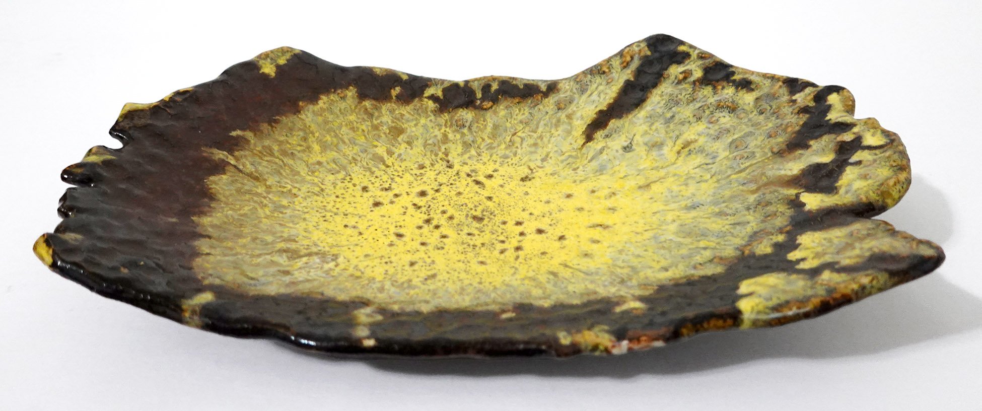
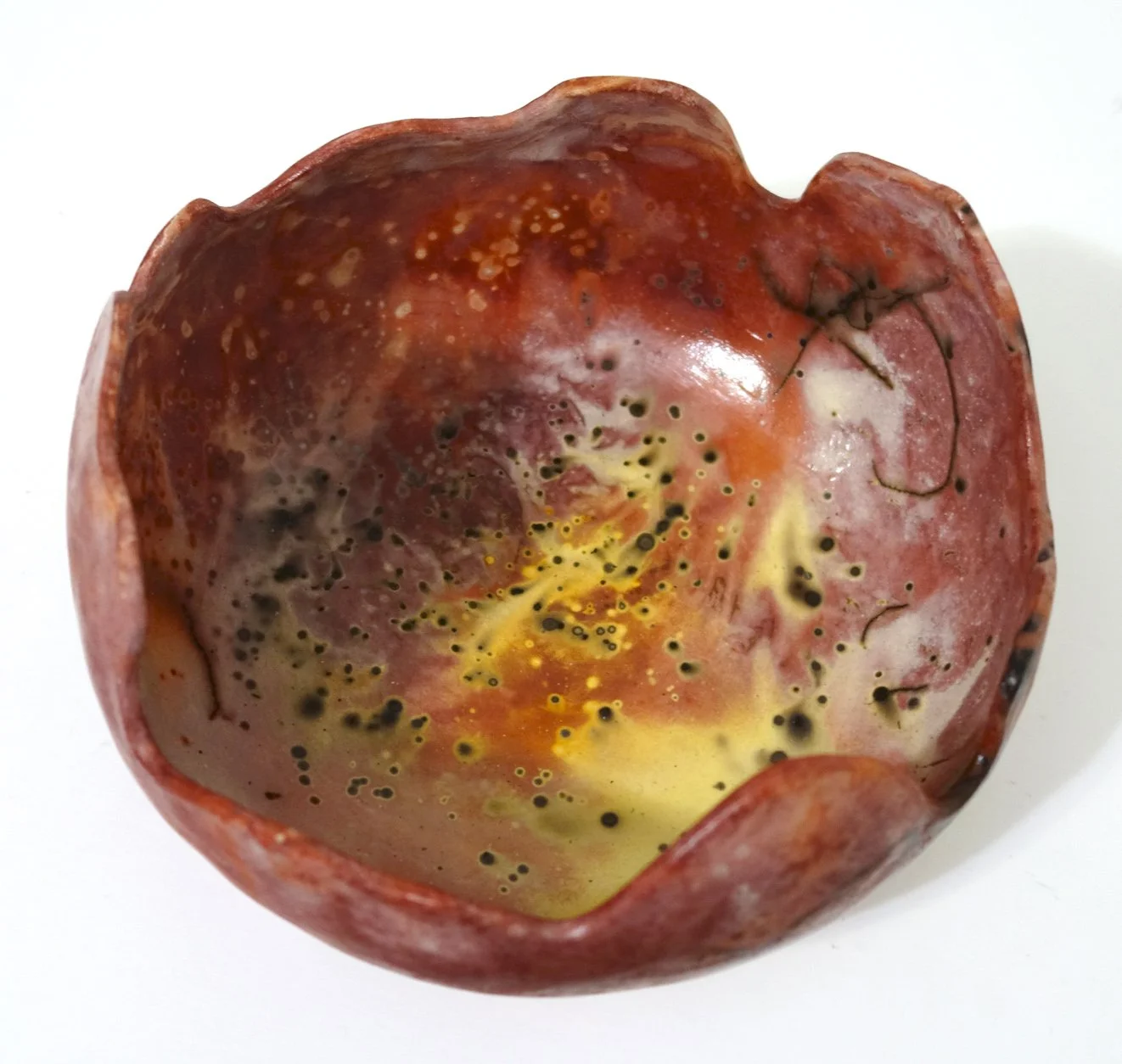
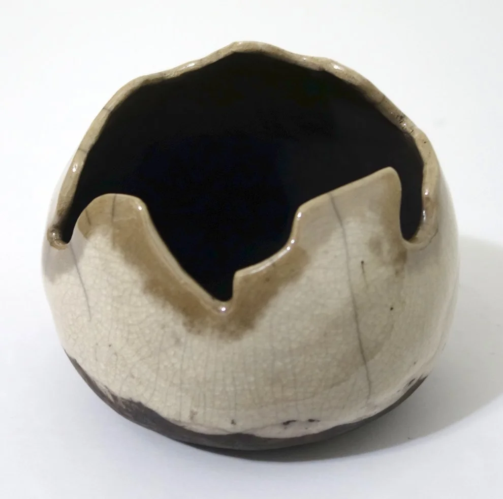
I’m just going to call it how I see it; the white crackle pieces I got out of this first round of raku firing were by and large underwhelming. The instructions say to put three coats of the white crackle glaze on; I think my interpretation of what three coats should be was thinner than the intended result. Next time, I plan to do at least five coats. However, it is also the case that in order to deter cracking, we did not plunge these pieces into water upon removing them from the kiln. Though dunking into cold water does increase the chances the whole piece shatters, it will also increase the crackle effect in any survivors. Not doing so may have also limited the resulting crackle in these ceramics.

I did apply and rinse off India ink on all the below pieces in a post-process attempt to heighten the crackle’s contrast; this did have a very slight effect, but it didn’t do nearly as much as I’d hoped.

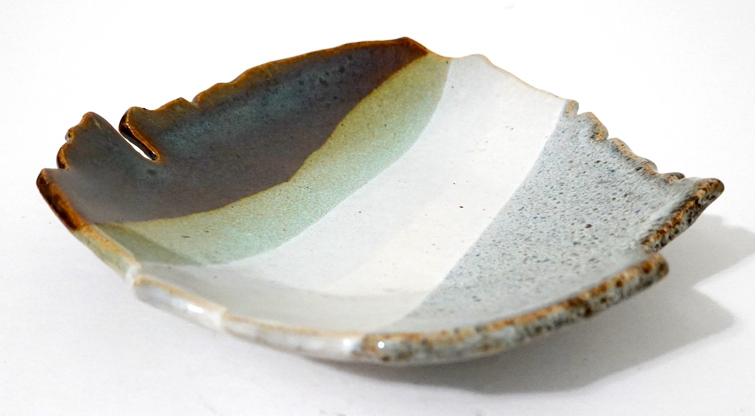
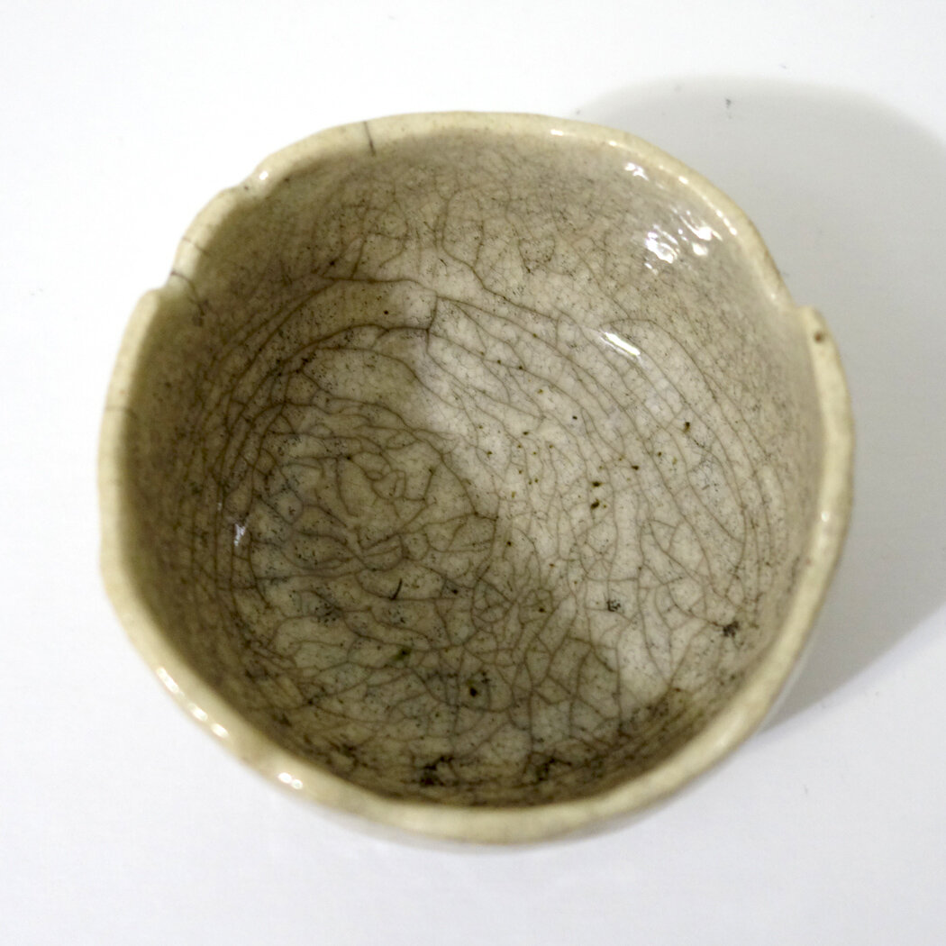
Below is the first piece; it’s a small dish, and honestly, the crackle is more impactful in these photos than it is in person. To me, it’s not that interesting of a piece, which is a shame as the costs of the process make it more expensive than I think its aesthetics merit.

The second piece has a similar aesthetic; it is perhaps a bit stronger, but still not as powerful in the crackle as I’d like. This one is a planter; raku is not watertight, so I plan to coat the interior with Thompson's WaterSeal to hopefully increase longevity before planting inside.

The third piece is much the same as the second, including it being a planter. The India ink soaked into the general glaze body more on this one, though, in a kind of pitting or freckling effect.

I had completed all of my white crackle glazing on these pieces before I fired any of them, which I now realize was a mistake; I should have glazed and fired one and then adjusted my process for the subsequent pieces. Admittedly, that is only somewhat possible as there are a limited number of firings per workshop, but it is a strategy that I plan to consider moving forward.

Finally, I present to you the only white crackle piece from this workshop that I consider to be successful! A combination of luck and possibly forgetting how many coats of glaze I applied and thus erring on the side of adding another contributed to this result. The brownish tinge near the top rim is an artifact of the smoke staining the surface; it is easily removable in the first 24 hours of the ceramic’s post-glazing life but then settles in. I somewhat thoughtlessly removed it from all the above pieces, but with this one I realized I could use it as a design element and didn’t remove it all. The strong black at the base is an artifact of the burning substrate (newspaper, in this case); it too could have been readily removed early on in the process but I again thought it added a dynamism to the piece. This one, too, is a planter, and will be receiving the Thompson’s WaterSeal on the interior.

I am still intrigued by the possibilities the crackle glazes (white and clear are the most standard options; turquoise is a rarer possibility as well) offer, but I will be more conservative moving forward with this glaze type due to this overall turnout on my first batch of attempts.

New Ceramics!

My latest batch of ceramics has come out of the final firing! I started these pieces around three months ago, but ceramics take time and sequential processing. Though there’s still quite a bit of trial and error, I feel that I am honing my glazing skills! There are several glazing combinations from this go-round that I’m definitely going to be revisiting. There is also a new glaze color in this set - Green Tweed - that we didn’t have on hand before; I glazed it blind (meaning I had no samples of it to see how it’d turn out) so I didn’t use it on too many pieces, but it turns out I really like it both solo and in combination with other colors so I’ll be adding into a more regular rotation.

Above you see three new small dishes or bowls. The photography of ceramics is difficult because they are three-dimensional objects with variance - how many photos do I need to share to truly capture enough of each artwork? For these, I think one photo sufficiently captures each piece, though on the one with the hand-painted rings, there are rings on the exterior of the dish as well which I’m not sure is evident. Maybe I should have taken a side photo too?

However, for the small bowl above, I think at least two photos are needed to understand the glazing; another could provide even more coverage, but I believe only one would be insufficient.

All of the eight pieces immediately above are planters with drainage holes, as demonstrated by the final photo in the grid.

For many of the more complexly glazed pieces, I think my photographs - even multiple - don’t fully capture their totality. I should experiment to see if different photo setups can help, but also I think some artwork is always going to be best suited for in-person appreciation!