handmade planters

New Planters!

I’ve been making quite a few planters for my own personal usage; it’d be cool to someday have my full plant collection in ceramic planters (rather than plastic)! I have hundreds of plants, so it’s a lofty goal. In addition, there’s always some amount of ceramic planter attrition due to storm/squirrel breakages so I regularly need to make replacements as well.

Here are my newest batch of planters! They all have between 2 to 4 drainage holes in their bases and the diameters range from 2-5”.

More Stoneware Ceramics!

I’ve been posting about my raku productivity of late, but I have also continued to make stoneware pottery too!

I really like the combination of two glazes - standard Cone 6 recipes for a white and “smoky brown.” I particularly like the crawling that frequently results. I sometimes add in a complementing lighter grey glaze which is a discard mix of my own creation and therefore likely very difficult to reproduce once gone.

Below are eight different pieces. They include, respectively, a bowl, two images of a planter, two more of a second bowl, a third bowl, two images of a dish, a fourth bowl, two images of a fifth smaller bowl, and two images of a sixth bowl.

First Raku Workshop Pieces - White Crackle Edition

I’m just going to call it how I see it; the white crackle pieces I got out of this first round of raku firing were by and large underwhelming. The instructions say to put three coats of the white crackle glaze on; I think my interpretation of what three coats should be was thinner than the intended result. Next time, I plan to do at least five coats. However, it is also the case that in order to deter cracking, we did not plunge these pieces into water upon removing them from the kiln. Though dunking into cold water does increase the chances the whole piece shatters, it will also increase the crackle effect in any survivors. Not doing so may have also limited the resulting crackle in these ceramics.

I did apply and rinse off India ink on all the below pieces in a post-process attempt to heighten the crackle’s contrast; this did have a very slight effect, but it didn’t do nearly as much as I’d hoped.

Below is the first piece; it’s a small dish, and honestly, the crackle is more impactful in these photos than it is in person. To me, it’s not that interesting of a piece, which is a shame as the costs of the process make it more expensive than I think its aesthetics merit.

The second piece has a similar aesthetic; it is perhaps a bit stronger, but still not as powerful in the crackle as I’d like. This one is a planter; raku is not watertight, so I plan to coat the interior with Thompson's WaterSeal to hopefully increase longevity before planting inside.

The third piece is much the same as the second, including it being a planter. The India ink soaked into the general glaze body more on this one, though, in a kind of pitting or freckling effect.

I had completed all of my white crackle glazing on these pieces before I fired any of them, which I now realize was a mistake; I should have glazed and fired one and then adjusted my process for the subsequent pieces. Admittedly, that is only somewhat possible as there are a limited number of firings per workshop, but it is a strategy that I plan to consider moving forward.

Finally, I present to you the only white crackle piece from this workshop that I consider to be successful! A combination of luck and possibly forgetting how many coats of glaze I applied and thus erring on the side of adding another contributed to this result. The brownish tinge near the top rim is an artifact of the smoke staining the surface; it is easily removable in the first 24 hours of the ceramic’s post-glazing life but then settles in. I somewhat thoughtlessly removed it from all the above pieces, but with this one I realized I could use it as a design element and didn’t remove it all. The strong black at the base is an artifact of the burning substrate (newspaper, in this case); it too could have been readily removed early on in the process but I again thought it added a dynamism to the piece. This one, too, is a planter, and will be receiving the Thompson’s WaterSeal on the interior.

I am still intrigued by the possibilities the crackle glazes (white and clear are the most standard options; turquoise is a rarer possibility as well) offer, but I will be more conservative moving forward with this glaze type due to this overall turnout on my first batch of attempts.

My Artist For the Earth Opening Reception!

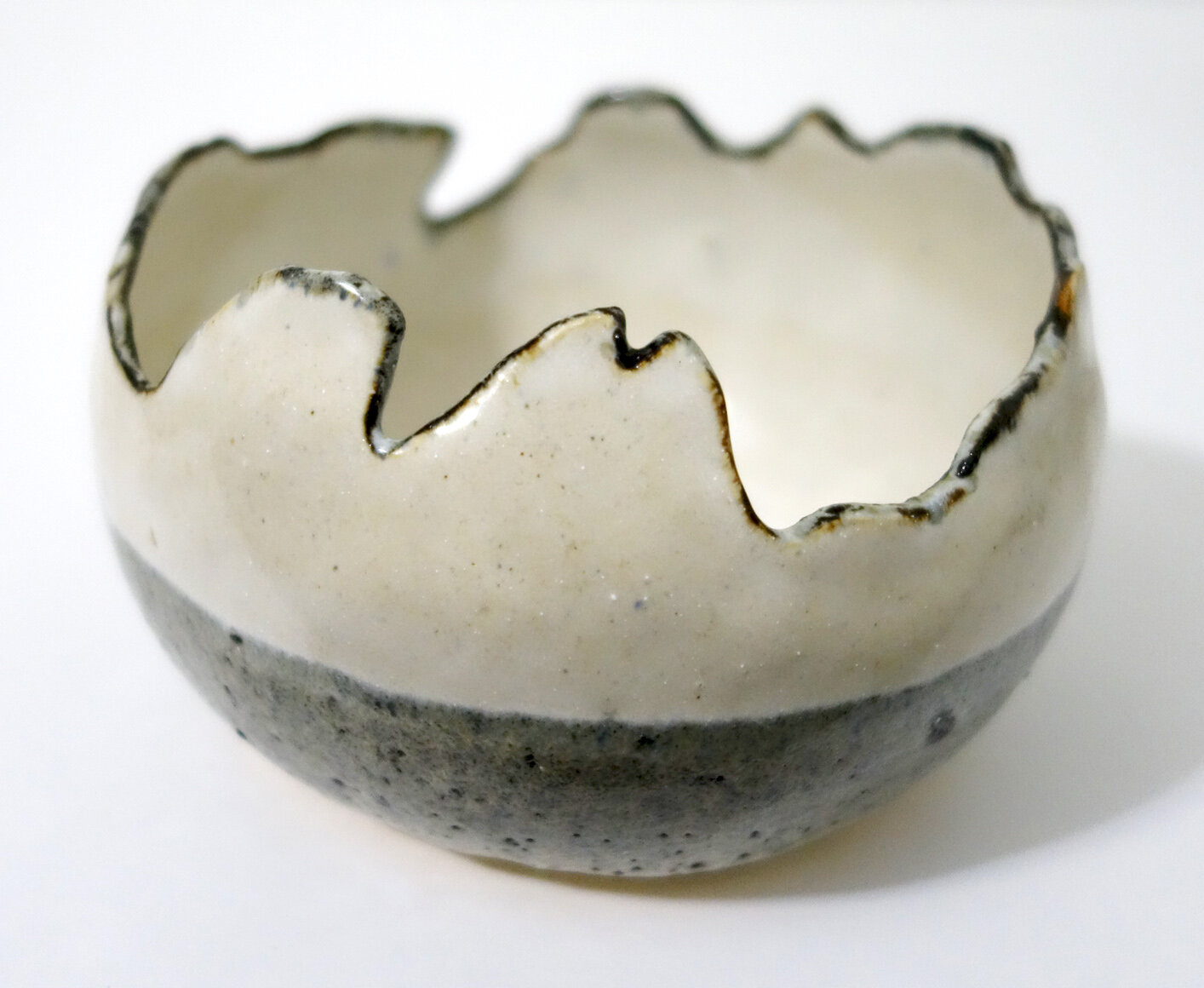
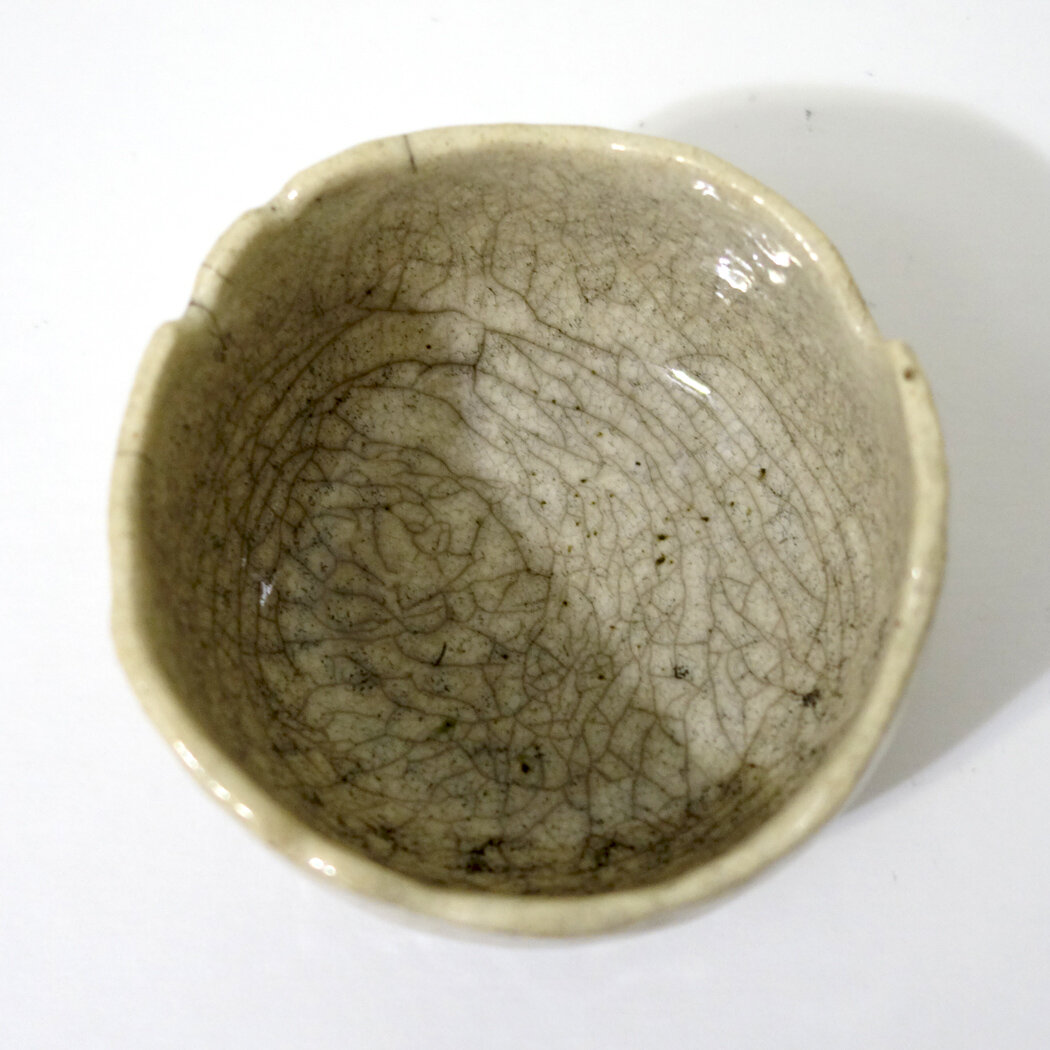
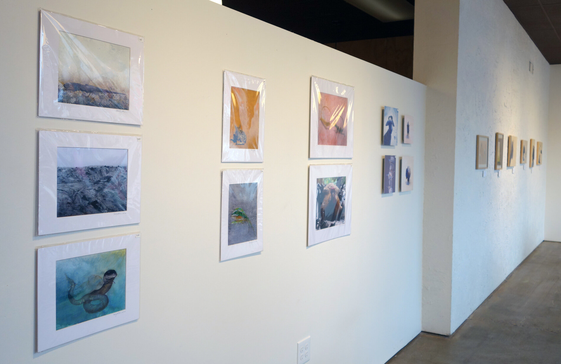
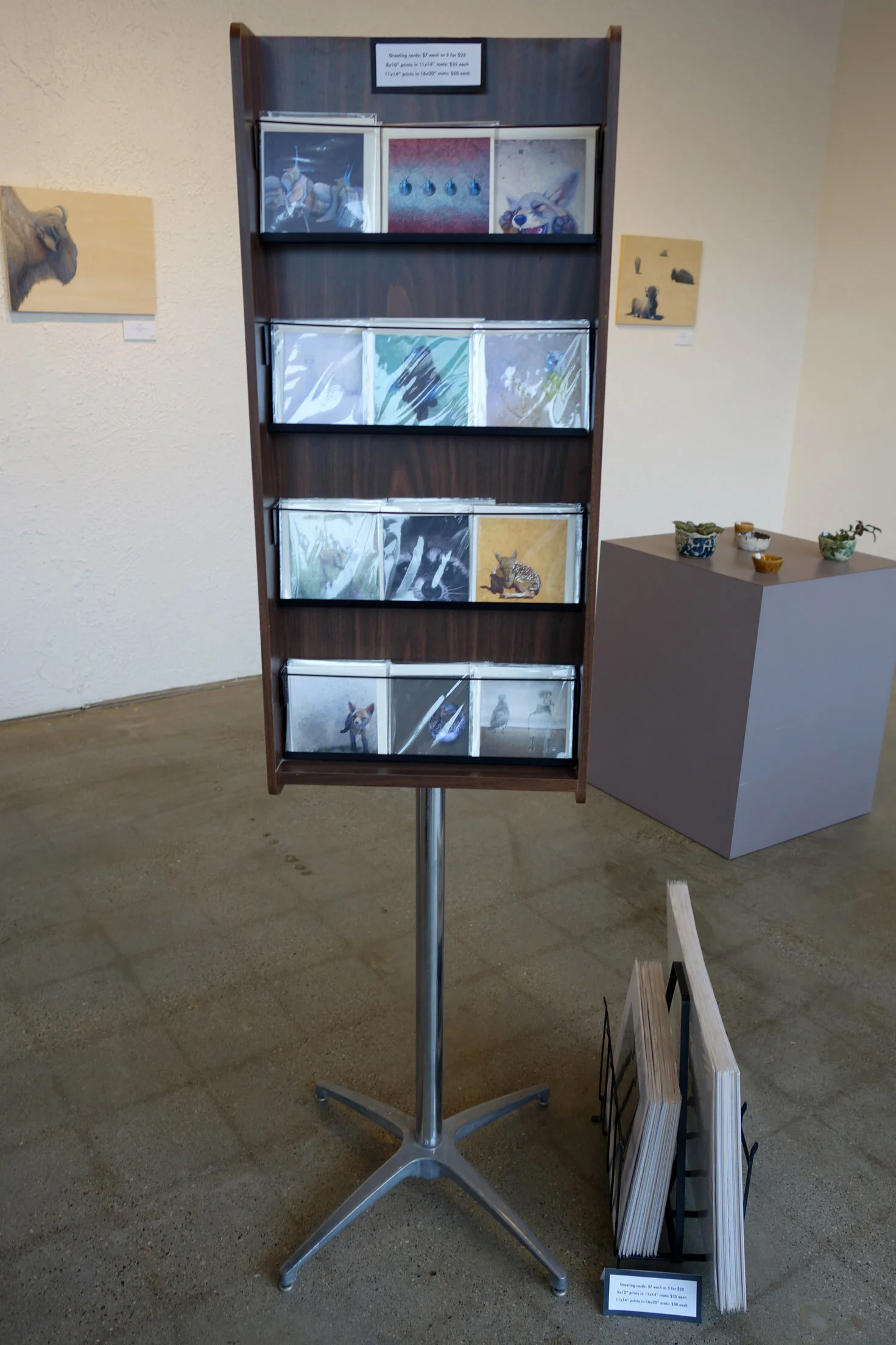
Well, Earth Day 2021 was quite eventful! I’ll do a separate post on the ART 225 Painting I project we took on earlier in the day, but this post is all about how my opening reception went for my Artist for the Earth solo show at The Block Gallery in downtown Sioux City.

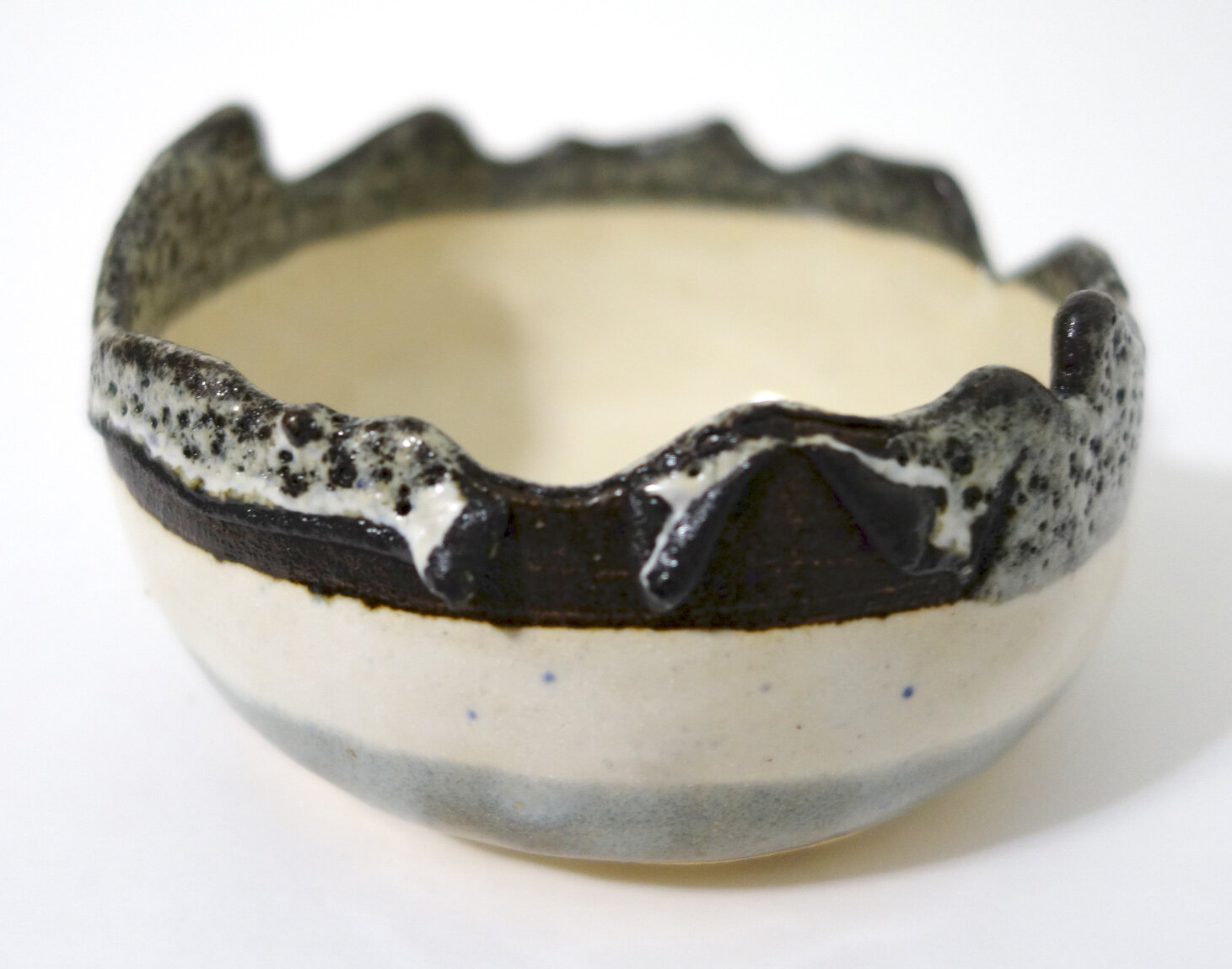
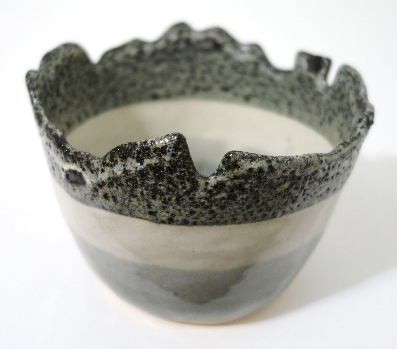
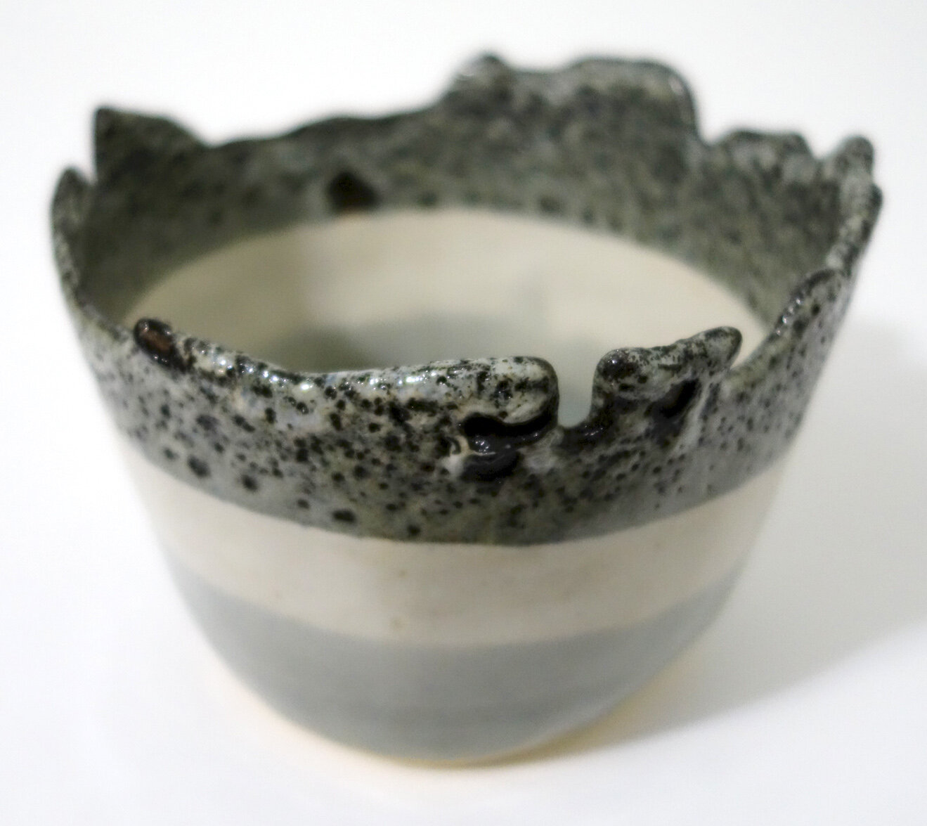
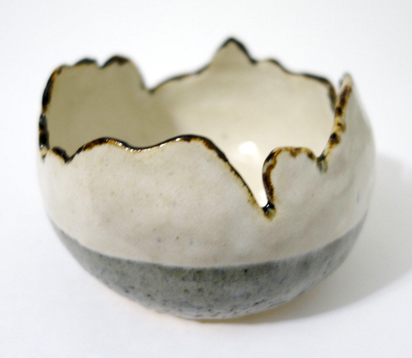
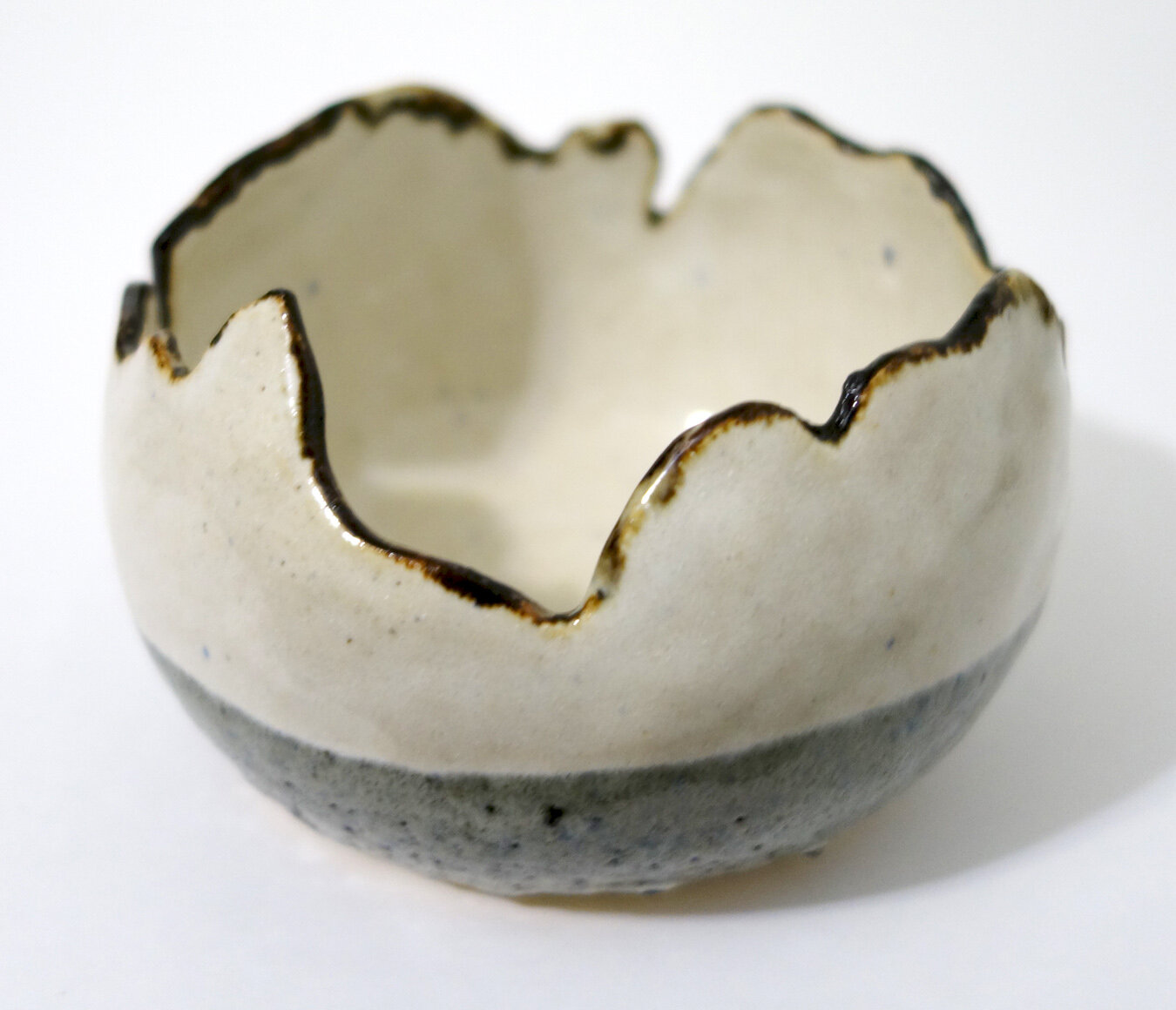
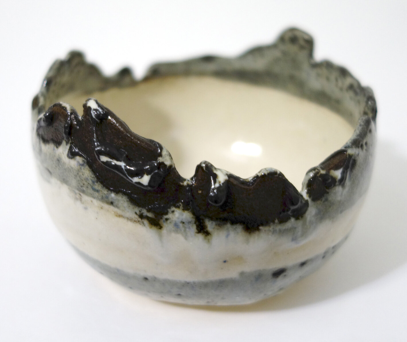
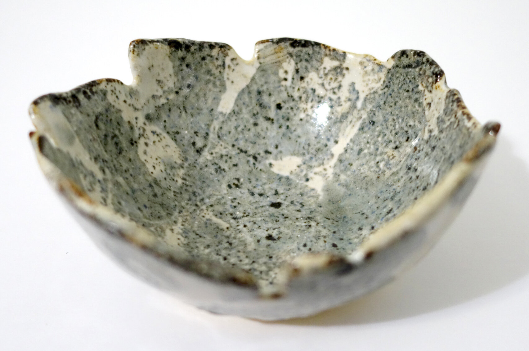
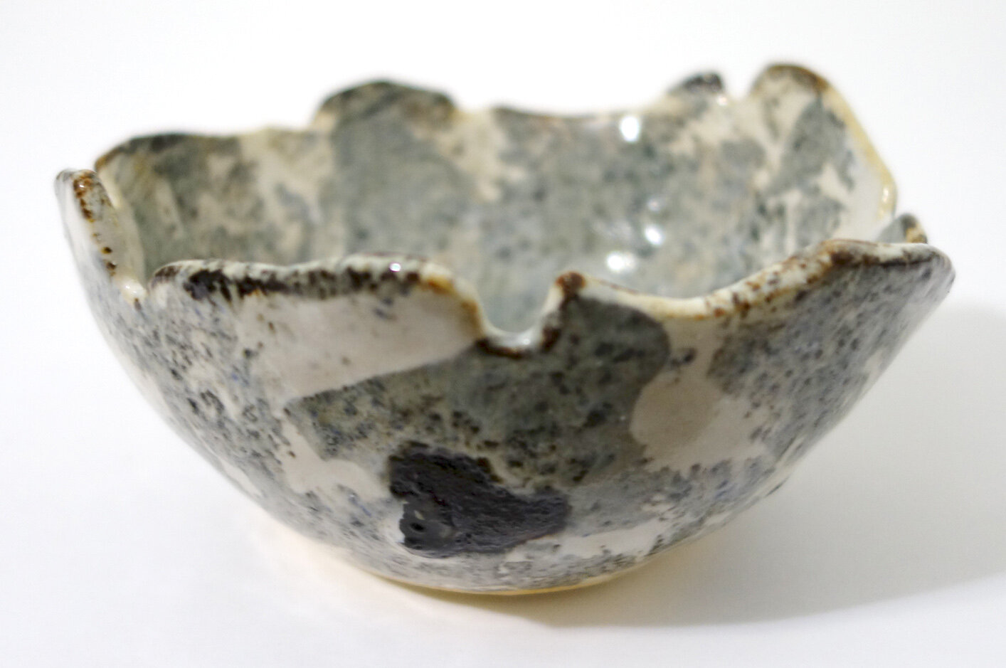
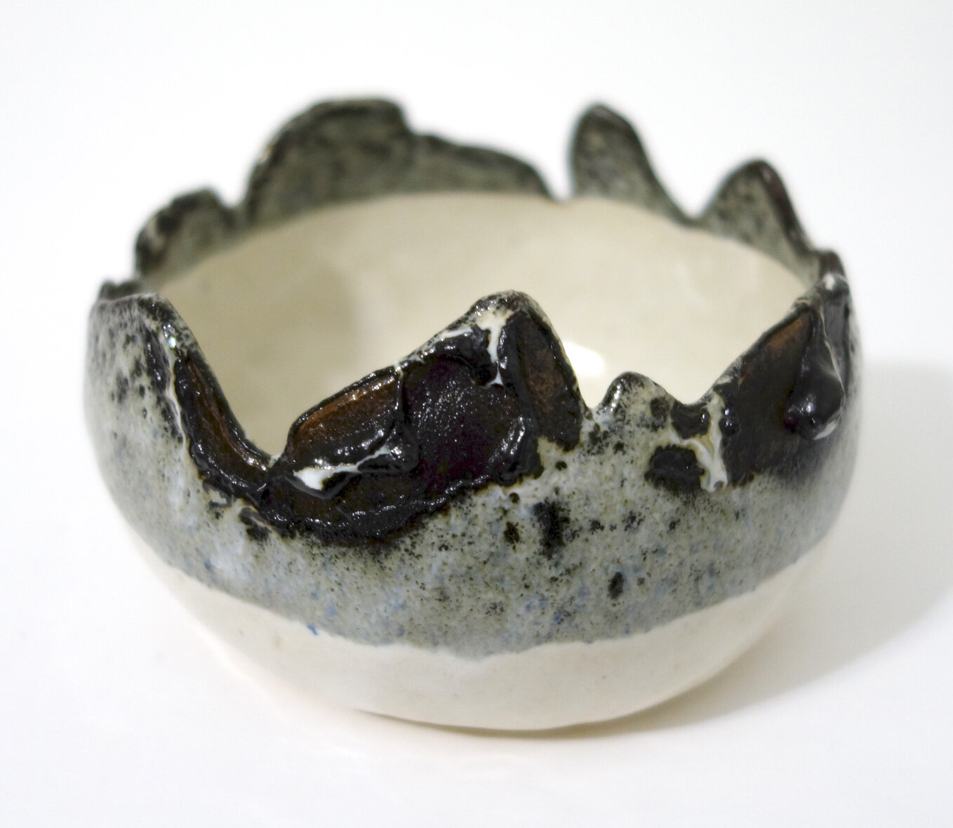
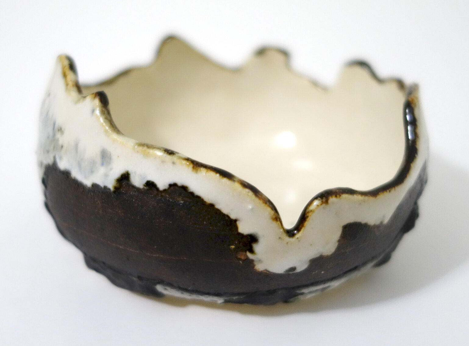
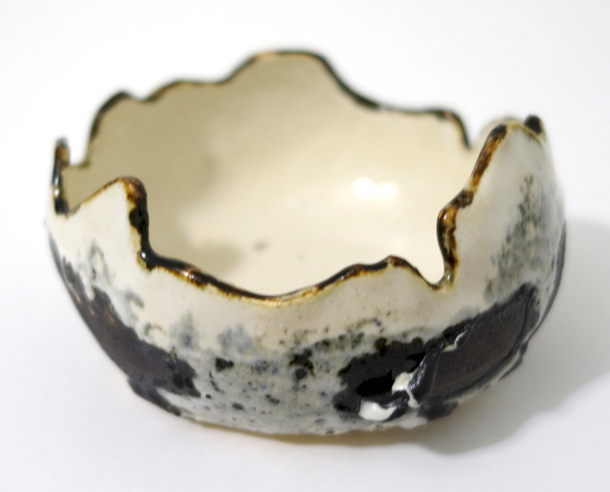
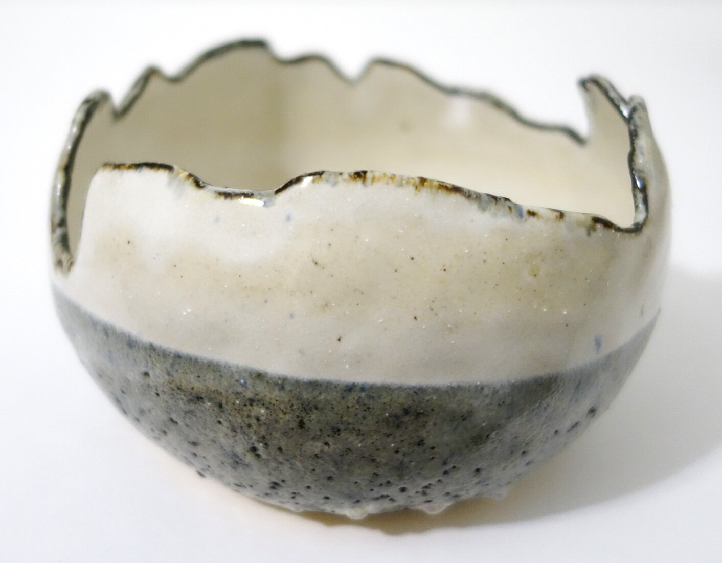
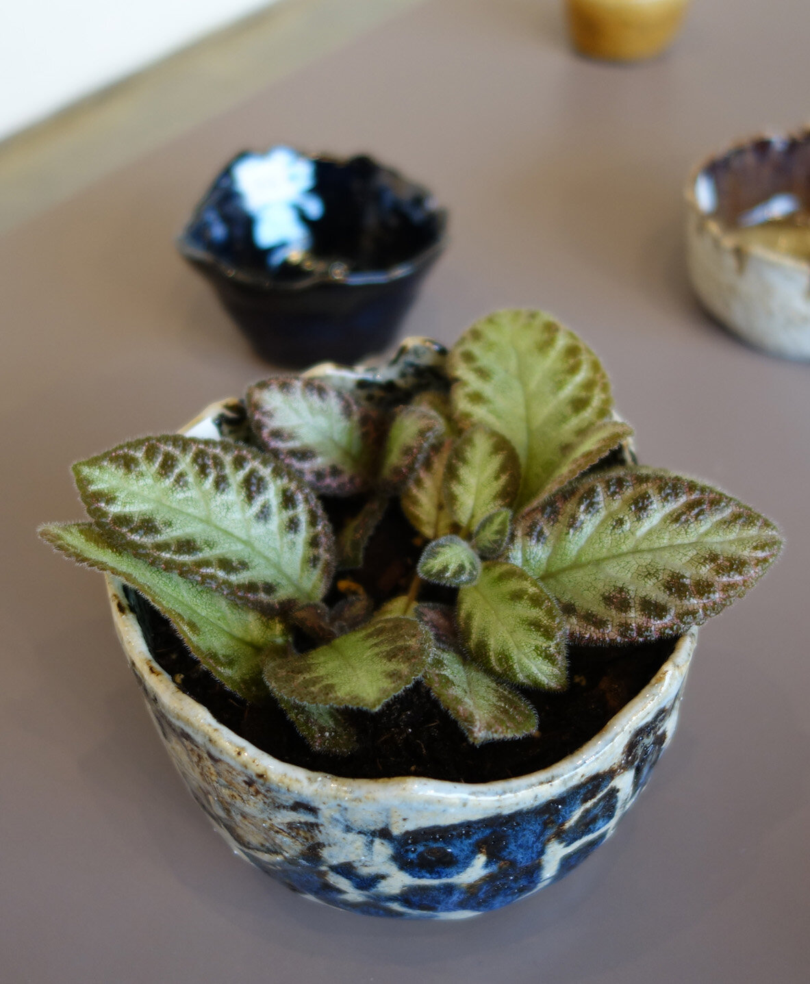
First of all, I want to say a big thank you to the Morningside Art Department federal work study studio art assistants Devyn Reilly and Rachel Steinkamp for helping me to install the show. While I’ve installed many a show alone, it is so much nicer to have skilled help working alongside you! I also had Rachel take some nice shots of the show after we installed it, so I might add more to the blog later, but here are a few photos I took tonight.

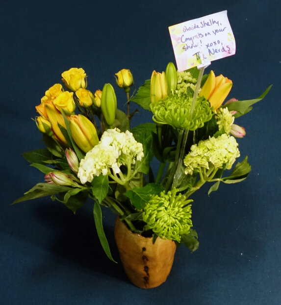
The last photo in the grid is thanks to some of my lovely friends, who not only came out to support me at the reception but also gifted me with a bouquet of flowers and purchased artwork and reproductions. A bunch of wonderful colleagues, students, and community members also came through and many left with various pieces of artwork as well. It was a lovely evening!

More Ceramics!

Here are some more of my ceramic pieces! The first two are of a lovely little bowl; it’s so varied and hard to photograph that unless I uploaded seven photos and a video I think you’ll miss out on some of its detail, but trust me when I say it’s really nice in person and is one of my best pieces thus far. All the rest are, as you can often expect of me, planters with drainage holes. I like all of these a lot and am particularly into the new white/blue/brown and deep brown/white glaze combinations.

The final image in the grid is wheel-thrown from an earlier cycle but has since been planted with an Episcia or “flame violet” cultivar! I am reminded by that planter that I should really make time to wheel throw again at some point, but then again I really like the personality and handcrafted appearance of my pinch pot practice…

New Ceramics!

My latest batch of ceramics has come out of the final firing! I started these pieces around three months ago, but ceramics take time and sequential processing. Though there’s still quite a bit of trial and error, I feel that I am honing my glazing skills! There are several glazing combinations from this go-round that I’m definitely going to be revisiting. There is also a new glaze color in this set - Green Tweed - that we didn’t have on hand before; I glazed it blind (meaning I had no samples of it to see how it’d turn out) so I didn’t use it on too many pieces, but it turns out I really like it both solo and in combination with other colors so I’ll be adding into a more regular rotation.

Above you see three new small dishes or bowls. The photography of ceramics is difficult because they are three-dimensional objects with variance - how many photos do I need to share to truly capture enough of each artwork? For these, I think one photo sufficiently captures each piece, though on the one with the hand-painted rings, there are rings on the exterior of the dish as well which I’m not sure is evident. Maybe I should have taken a side photo too?

However, for the small bowl above, I think at least two photos are needed to understand the glazing; another could provide even more coverage, but I believe only one would be insufficient.

All of the eight pieces immediately above are planters with drainage holes, as demonstrated by the final photo in the grid.

For many of the more complexly glazed pieces, I think my photographs - even multiple - don’t fully capture their totality. I should experiment to see if different photo setups can help, but also I think some artwork is always going to be best suited for in-person appreciation!