Residencies

New Artwork: The New Collective

This piece continues my series of paintings atop printed stationery from the Soviet occupation period in Estonia, issued under the ENSV (the Eesti Nõukogude Sotsialistlik Vabariik, or Estonian Soviet Socialist Republic).

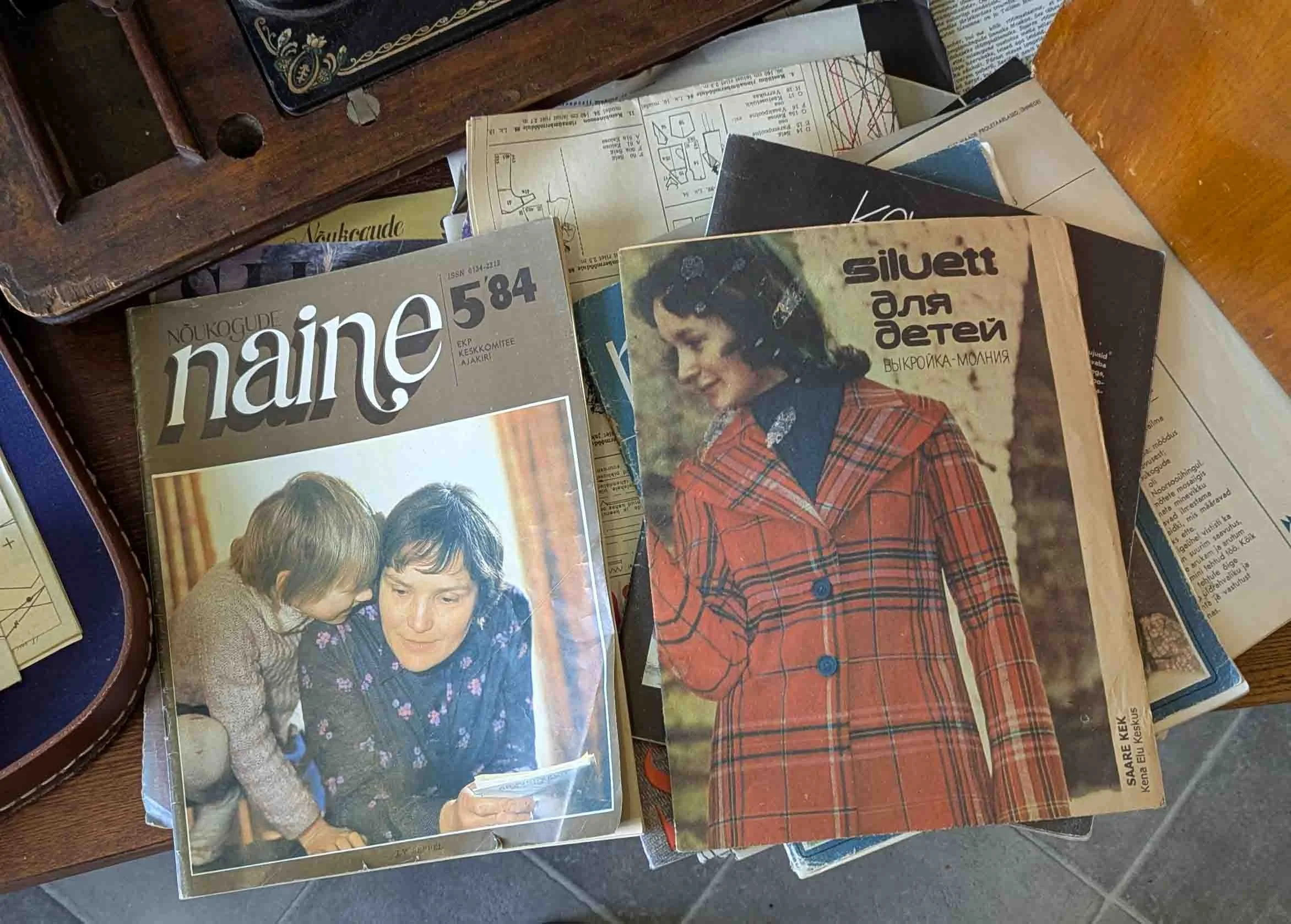
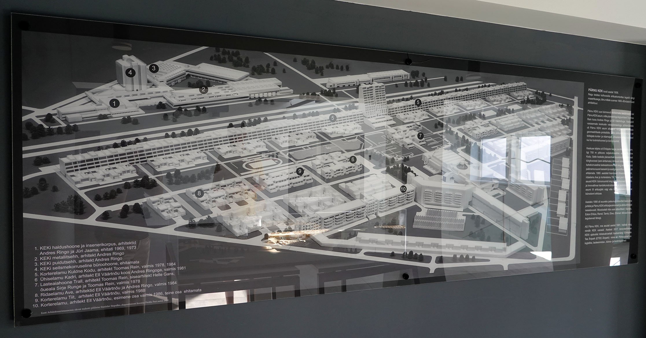
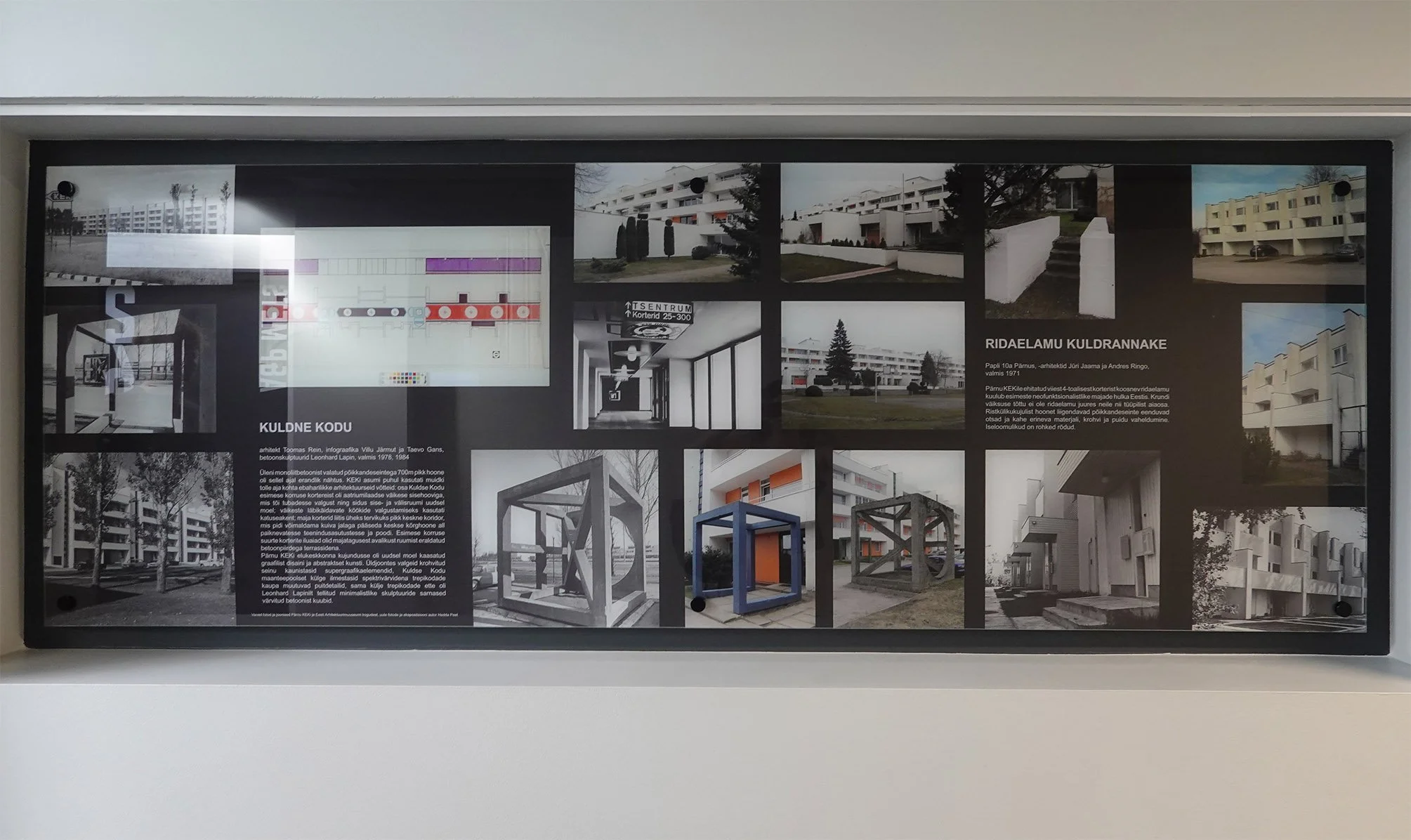
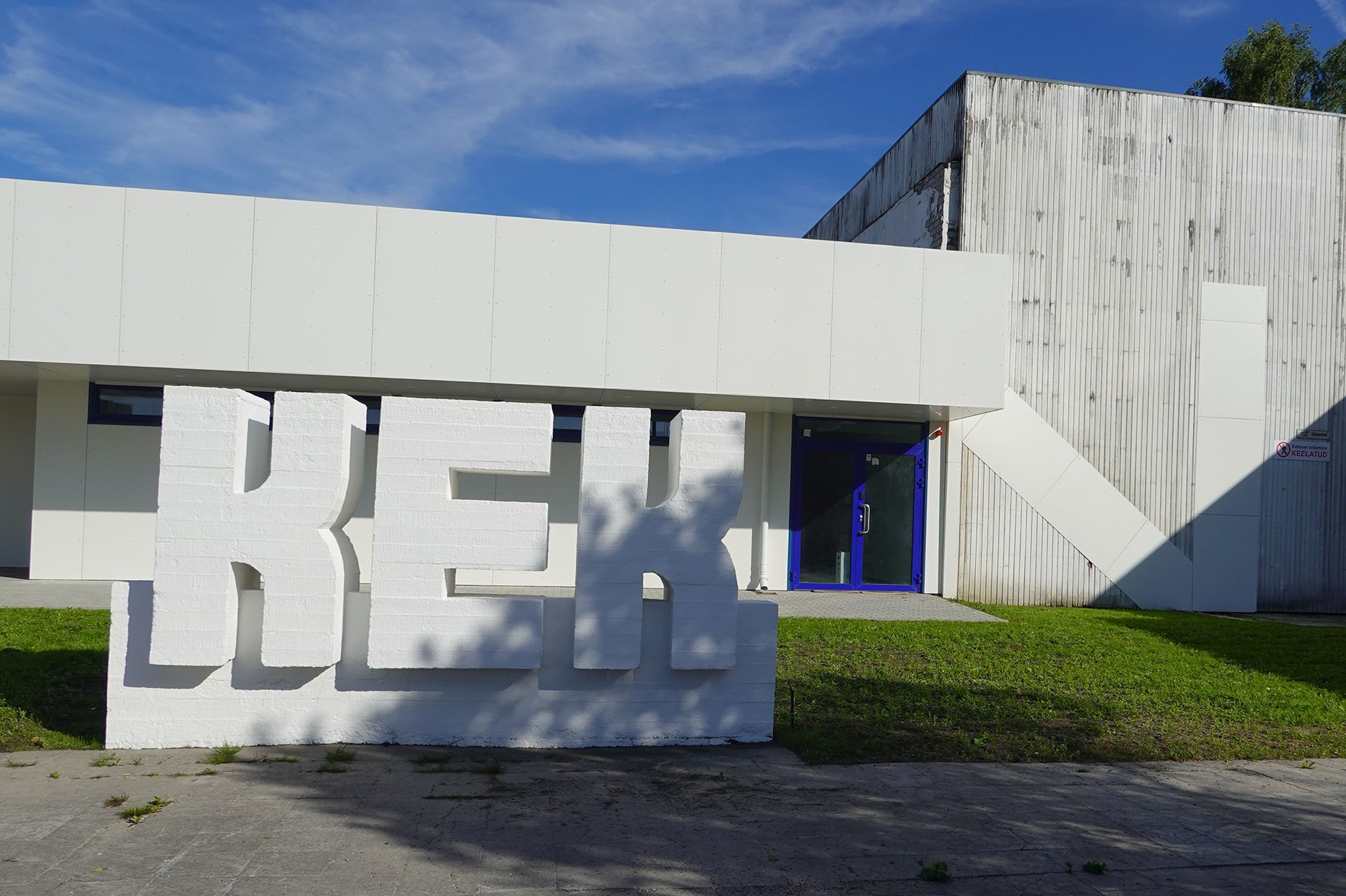
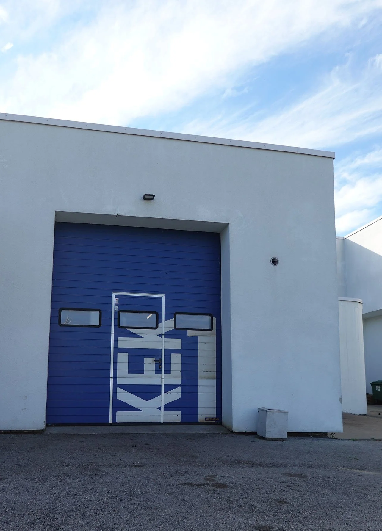
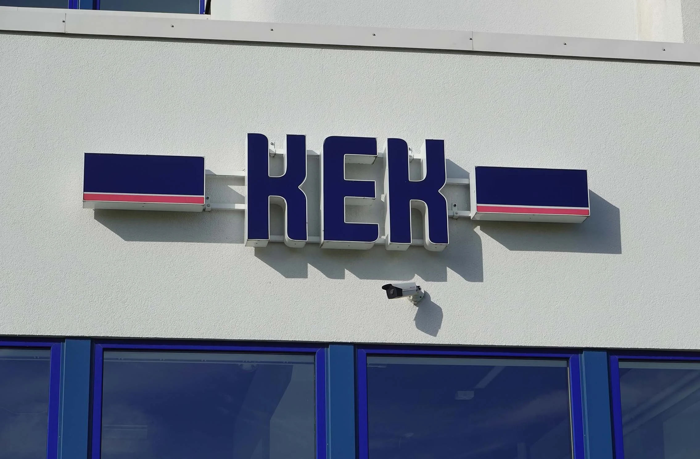
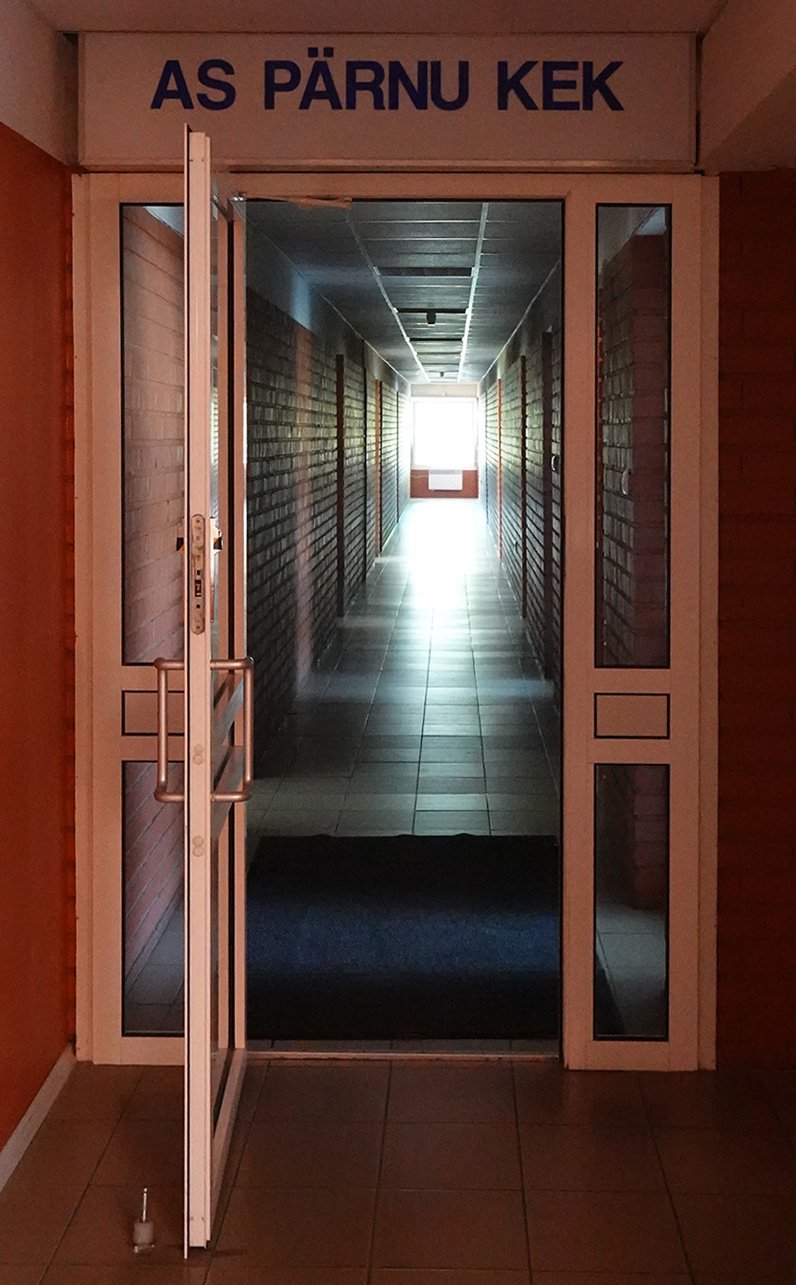
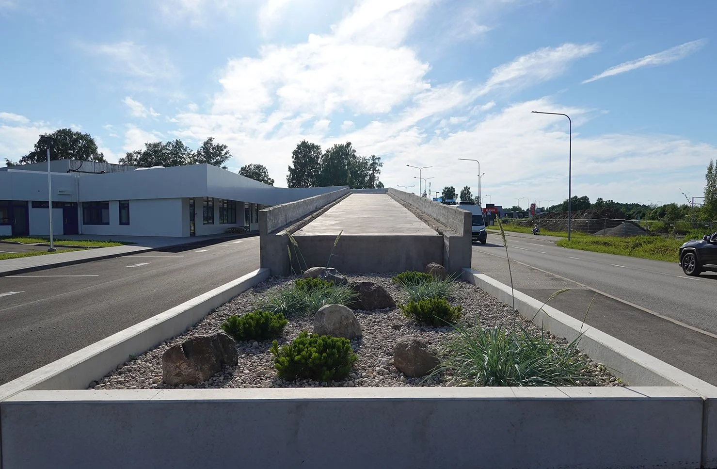
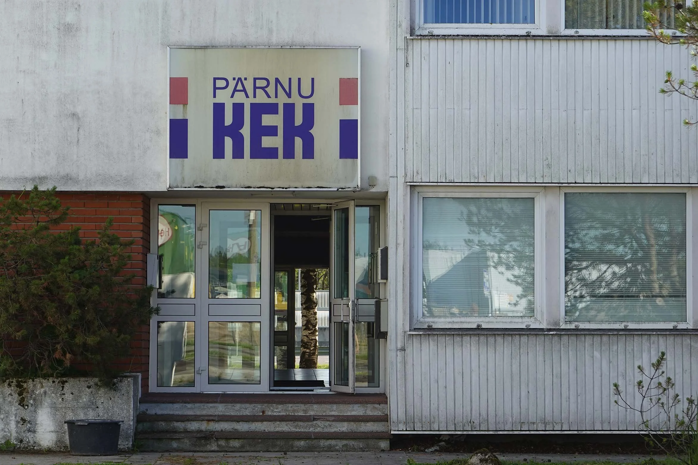
The substrate features Soviet-era industrial graphic design for Pärnu KEK (the Pärnu Külaehituskombinaat, or Collective Farm Construction Office). Founded to build infrastructure for rural collective farms, KEK eventually expanded into a broader portfolio of late-Soviet modernist architecture, becoming one of the more distinctive construction enterprises of the era.

I chose to paint another realistic, volumetric stork, this time sitting in a flat graphic semicircle “nest” that mirrors the geometry of the underlying design. KEK's original mandate was building the physical infrastructure of agricultural Estonia. Storks nest reliably on farm rooftops and chimneys across Estonia, colonizing the infrastructure the decommissioned collective left behind.

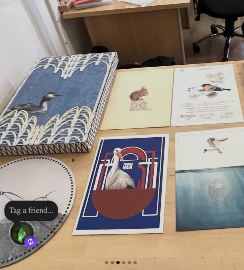
This is The New Collective, acrylic on occupied Estonian printed cardstock c. 1980, 11.38x8.2”, 2026.

Shelby Prindaville's painting of a white stork nesting on Pärnu KEK ENSV stationery c. 1980.

Soomaa National Park

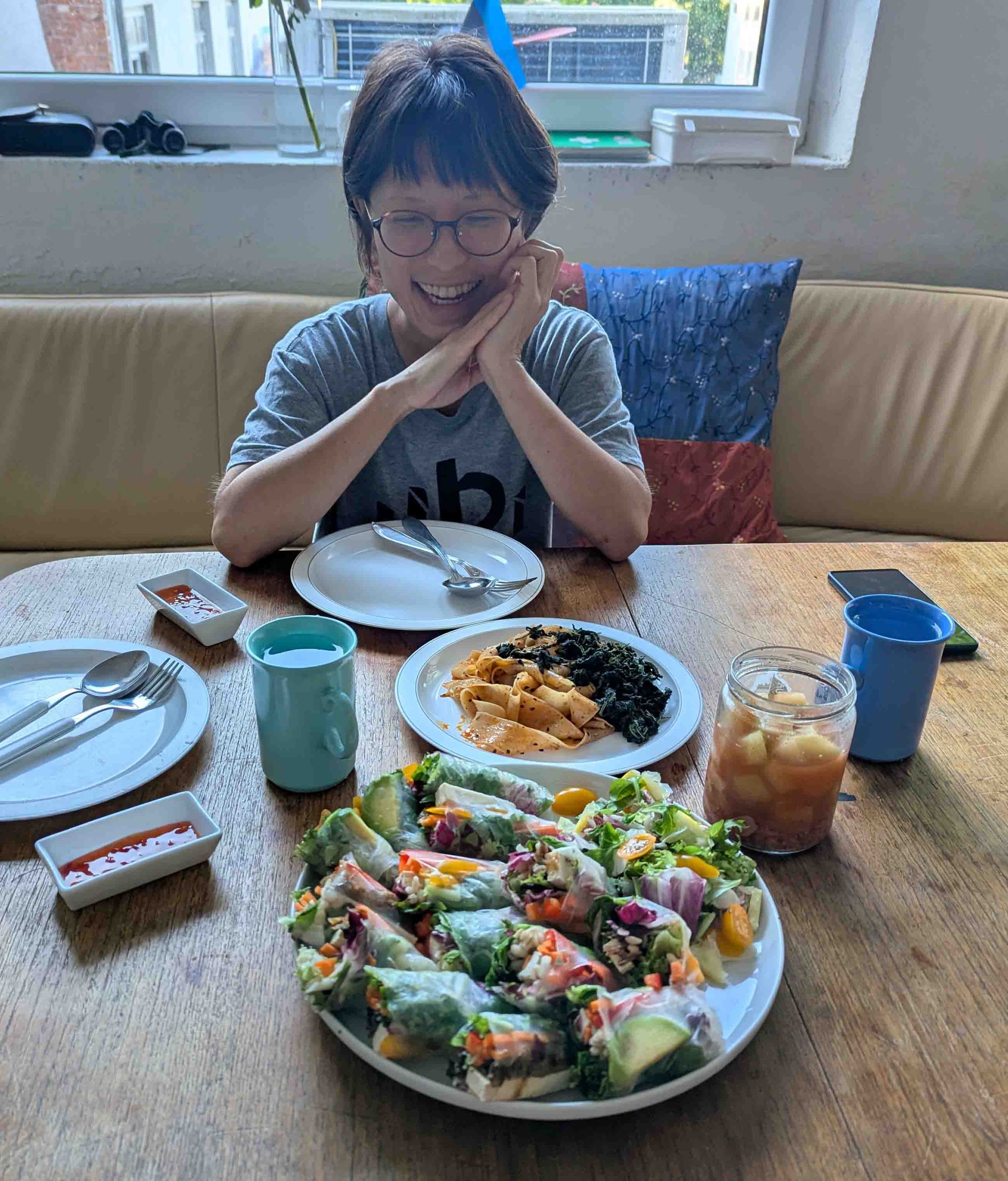
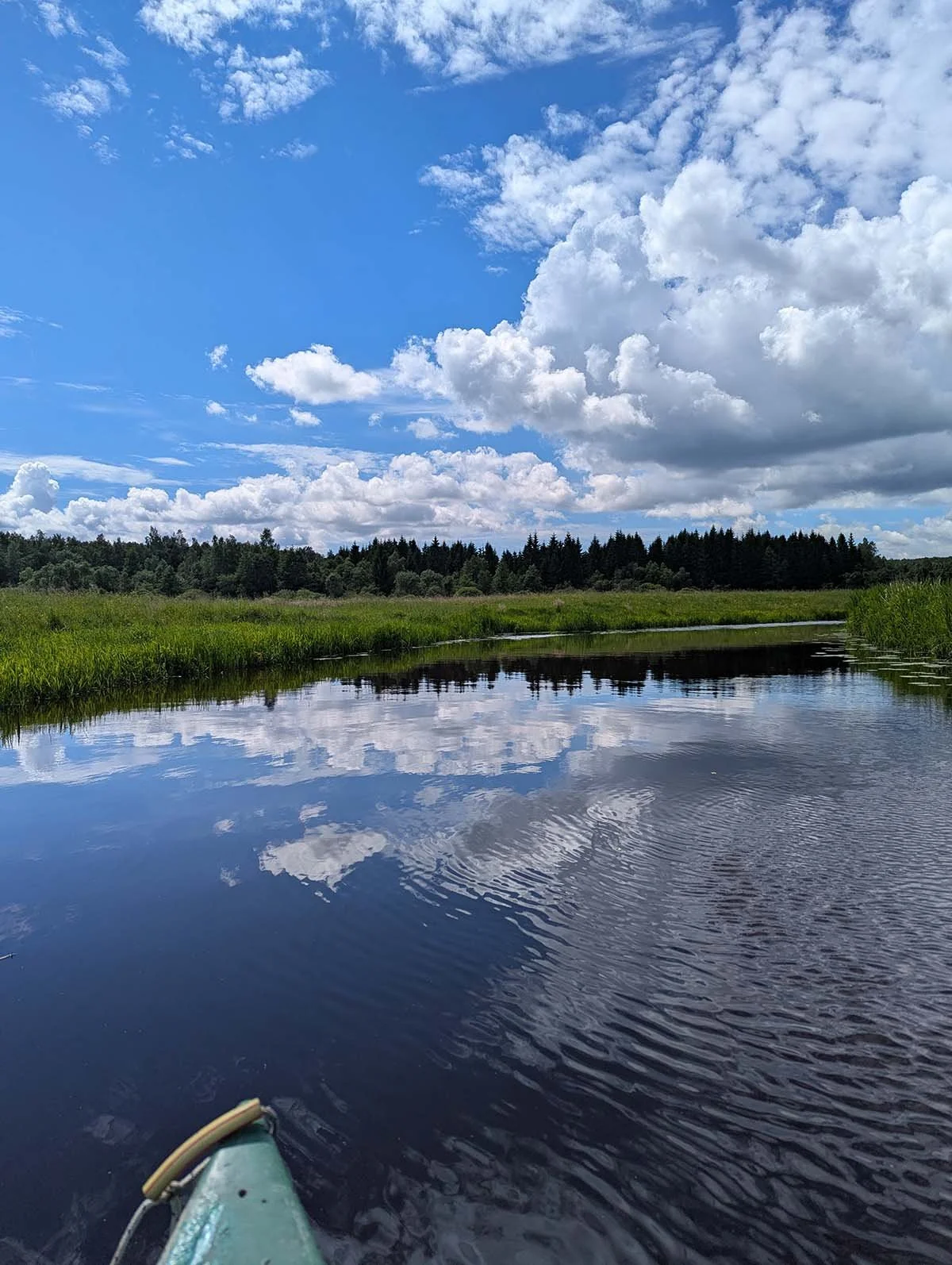
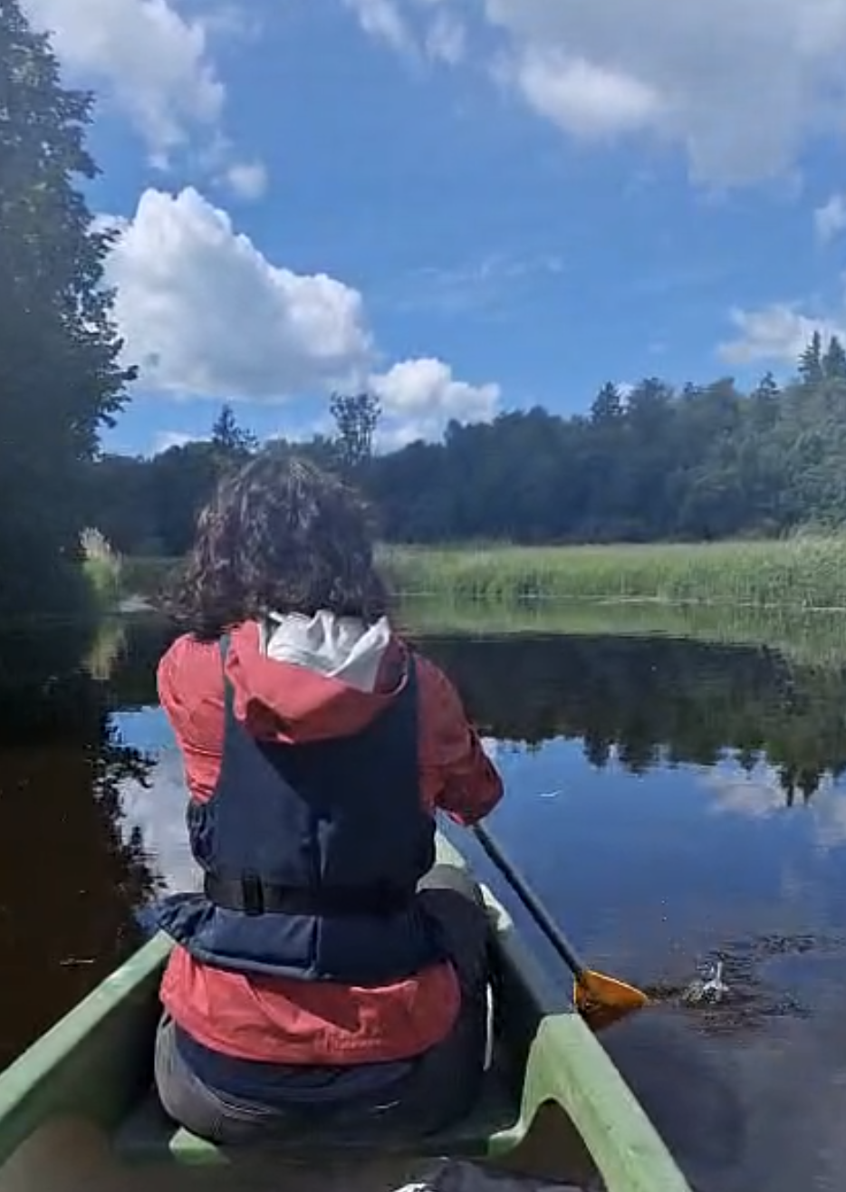
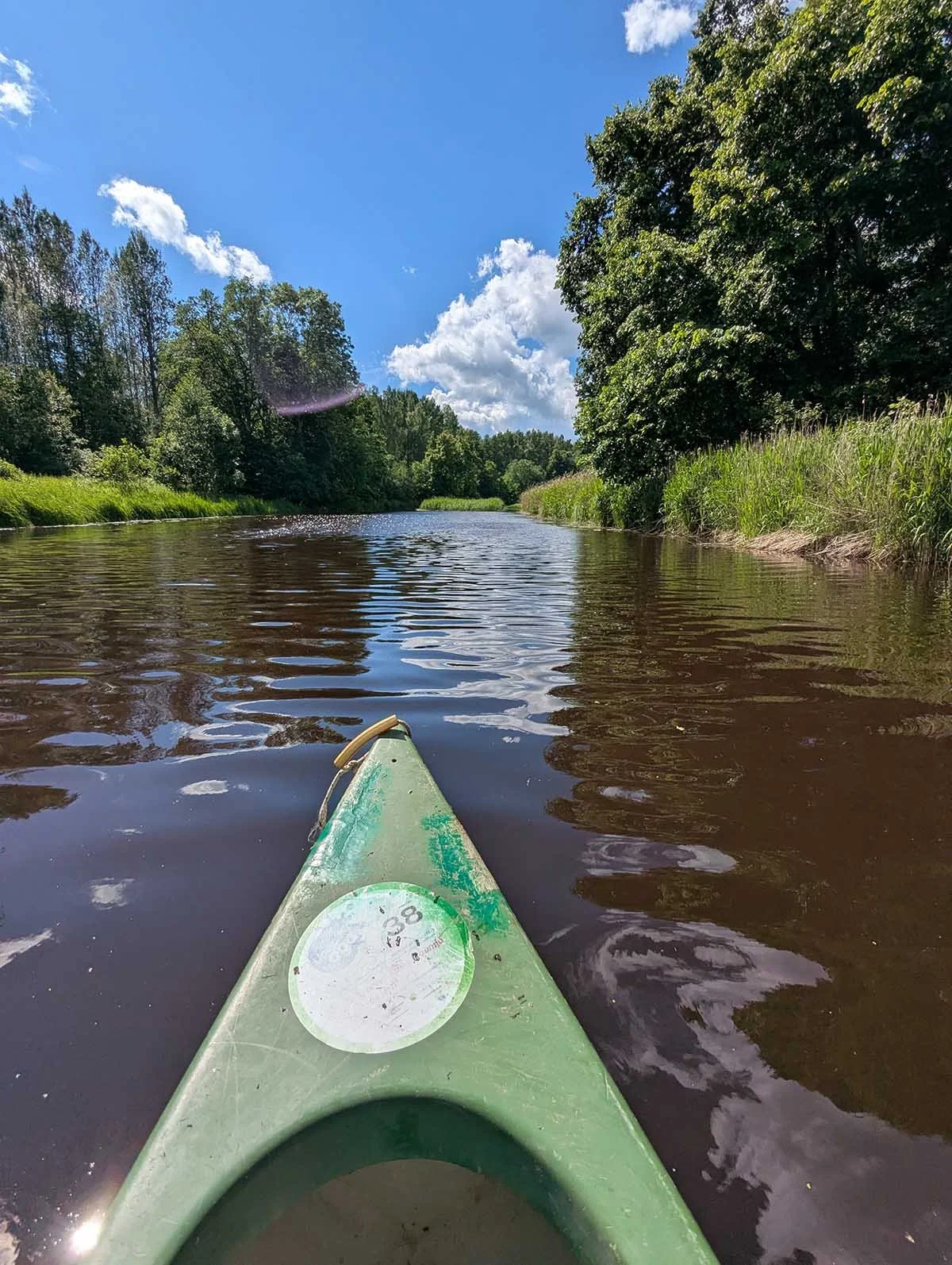
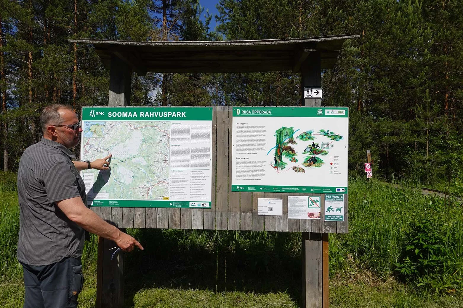
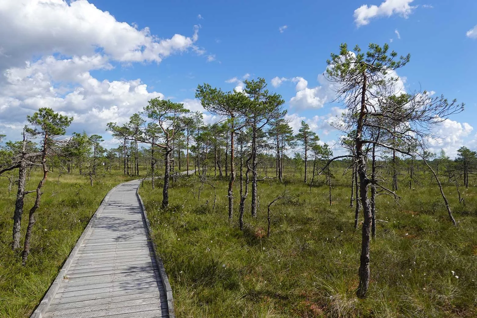
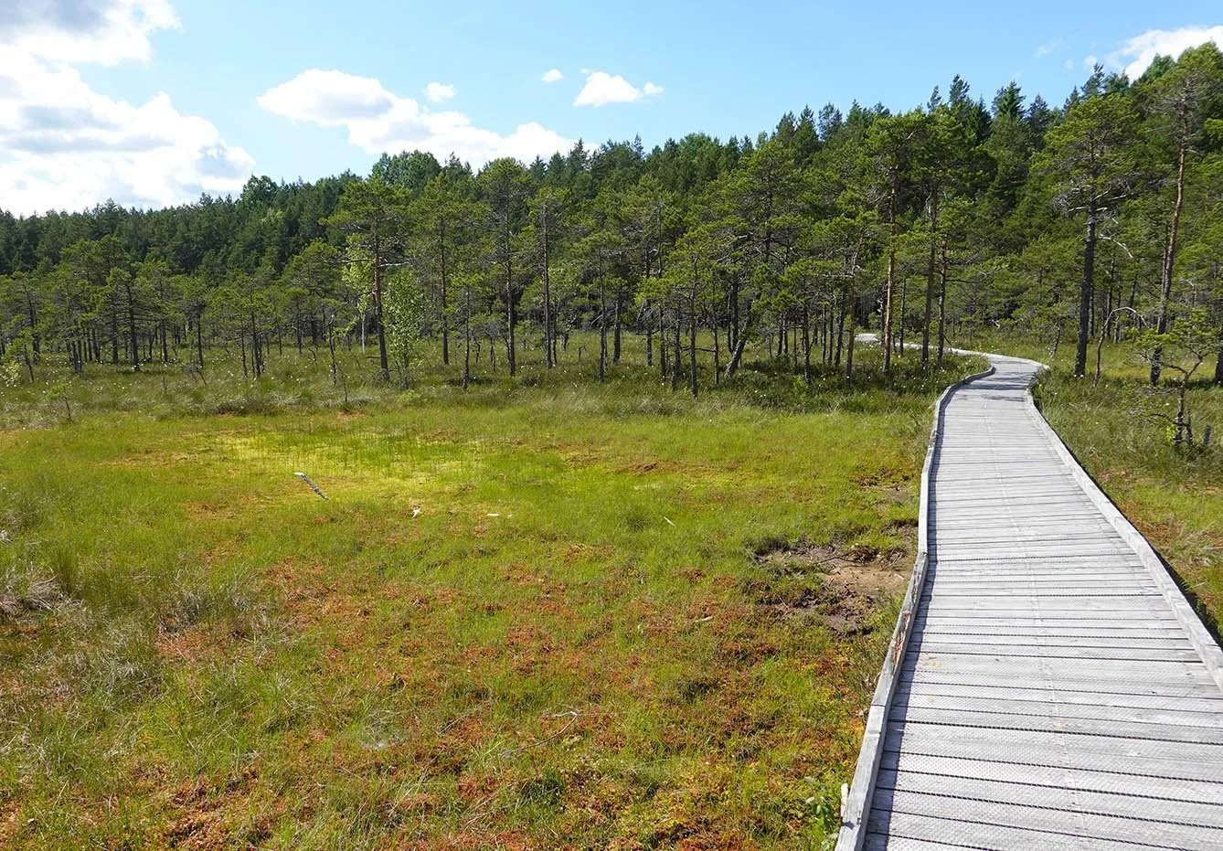
Estonia has one of the top ten bogs in the world at Soomaa National Park. I knew I wanted to see it, but I also figured I’d need a guide. There’s a company that does guided tours there, but they don’t do them for solo travelers. Knowing that, Marko offered to go canoeing with me if I was already going to go! This was very kind of him and a win-win for us both, I think though obviously more of a win for me - he got a free canoe ride (though he paid in gas and time to get us both there!), and I paid less than it would have cost if I had even managed to join an existing tour (and as far as I know, there were no existing tours) and also received a personal guided tour from him.

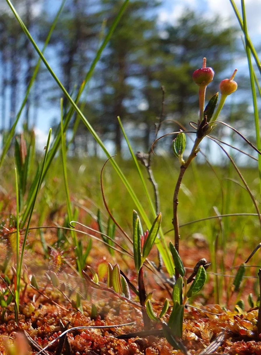
We canoed for two hours down the river, which was really fun! (About six hours later, my arms were really feeling it as I’ve pretty exclusively been walking for workouts here.) After the canoeing, I successfully petitioned to do a short bog hike as I really, really, really wanted to see wild sundews.

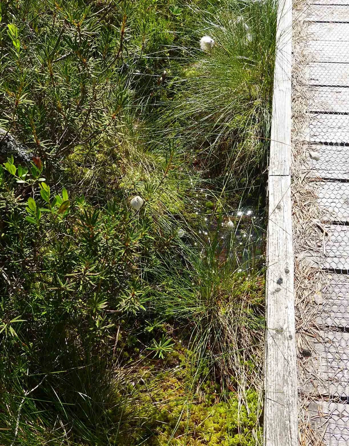
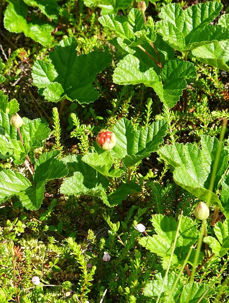
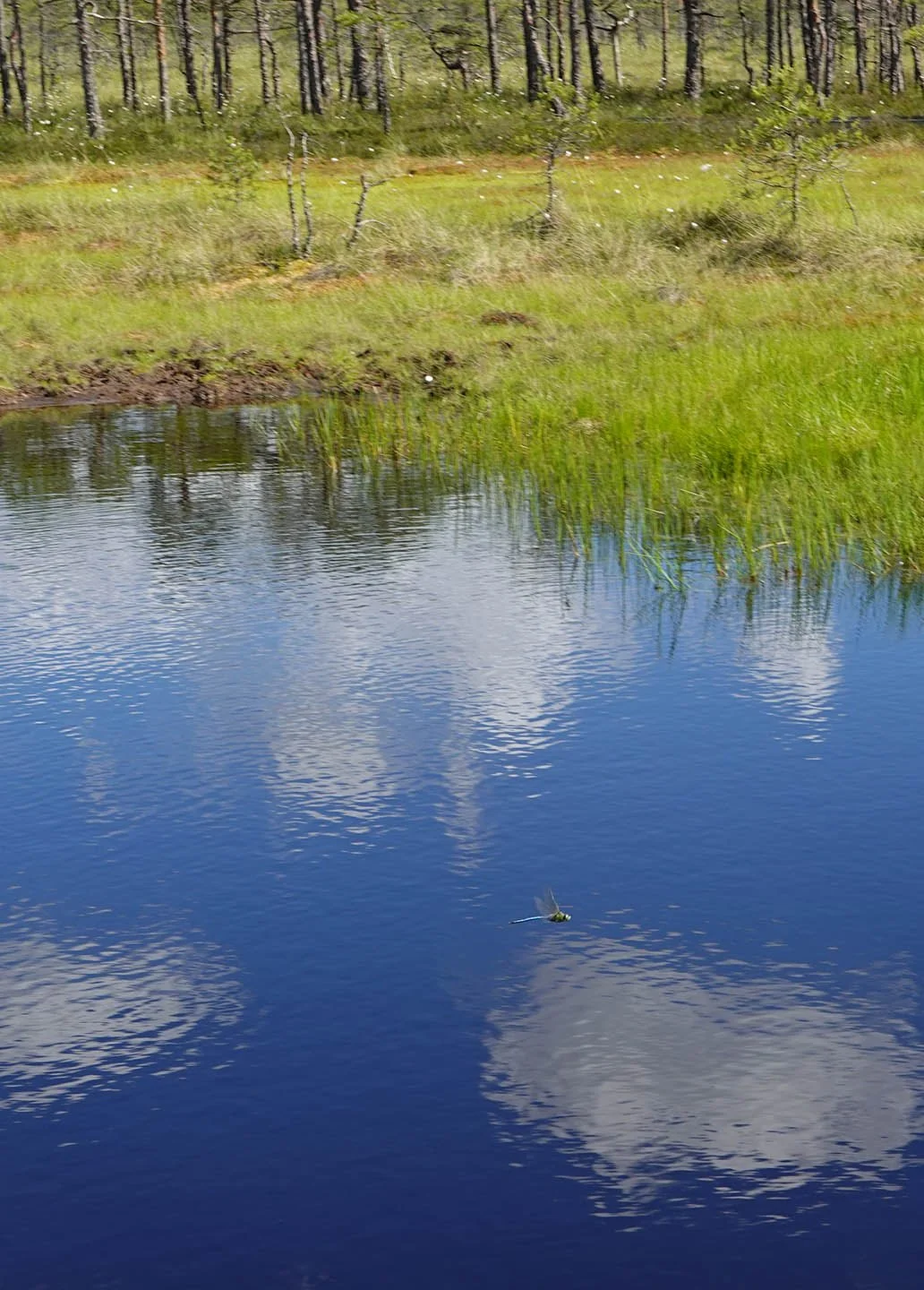
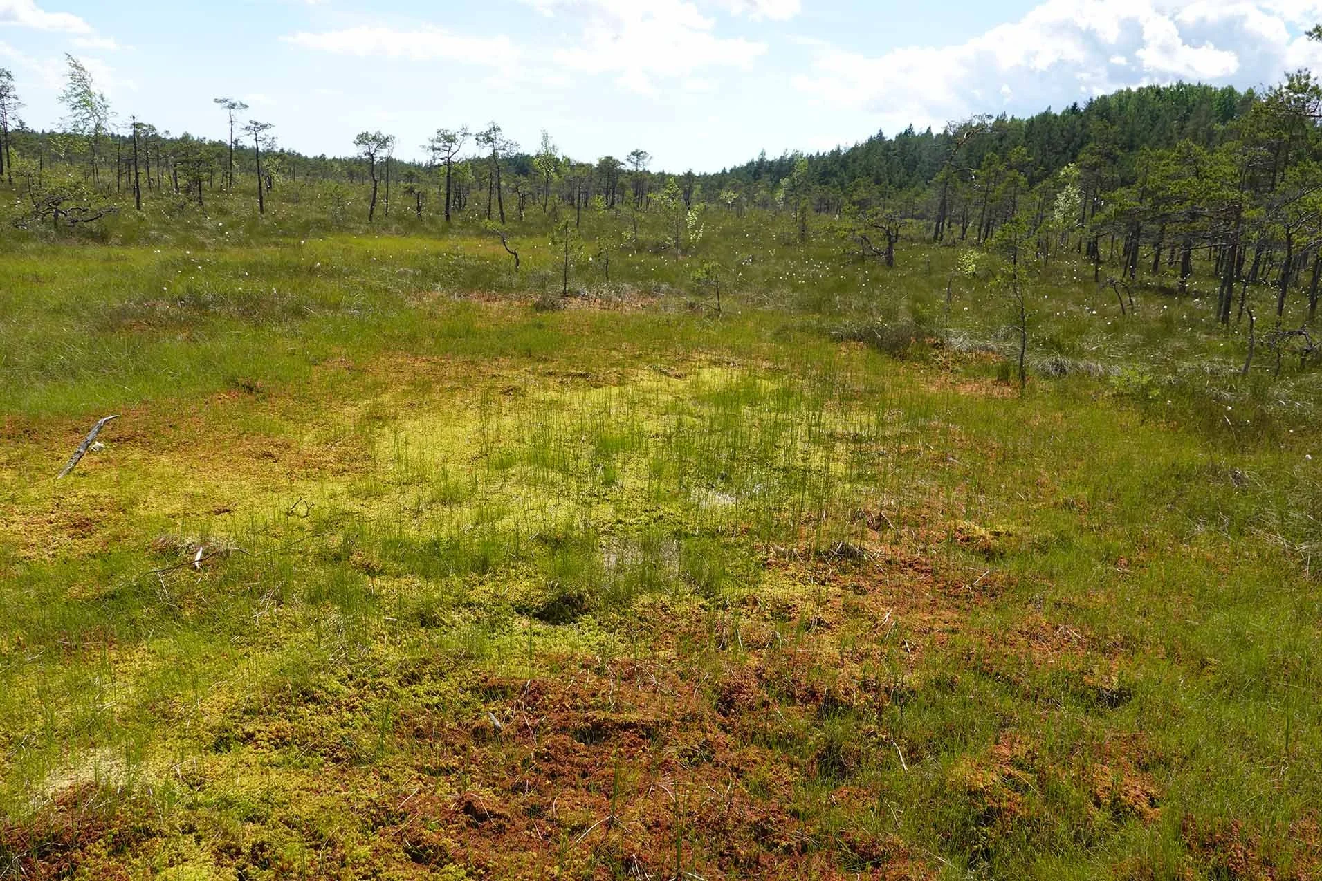
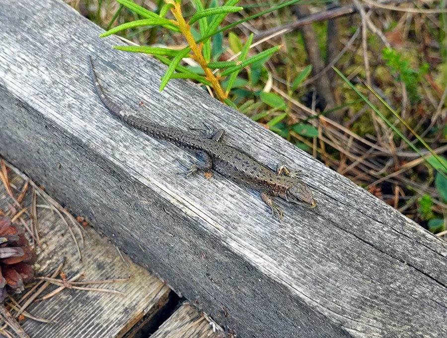
The bog was beautiful. Folks here often call bogs “green deserts,” as they are hostile to quite a lot of life - but I thought Soomaa’s bogs were otherworldly and had a variety of plant species to admire, as well as insects and some small lizards. (Presumably there’s more fauna, but that’s what I saw!)

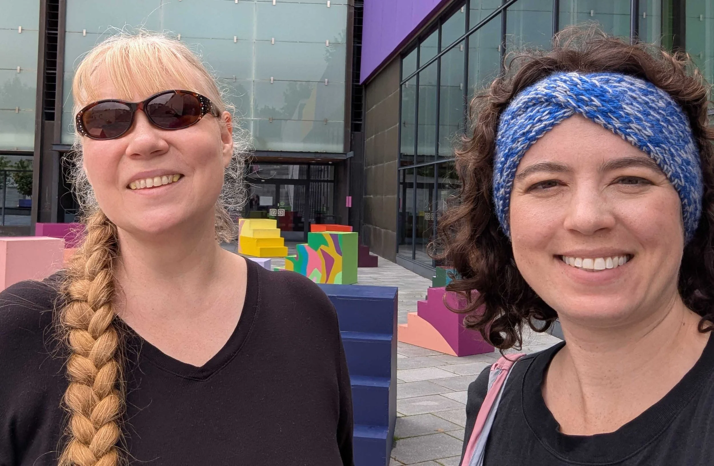
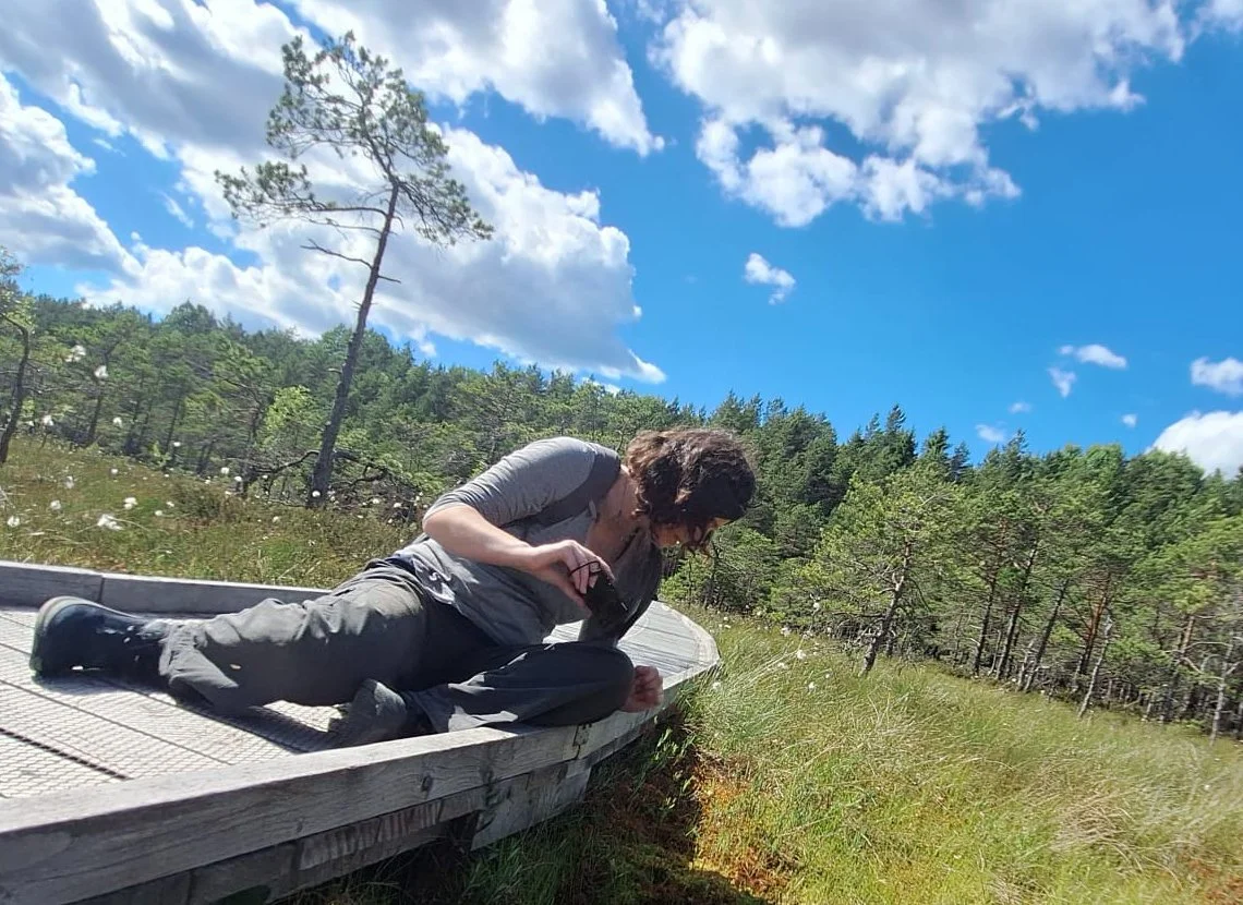
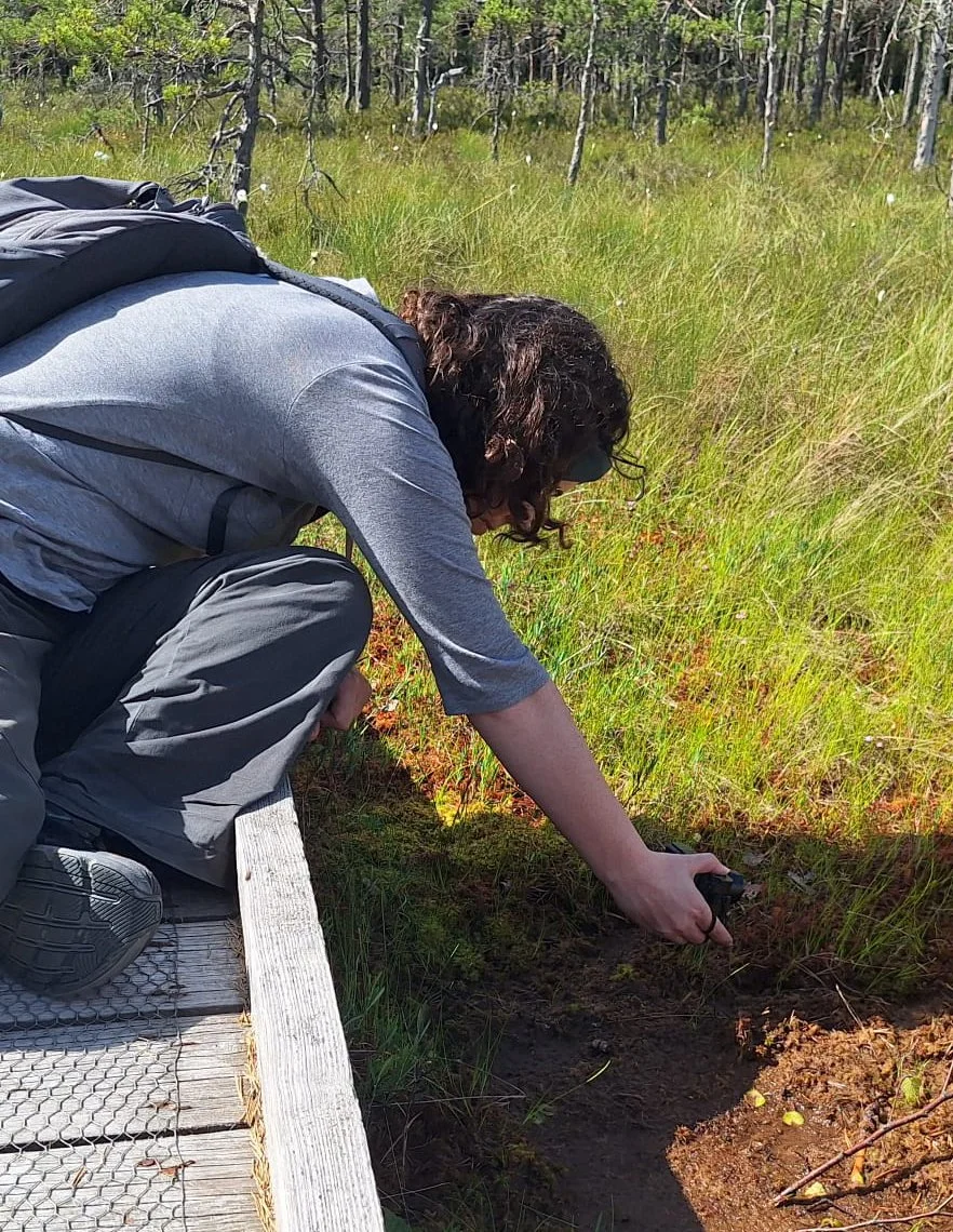
The wild sundews were present, as promised! Sundews are relatively small on the size hierarchy of plants, so to get good photos you want to get close. Marko took some pictures of me again; I usually travel solo, particularly when on research trips, so I really appreciate having some images documenting my work process!

New Artwork: Submerged Memory

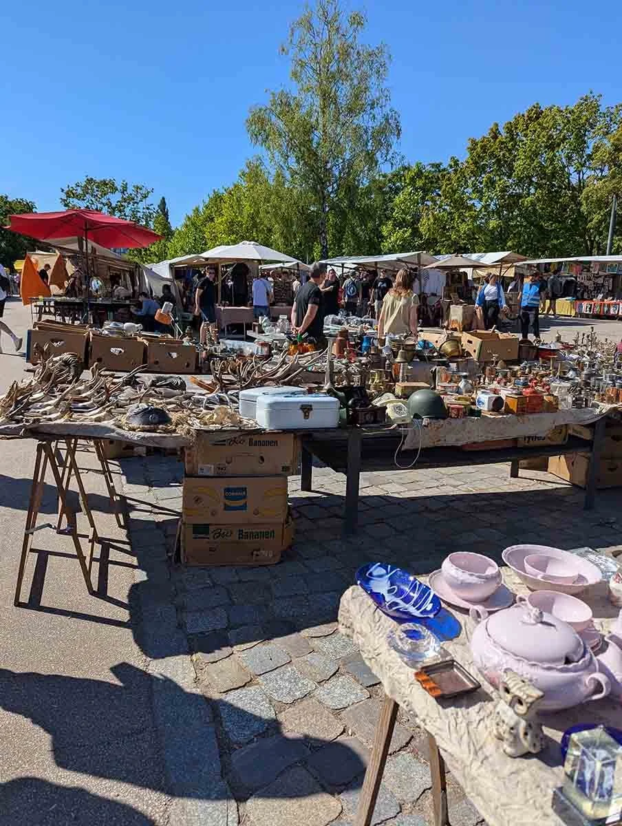
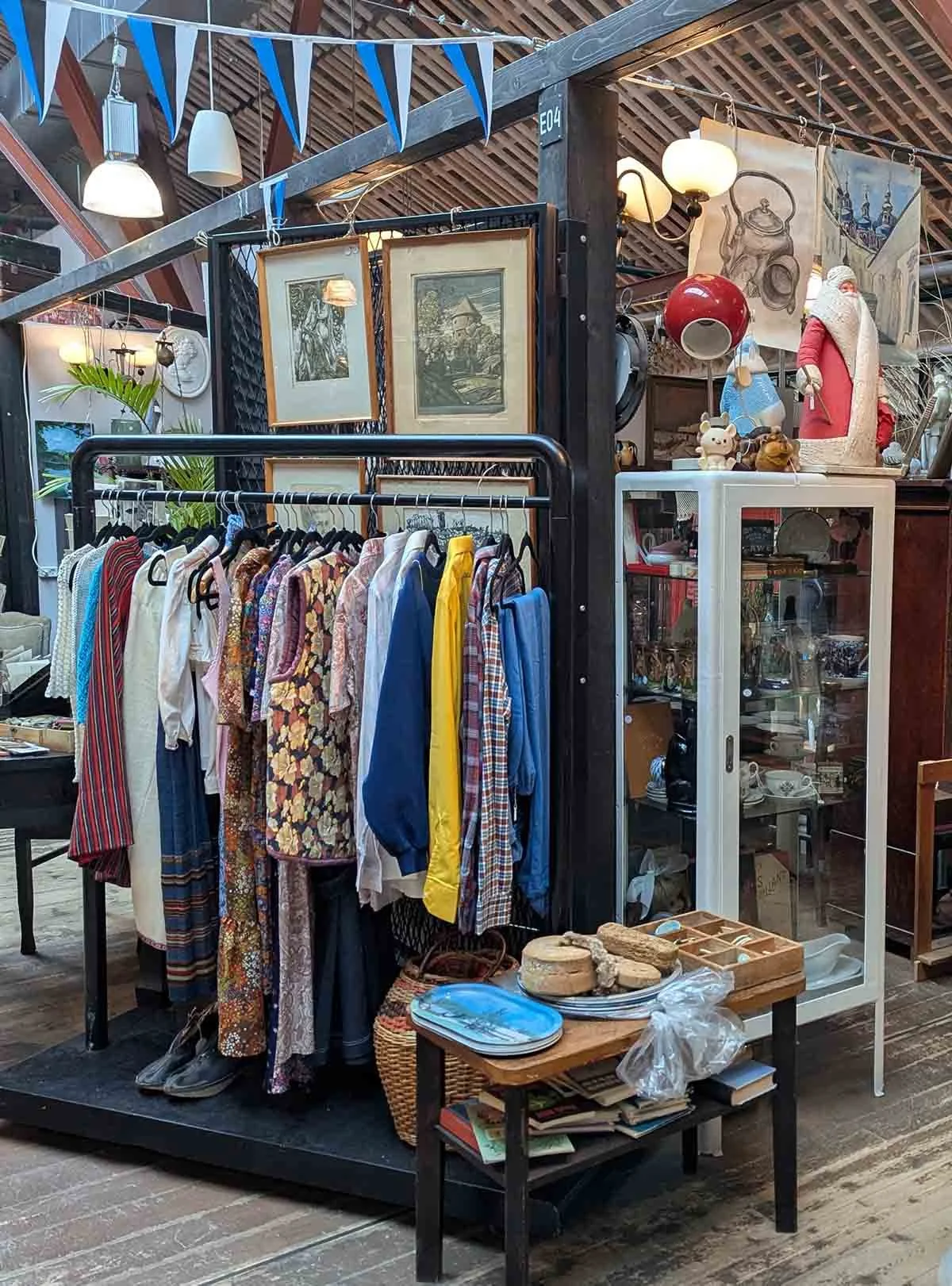
One of my consistent practices when traveling abroad is seeking out arts and flea markets, antique stores, vintage shops, and secondhand dealers. This has become part of my research methodology: an opportunity to encounter reference material, regional craft traditions, and occasionally, nontraditional media or substrates that find their way into the work. While I walk out of most places empty-handed, that's fine; the practice is cumulative.

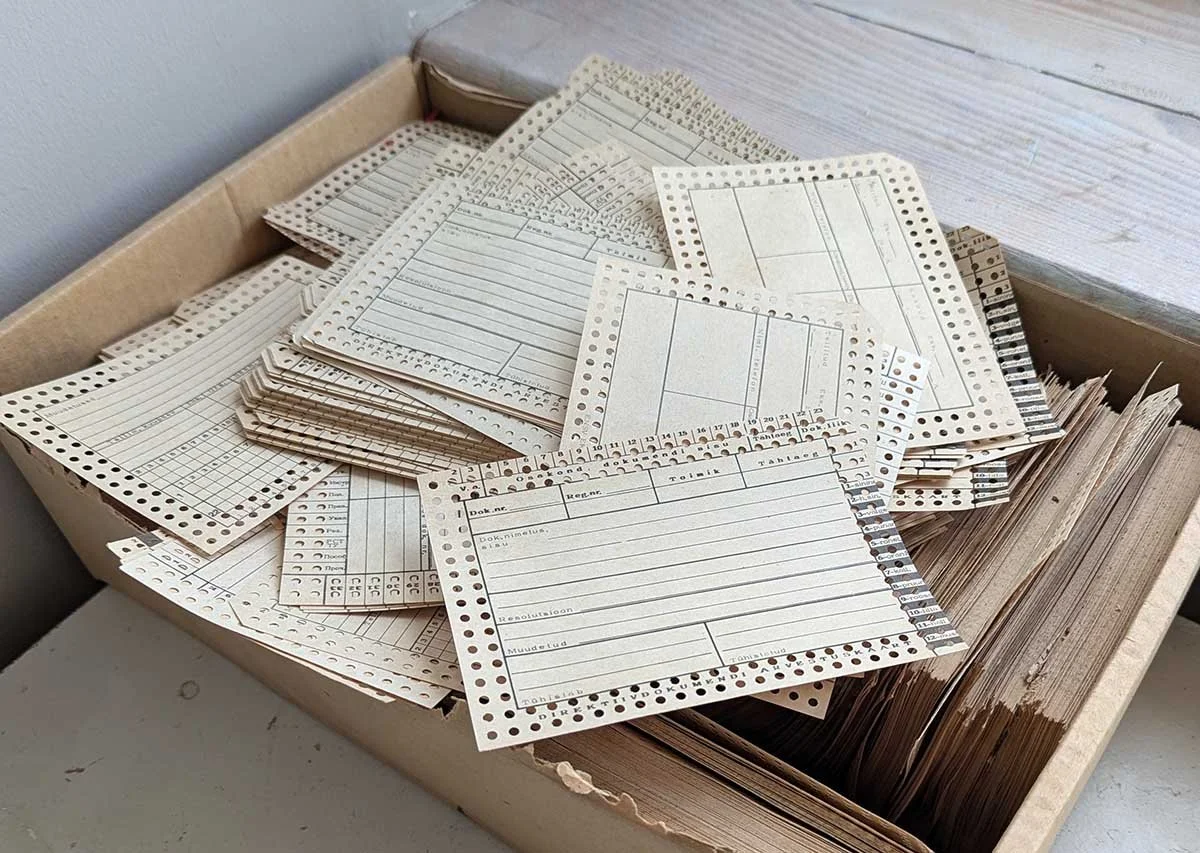
On my second-to-last weekend in Pärnu, I came across an unbranded antique shop that doesn't appear on Google Maps and opens only when the owner feels like it and puts out a sign on the street. Inside, I found a small cache of printed stationery from the Soviet occupation period, issued under the ENSV, the Eesti Nõukogude Sotsialistlik Vabariik, or Estonian Soviet Socialist Republic. Most of the material was too damaged for my purposes, or carried handwriting and other visual noise that would compete with the work. A few pieces, however, were relatively clean.

The surface is extraordinarily loaded. It's also materially demanding: decades-old printed, coated cardstock with a surface that requires careful handling and preparation. I purchased the few that might suit my purposes and got to work.

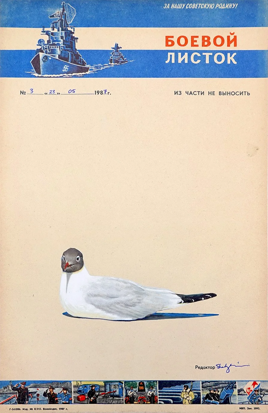
For this first piece, I inverted the cardstock and painted a split-level waterline view of the Baltic Sea directly over the now upside-down state emblem and its slogan. The sinking emblem remains visible, and traces of the communist motto persist in the lower register: Kõigi maade proletaarlased, ühinege! The standard English translation is "Workers of the world, unite!" though a more literal rendering would be "Proletarians of all lands, unite!"

Above the sea, a black-headed gull scans the surface below. In two earlier paintings from this residency, black-headed gulls appear as drone stand-ins, complete with stylized laser beams that complement their substrates’ perforations. Here, that same subject returns, but without overt weaponry.

This is Submerged Memory, acrylic on occupied Estonian printed cardstock from 1974, 11.38x8.2”, 2026.

Shelby Prindaville's painting of a black-headed gull flying over the Baltic Sea with an inverted, sinking ENSV state emblem and motto submerged in the water.

Exhibition at the Pärnu Keskraamatukogu (Central Library) Gallery!

My posts about my artwork necessarily are created after I finish them, and frequently more time passes to allow me to properly photograph and color correct the image, because I’m deciding between title options, in order to space my posts out a bit instead of posting in clumps… which is all to say that I actually managed to finish my first five paintings by June 17, even though they weren’t all online yet.

On June 18, residency director Taje Tross asked the Pärnu Keskraamatukogu (Central Library) if they would be willing to host an exhibition of my work sometime before I left, and I assumed they’d be considering a shorter show toward the end of the month - but instead they graciously agreed and asked that I show up the next day to install such that my exhibition ran from June 19-June 30! What luck: this is one of the longest international shows I’ve had as a part of a residency, and definitely the earliest. I am so appreciative I was given the opportunity to share my artwork in such a public gallery for so long (40% of the residency period!).

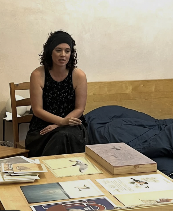
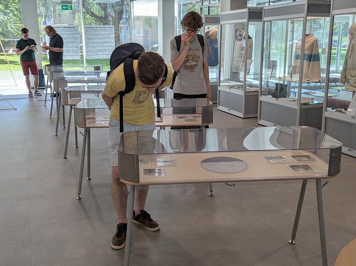
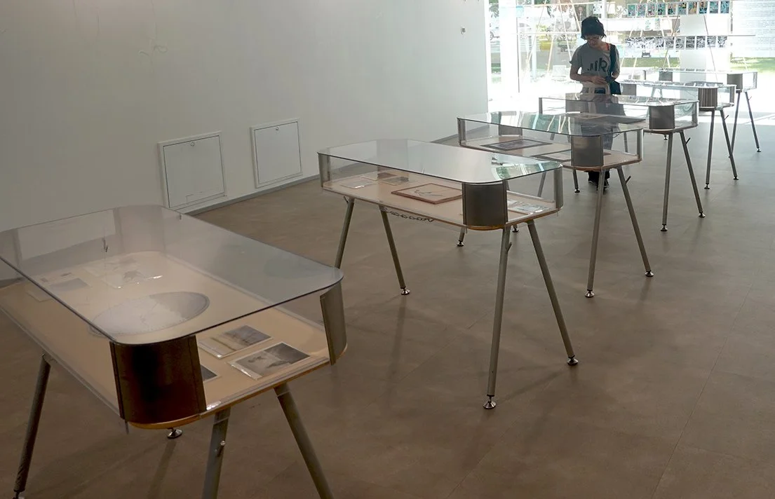
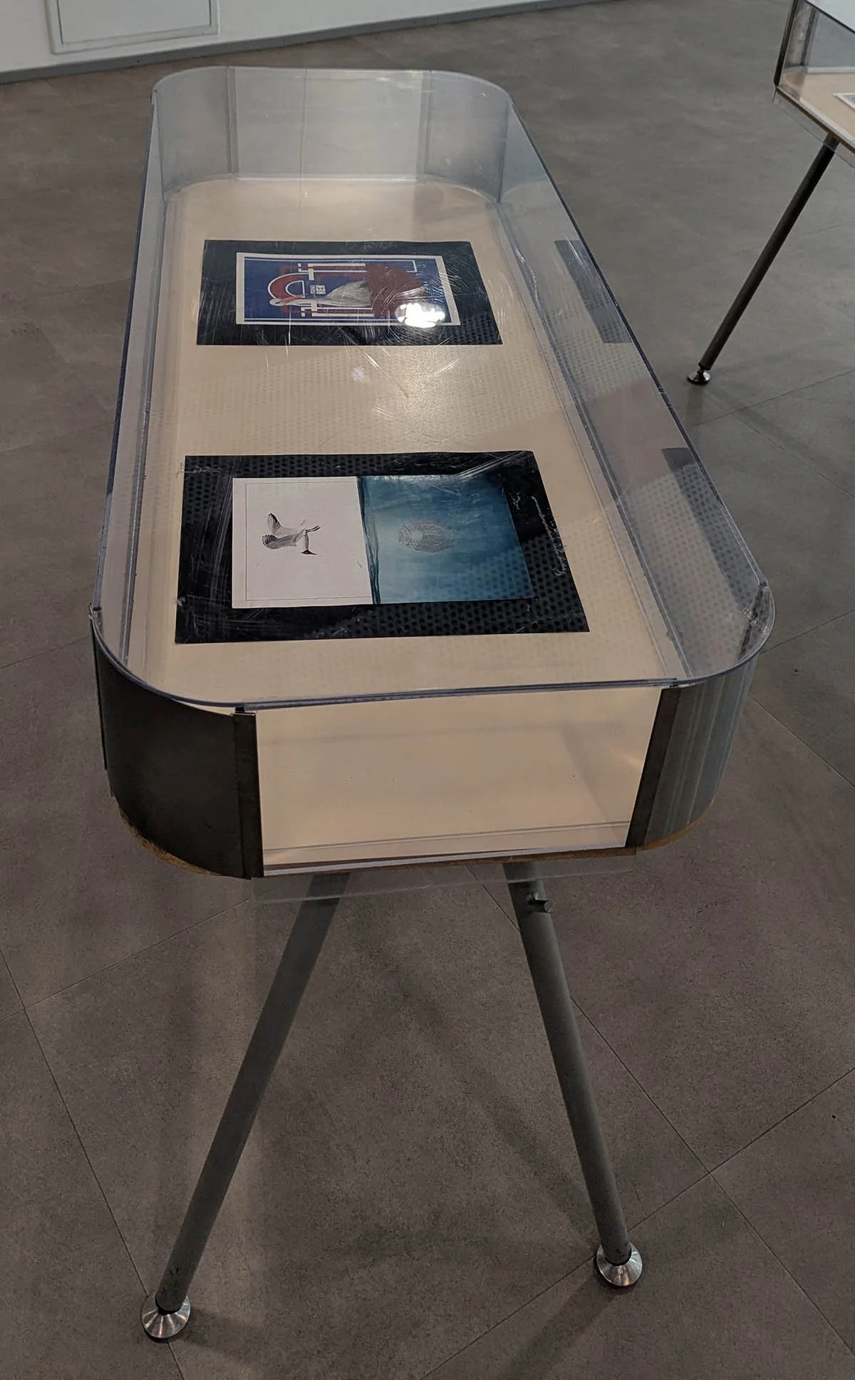
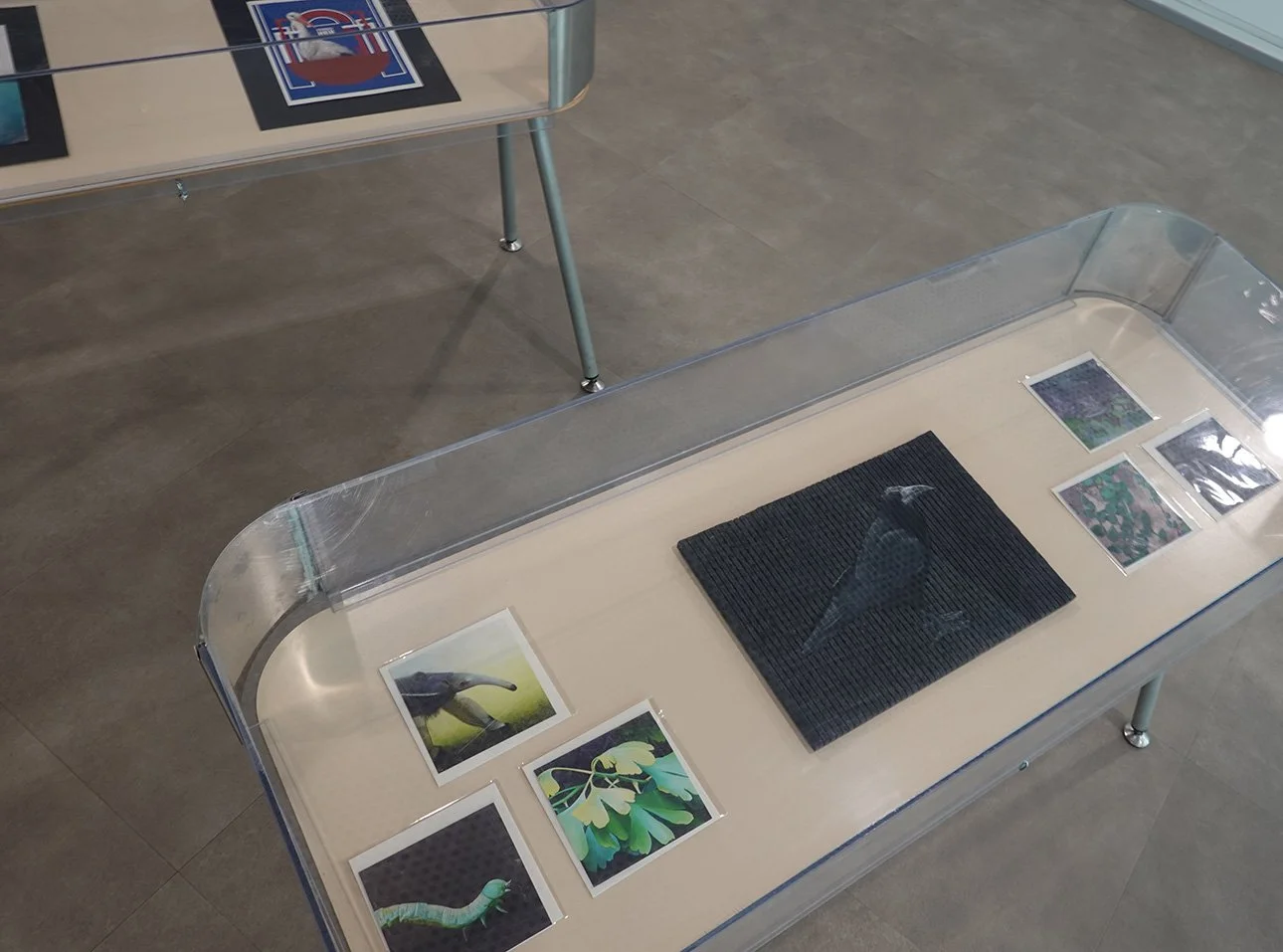
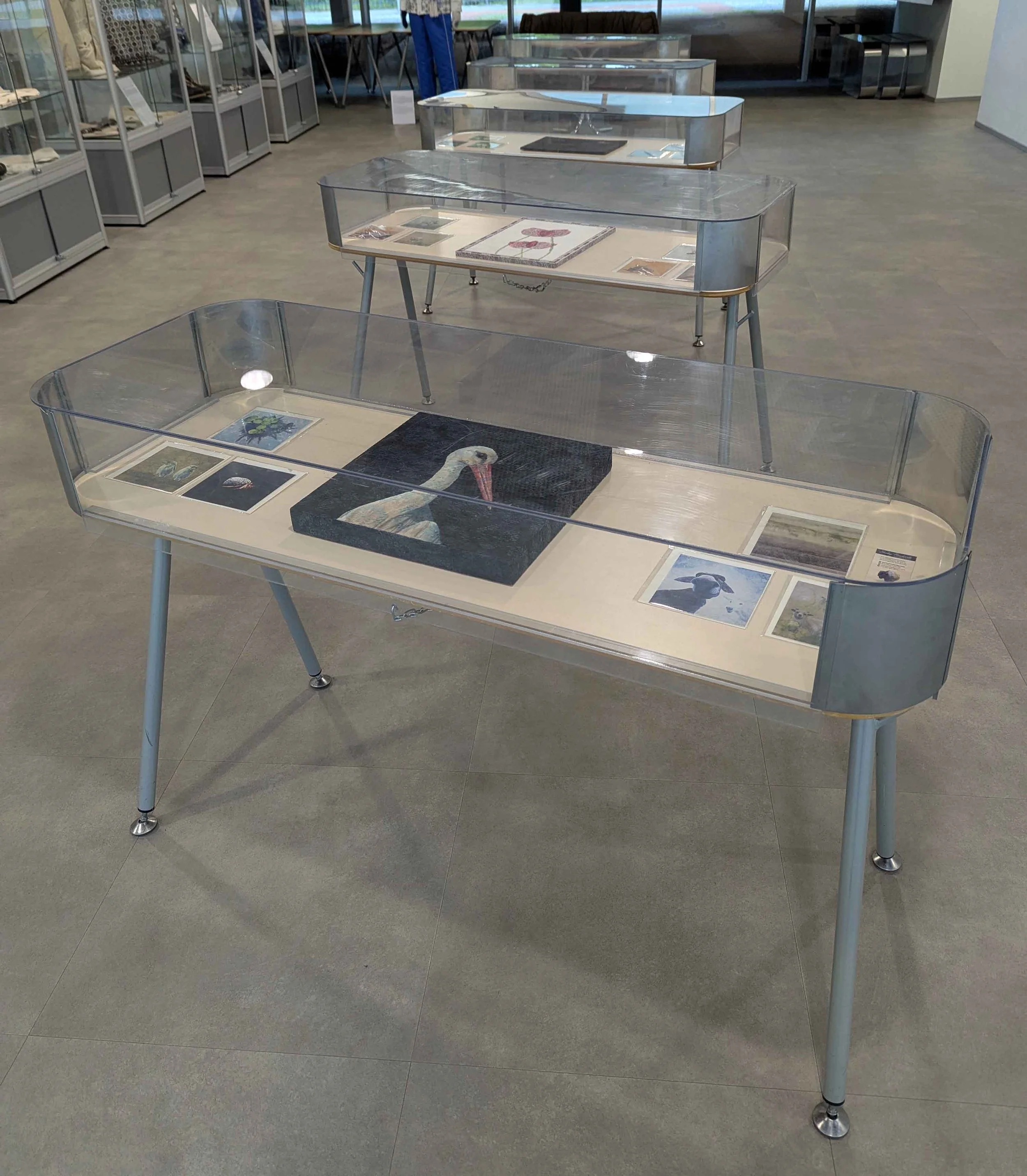
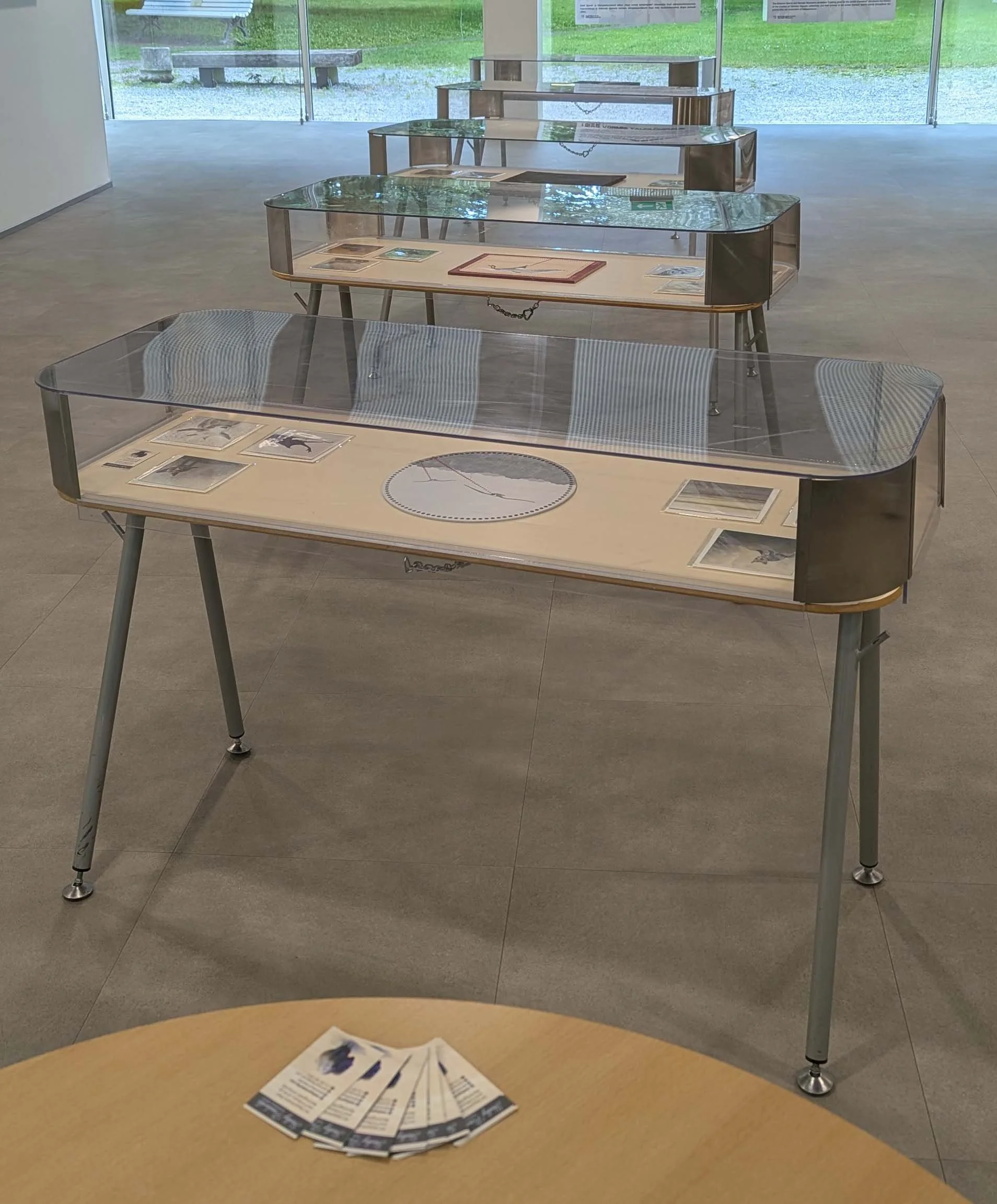
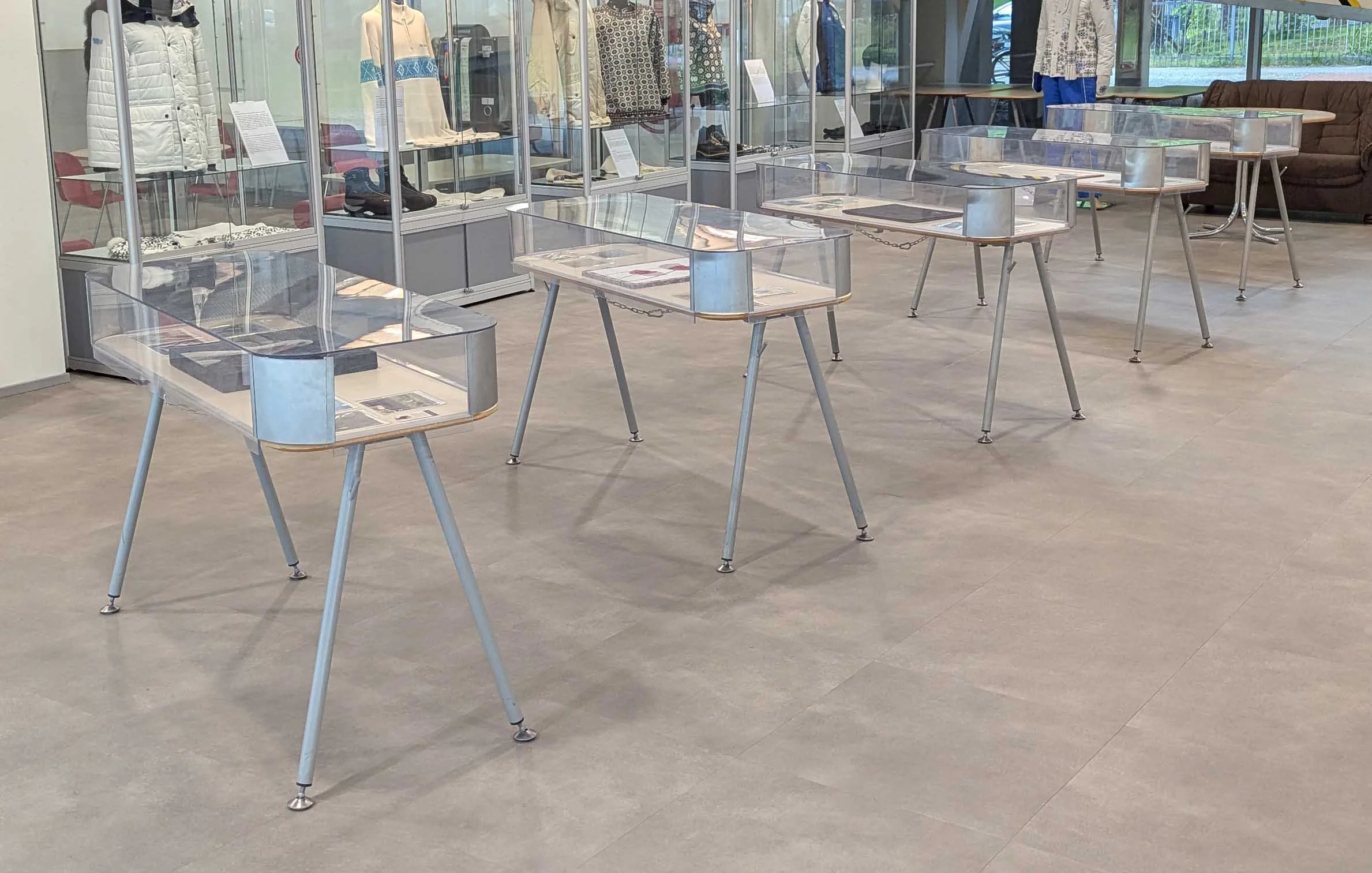
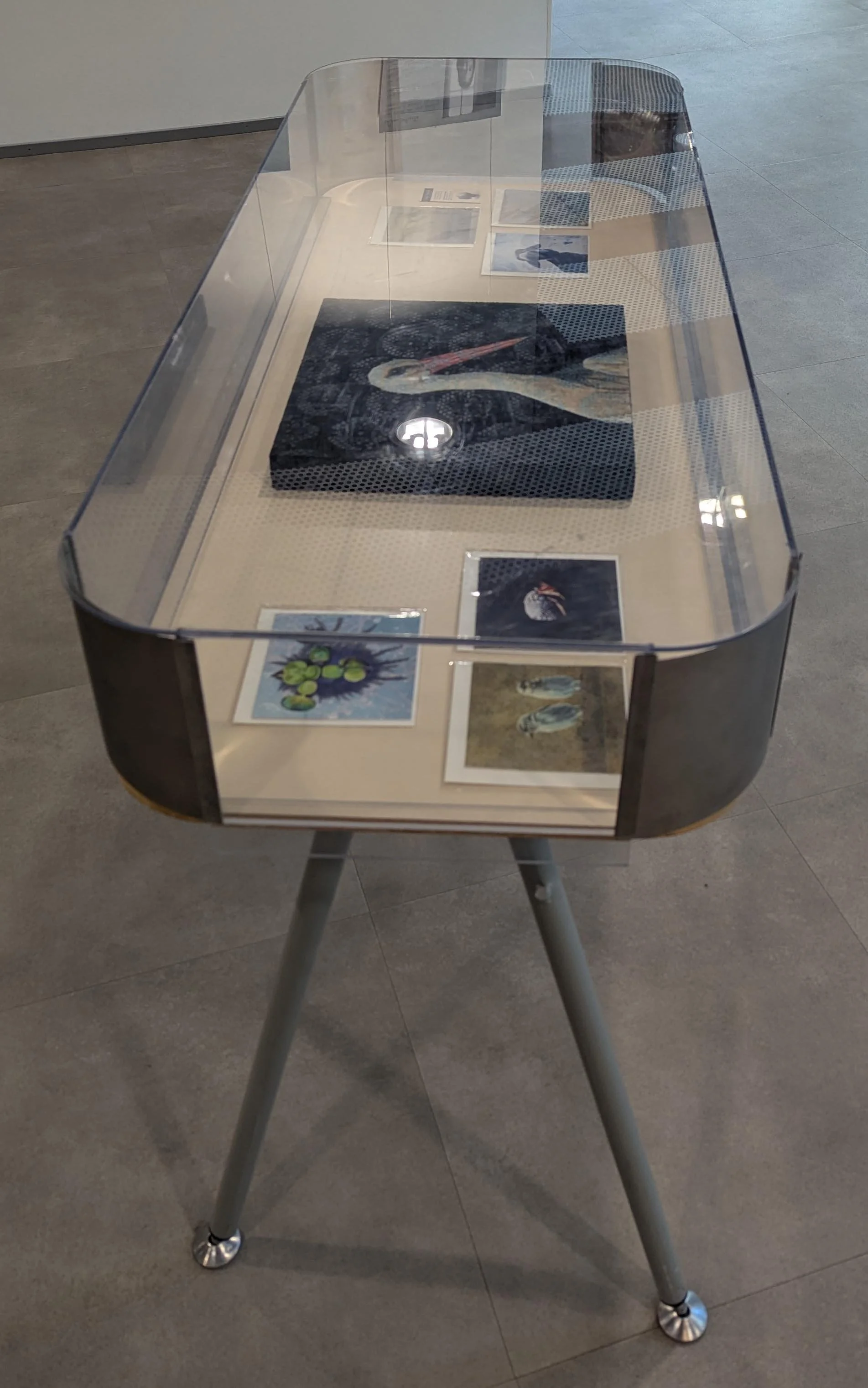
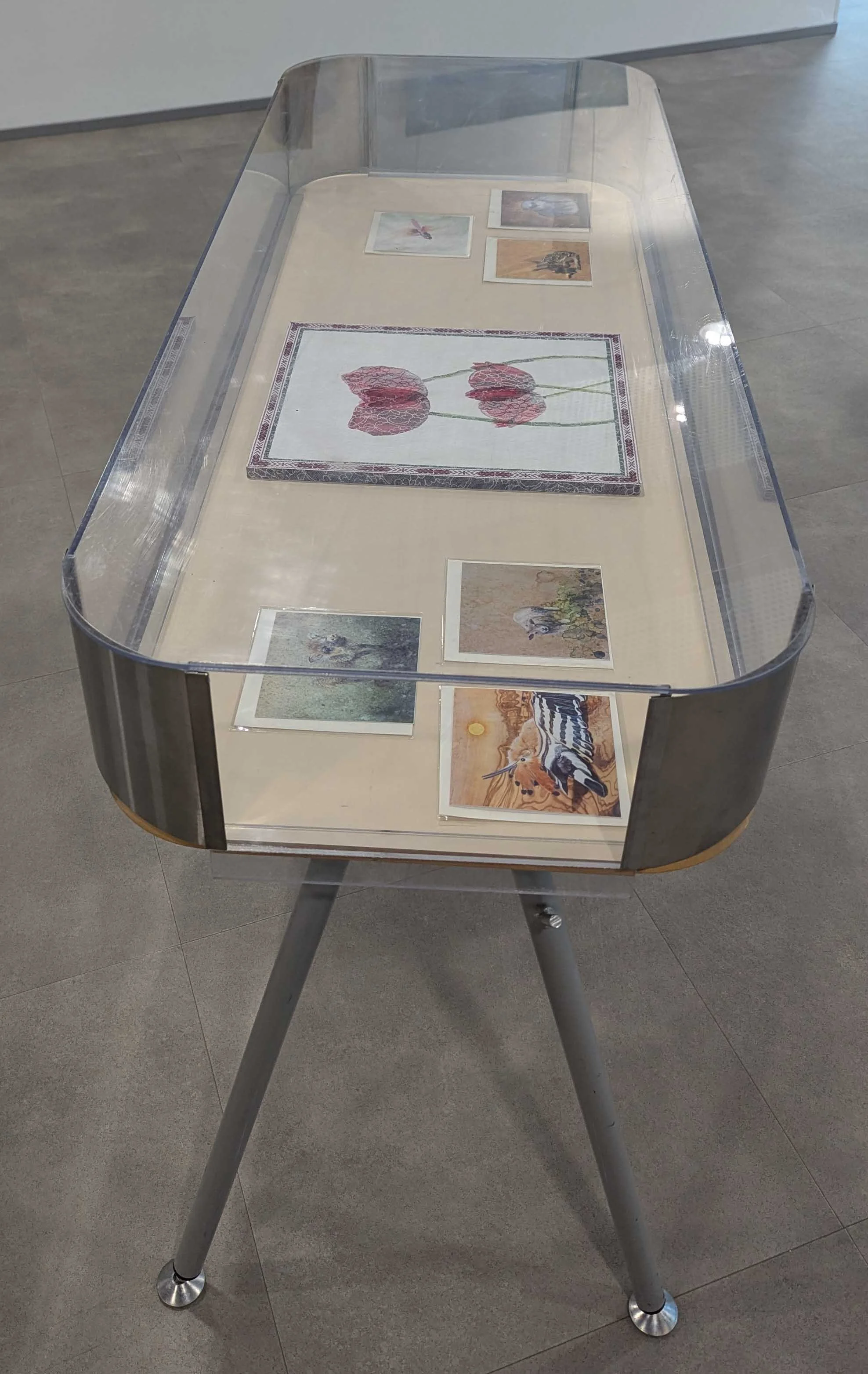
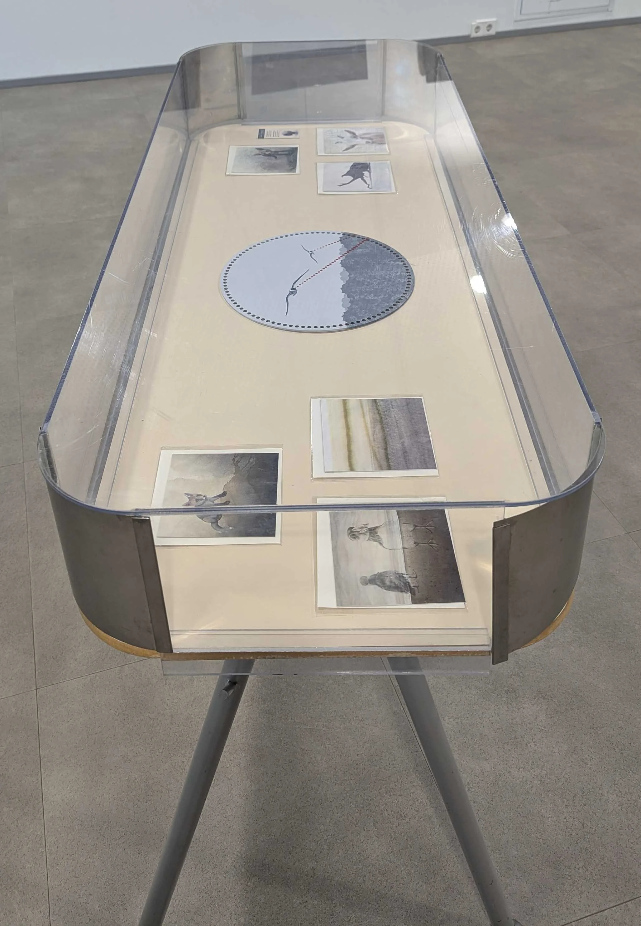
I brought all five finished paintings, along with a bunch of my greeting cards, and was given a prime set of exhibition tables with protective covers! As I finished more paintings during the show’s duration, I brought them in as well - that’ll be covered in another future post. I set up the show in their first floor gallery, and then returned to the residency to send off my exhibition information which I’m providing below.

Textiles and Territories

by Shelby Prindaville (USA)

This exhibition brings together paintings exploring Estonian ecology, domestic craft, folklore, and geopolitics. Lace, felt, and jacquard trim carry the warmth and care of traditional women's work. Set against that softness, perfokaart (Soviet-era punch cards) and a repurposed crochet panel become surfaces for gulls recast as drones, a collision between domestic inheritance and the machinery of surveillance and war.

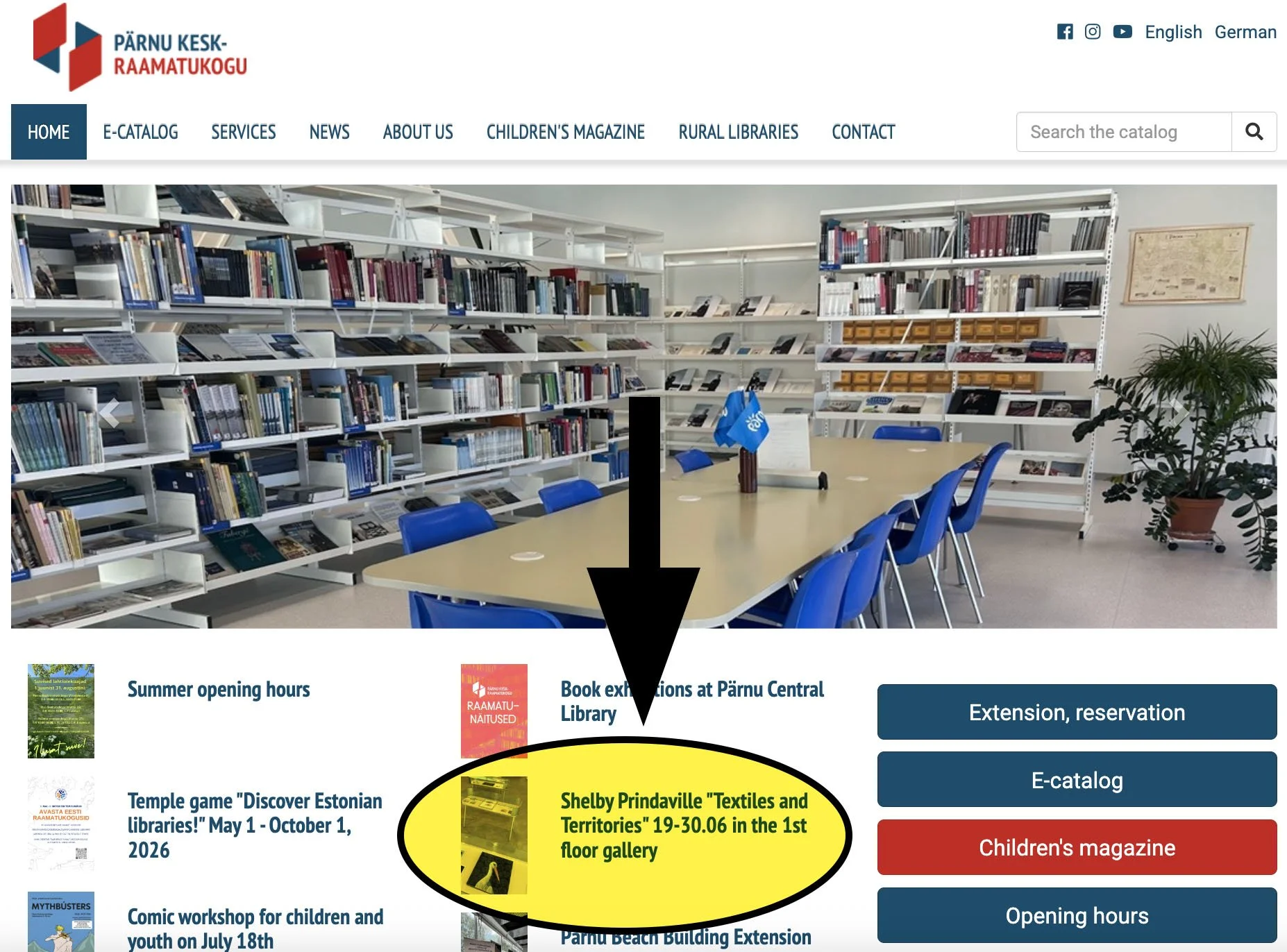
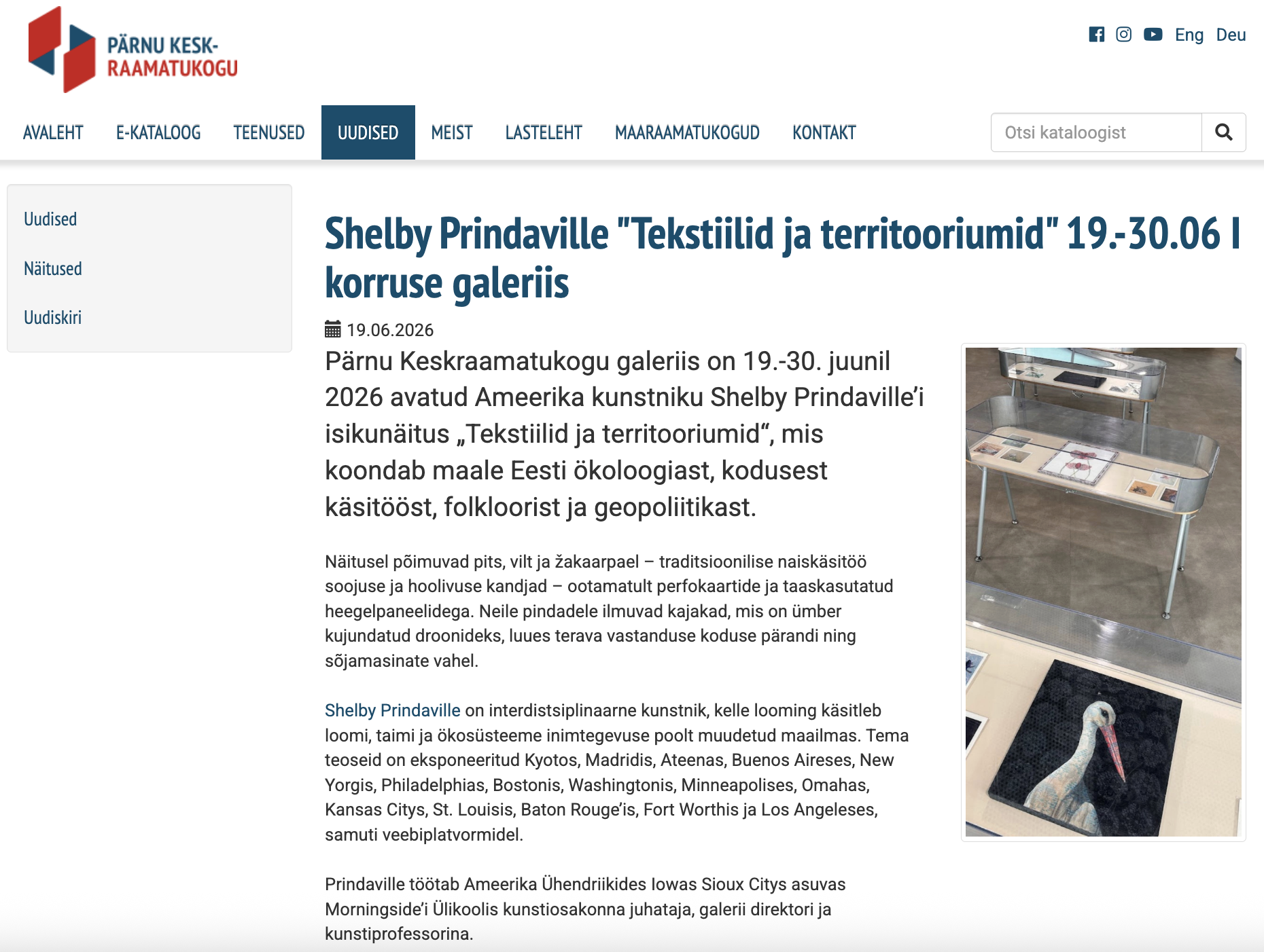
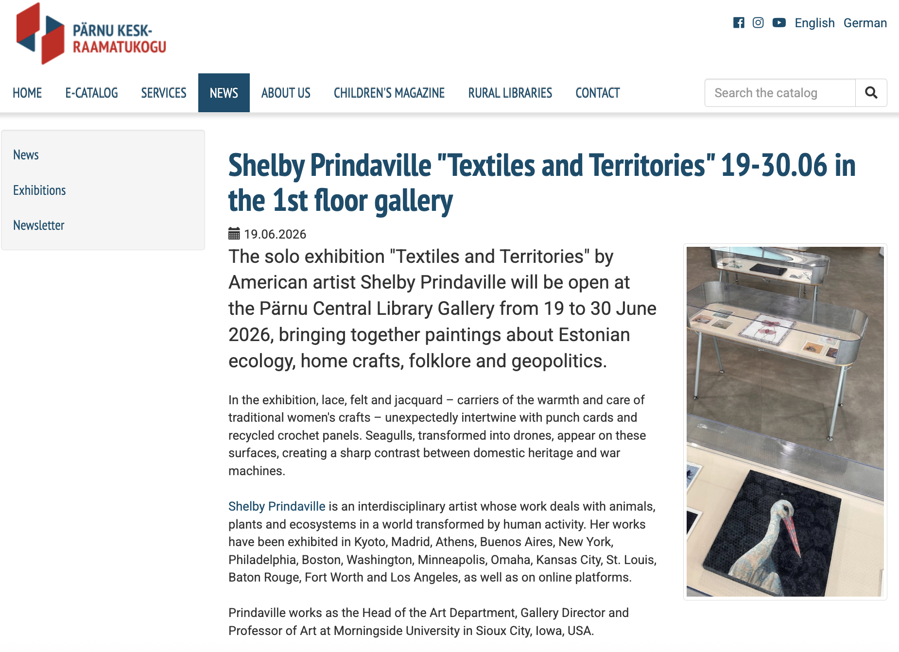
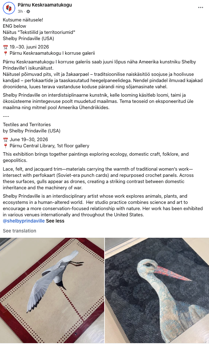
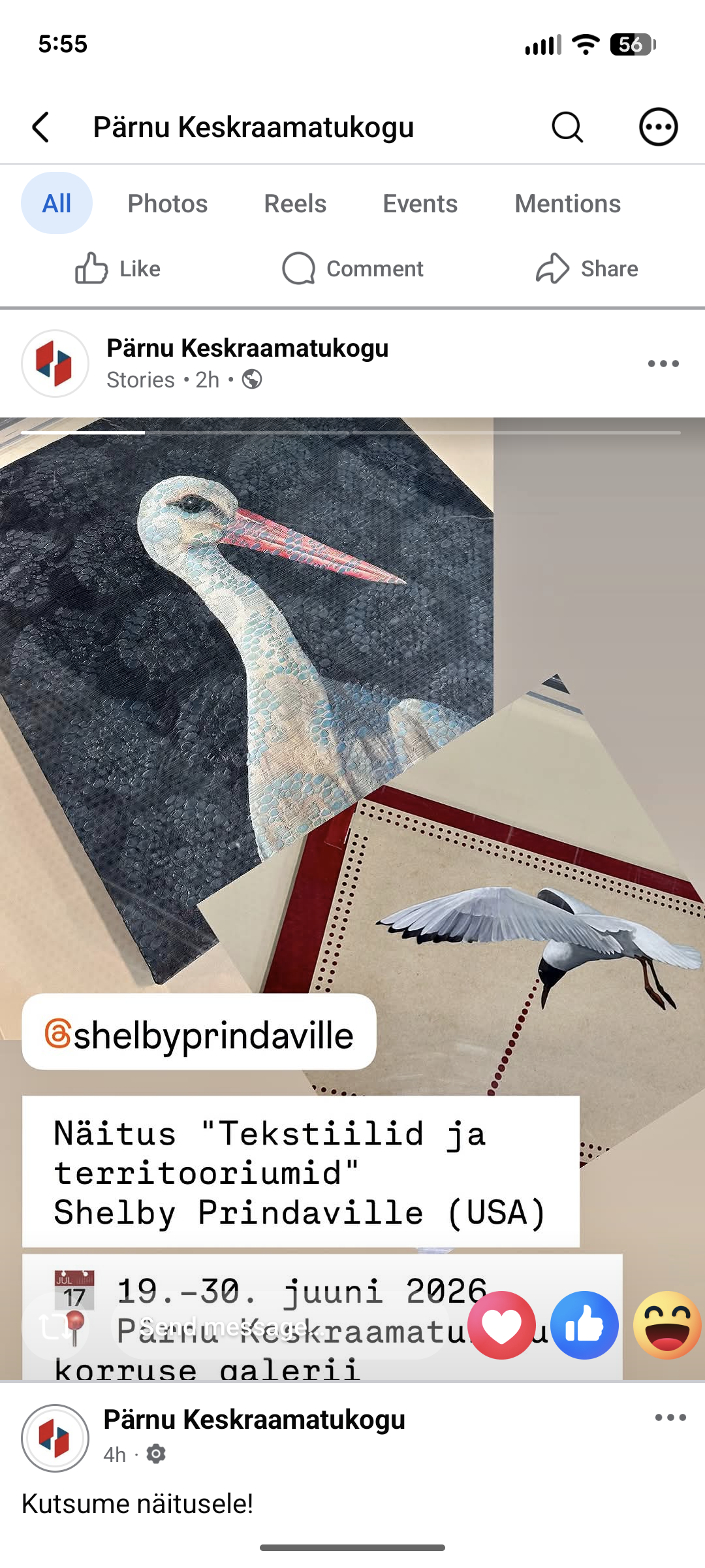
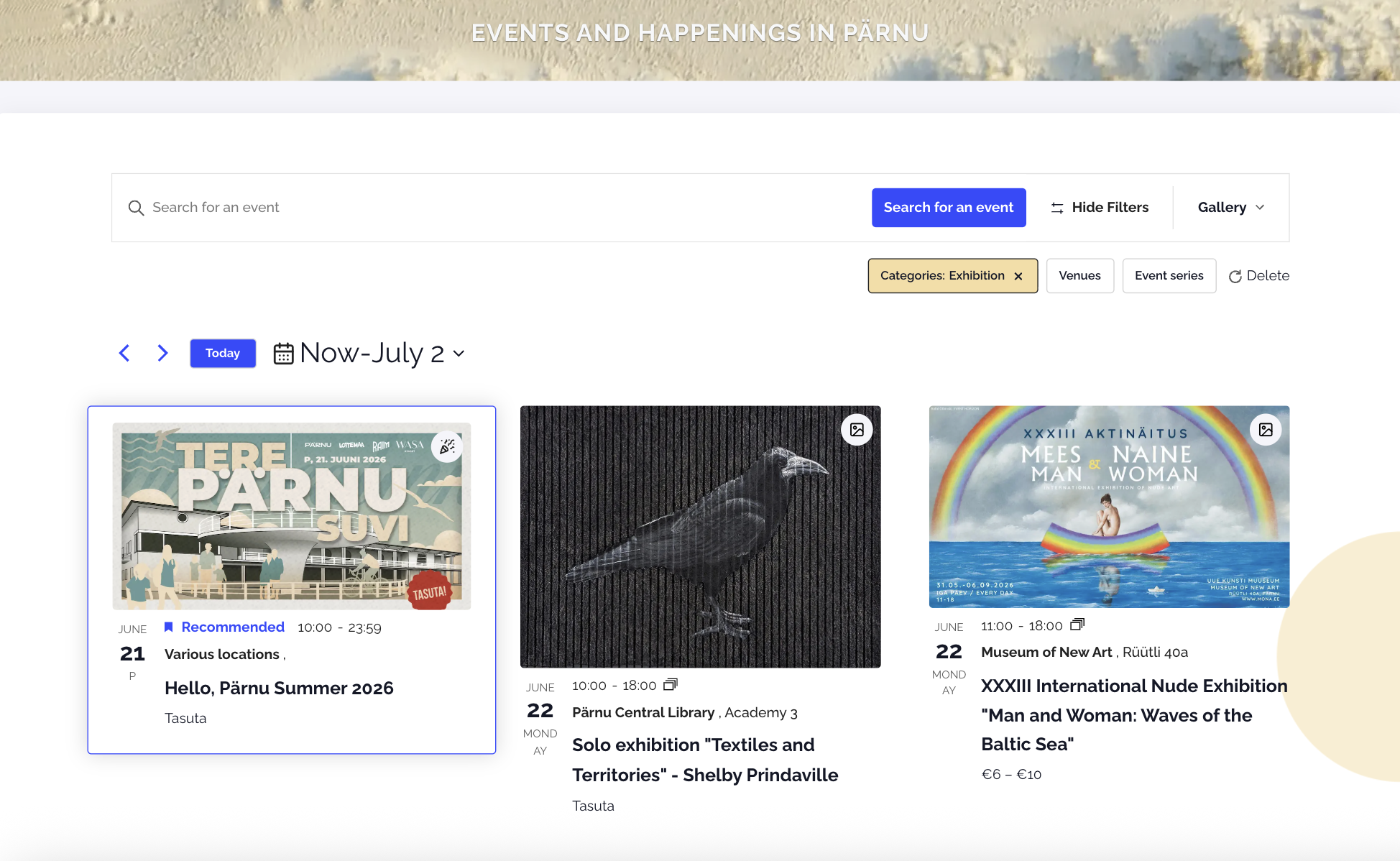
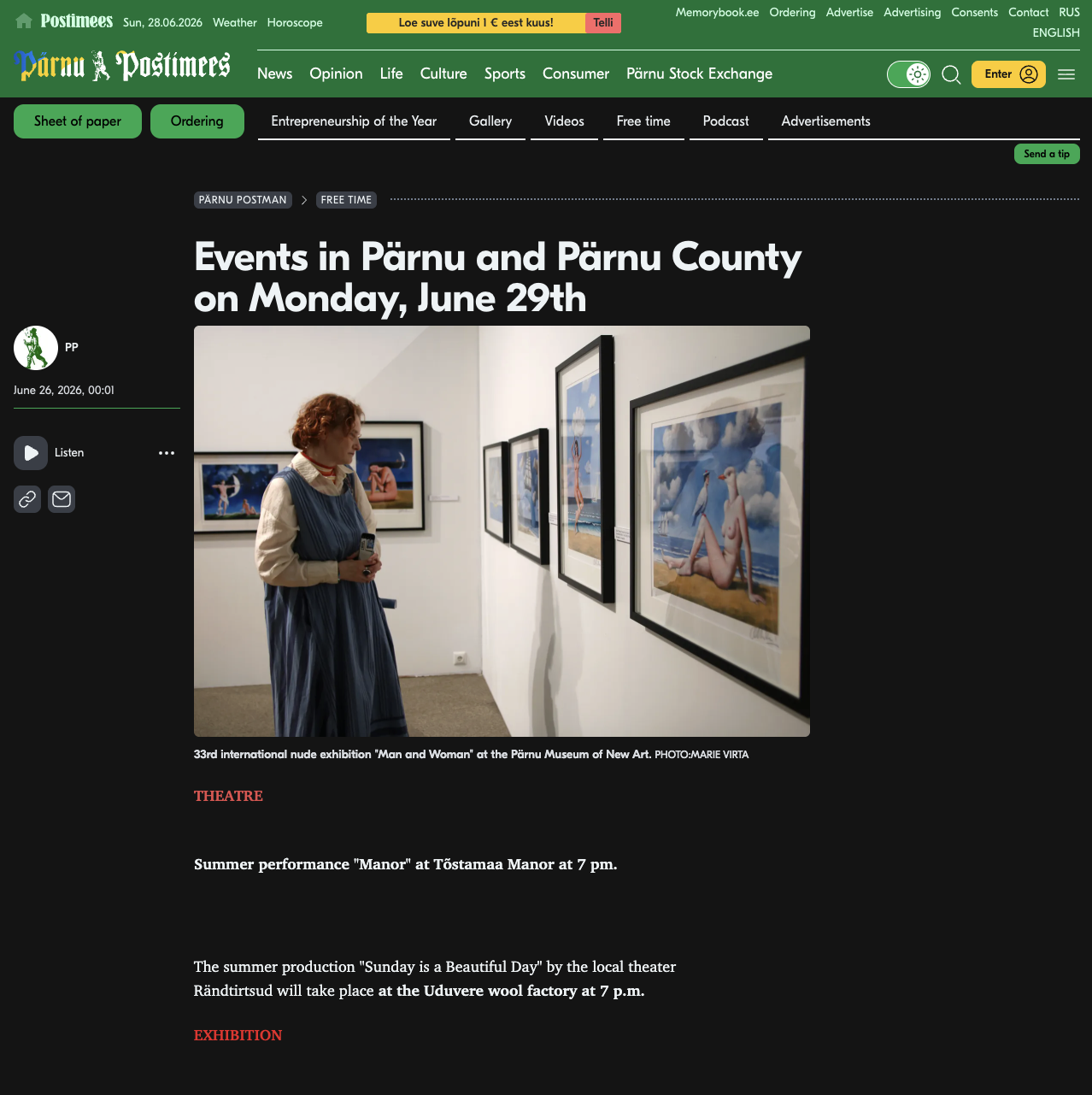
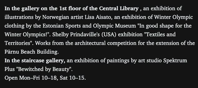
I was also able to swing by again shortly after installation with my new friend and nature guide Marko Poolamets on our way out of town to Soomaa National Park, and library director Krista Visas was checking it out as well! She was so warm and professional - she was pleased with the installation and happy to hear I had already sent her my show information. She sprang into action by putting it on social media immediately: their website homepage, news page, Facebook and Facebook stories were all updated the same day. It was also posted on the Tana Parnus events page and the Pärnu Postimees. Below are some screenshots of that publicity! You can click on any of the images below to see them larger.


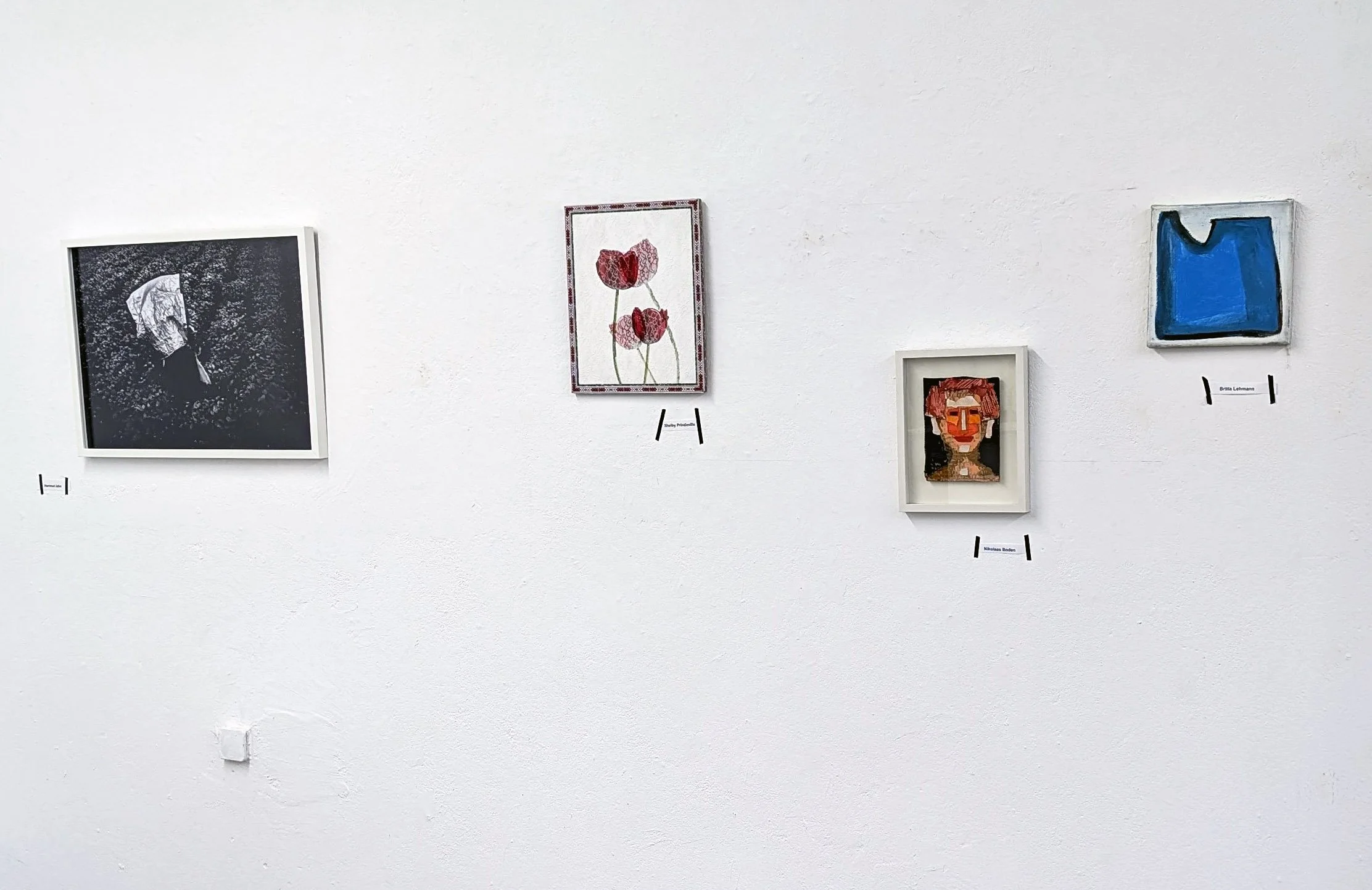
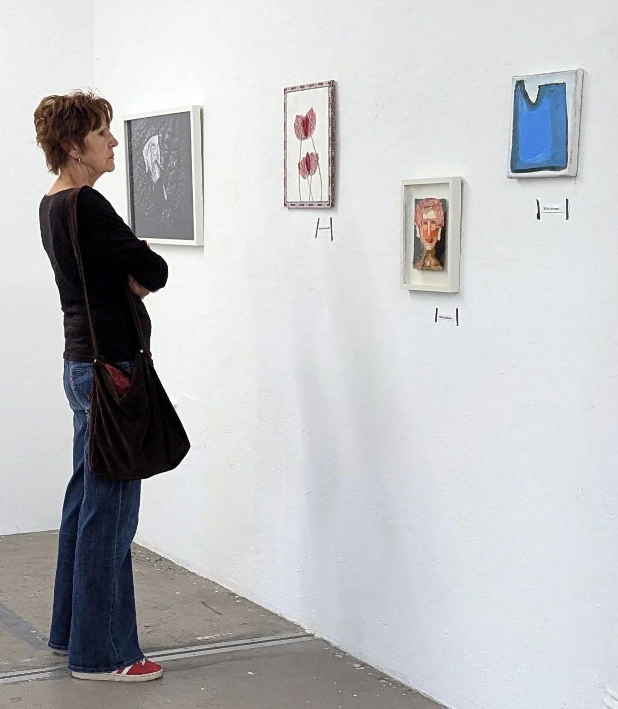
Next, some exhibition shots:

New Artwork: Vigilance Is Our Weapon

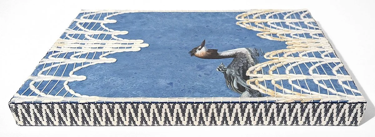
A companion to Surveillance, this work casts black-headed gulls as drones above a sea built from lace- and felt-placemat stencils and stamps. To evoke the stark visual language of USSR propaganda, the composition relies on a limited color palette and flat, simplified forms. The painted red laser beams begin as perfokaart stencils and then scale progressively toward the panel's edges. The substrate is a crochet base panel used for bags and accessories; ironically, the perforations in the panel are laser cut. Through its use of domestic textile imagery and substrate, the piece serves as a bridge between my Soviet occupation series and my ongoing explorations of Estonian craft traditions.

The title of this piece comes directly from a USSR propaganda poster from 1953.

This is Vigilance Is Our Weapon, acrylic, lace and perfokaart stenciling, and felt stamping on crochet base panel, 11.8x11.8x.125”, 2026.

Shelby Prindaville's gulls-as-drones painting on crochet base panel.

New Artwork: Surveillance

I took a departure from my textile mixed-media paintings for this piece. When I arrived at Loovlinnak Creative City Artist Residency, directors Al Padrok and Taje Tross generously gave me access to their tools and supplies, including several stacks of paper. Most of it was unremarkable: construction paper, printer paper, and graph paper. But one small stack caught my eye immediately. I could tell it was old and somehow related to typewriters or early computers, and when I asked, I learned it dated to the Soviet occupation. I adopted all of it, just four sheets, one of which had some math scribbled across it in pen.

Research revealed that it is Soviet-era perfokaart: stiff punch cards with holes in specific positions that fed instructions and data into mainframe computers before modern digital storage existed. From the 1970s through the 1980s, Soviet-bloc computing relied heavily on this technology, running the economic planning, industrial control, and record-keeping systems of the USSR, including in occupied Estonia.

I'd already been planning work that referenced Soviet propaganda posters, so the cards were a natural substrate. I cast a black-headed gull (Chroicocephalus ridibundus) as a drone after photographing many of them in flight. The species' limited, high-contrast palette and missile-like profile suited the graphic style of Soviet propaganda posters.

I sketched a range of compositions that played off the perfokaart's holes and contours while keeping that propaganda energy, and landed on a gull flying high, firing a dotted laser beam down into the punched border. I used the scribbled-on card as a stencil for the laser dots.  I kept the first as-is, and then scaled the rest up so the beam widens from a point near the gull into an even band.

This is Surveillance, acrylic on Soviet-era perfokaart (punch card) c. 1978, 8.2x11.75”, 2026.

Shelby Prindaville's painting of a gull cast as a drone on Soviet-era perfokaart.

Pärnu

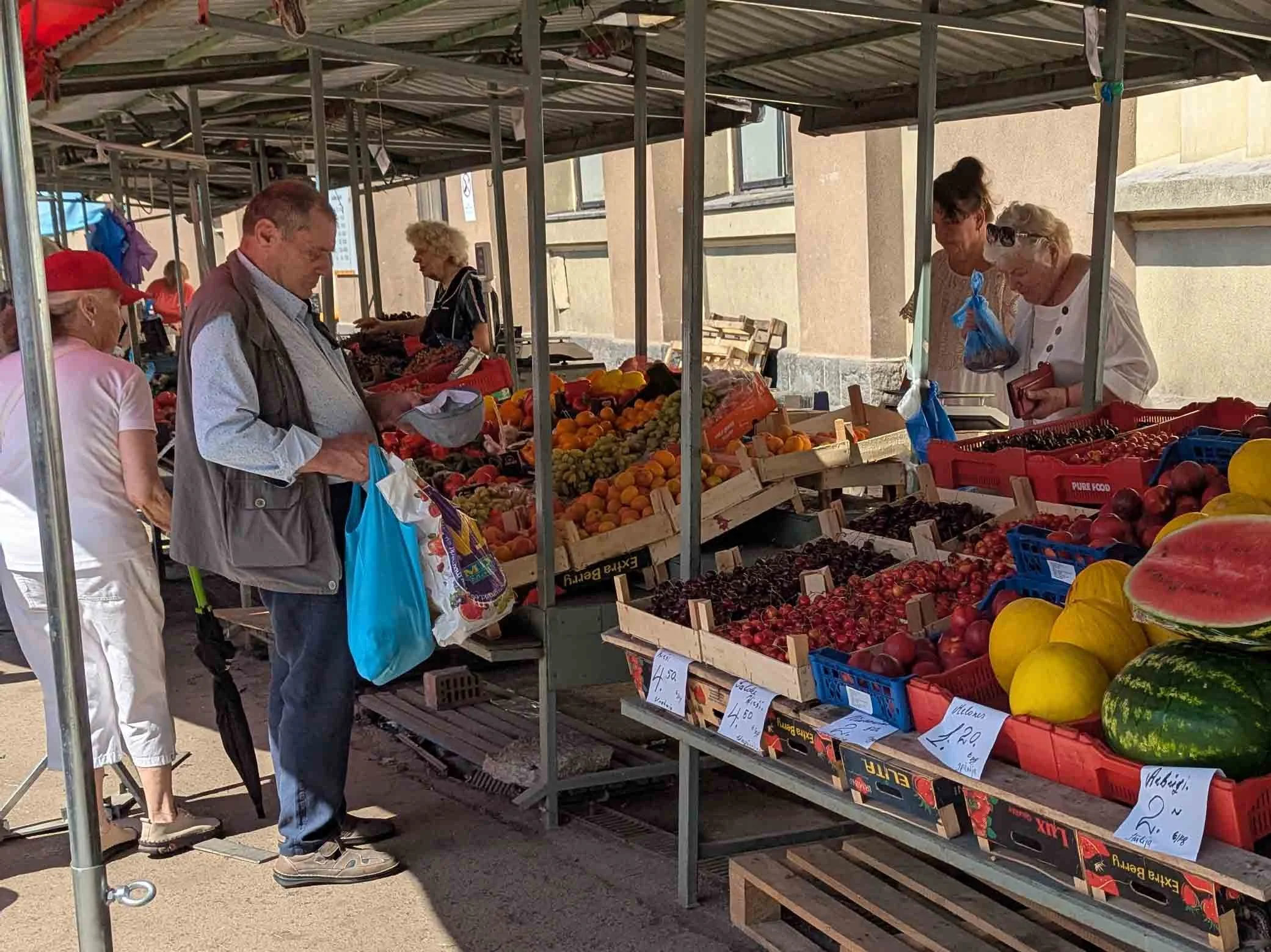
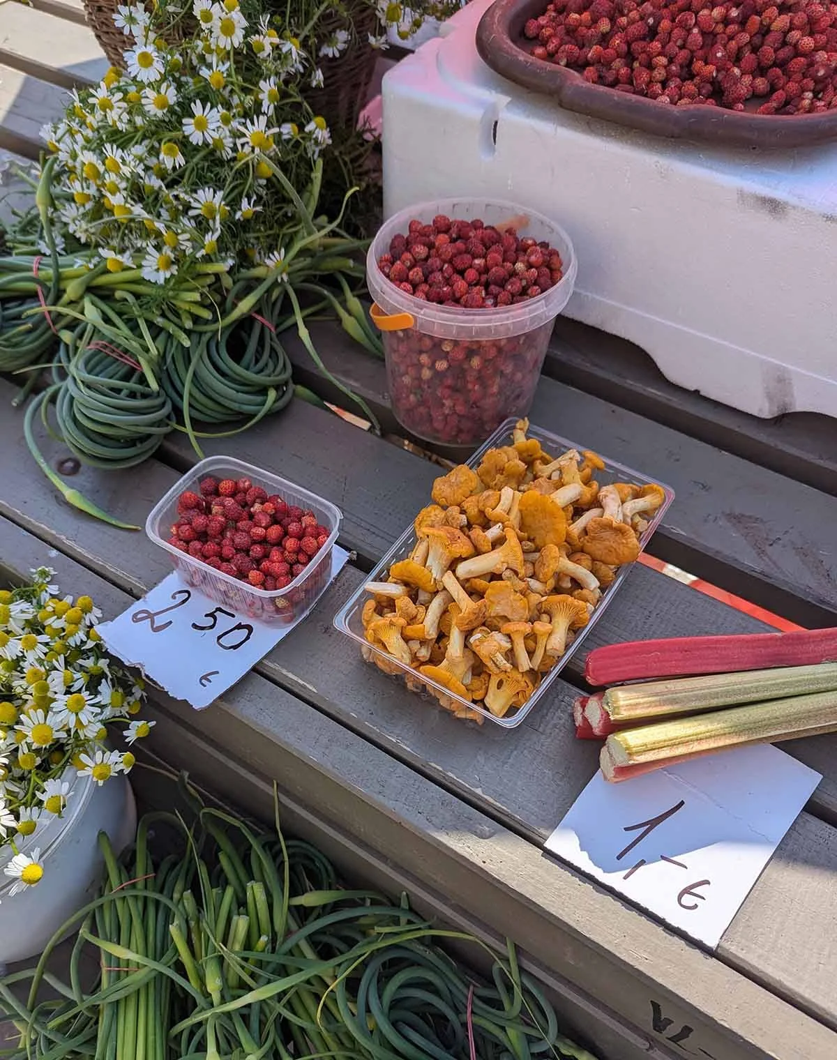
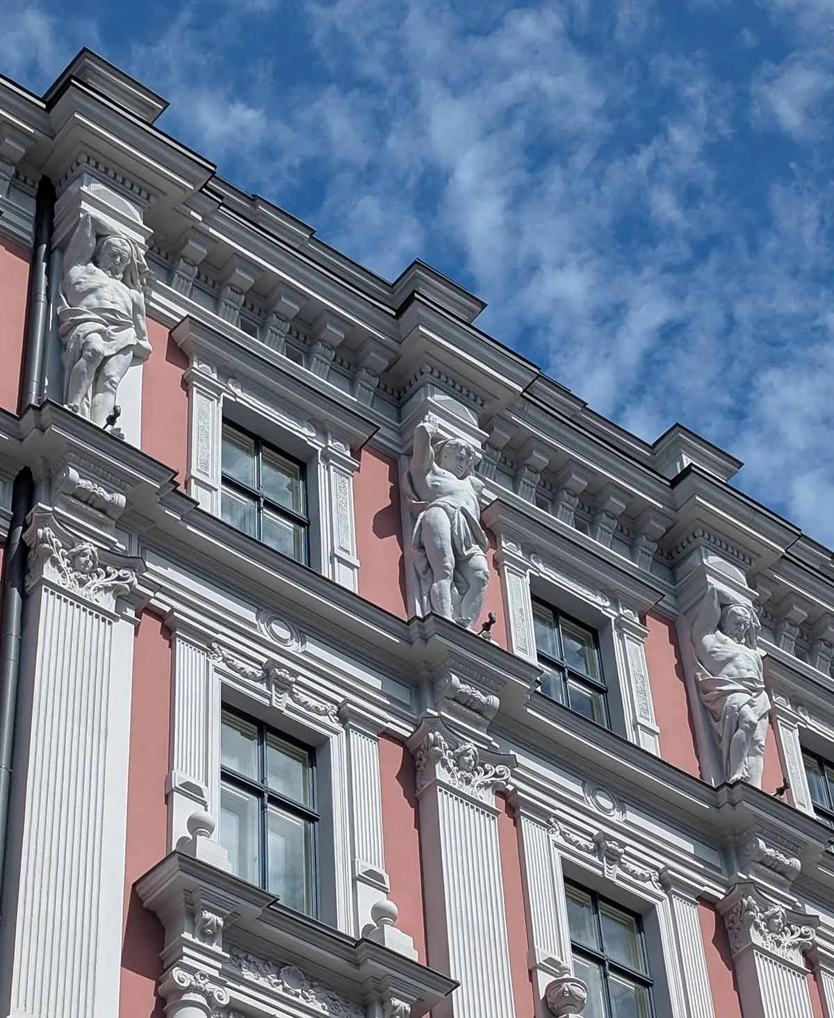
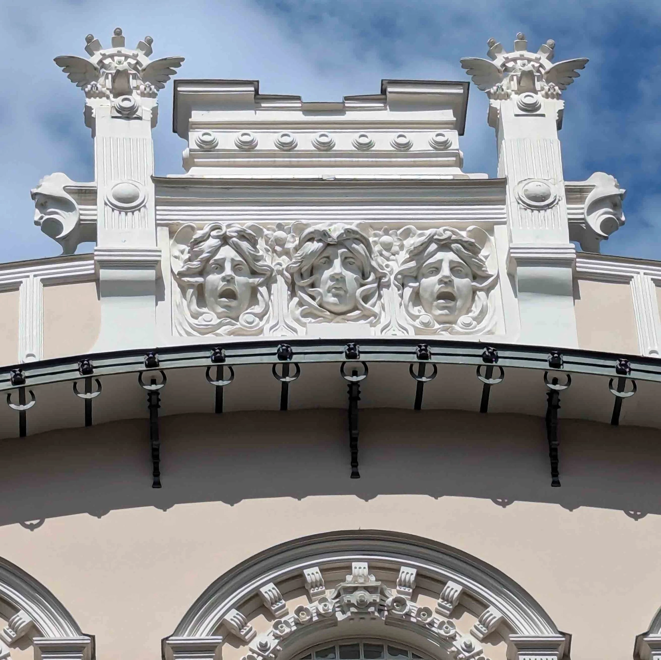
After my excursions on my nature and birding tour with Marko Poolamets and my trip to the Applied Arts Fair in Riga, I stayed in Pärnu for the next couple of weeks. While that meant a lot of studio time, it also meant a lot of long walks exploring everything Pärnu has to offer - which is a lot!

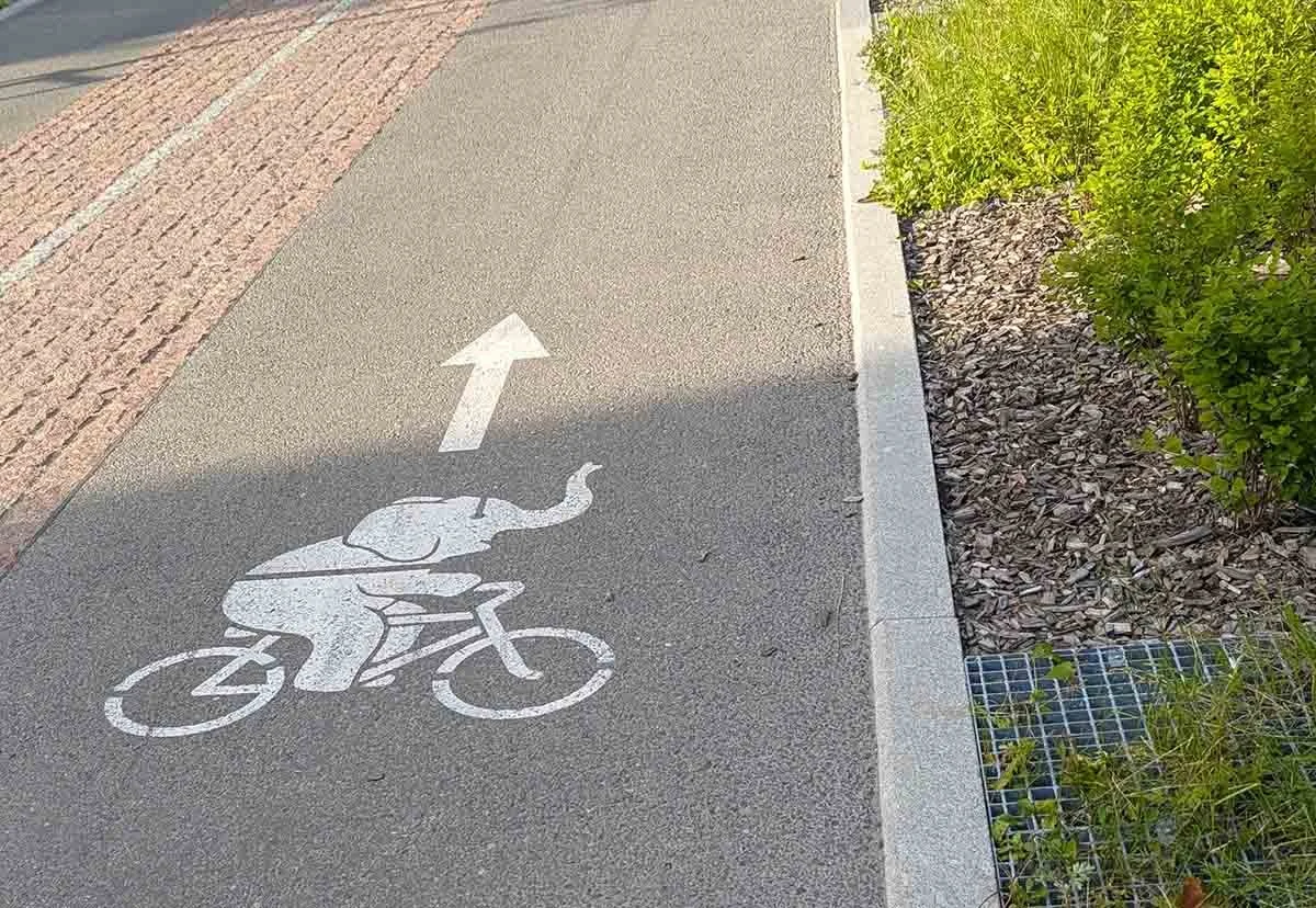
On the touristic side, Pärnu’s city symbol is the elephant, and there are concrete elephants strewn throughout the parks and roundabouts, and a large elephant slide is in the sea. There is a quaint Old Town, filled with souvenir stores, fashion shops, and restaurants. My favorite restaurant is a little vegan cafe called Liana Kohvik, but there are a lot of other nice options! There are also multiple malls, where you can get groceries, high end clothing, restaurant meals, and so forth. There are quite a few retailers outside of Old Town, including fabric stores, outlets, and secondhand and vintage shops.

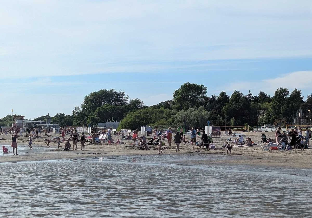
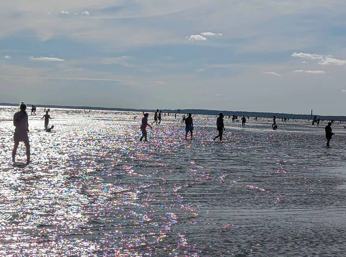
There’s also a lot of beautiful nature! My most scenic walk is is an approximately 5 mile loop through parks and residential neighborhoods down to the protected meadow, out to the beach, along the beach until it ends at the jetty, and then back up and through a park with a sculpture walk. There is always some wildlife to enjoy on that walk, including frogs, birds, and insects. I also really like walking along and across the river.

After almost three weeks and while doing a deep dive online, I discovered an artists’ guild that I hadn’t yet found in Old Town, and I was so confused - but when I went to it, I discovered why: they’ve closed off the whole street for construction for the whole month! With determination, I found an alternate route through back alleys and was pleased I did - it’s got a lot of great artists. There are other arts organizations here as well including the City Gallery and Artists’ House, and the Museum of New Art.

You can click into any of these cropped thumbnails to see the whole, larger images! They’re a mishmash of everything I mentioned above and some extras, like my favorite tree and the cat who demanded a lot of pets while I was eating vegan sushi.

New Artwork: Woven Thresholds

I’ve been painting red flowers lately, and I intentionally chose to continue that trend since I was building around a component I planned to use from the start: a jacquard folk pattern trim I picked up at Karnaluks OÜ in Tallinn. Once I saw a stand of vivid tulips, the rest of the composition came together..

The process differed from Between Worlds. Here, I painted the floater panel and tulips first, then laid down plastic and painted the lace pattern on top of it. After removing both those layers, I worked through a wide range of compositional options before settling on this angled, mirrored lace overlay. From there I secured the lace, added the trim, then cleaned up and secured the back. This was the second piece I started, but the third to finish! The delay was due to the sequential steps I needed to complete, each of which involved drying/curing periods.

Iconographically, tulips function as shields, threshold filters, and barriers across multiple traditions, a symbolism rooted in their nyctinasty: they close their petals tightly at night or on cloudy days, sealing their core away from cold, damp, and nocturnal threats. That self-protective habit is part of why tulips are believed to draw in positive energy while keeping poverty, bad luck, and hostility from crossing into the home, and why they carry associations of safety within oppressive environments. The lace adds a further veil over the tulips, while the mirrored, overlapping composition contributes a sense of movement and dissonance.

The outer border carries its own layer of meaning: it is a traditional Baltic woven band steeped in regional folklore and protective symbolism. Its color scheme has historically represented life, fire, and an active shield against negative energy. The pattern combines two ancient Baltic symbols: the Cross of Māra, tied to the Latvian goddess of earth and home and read as a sign of grounding and stability, and the hourglass motif, which represents the rhythm of time and the meeting point of the spiritual and physical worlds.

This is Woven Thresholds, acrylic, lace, and jacquard trim on wooden floater panel, 14x11x.5”, 2026.

Shelby Prindaville’s mixed media lace painting of tulips on a floater panel with Baltic jacquard trim.

Riga's Applied Arts Fair

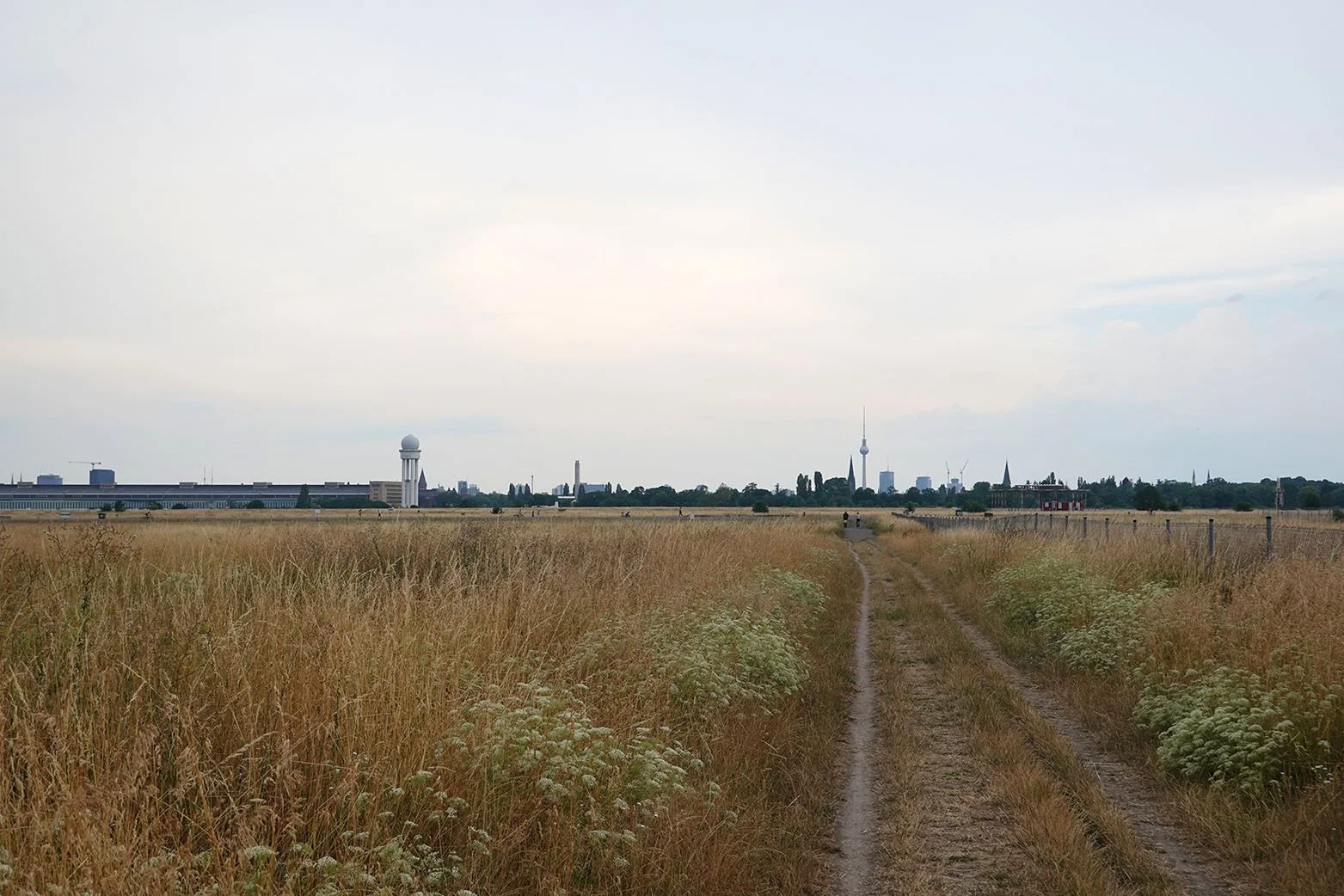
I knew I wanted to visit the capital of Latvia while I was in the area, as it’s about 2.5 hours away from Pärnu so it’s a doable day trip. When I learned that there was the best traditional crafts fair of the year happening in Riga at the Ethnographic Open Air Museum of Latvia during my stay, I bought my bus and fair tickets right away!

Though Riga is 2.5 hours away, getting to the museum took another 45 minutes or so of waiting and transit, but then I arrived! There were around 150 vendors of various types - basket weavers, woodworkers, ceramists, toy makers, farmer’s market stalls and bakers - and I would estimate maybe 90 of the vendors offered woolen goods including cloth, belts, clothing, mittens, socks, hats, and other accessories. In addition to those stalls, there were three major refreshment areas where attendees could buy food and drinks and port-a-potties were stationed nearby.

The fair was so big that I had to carefully section it as I went through, and it took me about three hours before I was confident I had seen each vendor. A handful of stations also had live demos, and there were also musical performances and a Latvian children’s play happening on a nearby stage.
Though I didn’t buy much due to a combination of minimal luggage space, costs and size of offerings, and the fact that I don’t tolerate wearing wool directly on my skin, I really enjoyed browsing all of the wares. Afterward, I wandered through part of the Ethnographic Open Air Museum. Then I headed back to central Riga by bus, and by the time I arrived, it was already after almost all the museums and shops had shut. I got dinner at a nearby mall food court (a surprisingly delicious meal!), and then hopped on my bus back! I do plan to return for another day trip, since I didn’t really see much of Riga overall beyond the Ethnographic Open Air Museum.

New Artwork: Sower's Shadow

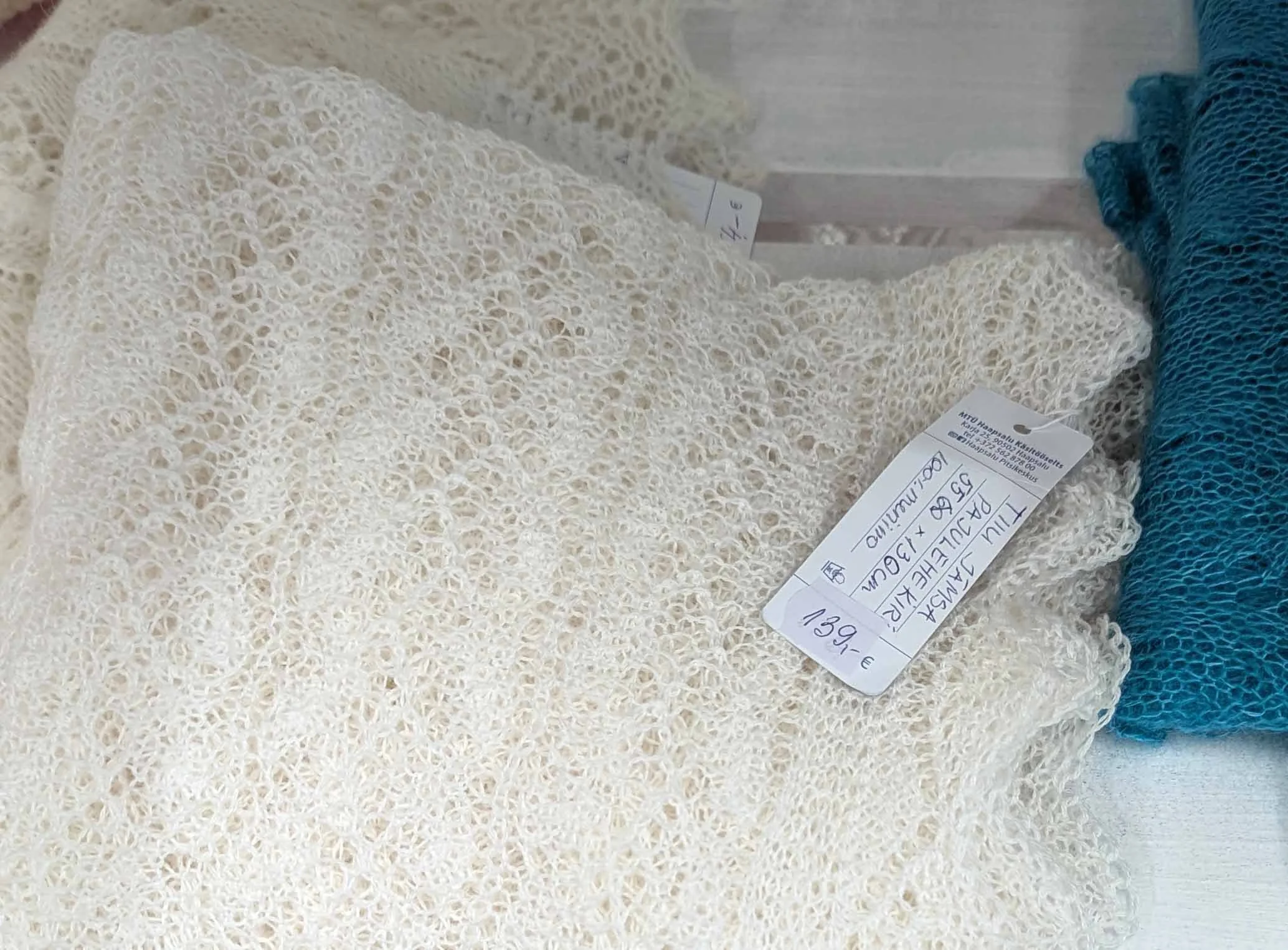
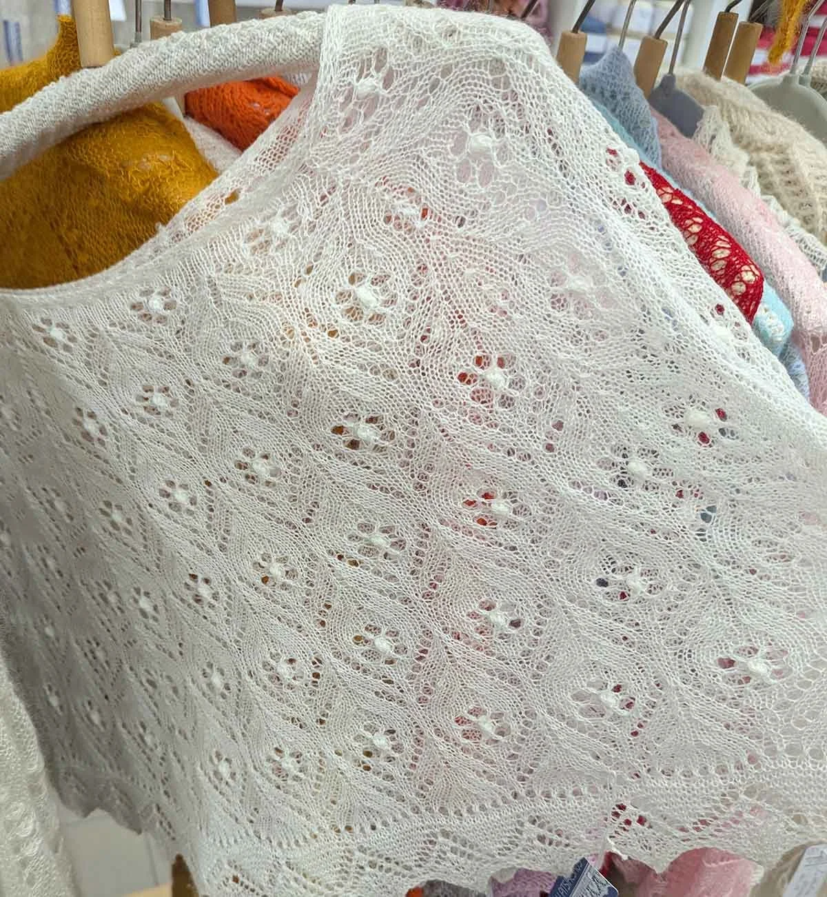
Wool is ubiquitous here in the Nordic-Baltic region, appearing in many forms: knitted, crocheted, and felted into clothing, mittens, and gloves; accessories like hats, necklaces, and pins; and home goods like placemats, blankets, and children's stuffed animals.

When I came across a felt letter board at a vintage shop in Pärnu, it spoke to me as a viable substrate. I wanted to incorporate wool in some way into my Estonian body of work given its regional importance, and I also liked the idea of converting a familiar mechanism for rigid text-based communication into artwork that through removal of its frame, rotation, and incorporation of organic form brings new associations.
This second finished mixed media painting depicts a rook (Corvus frugilegus). A member of the corvid family (which also includes crows, ravens, and jackdaws), rooks forage on arable land and nest close to farms and villages.

This is Sower’s Shadow, acrylic, molding paste, and matte medium on felt letter board, 11x14.9x.4”, 2026.

Shelby Prindaville's painting of a rook on a felt letter board.

New Artwork: Between Worlds

My first finished mixed media painting in Estonia depicts a white stork (Ciconia ciconia).

The substrate is antique lace over wood panel. My process involved attaching the lace to the panel, painting the portrait, removing the lace and altering the coloration of the wood panel surface, and then meticulously re-registering and attaching the lace back on top and sealing it down.

These birds are embedded in Estonian rural life: they're associated with summer farms and considered good luck omens. Storks are also important in folklore, as they accompany souls to the underworld and bring newborns into the world as a part of a cycle of death and rebirth in Finno-Ugric mythology.

This is Between Worlds, acrylic and antique lace on wood panel, 14x14x1.5”, 2026.

Shelby Prindaville's mixed media lace painting of a white stork.

My First Days in the Baltics - Helsinki, Tallinn, western Estonia

I flew into Helsinki, Finland; when I was looking at my flights, I saw they all routed through Helsinki to Tallinn. Since I knew I wanted to visit it during my stay, I figured I’d save on time and ferry costs if I just landed in Helsinki to begin with and then ferried down to Tallinn after a couple of days.

In Helsinki, I visited two different museums (the Architecture and Design Museum and Amos Rex), Temppeliaukio Church, and checked out Hietalahti flea market, Market Square, Old Market Hall), and the Design District. I was lucky enough to get to visit Amos Rex with a former student of mine who was also in Helsinki, so that was quite cool! As I was seeing all the arts and crafts, I noted how much knitting, crocheting, fiber arts, fabrics, and fashion are a part of the design landscape here - particularly that of women. I decided I want to lean into that for my own artwork.

Some general takeaways from Helsinki - the downtown and all associated destinations felt more contained and smaller than I anticipated. There is pretty clearly a decent vegan and vegetarian scene. The tram system is really nice. For whatever reason, Helsinki is like Japan wherein they give you the smallest of cups even for water, so you have to ask for refills constantly. Or you just outright have to pay for water, and even then it’s a tiny bottle. I much prefer the US’s large glass of free tap water approach.
After I was done touring Helsinki, I took the Tallink ferry down from Helsinki to Tallinn, Estonia. The ferry was absolutely enormous, and fortunately it did not set off any significant motion sickness. Once in Tallinn, I hauled my luggage from the port terminal to my hotel and set off on an evening walking loop of the Old Town. Note the seagull-man standoff; they were arguing about whose dinner it was that the man was trying to consume.

The next morning, I headed to Karnaluks OÜ to check out fabric and ribbon options, and had lunch in Tallinn before catching a bus down to Pärnu. After I arrived, I met with the residency directors Taje Tross and Al Paldrok, and they showed me the ins and outs of the residency and nearby neighborhood. I popped out to grab some groceries and then met up for dinner with Marko Poolamets, a Renaissance man. Amongst his many professions, he serves as a nature photographer and tour guide; I had booked the next day with him and his gear. He is also a university professor of marketing, an oral history interviewer, sits on the board of two museums, does environmental science work…

The next morning, Marko and I woke up quite early and went out for a long, delightful day of mostly birding (we were open to other species too, but the birds are plentiful here!). It was lovely to work with him and to get to borrow his gear, including his spotting scope with phone attachment. We spent a full twelve hours touring around a chunk of western Estonia including Matsalu and Haapsalu.

Then the rest of that first week I spent in the studio!

Upcoming: Takt Residency in Berlin, Germany

I have previously completed multiple summers with two residencies when it was logistically and/or financially efficient to do so. Because international airfare represents a significant portion of the overall expense, the timelines lined up, and the locations are reasonably close, I’m pleased to share that I will be doing another two residency summer!

Following my residency this June at Loovlinnak Creative City Artist Residency in Pärnu, Estonia, I will be undertaking a residency in July at Takt in Berlin, Germany. I’ve been working on setting this up for several months, but though it does save on airfare it nevertheless is of course more expensive than doing just one - so part of the organizing included seeking funding. Fortunately, I was just awarded a Morningside University 2026 Ver Steeg Faculty Scholarship Grant that will partially support these projects (it was a very competitive year, so I was fortunate to be funded at all and did not get the total amount I asked for… but I received enough that I’m able to personally afford the rest!).

I am very excited to get to research and document ecosystems in Baltic and Northern Europe for the first time! My interest list includes Matsalu National Park, Soomaa National Park, the Botanischer Garten und Botanisches Museum Berlin, Tegeler Fließ, and Grunewald Forest.

German is an easier language to learn for English speakers than Estonian (German is category II, while Estonian is category III), and there is a Duolingo course for it, so I now plan to memorize a few phrases in Estonian but primarily work on my German!

On a personal note, I’ve been repeatedly told by other travelers that Berlin is one of the top vegetarian and vegan meccas of the world. I’m really looking forward to experiencing that firsthand!

Upcoming: Loovlinnak Creative City Artist Residency in Pärnu, Estonia

I’m excited to share that I will be attending the Loovlinnak Creative City Artist Residency in Pärnu, Estonia this summer for a month-long stay in June 2026! This will be my first time in the Baltics, and I’m excited to experience and document the environment and atmosphere in and around the “summer capital of Estonia.”

As always, I’ll try to get some Estonian under my belt before I go. However, there are no local classes in Estonian nor is it even available on Duolingo, and it’s a language family with which I’m unfamiliar (Finnic, a division of Finno-Ugric). I imagine I’m not going to get very far with this one, but I’ll do what I can!

Japanese Site-Specific Pottery!

While I was in Japan this summer, I visited a number of important ceramic-production locations (Shigaraki, Imari, Arita, and Karatsu). I’d wanted to make ceramics during my first Arts Itoya residency, but the firing timings did not align with a one-month stay; for my second I was there for even less time due to my Kyoto solo show so I knew it couldn’t happen.

However, on this second trip I bought a small quantity of Shigaraki clay (Shigaraki is one of the six ancient kilns of Japan) and gathered volcanic ash (with the permission of my tour guide) outside of a shrine on Mount Aso. I brought these materials back with me, and made a couple of pieces!

My hope had been that the Shigaraki clay I purchased had the feldspar inclusions that lead to a sort of blistered, weeping surface; those descriptors don’t sound particularly aesthetically compelling but I really like the unique finish. However this didn’t happen with the clay I bought. It could potentially be due to how I fired it (Cone 6 electric), but from its pre-fired texture, I don’t think it had those inclusions in it to begin with. Though that was a disappointment, I am still happy with the resulting pieces.

I made a medium-sized bowl and a very small bowl, and the images below depict them individually as well as together for a better sense of scale. They are site-specific to Japan and materially meaningful!

Arts Itoya 2025 Residency Artwork 5: Edge of Motion

After I painted After the Rain, I still had one sheet of the Nao Washi paper I had purchased left, and I was still very interested in working with the sumi as well - so I decided to make another in the same vein! This time, the subject is a grey heron (Ardea cinerea) I spotted hunting in a river. I fortunately finished this painting just ahead of when I needed to pack up at the end of the residency!

This is Edge of Motion, sumi and acrylic on washi paper, 5.3 x 15", 2025.

Arts Itoya 2025 Residency Artwork 4: After the Rain

In my travels in Japan, I’ve repeatedly come across calligraphy tools, artwork, and even participated in a 5th grade calligraphy lesson last year in Yamanashi City! In art classrooms in the US, the primary liquid ink we use is India ink (sometimes called China ink). Sumi is a bit different; the primary differentiator is that liquid sumi is typically soot bound with a synthetic glue that is not waterproof, so it can be lifted even after it dries. India ink is typically waterproof after drying. Sumi also has a more expressive and variable tone compared to the uniform performance of India ink.

In Japan, there is a type of artwork called sumi-e, which are ink wash paintings. They are often 100% sumi, though some add small accents with red ink and you can find some outliers that expand the color palette just a bit further. By adding acrylic paint, however, I have definitely strayed outside of making a traditional sumi-e. This would be better classified as mixed media, inspired by sumi-e. I painted atop a washi paper I purchased at Nao Washi in Saga.

The subject of this painting is a Japanese native freshwater crab (Geothelphusa dehaani) called sawagani (サワガニ). I have seen these crabs all around Japan, often in and around streams but also venturing further afield in evening rains. I encountered this one on the street while biking home from the studio one night right after the rain had stopped.

This is After the Rain, sumi and acrylic on washi paper, 5.3 x 15", 2025.

Arts Itoya 2025 Residency Show: Ikigai, Continuing

My June 2025 show card design for Ikigai, Continuing.

The Arts Itoya residency show and reception was scheduled earlier in June 2025 than it was in June 2024 and I arrived five days late due to my show at Kansai Gaidai, so I only had three works finished for my Arts Itoya show (as well as a work in progress!). I titled my show Ikigai, Continuing 「生き甲斐・再び」, to connect it to my June 2024 Arts Itoya show Ikigai 「生き甲斐」. To the right you can see the show card face which I designed!

The reception was a great time; it was four hours long and quite a few people stopped in to check it out. I had invited a very well-known artist from Takeo, Takeru Niizato, to stop by (and also asked if I could set up a visit to his atelier after our show came down); he was very kind and took the time to attend our reception and scheduled our visit for later that week.

Below are some photos from my show reception!

Arts Itoya 2025 Residency Artwork 3: Blue Hour (藍影)

Painting tanuki (Nyctereutes viverrinus) unintentionally became a multi-year quest, which lived up to the yokai version’s reputation for illusions and light-hearted trickery.

I decided to paint them on the fan-shaped washi paper which I dyed with indigo (aizome) in my workshop in Tokyo in mid-May. Due to the coloration of the washi and the folkloric aspect of tanuki, I chose to paint them in a limited color palette which isn’t completely monochromatic but which has indigo as the key color.

Tanuki are nocturnal, so the English title Blue Hour felt appropriate as the blue hour is a term for the short period of twilight just before sunrise or just after sunset. The Japanese title is 藍影 (Aikage), which means Indigo Shadows.

This is Blue Hour (藍影), acrylic and traditional indigo dye on fan-shaped washi paper, 7.7x15.75”, 2025.

Arts Itoya 2025 Residency Artwork 2: Even the Shadows Are Fresh

There’s a word in Japanese that doesn’t quite have a satisfying translation to English: 新緑 (shinryoku). It’s the new, lush green of early summer. One of the plants that always captures that feeling for me is the ginkgo tree (Ginkgo biloba). I wanted to capture 新緑 in a painting of ginkgo leaves.

In researching possible titles for this painting, I learned that the ginkgo tree holds particular significance in Japan as one of the “survivor trees” that survived the atomic bombing of Hiroshima. I watched a short documentary on the man who has dedicated himself to caring for these trees and the trees themselves here. I highly recommend watching it; it is a moving story.

I also was inspired by haiku about shinryoku and related concepts like wakaba and midorisasu, like this poem from the poet Teruko from the Rainier Haiku Ginsha: “は一色ならず色重ね (shinryoku wa hitoiro narazu irokasane) / fresh green is not one color but layered hues.”

This is Even the Shadows Are Fresh (新緑), acrylic on round wooden panel, 12x12x.875”, 2025.

As a little bonus, here are a few images I’ve gathered of ginkgo leave motifs around Japan!