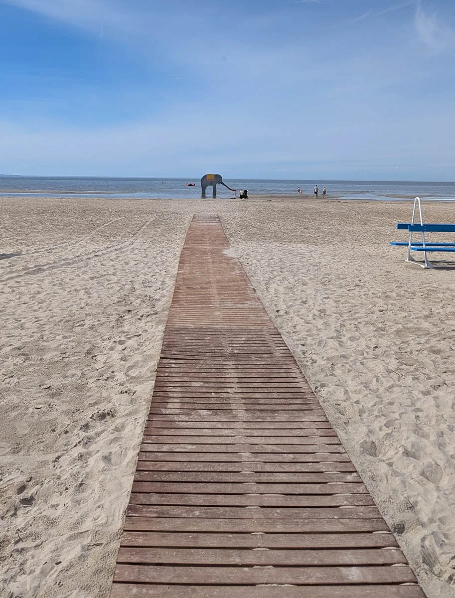
One of my consistent practices when traveling abroad is seeking out arts and flea markets, antique stores, vintage shops, and secondhand dealers. This has become part of my research methodology: an opportunity to encounter reference material, regional craft traditions, and occasionally, nontraditional media or substrates that find their way into the work. While I walk out of most places empty-handed, that's fine; the practice is cumulative.
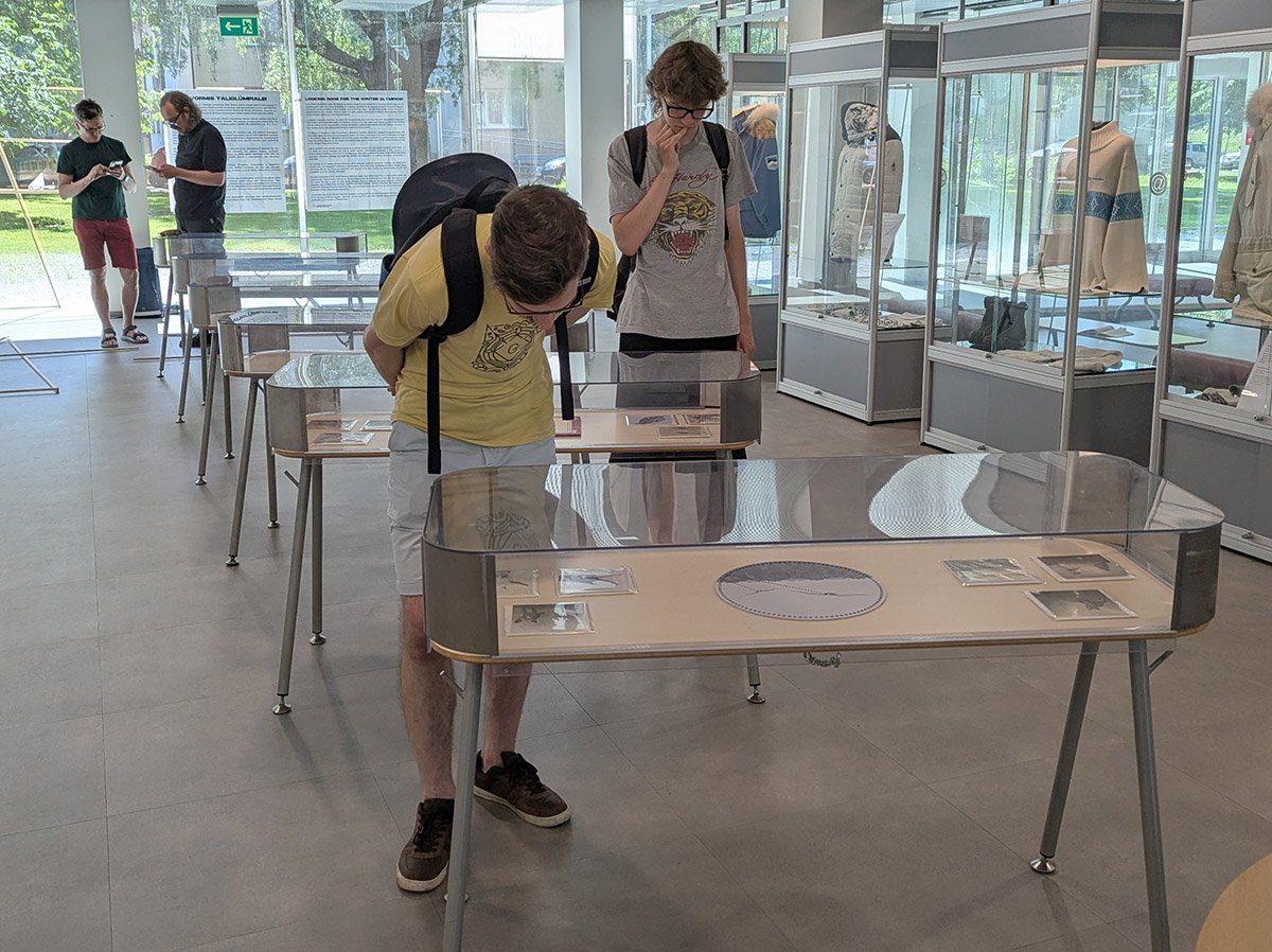
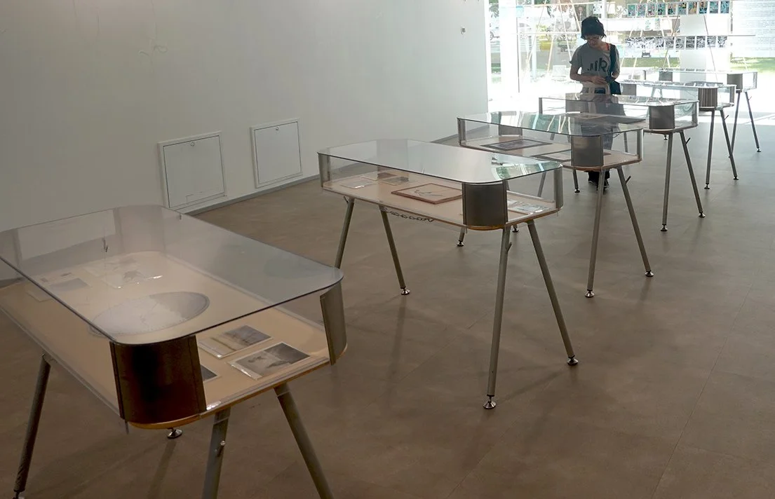
On my second-to-last weekend in Pärnu, I came across an unbranded antique shop that doesn't appear on Google Maps and opens only when the owner feels like it and puts out a sign on the street. Inside, I found a small cache of printed stationery from the Soviet occupation period, issued under the ENSV, the Eesti Nõukogude Sotsialistlik Vabariik, or Estonian Soviet Socialist Republic. Most of the material was too damaged for my purposes, or carried handwriting and other visual noise that would compete with the work. A few pieces, however, were relatively clean.
The surface is extraordinarily loaded. It's also materially demanding: decades-old printed, coated cardstock that requires careful handling and preparation. I purchased the few that might suit my purposes and got to work.
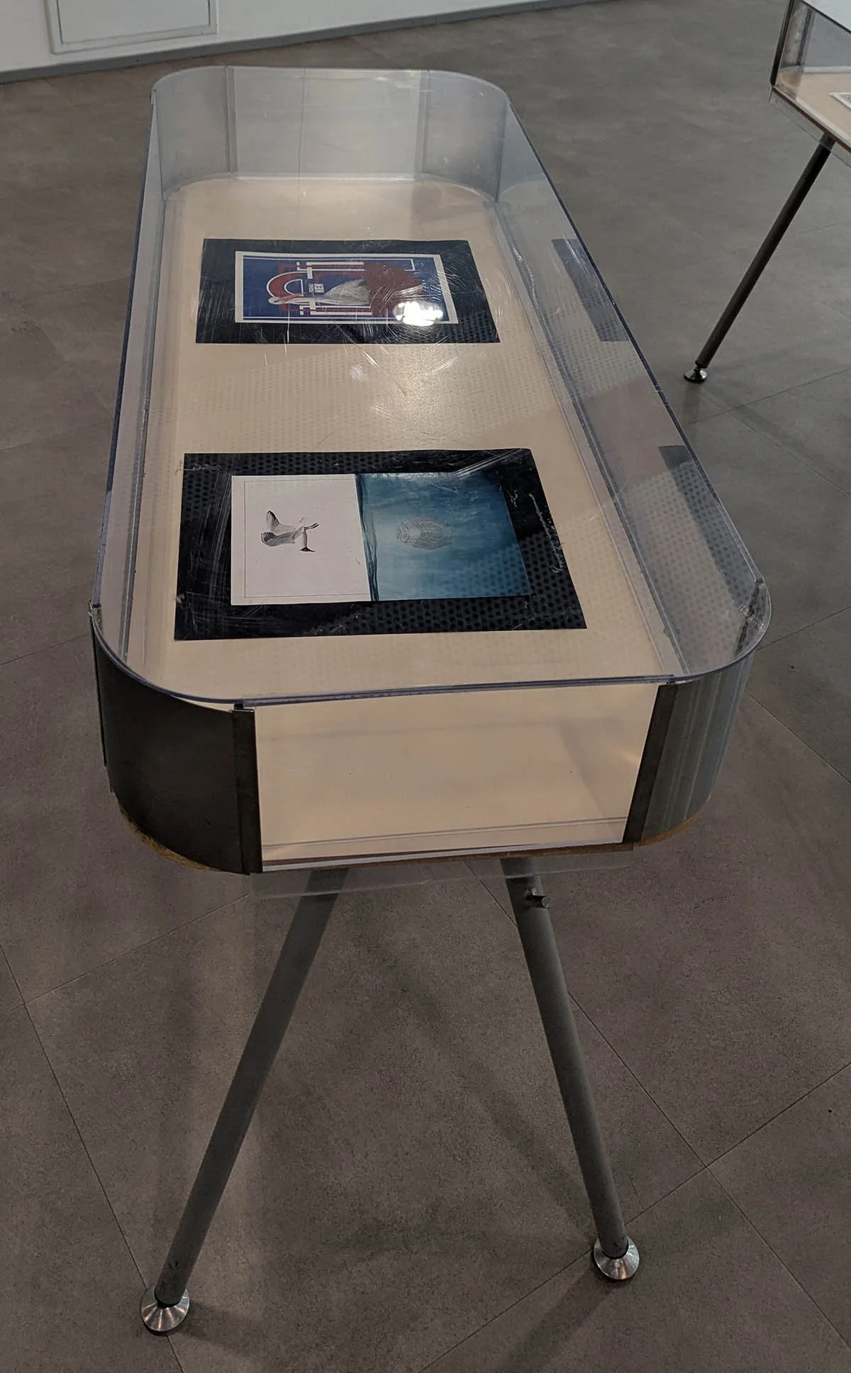
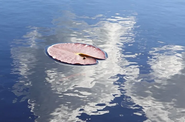
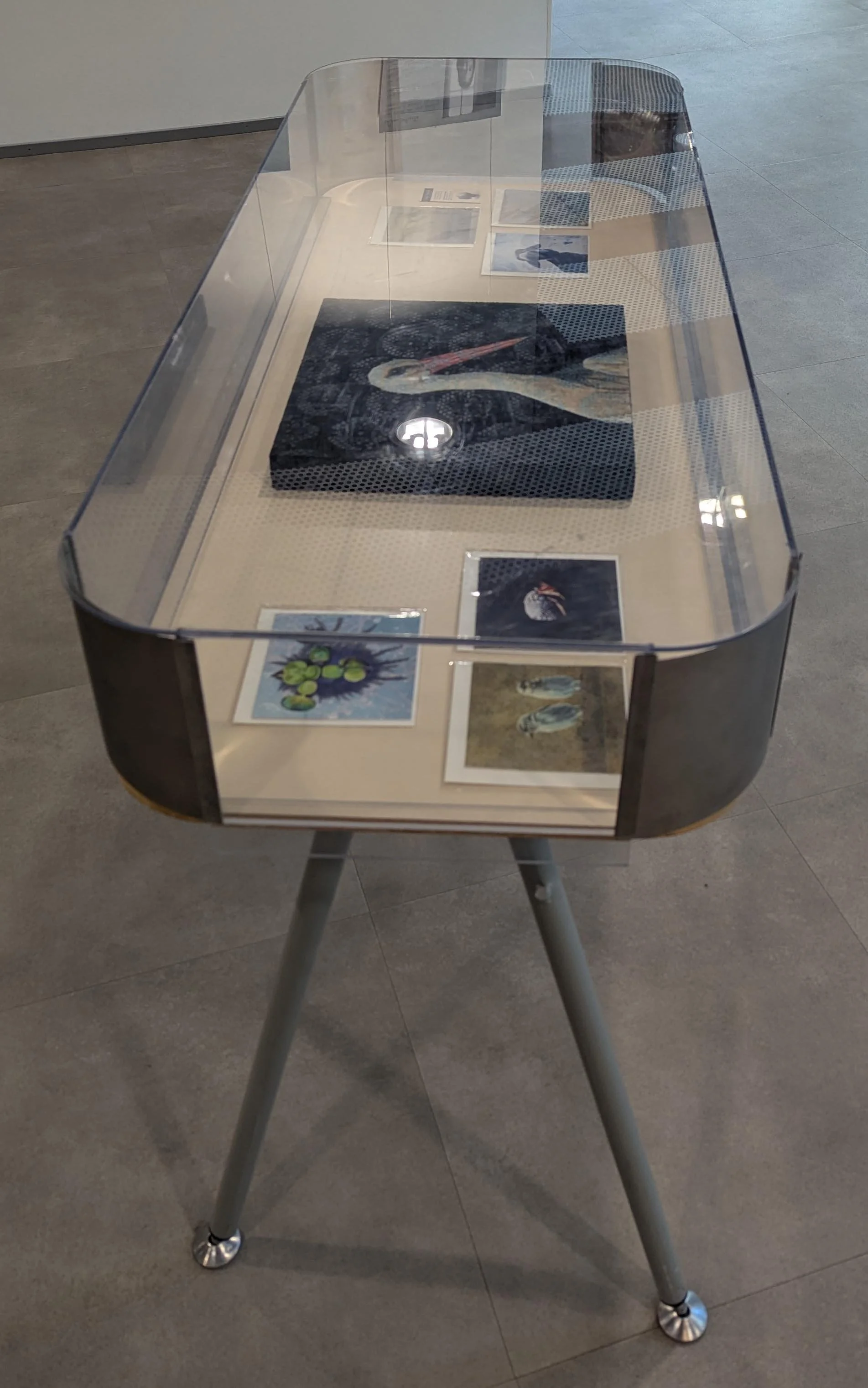
For this first piece, I inverted the cardstock and painted a split-level waterline view of the Baltic Sea directly over the now upside-down state emblem and its slogan. The sinking emblem remains visible, and traces of the communist motto persist in the lower register: Kõigi maade proletaarlased, ühinege! The standard English translation is "Workers of the world, unite!" though a more literal rendering would be "Proletarians of all lands, unite!"
Above the sea, a black-headed gull scans the surface below. In two earlier paintings from this residency, black-headed gulls appear as drone stand-ins, complete with stylized laser beams that complement their substrates’ perforations. Here, that same subject returns, but without overt weaponry.
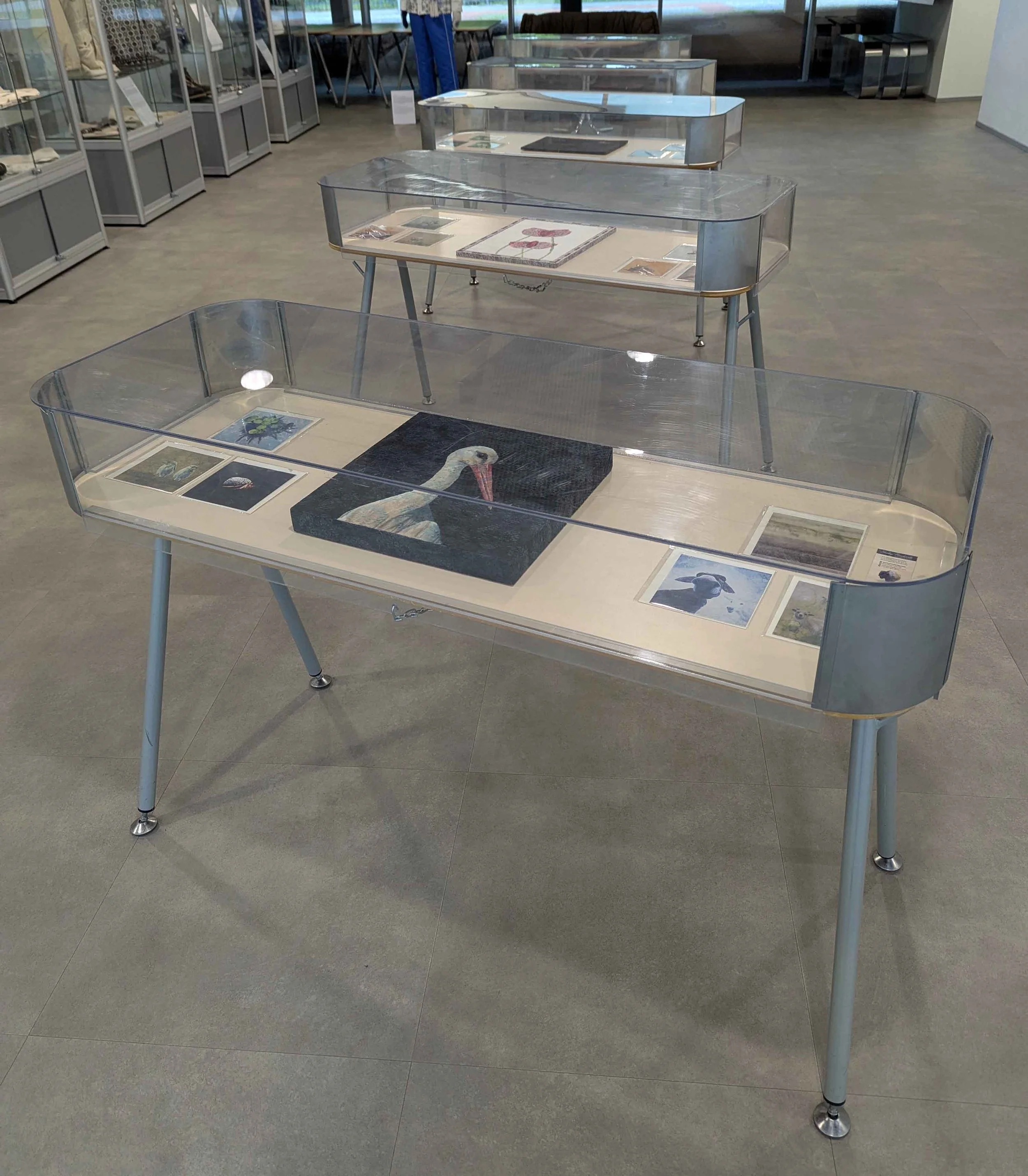
This is Submerged Memory, acrylic on occupied Estonian printed cardstock from 1974, 11.38x8.2”, 2026.