Shelby Prindaville

New Artwork: The New Collective

This piece continues my series of paintings atop printed stationery from the Soviet occupation period in Estonia, issued under the ENSV (the Eesti Nõukogude Sotsialistlik Vabariik, or Estonian Soviet Socialist Republic).

The substrate features Soviet-era industrial graphic design for Pärnu KEK (the Pärnu Külaehituskombinaat, or Collective Farm Construction Office). Founded to build infrastructure for rural collective farms, KEK eventually expanded into a broader portfolio of late-Soviet modernist architecture, becoming one of the more distinctive construction enterprises of the era.

I chose to paint another realistic, volumetric stork, this time sitting in a flat graphic semicircle “nest” that mirrors the geometry of the underlying design. KEK's original mandate was building the physical infrastructure of agricultural Estonia. Storks nest reliably on farm rooftops and chimneys across Estonia, colonizing the infrastructure the decommissioned collective left behind.

This is The New Collective, acrylic on occupied Estonian printed cardstock c. 1980, 11.38x8.2”, 2026.

Shelby Prindaville's painting of a white stork nesting on Pärnu KEK ENSV stationery c. 1980.

New Artwork: Submerged Memory

One of my consistent practices when traveling abroad is seeking out arts and flea markets, antique stores, vintage shops, and secondhand dealers. This has become part of my research methodology: an opportunity to encounter reference material, regional craft traditions, and occasionally, nontraditional media or substrates that find their way into the work. While I walk out of most places empty-handed, that's fine; the practice is cumulative.

On my second-to-last weekend in Pärnu, I came across an unbranded antique shop that doesn't appear on Google Maps and opens only when the owner feels like it and puts out a sign on the street. Inside, I found a small cache of printed stationery from the Soviet occupation period, issued under the ENSV, the Eesti Nõukogude Sotsialistlik Vabariik, or Estonian Soviet Socialist Republic. Most of the material was too damaged for my purposes, or carried handwriting and other visual noise that would compete with the work. A few pieces, however, were relatively clean.

The surface is extraordinarily loaded. It's also materially demanding: decades-old printed, coated cardstock with a surface that requires careful handling and preparation. I purchased the few that might suit my purposes and got to work.

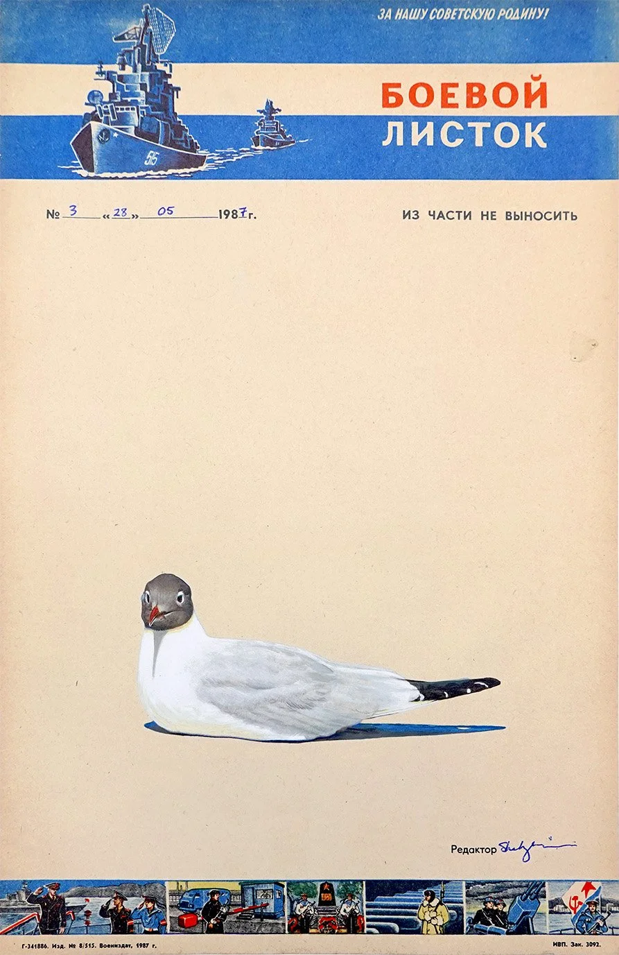
For this first piece, I inverted the cardstock and painted a split-level waterline view of the Baltic Sea directly over the now upside-down state emblem and its slogan. The sinking emblem remains visible, and traces of the communist motto persist in the lower register: Kõigi maade proletaarlased, ühinege! The standard English translation is "Workers of the world, unite!" though a more literal rendering would be "Proletarians of all lands, unite!"

Above the sea, a black-headed gull scans the surface below. In two earlier paintings from this residency, black-headed gulls appear as drone stand-ins, complete with stylized laser beams that complement their substrates’ perforations. Here, that same subject returns, but without overt weaponry.

This is Submerged Memory, acrylic on occupied Estonian printed cardstock from 1974, 11.38x8.2”, 2026.

Shelby Prindaville's painting of a black-headed gull flying over the Baltic Sea with an inverted, sinking ENSV state emblem and motto submerged in the water.

Exhibition at the Pärnu Keskraamatukogu (Central Library) Gallery!

My posts about my artwork necessarily are created after I finish them, and frequently more time passes to allow me to properly photograph and color correct the image, because I’m deciding between title options, in order to space my posts out a bit instead of posting in clumps… which is all to say that I actually managed to finish my first five paintings by June 17, even though they weren’t all online yet.

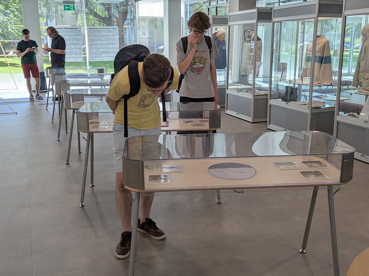
On June 18, residency director Taje Tross asked the Pärnu Keskraamatukogu (Central Library) if they would be willing to host an exhibition of my work sometime before I left, and I assumed they’d be considering a shorter show toward the end of the month - but instead they graciously agreed and asked that I show up the next day to install such that my exhibition ran from June 19-June 30! What luck: this is one of the longest international shows I’ve had as a part of a residency, and definitely the earliest. I am so appreciative I was given the opportunity to share my artwork in such a public gallery for so long (40% of the residency period!).

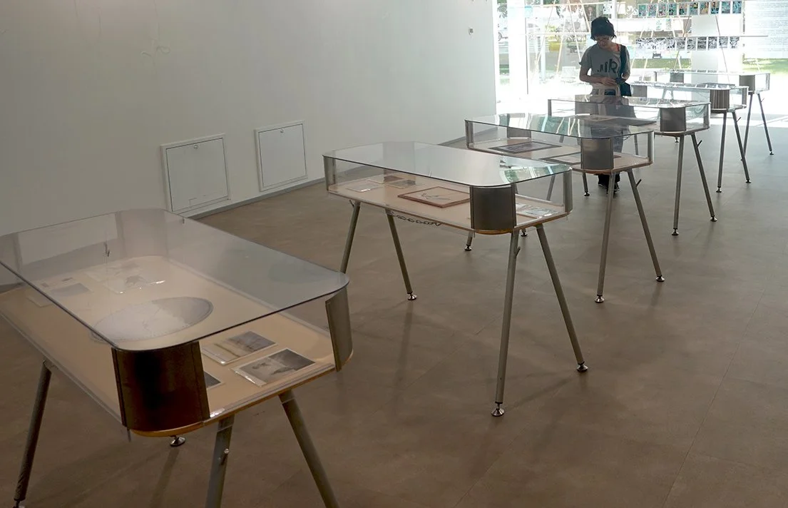
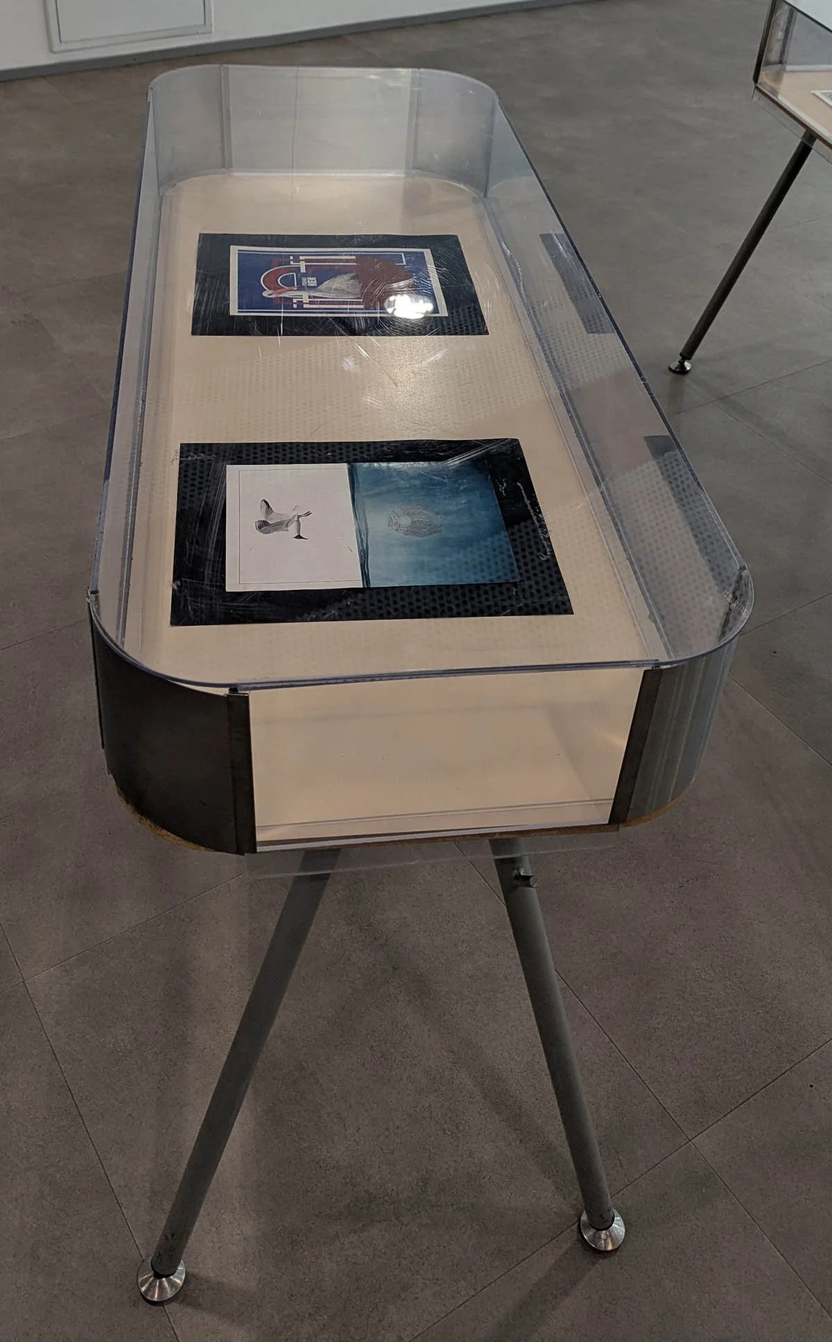
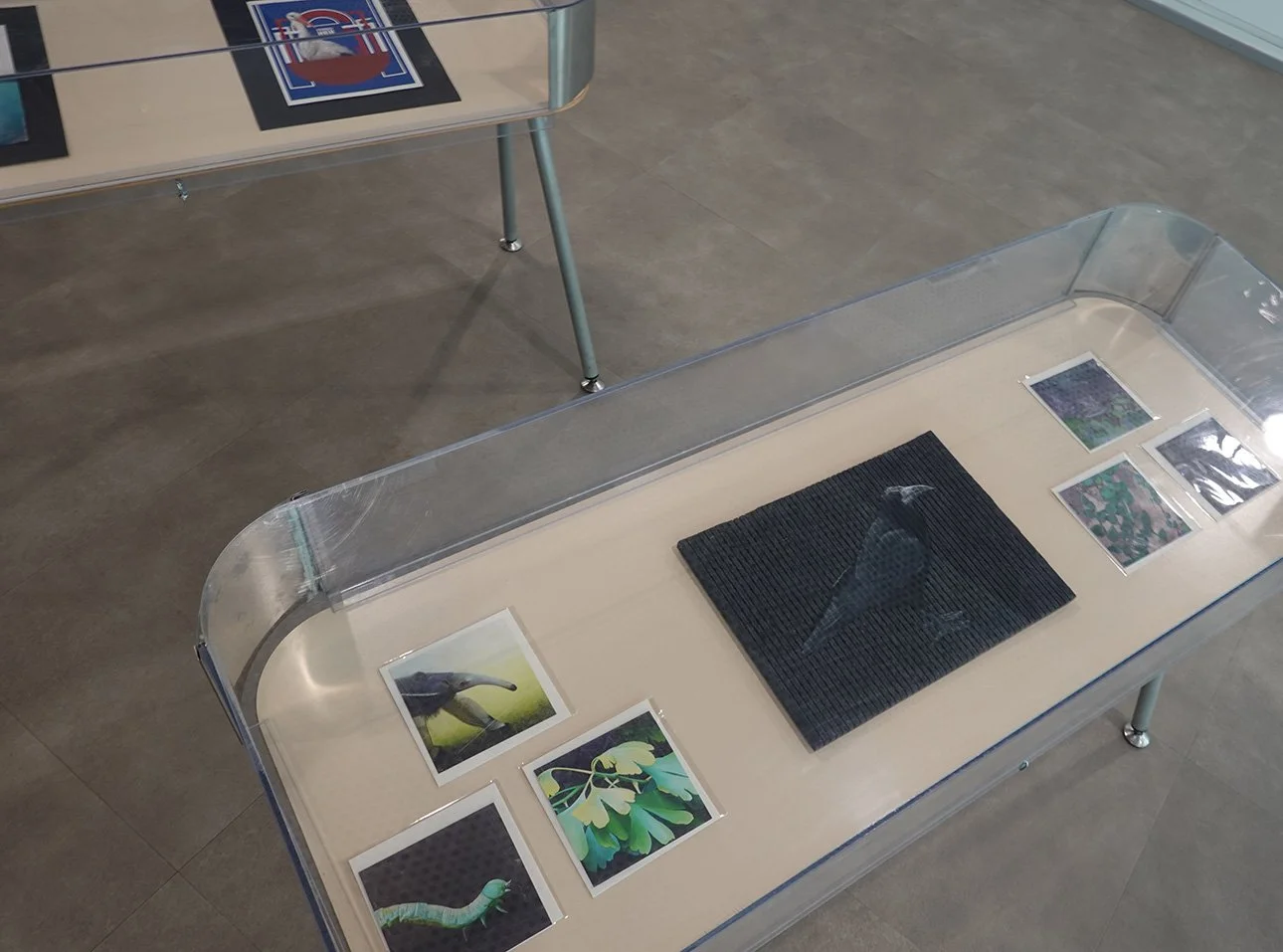
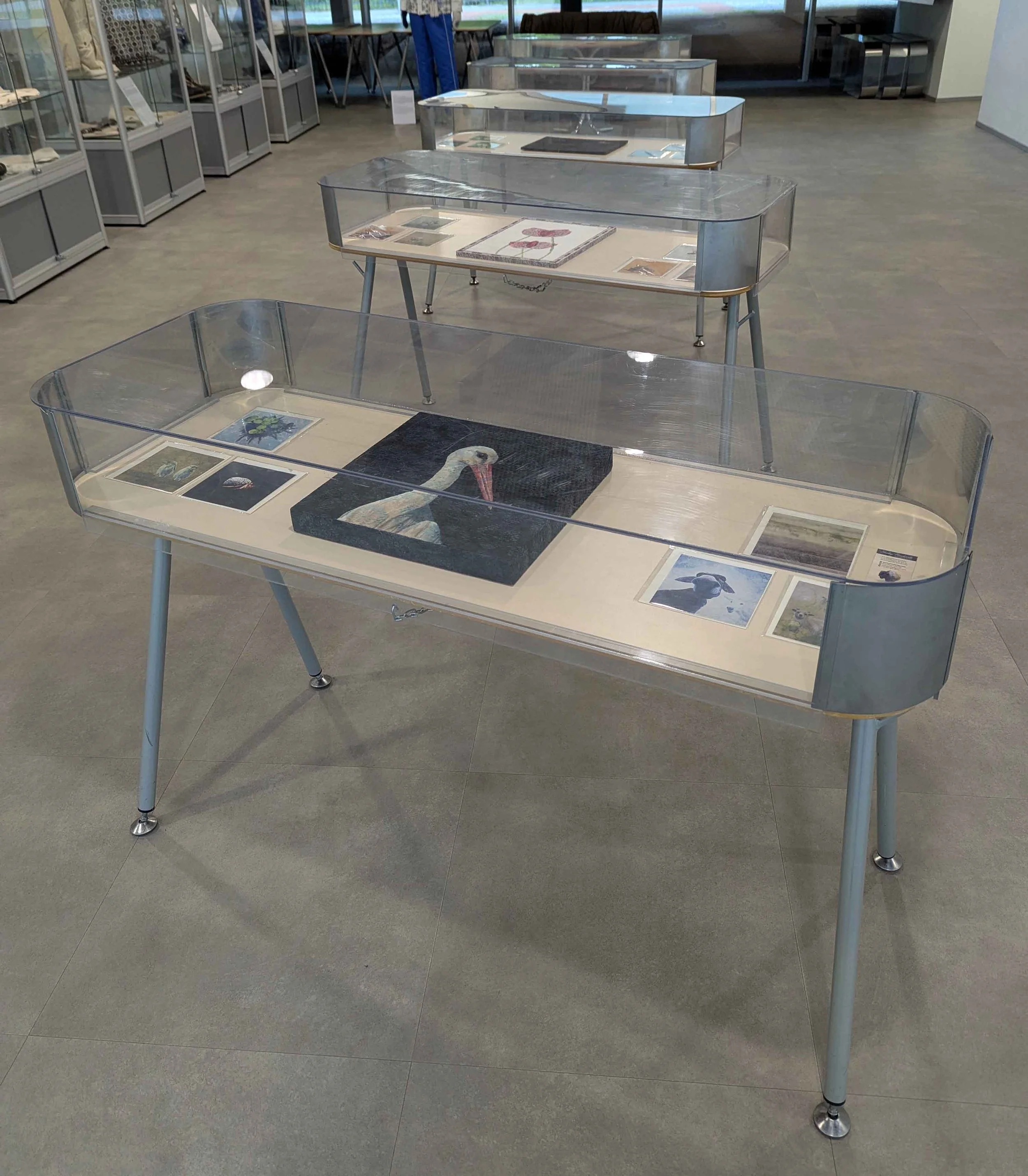
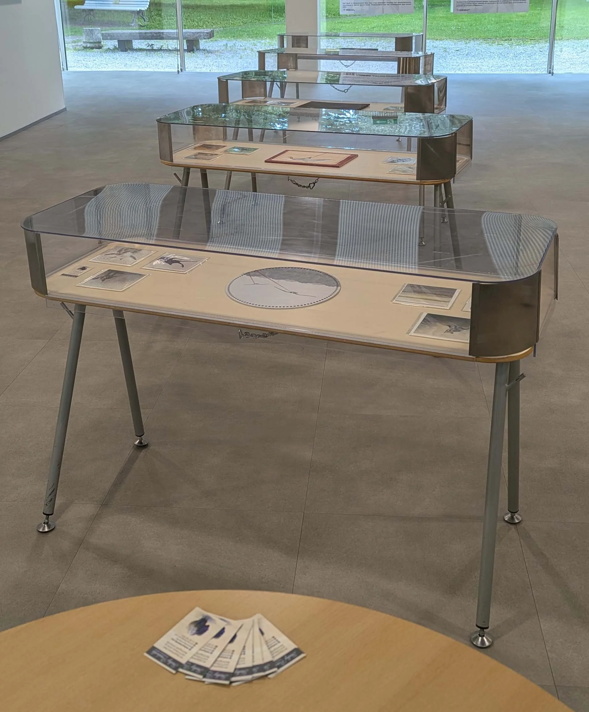
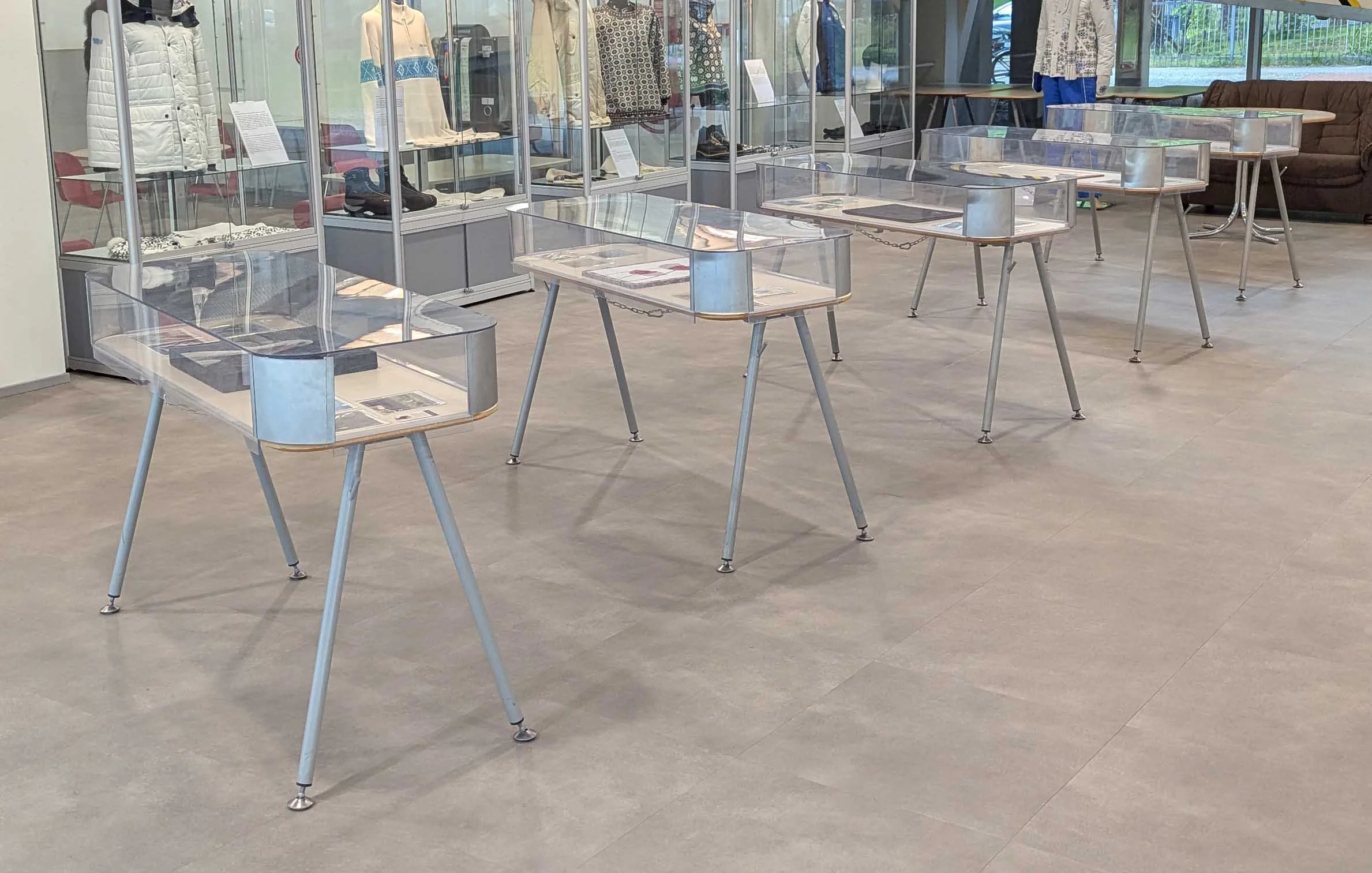
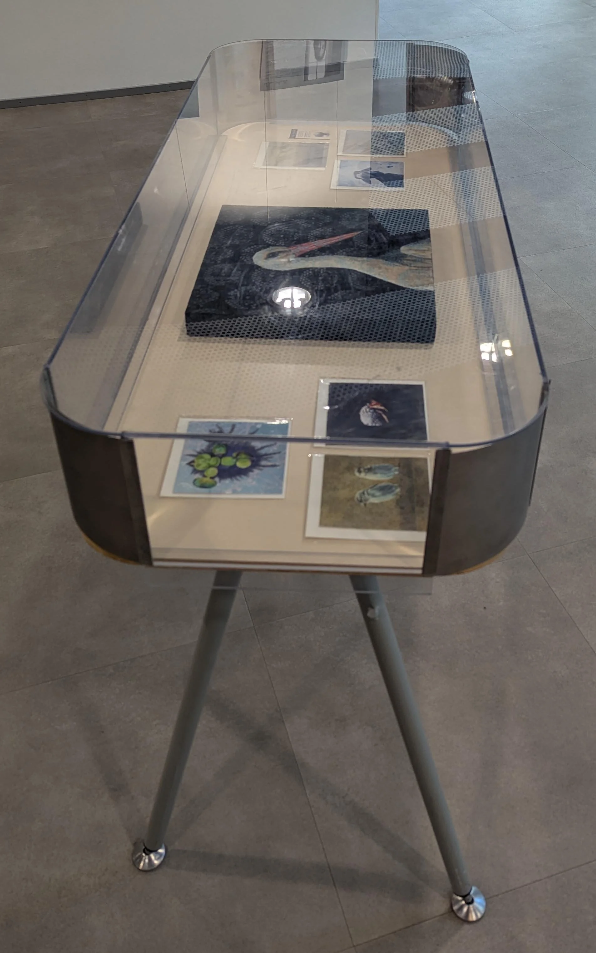
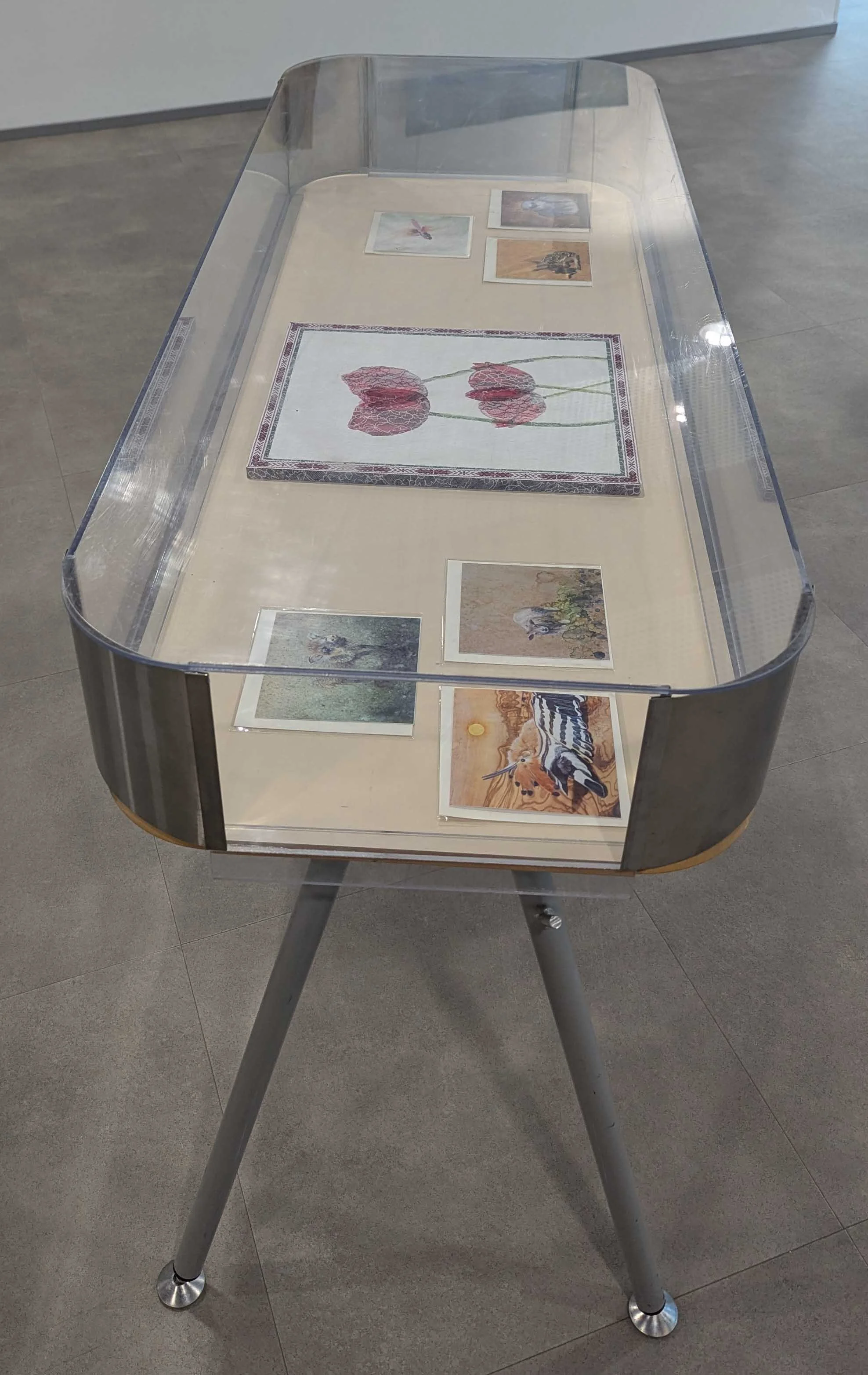
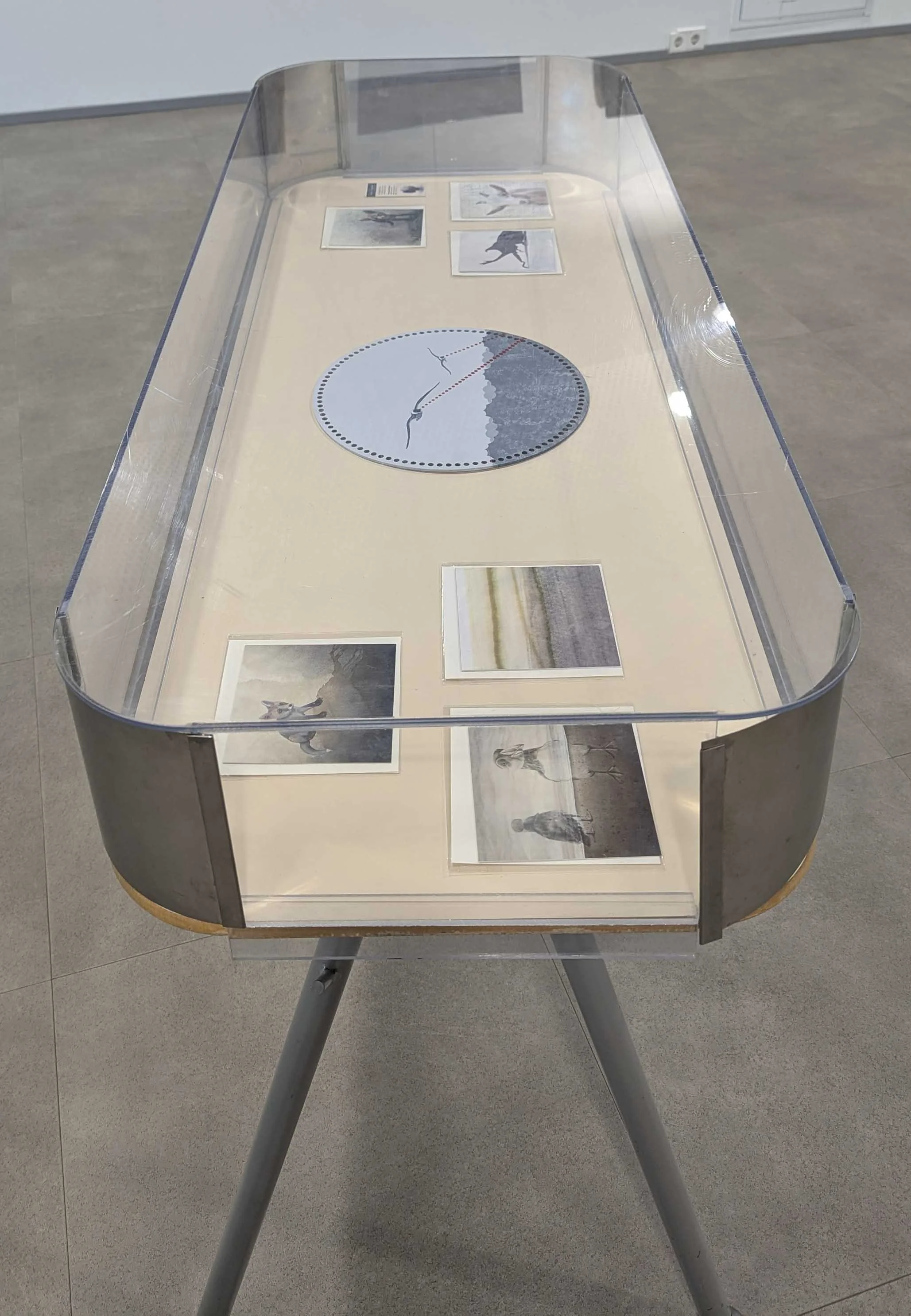
I brought all five finished paintings, along with a bunch of my greeting cards, and was given a prime set of exhibition tables with protective covers! As I finished more paintings during the show’s duration, I brought them in as well - that’ll be covered in another future post. I set up the show in their first floor gallery, and then returned to the residency to send off my exhibition information which I’m providing below.

Textiles and Territories

by Shelby Prindaville (USA)

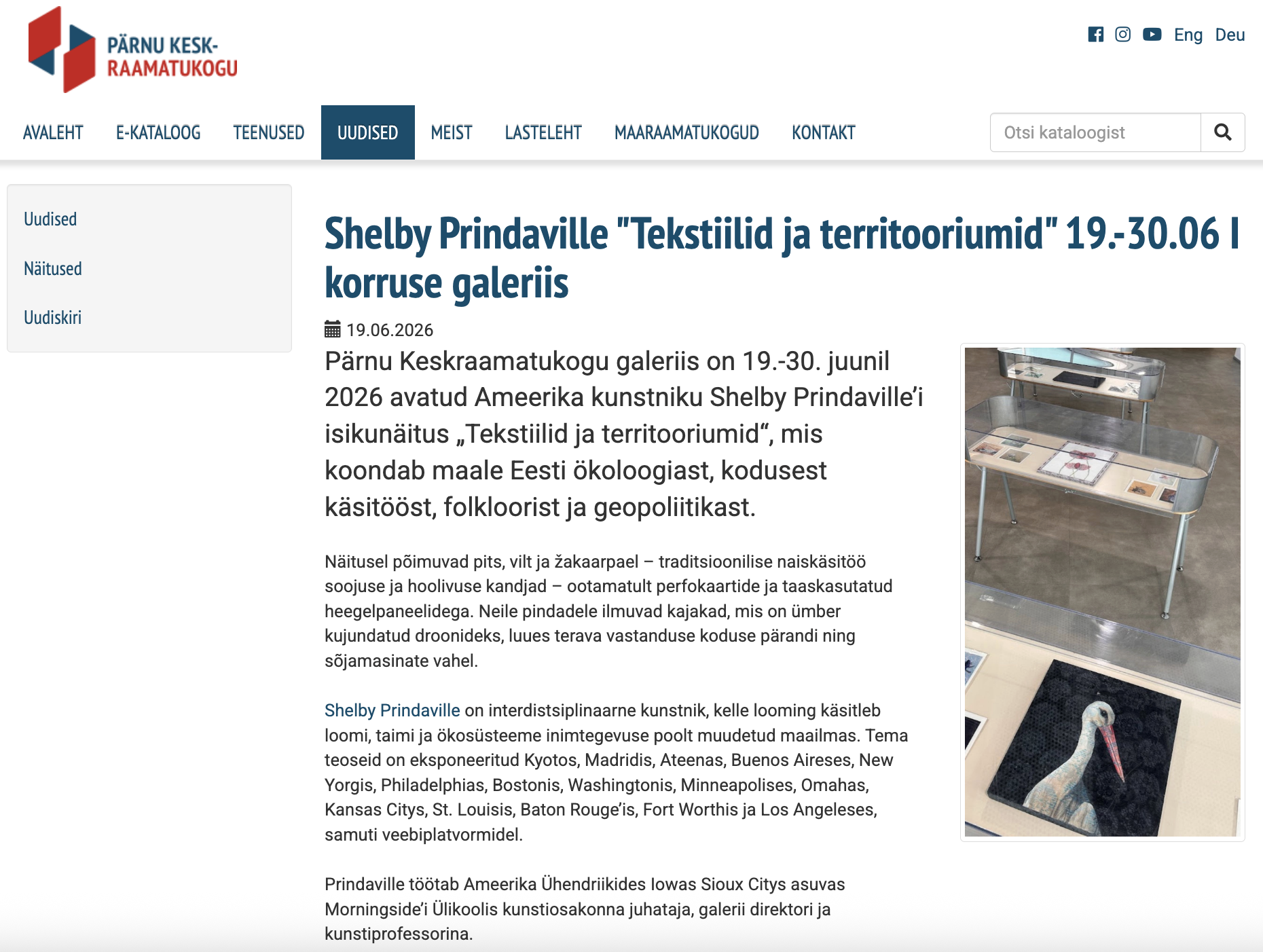
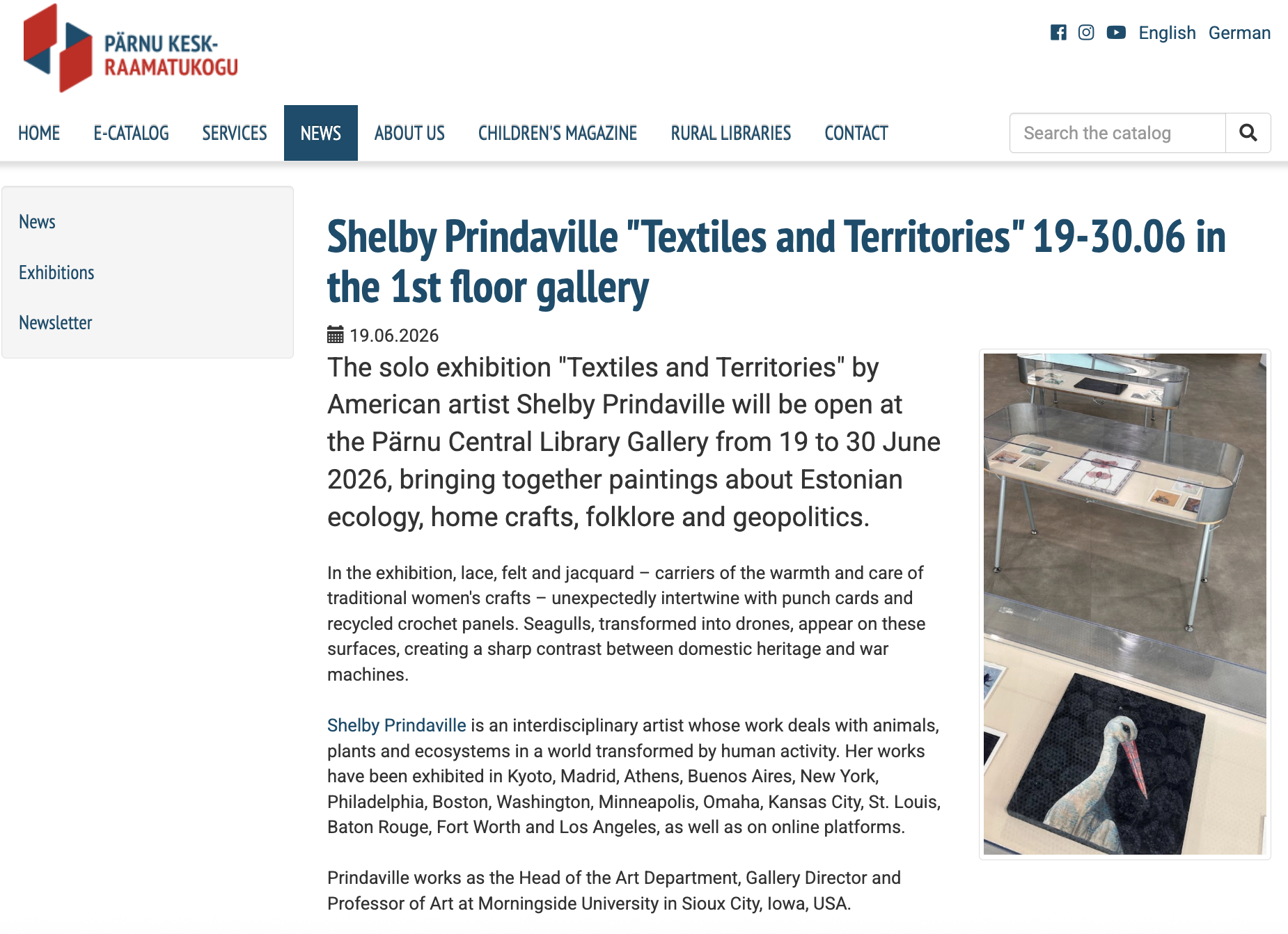
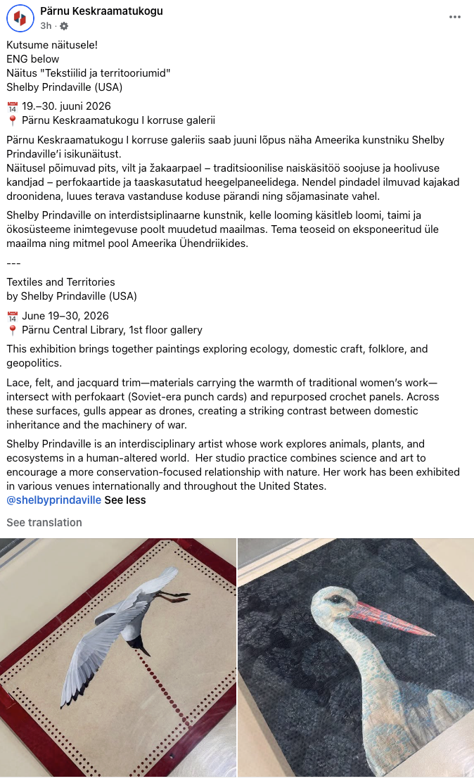
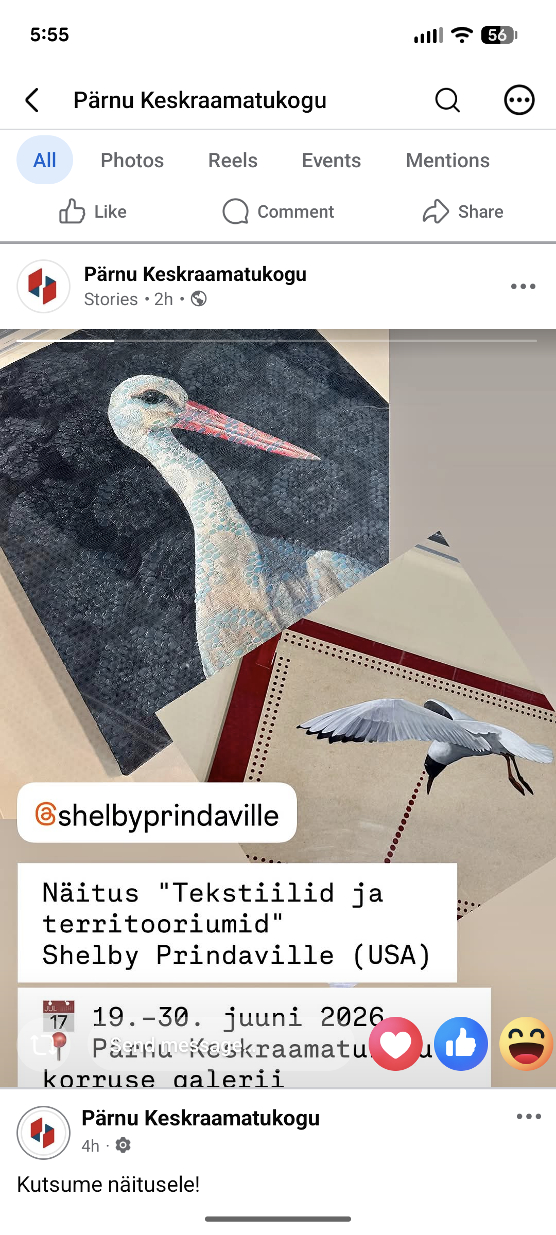
This exhibition brings together paintings exploring Estonian ecology, domestic craft, folklore, and geopolitics. Lace, felt, and jacquard trim carry the warmth and care of traditional women's work. Set against that softness, perfokaart (Soviet-era punch cards) and a repurposed crochet panel become surfaces for gulls recast as drones, a collision between domestic inheritance and the machinery of surveillance and war.

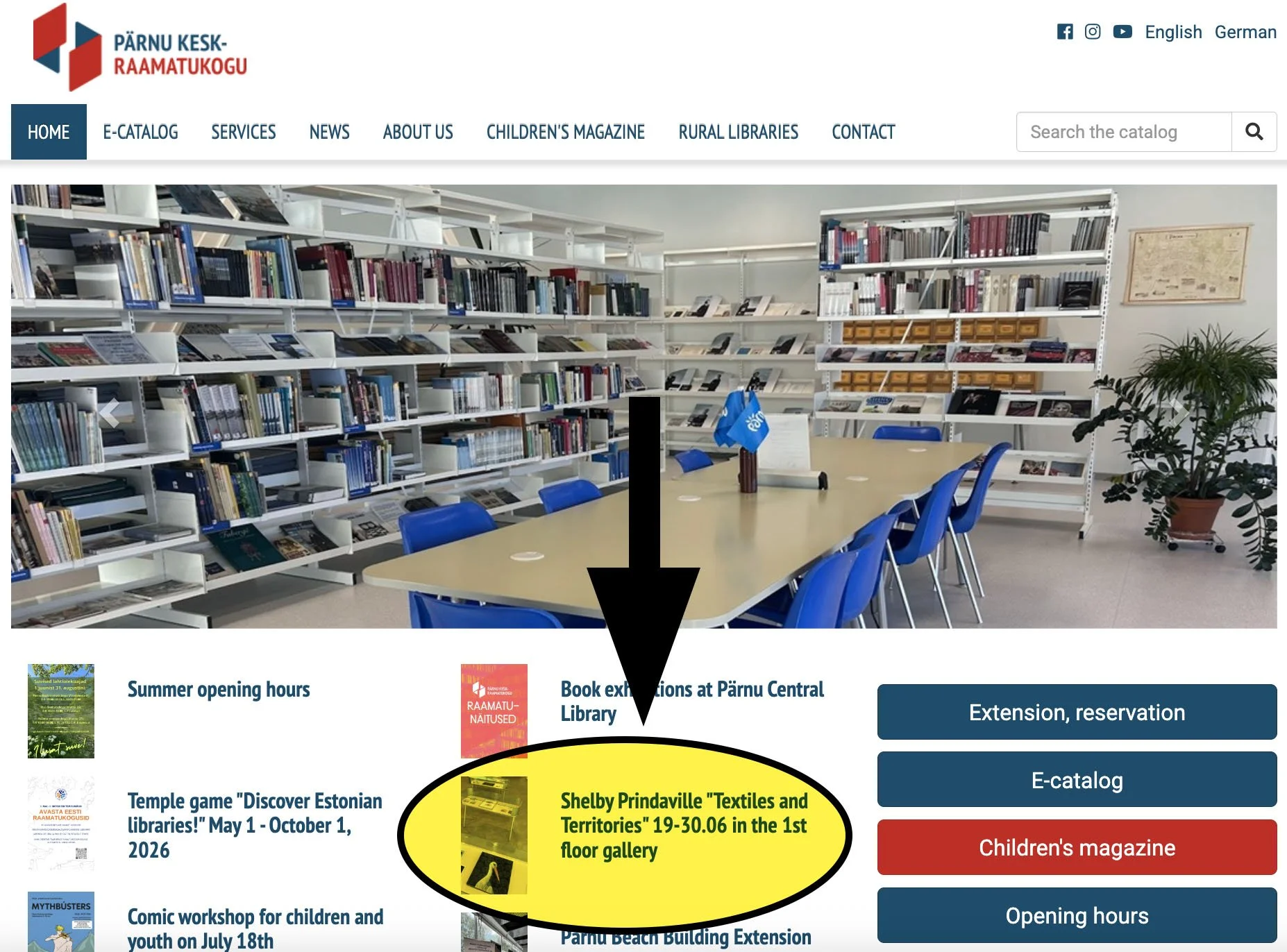
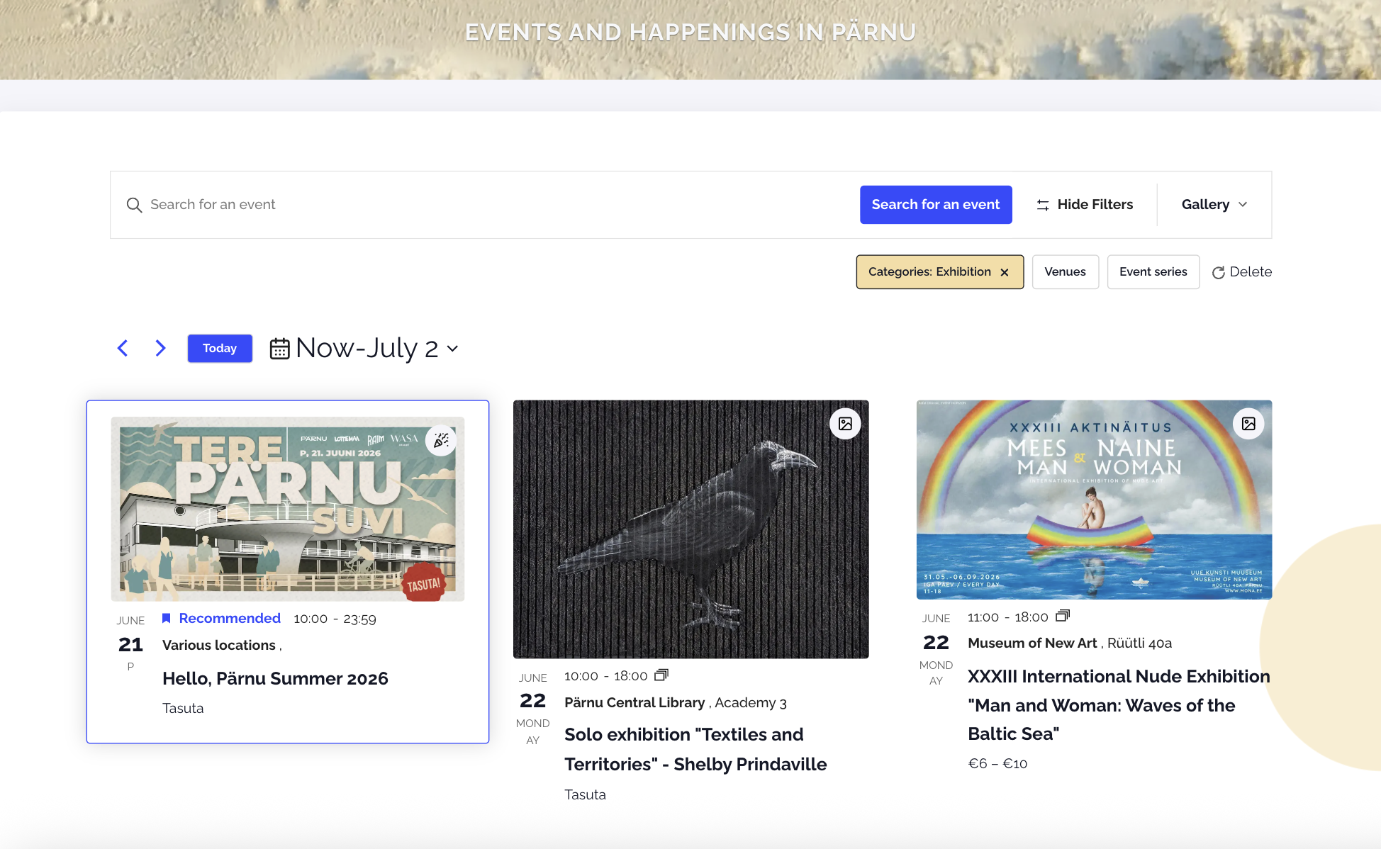
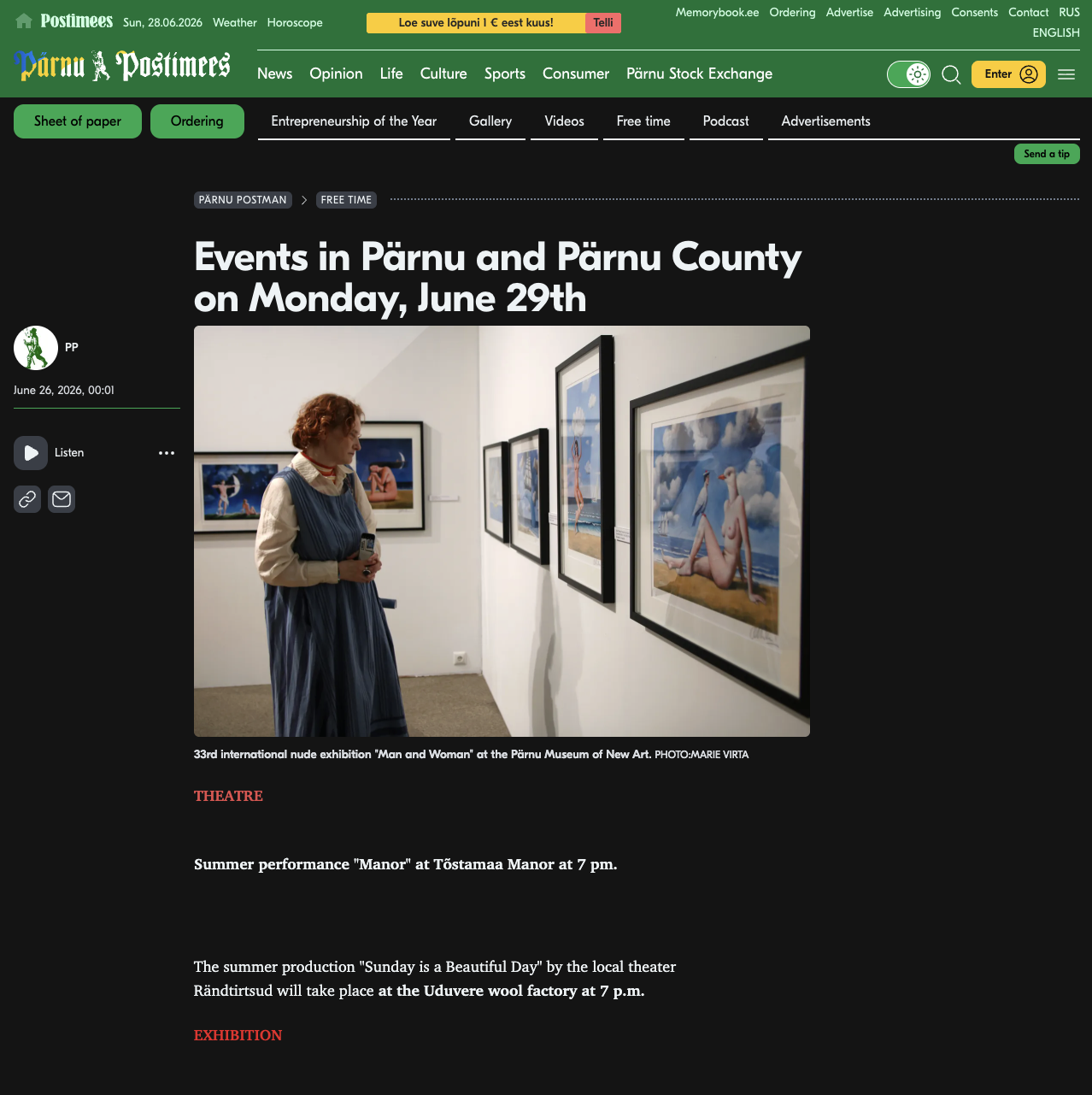
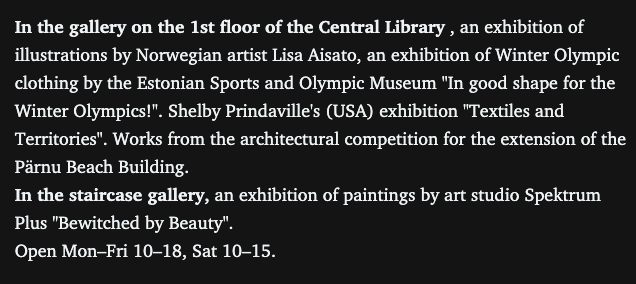
I was also able to swing by again shortly after installation with my new friend and nature guide Marko Poolamets on our way out of town to Soomaa National Park, and library director Krista Visas was checking it out as well! She was so warm and professional - she was pleased with the installation and happy to hear I had already sent her my show information. She sprang into action by putting it on social media immediately: their website homepage, news page, Facebook and Facebook stories were all updated the same day. It was also posted on the Tana Parnus events page and the Pärnu Postimees. Below are some screenshots of that publicity! You can click on any of the images below to see them larger.


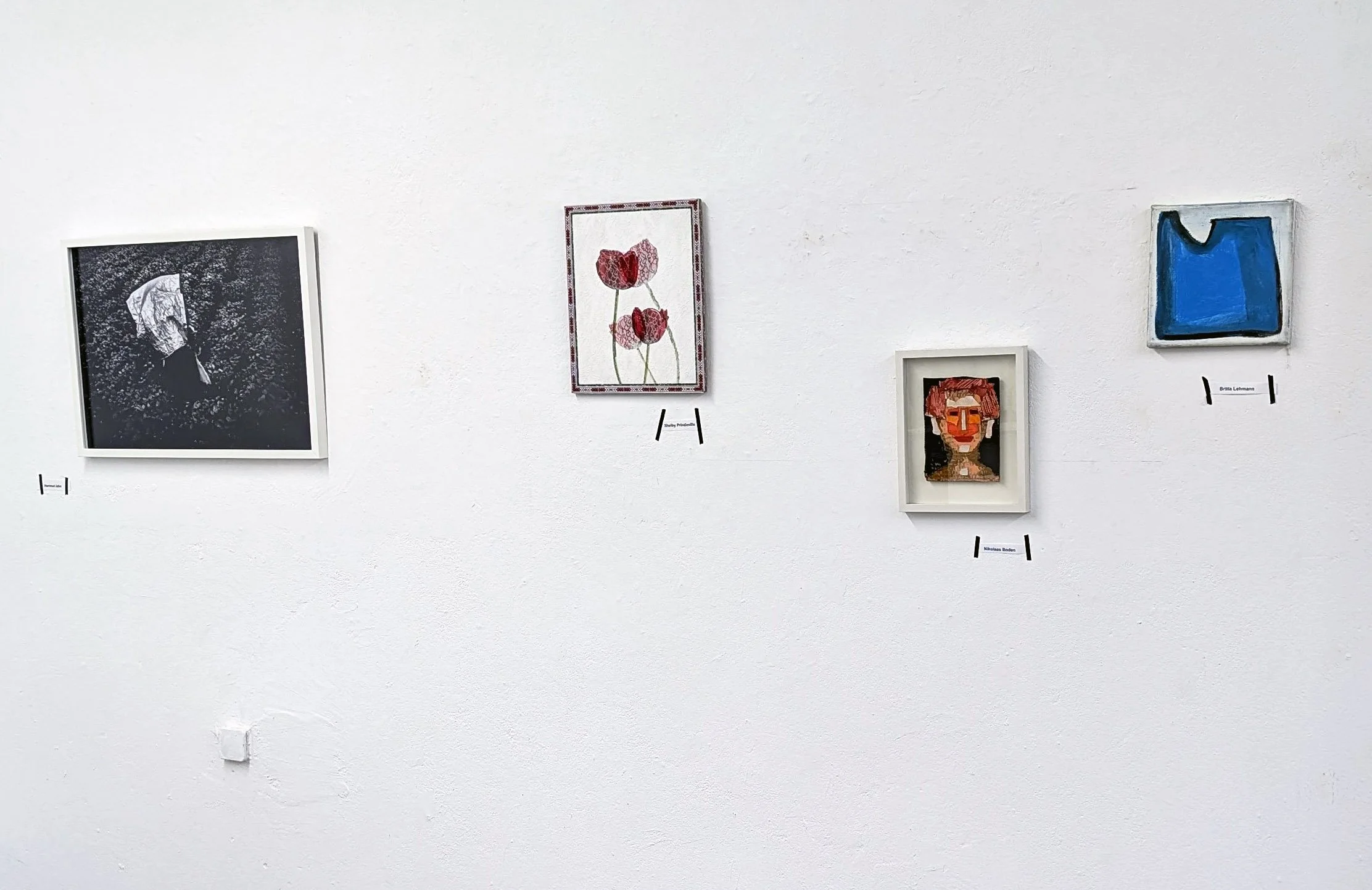
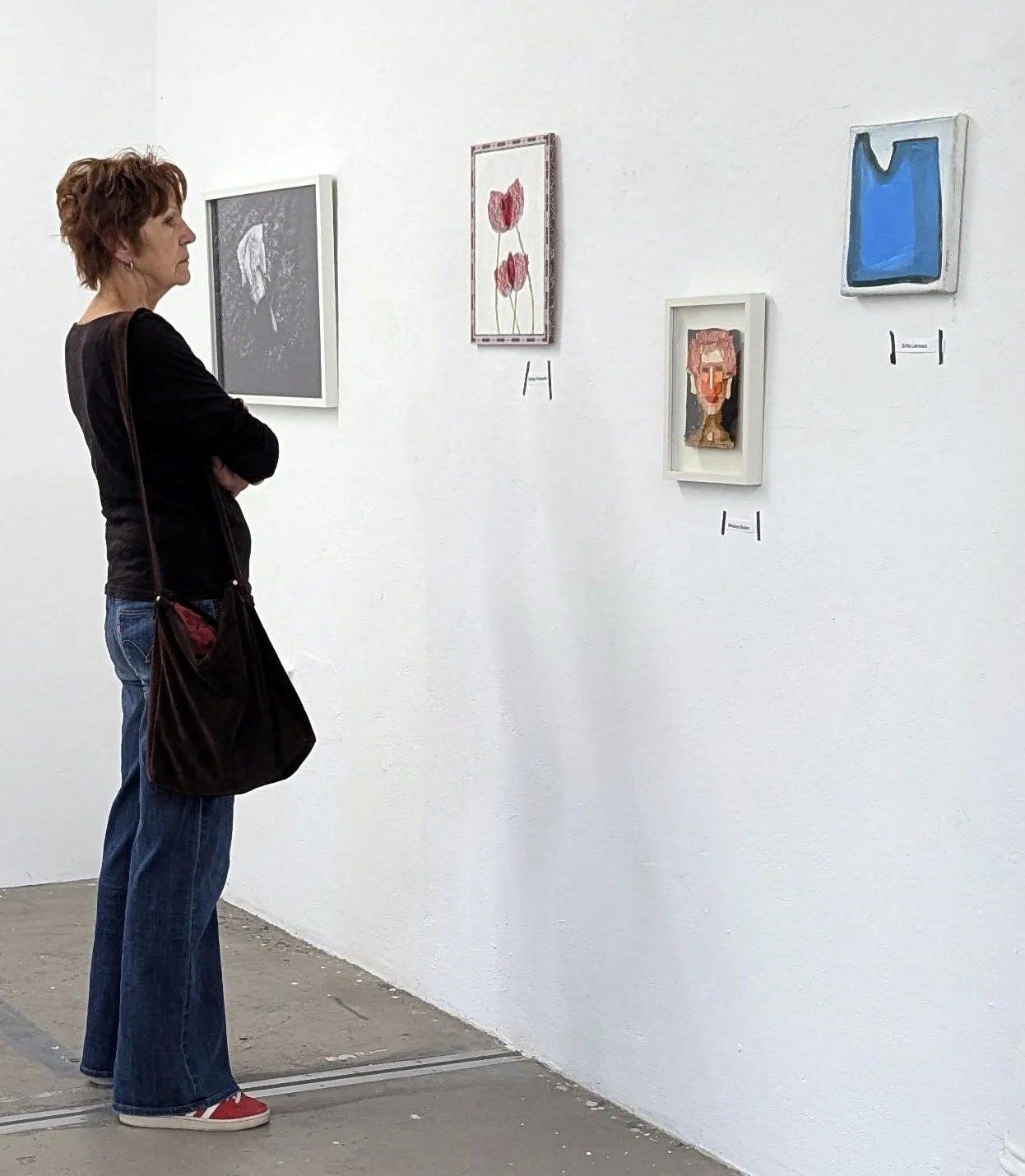
Next, some exhibition shots:

New Artwork: Vigilance Is Our Weapon

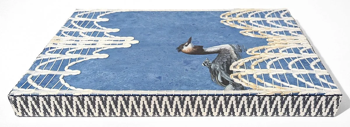
A companion to Surveillance, this work casts black-headed gulls as drones above a sea built from lace- and felt-placemat stencils and stamps. To evoke the stark visual language of USSR propaganda, the composition relies on a limited color palette and flat, simplified forms. The painted red laser beams begin as perfokaart stencils and then scale progressively toward the panel's edges. The substrate is a crochet base panel used for bags and accessories; ironically, the perforations in the panel are laser cut. Through its use of domestic textile imagery and substrate, the piece serves as a bridge between my Soviet occupation series and my ongoing explorations of Estonian craft traditions.

The title of this piece comes directly from a USSR propaganda poster from 1953.

This is Vigilance Is Our Weapon, acrylic, lace and perfokaart stenciling, and felt stamping on crochet base panel, 11.8x11.8x.125”, 2026.

Shelby Prindaville's gulls-as-drones painting on crochet base panel.

New Artwork: Surveillance

I took a departure from my textile mixed-media paintings for this piece. When I arrived at Loovlinnak Creative City Artist Residency, directors Al Padrok and Taje Tross generously gave me access to their tools and supplies, including several stacks of paper. Most of it was unremarkable: construction paper, printer paper, and graph paper. But one small stack caught my eye immediately. I could tell it was old and somehow related to typewriters or early computers, and when I asked, I learned it dated to the Soviet occupation. I adopted all of it, just four sheets, one of which had some math scribbled across it in pen.

Research revealed that it is Soviet-era perfokaart: stiff punch cards with holes in specific positions that fed instructions and data into mainframe computers before modern digital storage existed. From the 1970s through the 1980s, Soviet-bloc computing relied heavily on this technology, running the economic planning, industrial control, and record-keeping systems of the USSR, including in occupied Estonia.

I'd already been planning work that referenced Soviet propaganda posters, so the cards were a natural substrate. I cast a black-headed gull (Chroicocephalus ridibundus) as a drone after photographing many of them in flight. The species' limited, high-contrast palette and missile-like profile suited the graphic style of Soviet propaganda posters.

I sketched a range of compositions that played off the perfokaart's holes and contours while keeping that propaganda energy, and landed on a gull flying high, firing a dotted laser beam down into the punched border. I used the scribbled-on card as a stencil for the laser dots.  I kept the first as-is, and then scaled the rest up so the beam widens from a point near the gull into an even band.

This is Surveillance, acrylic on Soviet-era perfokaart (punch card) c. 1978, 8.2x11.75”, 2026.

Shelby Prindaville's painting of a gull cast as a drone on Soviet-era perfokaart.

New Artwork: Woven Thresholds

I’ve been painting red flowers lately, and I intentionally chose to continue that trend since I was building around a component I planned to use from the start: a jacquard folk pattern trim I picked up at Karnaluks OÜ in Tallinn. Once I saw a stand of vivid tulips, the rest of the composition came together..

The process differed from Between Worlds. Here, I painted the floater panel and tulips first, then laid down plastic and painted the lace pattern on top of it. After removing both those layers, I worked through a wide range of compositional options before settling on this angled, mirrored lace overlay. From there I secured the lace, added the trim, then cleaned up and secured the back. This was the second piece I started, but the third to finish! The delay was due to the sequential steps I needed to complete, each of which involved drying/curing periods.

Iconographically, tulips function as shields, threshold filters, and barriers across multiple traditions, a symbolism rooted in their nyctinasty: they close their petals tightly at night or on cloudy days, sealing their core away from cold, damp, and nocturnal threats. That self-protective habit is part of why tulips are believed to draw in positive energy while keeping poverty, bad luck, and hostility from crossing into the home, and why they carry associations of safety within oppressive environments. The lace adds a further veil over the tulips, while the mirrored, overlapping composition contributes a sense of movement and dissonance.

The outer border carries its own layer of meaning: it is a traditional Baltic woven band steeped in regional folklore and protective symbolism. Its color scheme has historically represented life, fire, and an active shield against negative energy. The pattern combines two ancient Baltic symbols: the Cross of Māra, tied to the Latvian goddess of earth and home and read as a sign of grounding and stability, and the hourglass motif, which represents the rhythm of time and the meeting point of the spiritual and physical worlds.

This is Woven Thresholds, acrylic, lace, and jacquard trim on wooden floater panel, 14x11x.5”, 2026.

Shelby Prindaville’s mixed media lace painting of tulips on a floater panel with Baltic jacquard trim.

New Artwork: Sower's Shadow

Wool is ubiquitous here in the Nordic-Baltic region, appearing in many forms: knitted, crocheted, and felted into clothing, mittens, and gloves; accessories like hats, necklaces, and pins; and home goods like placemats, blankets, and children's stuffed animals.

When I came across a felt letter board at a vintage shop in Pärnu, it spoke to me as a viable substrate. I wanted to incorporate wool in some way into my Estonian body of work given its regional importance, and I also liked the idea of converting a familiar mechanism for rigid text-based communication into artwork that through removal of its frame, rotation, and incorporation of organic form brings new associations.

This second finished mixed media painting depicts a rook (Corvus frugilegus). A member of the corvid family (which also includes crows, ravens, and jackdaws), rooks forage on arable land and nest close to farms and villages.

This is Sower’s Shadow, acrylic, molding paste, and matte medium on felt letter board, 11x14.9x.4”, 2026.

Shelby Prindaville's painting of a rook on a felt letter board.

New Artwork: Between Worlds

My first finished mixed media painting in Estonia depicts a white stork (Ciconia ciconia).

The substrate is antique lace over wood panel. My process involved attaching the lace to the panel, painting the portrait, removing the lace and altering the coloration of the wood panel surface, and then meticulously re-registering and attaching the lace back on top and sealing it down.

These birds are embedded in Estonian rural life: they're associated with summer farms and considered good luck omens. Storks are also important in folklore, as they accompany souls to the underworld and bring newborns into the world as a part of a cycle of death and rebirth in Finno-Ugric mythology.

This is Between Worlds, acrylic and antique lace on wood panel, 14x14x1.5”, 2026.

Shelby Prindaville's mixed media lace painting of a white stork.

New Artwork: Remnant and Relic

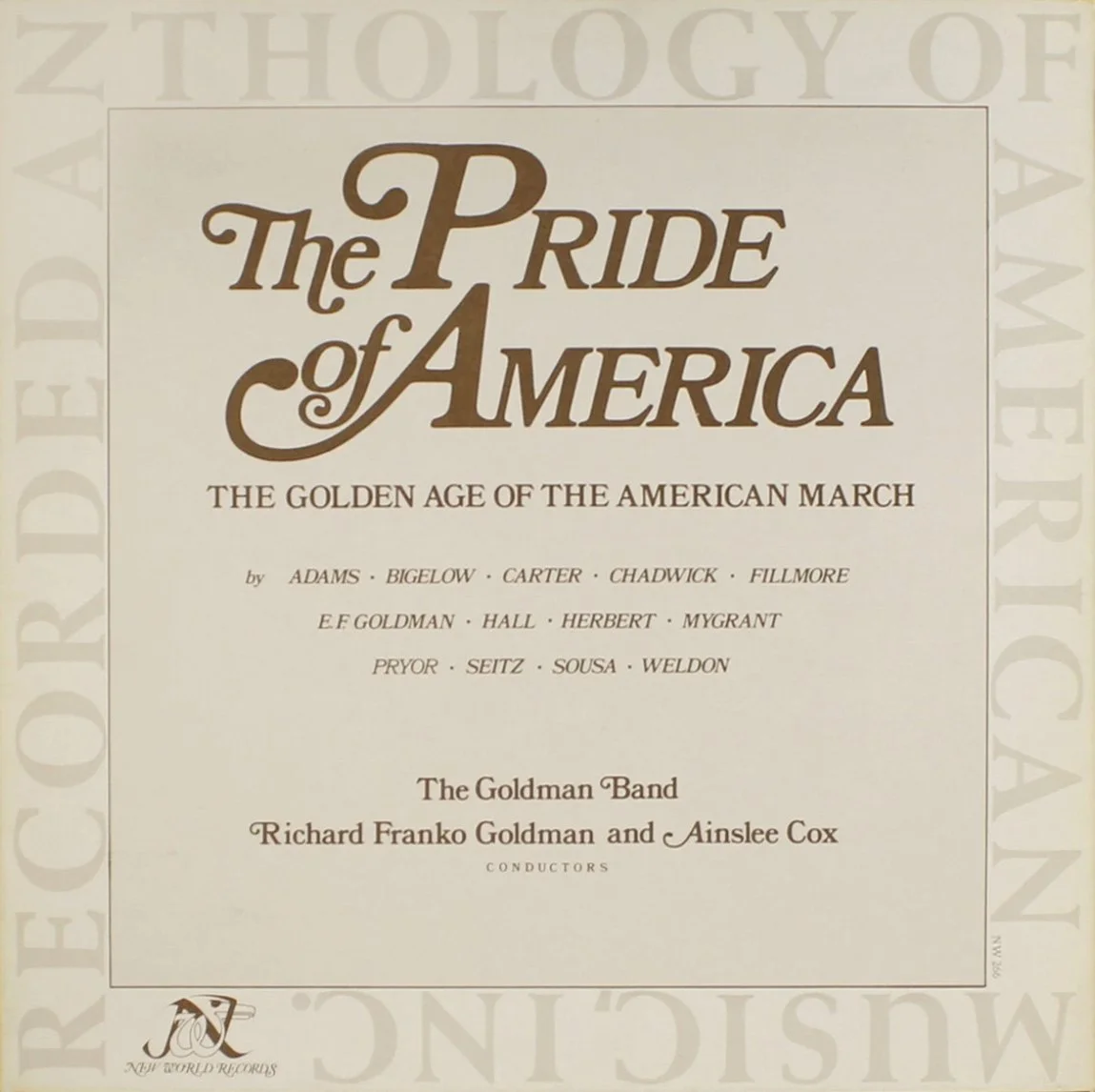
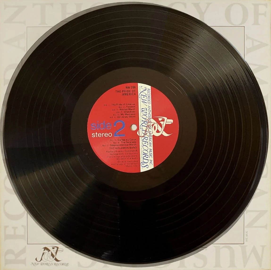
Here’s my two-piece entry into the Got Ya Covered invitational group competition! I began by sifting through some vinyl records the Morningside music department was willing to let me use, and I settled on The Pride of America: The Golden Age of the American March. This selection in combination with my route forward has environmental and political resonance.

A straightforward painted image on the record ultimately felt too detached from my practice, which focuses on ecology and materiality. I found myself more interested in the record as a petroleum-based artifact of human industry and consumption, and decided to pursue natural degradation and corrosion as my artistic approach.

Below are the the finished pieces!

Remnant, mixed media including layered stains on deteriorated album jacket, 12.5x12.5”, 2026.

Relic, mixed media including patination and surface accretion on vinyl record, 12.1x12.1x.2”, 2026.

More Raku Saggar "Faux Pit Fire" Attempts

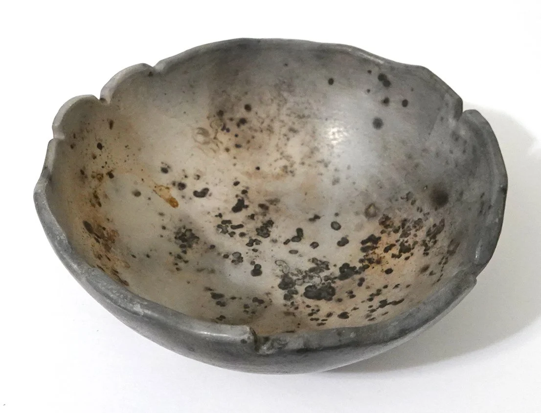
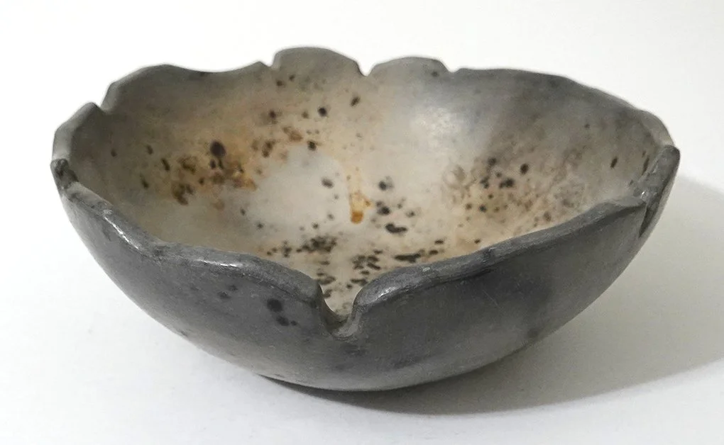
You may recall I previously experimented with using raku aluminum foil saggars to approximate pit firing. That first time, I just tried it on one piece of burnished pottery; I liked the results!

At this recent workshop, I did two more. I also added some combustibles I hadn’t yet tried: Miracle Gro fertilizer crystals and Zep Root Kill crystals (copper sulfate pentahydrate). If I were doing actual, controlled experiments, I would test one variable at a time and then combinations of two at a time, three, and so forth. However, I have to pay firing fees for each piece of pottery I take to these workshops, so instead I’m being pretty liberal with my variables.

I strategically placed root kill crystals, Miracle Gro, coffee grounds, banana peel, copper mesh, copper wire, and steel wool in and around the bowl below. This time, I tacked the crystals and powder to the foil and the bowl with hairspray, so it could stay in contact with the interior and exterior sides instead of just falling to the bottom. I wrapped that all fairly tightly with a layer of aluminum foil. Then I poured some salt on and added another two layers of aluminum foil, hoping to get some cool fuming reactions.

I waited to see how the bowl turned out before committing to doing another with this same finishing technique. I admit that I was hoping the new crystals I added would have contributed a wider range of colors, but I nevertheless liked the result.

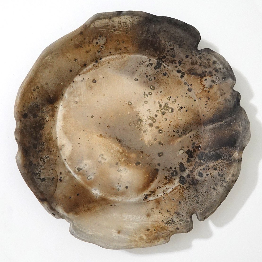
However, I wanted even more finer carbon marks on my second piece (a plate), so I used the same ingredients and added a small sprinkling of sugar as well. I again put some salt between the first and second layer of aluminum, and it didn’t seem like it required a third foil layer for coverage (it was easier to wrap the flatter form) so it got fired with just two.

I adore this plate - it’s either tied for my favorite piece from this firing or might take first place.

I Recorded a New Podcast Episode for Facetime with Scientists!

I recorded a podcast episode with From the Lab Bench’s Facetime with Scientists! As of my writing this, the audio version of “Did we evolve to create art?” is available but shortly the video episode should also appear on Spotify, and here’s the YouTube link as well.

Thanks so much to Paige Jarreau for her interest in my work!

New Raku Copper Glaze Pottery

Since I focused on hump mold pottery for this workshop, I was able to bring a number of pieces with surface texture. In my opinion, I thought copper glazes would be the best choice for those textures! On all of these pieces, I only glazed the top or interior, and left the outside and rim unglazed to carbon trap smoke and become a matte dark gray. I did some planning and sketches ahead of time, and decided I preferred that contrast more than doing a copper glaze exterior as well

I used a variety of glazes both in combination and individually on a couple pieces. They included Tutti Frutti, Blue Copper Flash, Blue Silver Luster, Golden Rainbow, Peacock, Lithium Carbonate and Midnight Luster.

Here is a textured plate with Tutti Frutti on the outer rim and Blue Copper Flash on the inside.

Next is a similar plate, glazed entirely with Golden Rainbow.

This plate was more experimental - I left some geometric shapes that aligned with the texture I imprinted unglazed, so they joined the base and rim in becoming matte dark gray. Then I glazed aligning with the texture again in three segments: Golden Rainbow, Blue Silver Luster, and Midnight Luster.

This is a small, curved dish. I no longer recall what I did with the glazing on this one, but I’m pretty sure it was a mix!

This bowl is the other piece tied for my favorite from this workshop! It has light texture and was glazed on the interior toward the rim with Tutti Frutti and toward the bottom with Blue Copper Flash.

I never know how lithium carbonate will come out - sometimes it’s gorgeous, sometimes it’s meh, and often I over-apply it and undesirable results like blistering occur. I decided to try it on this bowl, and I’m happy that this time I didn’t over apply. I was hoping for one of the radiant, glossy finishes it can do, but it chose a more satin, sedate finish. I still like it!

I refired this large dish after putting a bit more glaze on, as the way the glaze appeared on the first firing was to my mind not pleasing (though others said they really liked it). Though refiring stresses a piece and can cause it to crack or lead to even worse glaze results, in this case it came out whole and I much prefer it in its second evolution!

Clear and White Crackle Raku Ceramics - Stripe Edition

I decided to try clear crackle atop the wavy Mason-stain striped bowl you can see on the shelf in the second photo in this post. Unfortunately (at least to my mind), the very light pink and lavender stripes went almost completely fugitive in the heat; the orange fared much better, but it means the overall result is not what I had intended!

I still think it’s interesting, though:

I also applied white crackle in an asymmetrical split to this plate, choosing to leave a stripe unglazed so it would carbon trap the smoke in the reduction enviroment:

Mason Stain Obvara Raku Ceramics - Round 2

I tried out finishing some burnished, Mason stained pottery with the obvara technique in my last workshop, but it turned out the obvara had a difficult time clinging onto the surfaces; I decided to try again with unburnished Mason stained ceramics.

I decided to do three bowls stained a very light pink, a stronger orange pastel, and a stronger lavender pastel. I think the results of those stains were extremely subtle. This was in part because the lavender pigmentation went partially fugitive, the orange is perhaps too akin in hue, and the pink was already barely there and also went fugitive. It’s also because I allowed them to go into the fermented yeast bath right out of the kiln instead of cooling off for a minute or two, and I’ve found that when the pottery is at its top temperature, the majority of the carbonization is usually quite dark. That obviously covers over any underlying stain, but it provides a fuller value range and in the areas where there is minimal carbonization, it leads to high contrast. They’re beautiful obvara bowls, regardless of whether the Mason stains had much impact!

Here is the very light pink:

Next, the orange (note that the lighter areas are a bit warmer!):

Finally, the lavender; interestingly despite the fugitive nature the one that is perhaps the most visible due to the coolness it contributes:

Preparing for the Next Raku Workshop: Hump Molds!

A plaster hump mold for a plate.

I’ll be taking a group of nine (including myself) to another raku ceramics workshop at Dakota Potters Supply this weekend!

This semester has been very busy, so I’ve chosen to focus entirely on hump-mold pottery for this workshop. Using plaster hump molds (convex forms over which slabs are placed and pressed) significantly reduces the time required to make raw ware compared to pinch-pot, hand-built construction.

Hump molds also allow me to easily add and retain complex texture particularly to the interior of a piece; when making a pinch pot, the shape comes from pounding, pulling, and tapping the clay with tools that typically leave a fairly consistent surface. I can add texture to the exterior of a pinch-pot bowl or vase after it is built by rolling it over a texture plate or hitting it with a textured paddle, but I can’t do that to the interior. I can always carve texture into both sides or use other techniques if I really want to, but what I’m getting at is that texture is more complicated to add and retain when working in my preferred pinch pot style.

With these plaster hump molds, I can easily add complex surface texture to a flat slab and control whether it appears on the exterior, interior, or both. I then rely on gentle pressure, gravity, and evaporation to shape the clay, rather than the more aggressive pinch-pot methods that diminish or fully remove surface detail.

I am also continuing to experiment with Mason stains and burnishing on a few of the ceramics!

I saved enough time that I actually made more pottery than I think I’ll have time to finish at the workshop, which is a good problem to have. I’ll nevertheless bring it all just in case I’m wrong about that! Below is all the bisque ware I’m bringing with me. I share space with other folks in our ceramics studio, so I’ve crossed out the pieces in the first photo that aren’t mine. In the second photo, you can see the variety of techniques more closely, and the plate I’m holding corresponds to the hump mold pictured above (as do others).

A Better Way to Tape Down Paper

When drawing and painting on paper, artists typically tape more delicate papers down to a board unless that paper comes as part of a pad already. Taping loose papers to boards allows artists to keep the paper flat and unwrinkled while being able to easily move it around and draw on it at more upright angles. (Drawing flat on a table or in an artist's lap can often introduce unintentional perspective distortion, while drawing closer to upright minimizes those issues.)

Note the white tape diagonally placed on top of the corners of the paper. You can click into this to see it more clearly in a larger view!

I don't believe I've ever really been taught how to tape; I think as students we all just convergently evolved similar techniques to tape each corner down at a diagonal. Then at the end of the painting, you peel it back and extend the artwork into those blank corners if necessary.

As a teacher, I did start to tell my students to aim for a small but not tiny amount of corner coverage: too much and you have more to fix at the end, while too little and the paper pulls free from the tape and falls at inopportune moments. I also tell them that if you want the tape to be sticky-but-not-too-sticky, you can press it to your pants or shirt first for easier removal.

While I was doing my first artist residency at Arts Itoya in Japan in June 2024, I used this same taping technique and it damaged several of the delicate washi papers.

To the right, you can see an image of my in-progress Paper Snow in January 2025 with taped corners.

I innovated a new technique during my second artist residency at Arts Itoya in June 2025! The new method is to place a piece of acid-free archival tape onto the back of the paper. That tape can remain indefinitely if the paper is prone to tearing, or can be gently removed if desired, and even if it does cause slight surface damage upon removal, that's happening on the side of paper no one's seeing. Then I place another piece of tape onto the first and extend it out past the edge of the painting so the sticky side is face up. Then I place a piece of tape sticky side down onto that. Here is an image of this taping technique:

Note that the tape is now not touching the face of the artwork at all!

I strongly recommend this new technique for:

  • paintings and drawings on delicate papers

  • paintings and drawings where the media will extend to the corners, so that you don't have to carefully match the markmaking, color palette, etc. afterwards but can just actively address the whole picture plane at once

I'm teaching Painting I this semester, and so I showed my students both options at the beginning of the semester. Most students have chosen to adopt this new method even when dealing with sturdy substrates like canvas paper, due to the second point above.

Judging the 2026 Western Valley Art Conference

I was invited to judge the Western Valley Art Conference later this week! It’s a large annual regional high school art competition with ten schools participating in the conference from around western Iowa, and this year it will be hosted at Lawton-Bronson High School. I’m really looking forward to seeing all the entries!

Upcoming: Loovlinnak Creative City Artist Residency in Pärnu, Estonia

I’m excited to share that I will be attending the Loovlinnak Creative City Artist Residency in Pärnu, Estonia this summer for a month-long stay in June 2026! This will be my first time in the Baltics, and I’m excited to experience and document the environment and atmosphere in and around the “summer capital of Estonia.”

As always, I’ll try to get some Estonian under my belt before I go. However, there are no local classes in Estonian nor is it even available on Duolingo, and it’s a language family with which I’m unfamiliar (Finnic, a division of Finno-Ugric). I imagine I’m not going to get very far with this one, but I’ll do what I can!

Biophilia Solo Show Valentine's Day Event & Press

The Le Mars Arts Center will be hosting “Wildly in Love” this Saturday, February 14th from 4:30-7pm. A Valentine’s Day social hour and arts benefit with private gallery access to my solo show Biophilia, it emphasizes bringing people, the arts, and the natural world together. If you’re interested in attending, tickets can be purchased here.

The Le Mars Sentinel published an article by Beverly Van Buskirk about this upcoming event, “Le Mars Arts Center hosts ‘Wildly in Love’ event Feb. 14.”

Here’s an excerpt from the article:

“Rooted in humanity’s innate connection to nature, Biophilia explores ecological systems, growth, and organic forms through painting, mixed media, ceramics, and sculptural works. Prindaville’s practice blends scientific inquiry with expressive mark-making, creating pieces that feel both contemplative and vibrant. “This entire showcase was carefully curated for our space, bringing in the natural world,” said Draven Haefs, Executive Director of the Le Mars Arts Center. “Biophilia feels especially timely, and we’re thrilled to share it with our community as part of this season of new, intimate arts experiences.”

Biophilia Images!

Here are some photos of my solo show Biophilia at the Le Mars Arts Center, taken by their executive director Draven Haefs! Note that not all galleries/pieces on display are documented here, but it’s a representative subset. The slideshow includes an image from the reception as well! As a reminder, this show will be up through February 21, 2026 if you want to stop by and see it in person.