artwork

New Artwork: Submerged Memory

One of my consistent practices when traveling abroad is seeking out arts and flea markets, antique stores, vintage shops, and secondhand dealers. This has become part of my research methodology: an opportunity to encounter reference material, regional craft traditions, and occasionally, nontraditional media or substrates that find their way into the work. While I walk out of most places empty-handed, that's fine; the practice is cumulative.

On my second-to-last weekend in Pärnu, I came across an unbranded antique shop that doesn't appear on Google Maps and opens only when the owner feels like it and puts out a sign on the street. Inside, I found a small cache of printed stationery from the Soviet occupation period, issued under the ENSV, the Eesti Nõukogude Sotsialistlik Vabariik, or Estonian Soviet Socialist Republic. Most of the material was too damaged for my purposes, or carried handwriting and other visual noise that would compete with the work. A few pieces, however, were relatively clean.

The surface is extraordinarily loaded. It's also materially demanding: decades-old printed, coated cardstock with a surface that requires careful handling and preparation. I purchased the few that might suit my purposes and got to work.

For this first piece, I inverted the cardstock and painted a split-level waterline view of the Baltic Sea directly over the now upside-down state emblem and its slogan. The sinking emblem remains visible, and traces of the communist motto persist in the lower register: Kõigi maade proletaarlased, ühinege! The standard English translation is "Workers of the world, unite!" though a more literal rendering would be "Proletarians of all lands, unite!"

Above the sea, a black-headed gull scans the surface below. In two earlier paintings from this residency, black-headed gulls appear as drone stand-ins, complete with stylized laser beams that complement their substrates’ perforations. Here, that same subject returns, but without overt weaponry.

This is Submerged Memory, acrylic on occupied Estonian printed cardstock from 1974, 11.38x8.2”, 2026.
Shelby Prindaville's painting of a black-headed gull flying over the Baltic Sea with an inverted, sinking ENSV state emblem and motto submerged in the water.

Exhibition at the Pärnu Keskraamatukogu (Central Library) Gallery!

My posts about my artwork necessarily are created after I finish them, and frequently more time passes to allow me to properly photograph and color correct the image, because I’m deciding between title options, in order to space my posts out a bit instead of posting in clumps… which is all to say that I actually managed to finish my first five paintings by June 17, even though they weren’t all online yet.

On June 18, residency director Taje Tross asked the Pärnu Keskraamatukogu (Central Library) if they would be willing to host an exhibition of my work sometime before I left, and I assumed they’d be considering a shorter show toward the end of the month - but instead they graciously agreed and asked that I show up the next day to install such that my exhibition ran from June 19-June 30! What luck: this is one of the longest international shows I’ve had as a part of a residency, and definitely the earliest. I am so appreciative I was given the opportunity to share my artwork in such a public gallery for so long (40% of the residency period!).

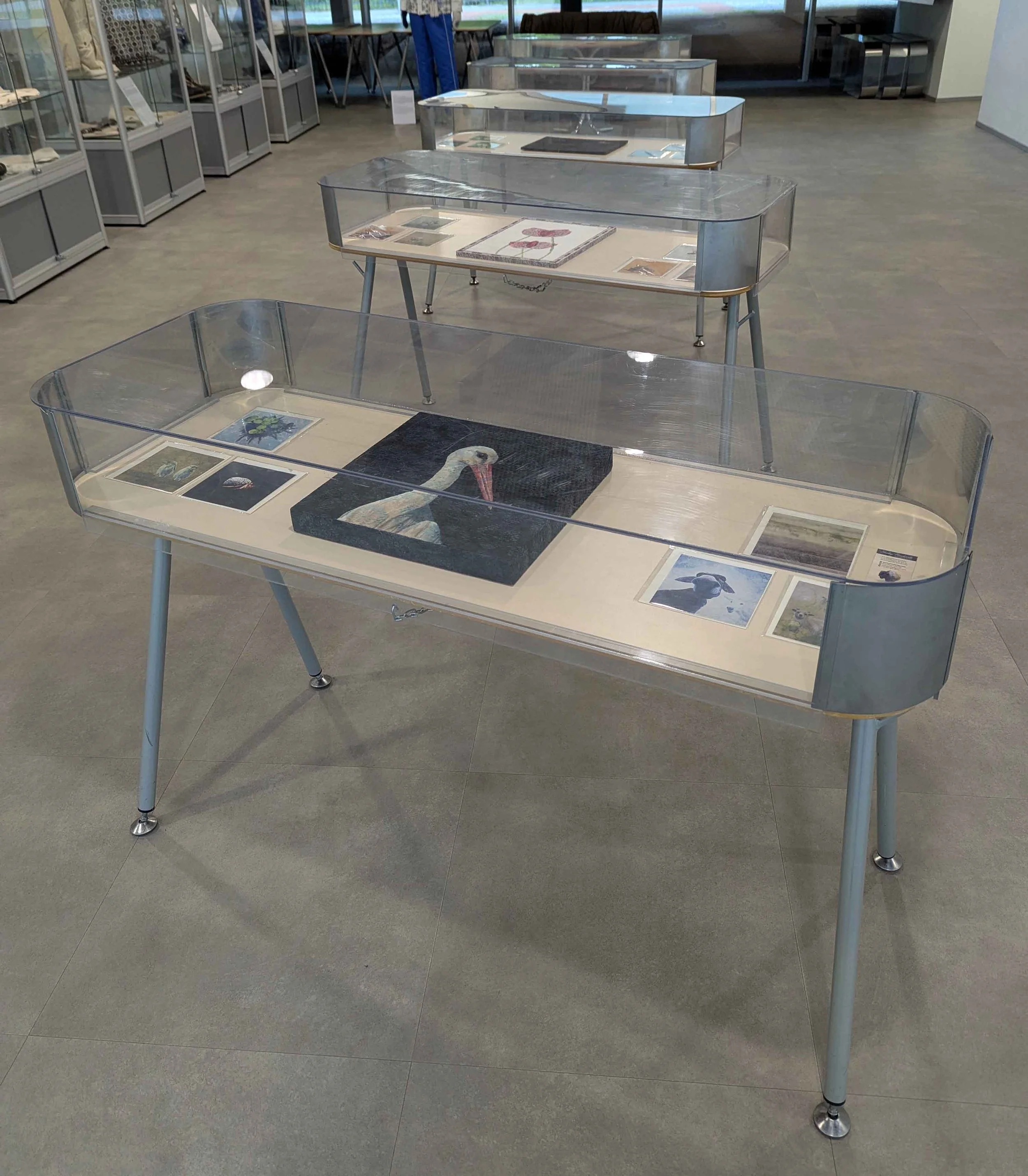
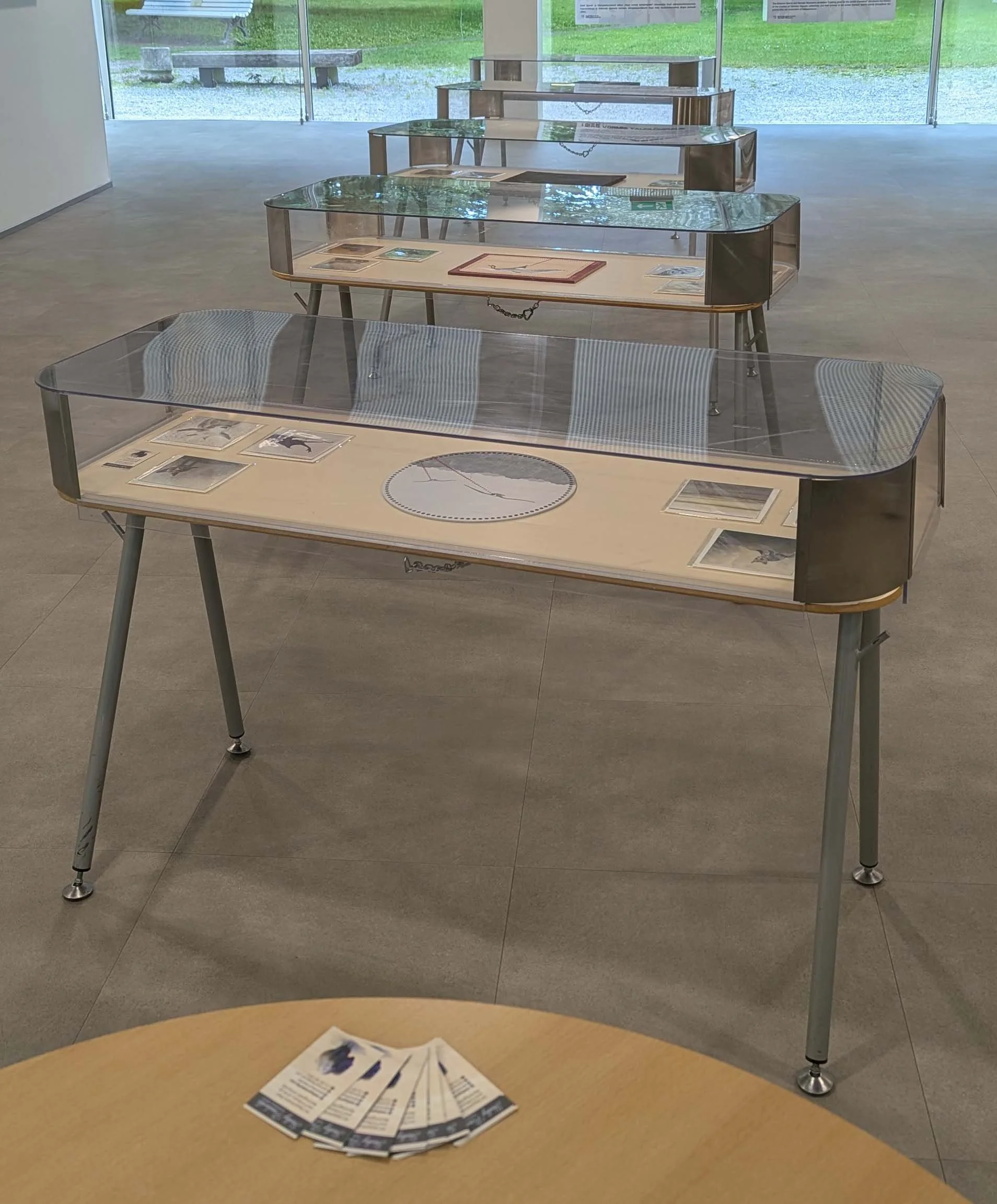
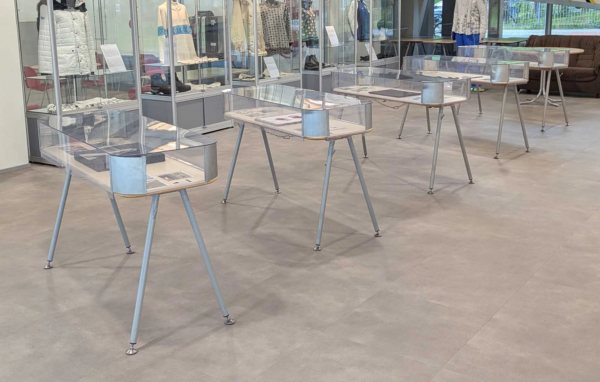
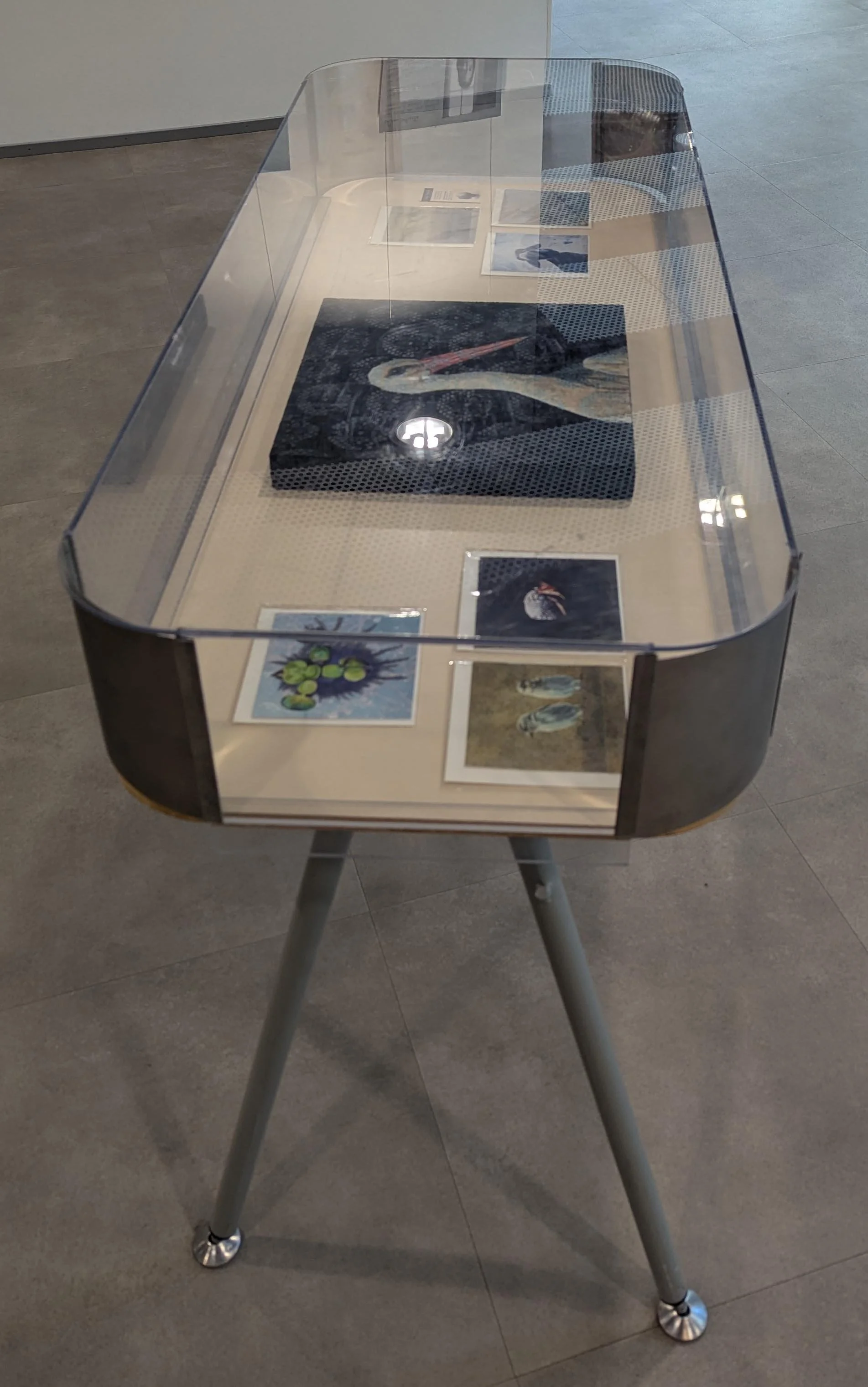
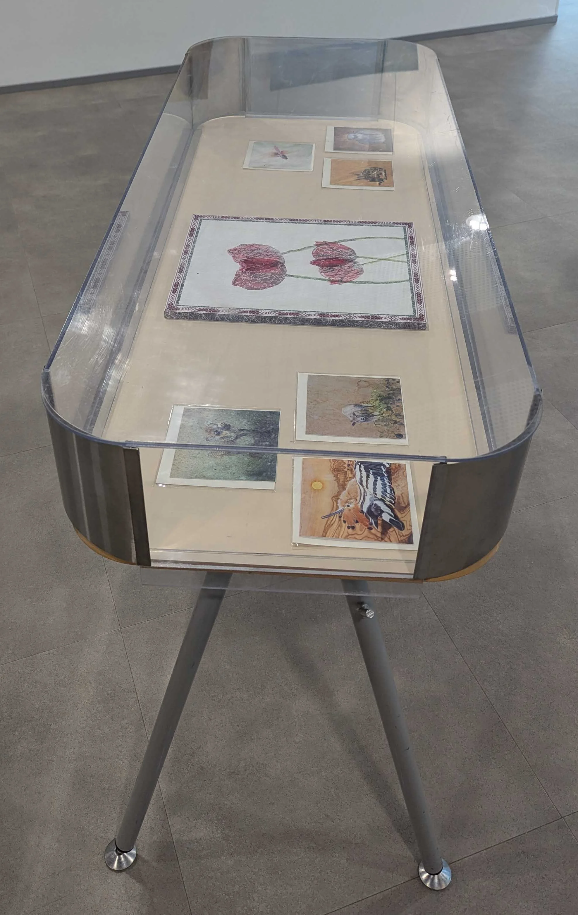
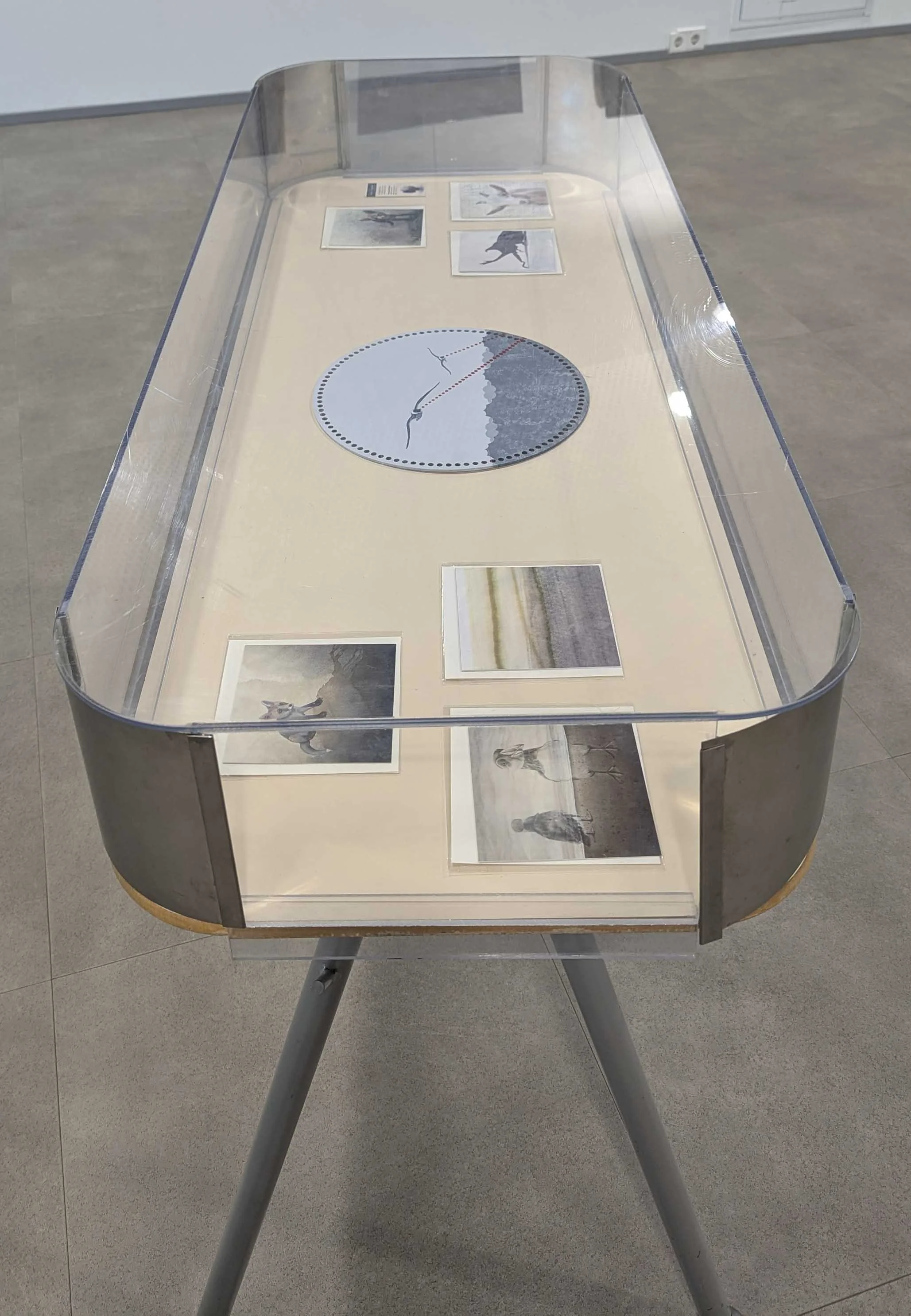
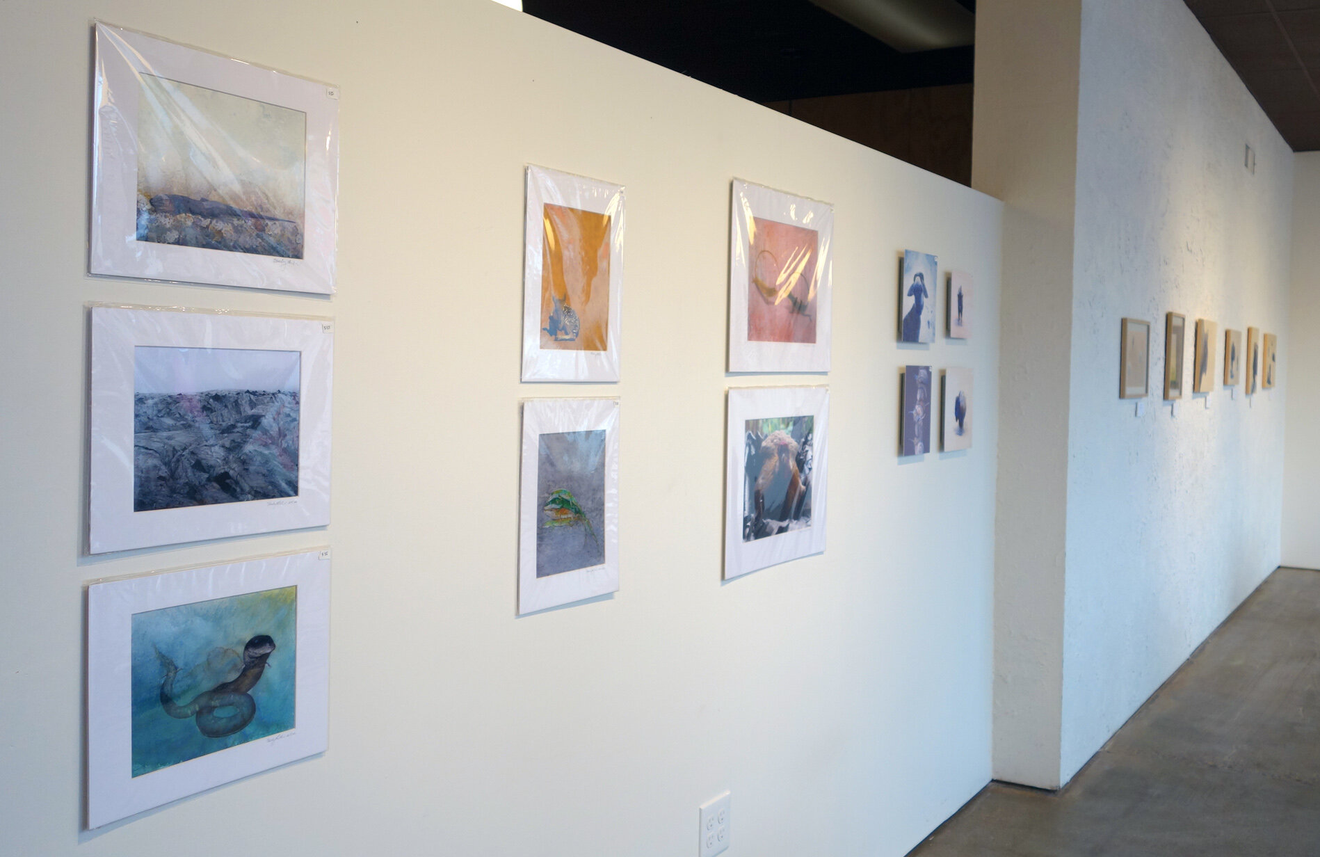
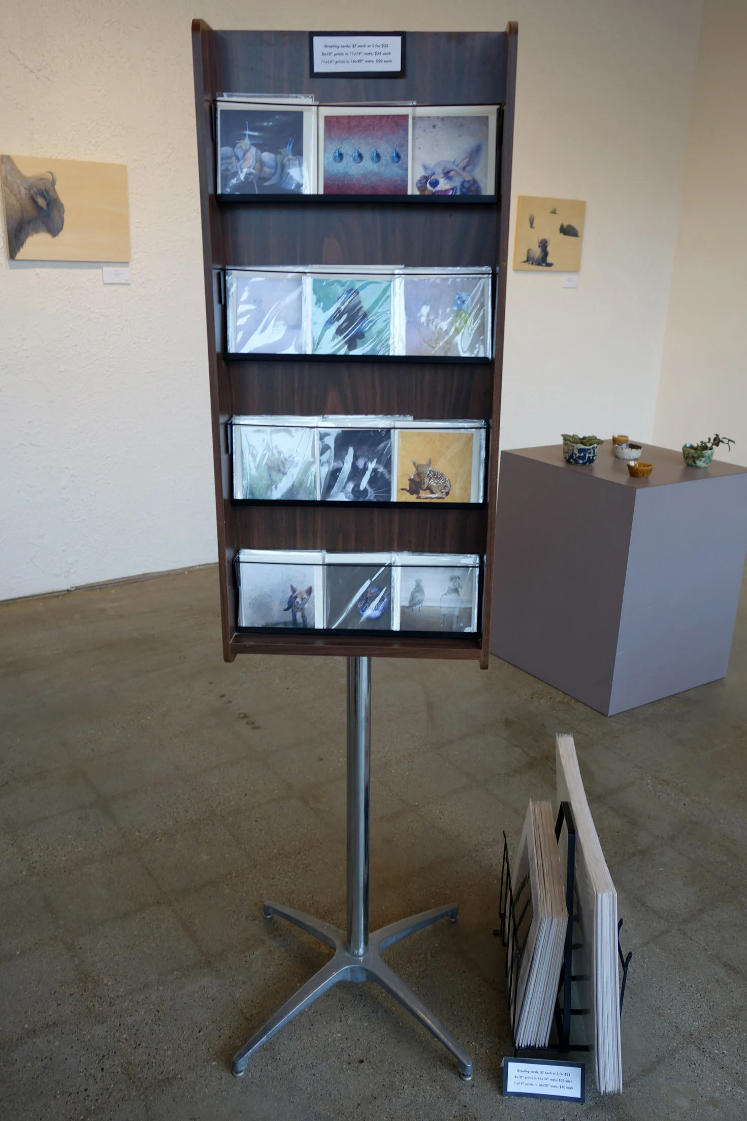
I brought all five finished paintings, along with a bunch of my greeting cards, and was given a prime set of exhibition tables with protective covers! As I finished more paintings during the show’s duration, I brought them in as well - that’ll be covered in another future post. I set up the show in their first floor gallery, and then returned to the residency to send off my exhibition information which I’m providing below.

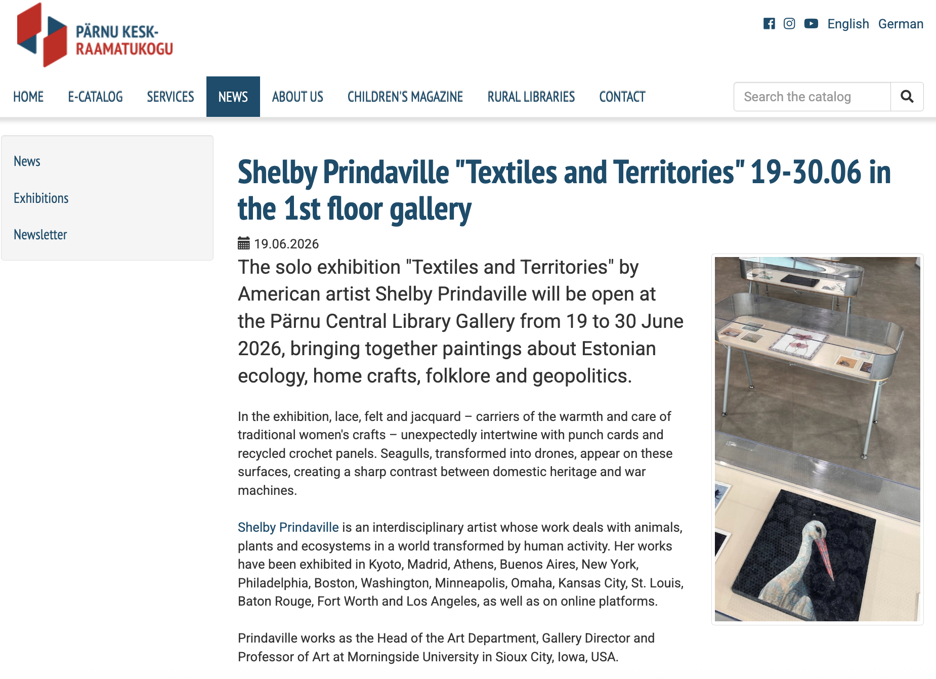
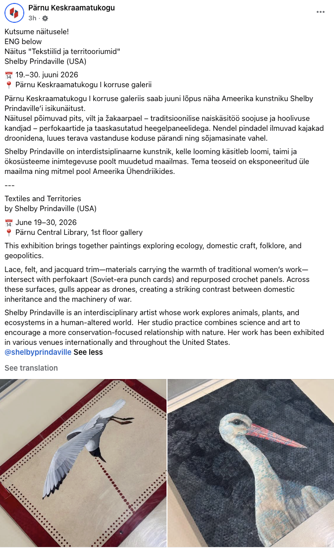
Textiles and Territories

by Shelby Prindaville (USA)

This exhibition brings together paintings exploring Estonian ecology, domestic craft, folklore, and geopolitics. Lace, felt, and jacquard trim carry the warmth and care of traditional women's work. Set against that softness, perfokaart (Soviet-era punch cards) and a repurposed crochet panel become surfaces for gulls recast as drones, a collision between domestic inheritance and the machinery of surveillance and war.

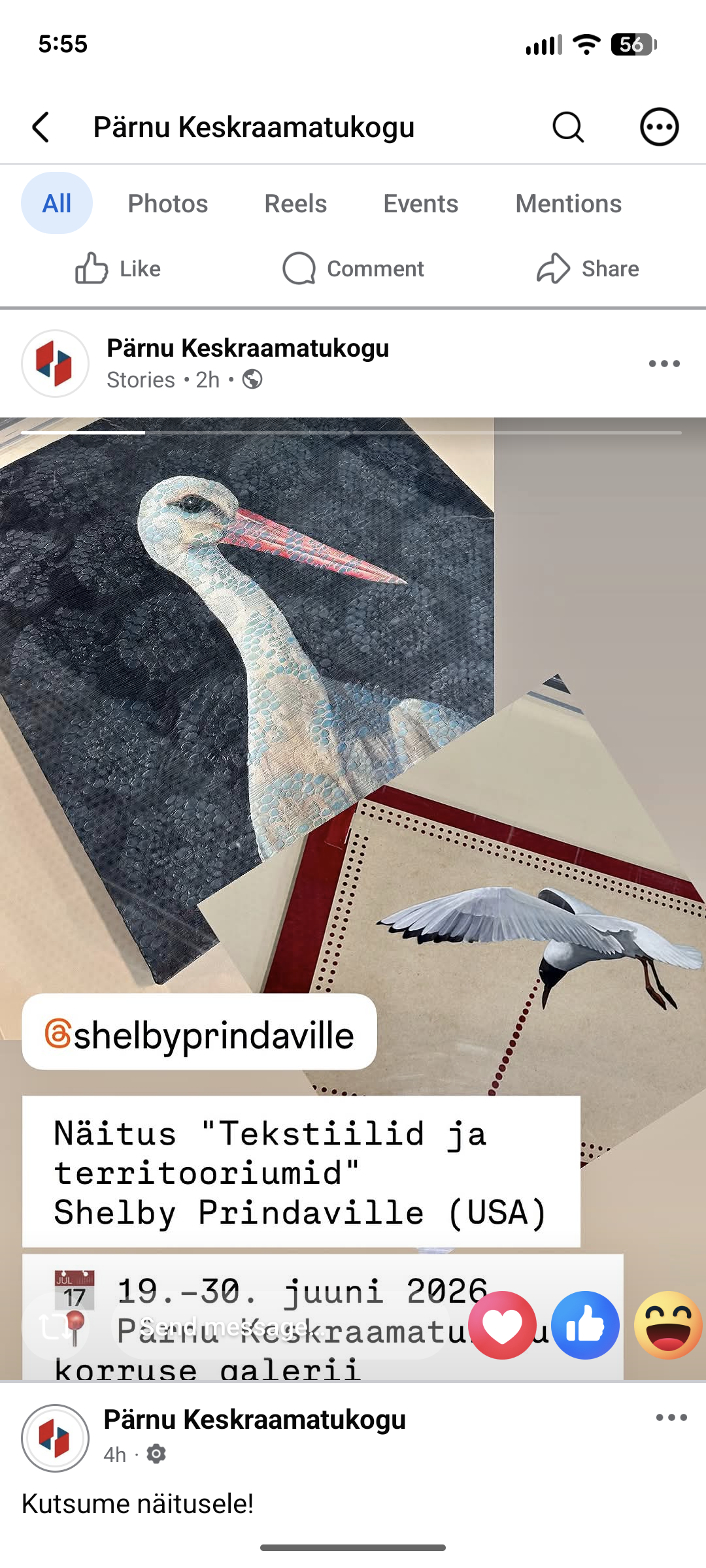
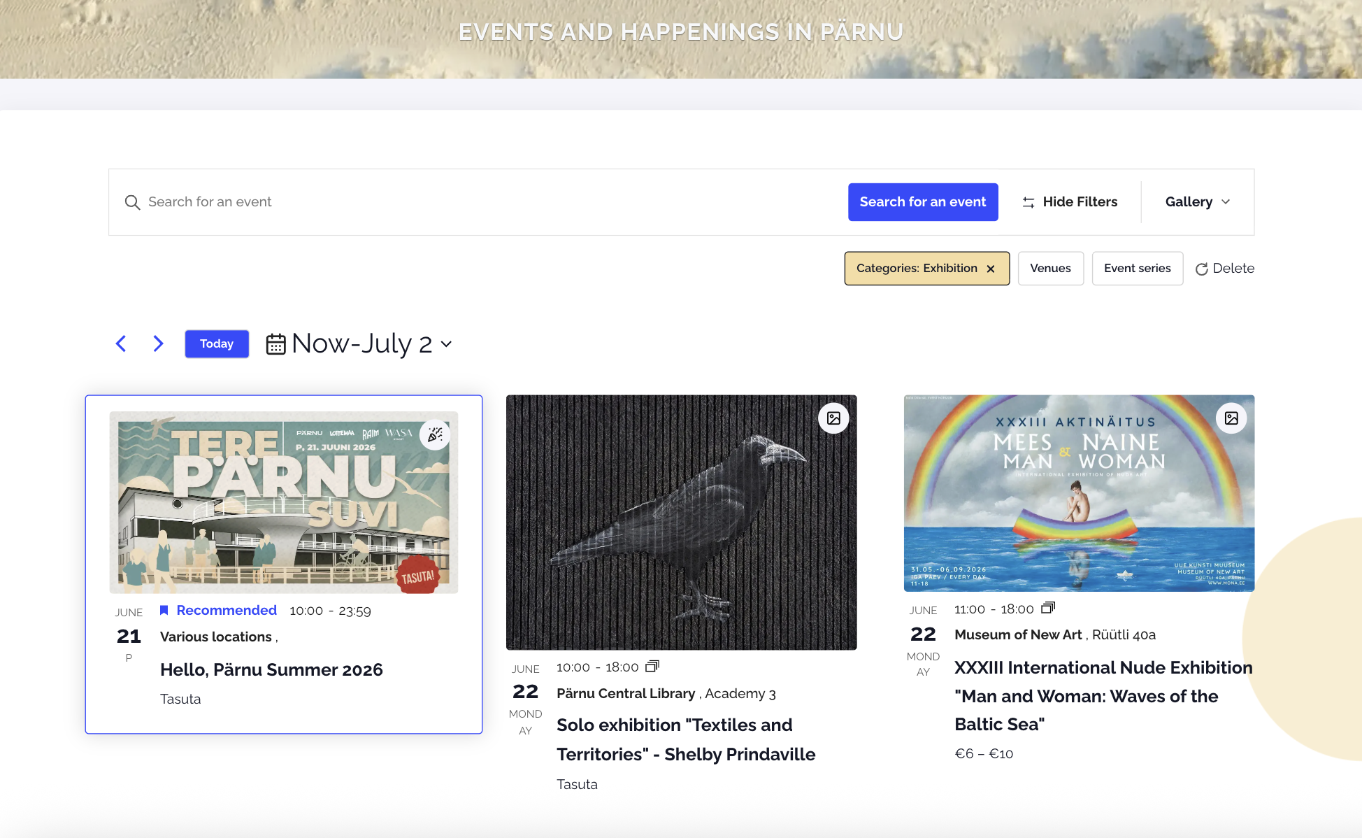
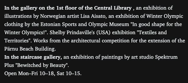
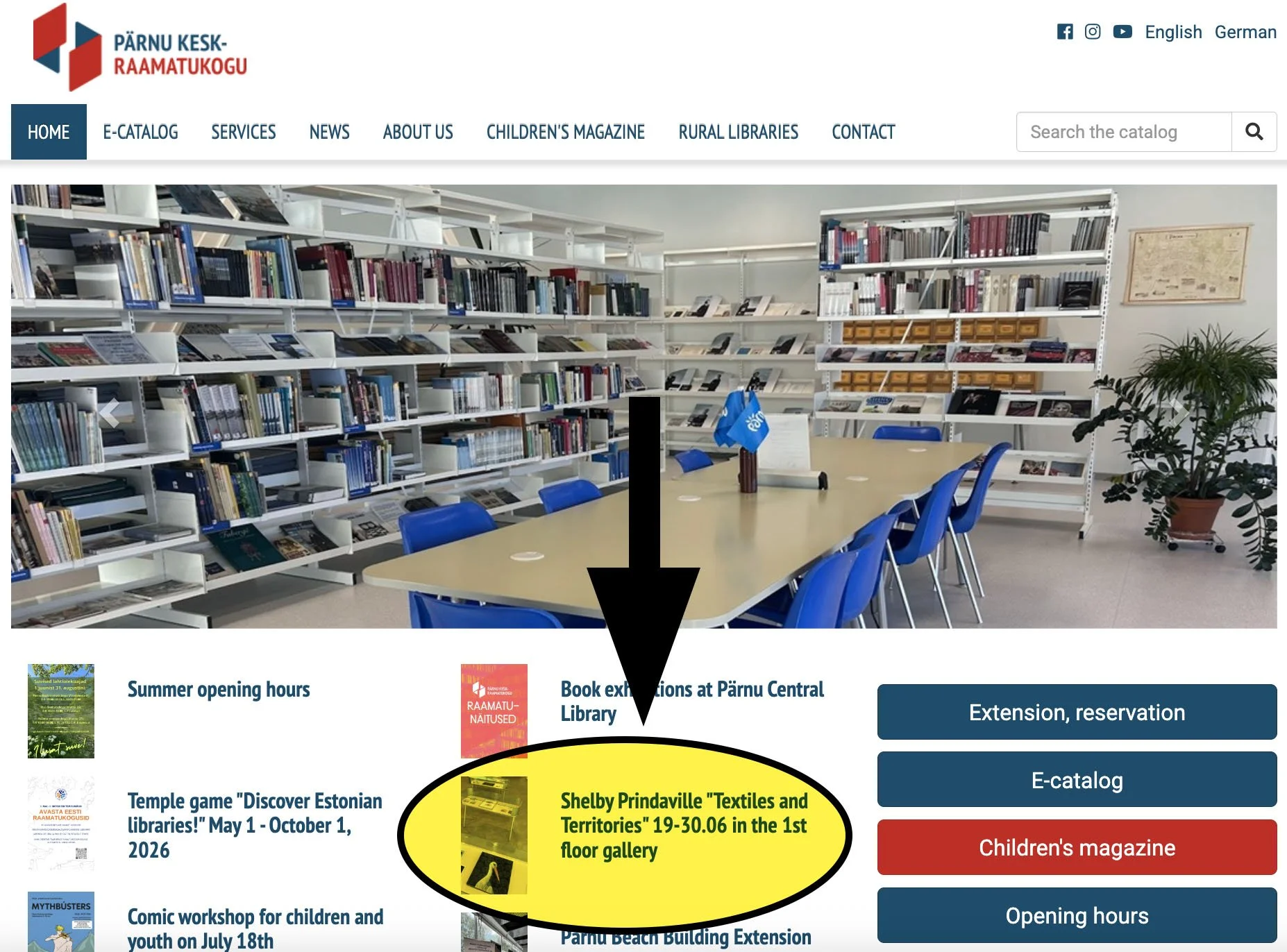
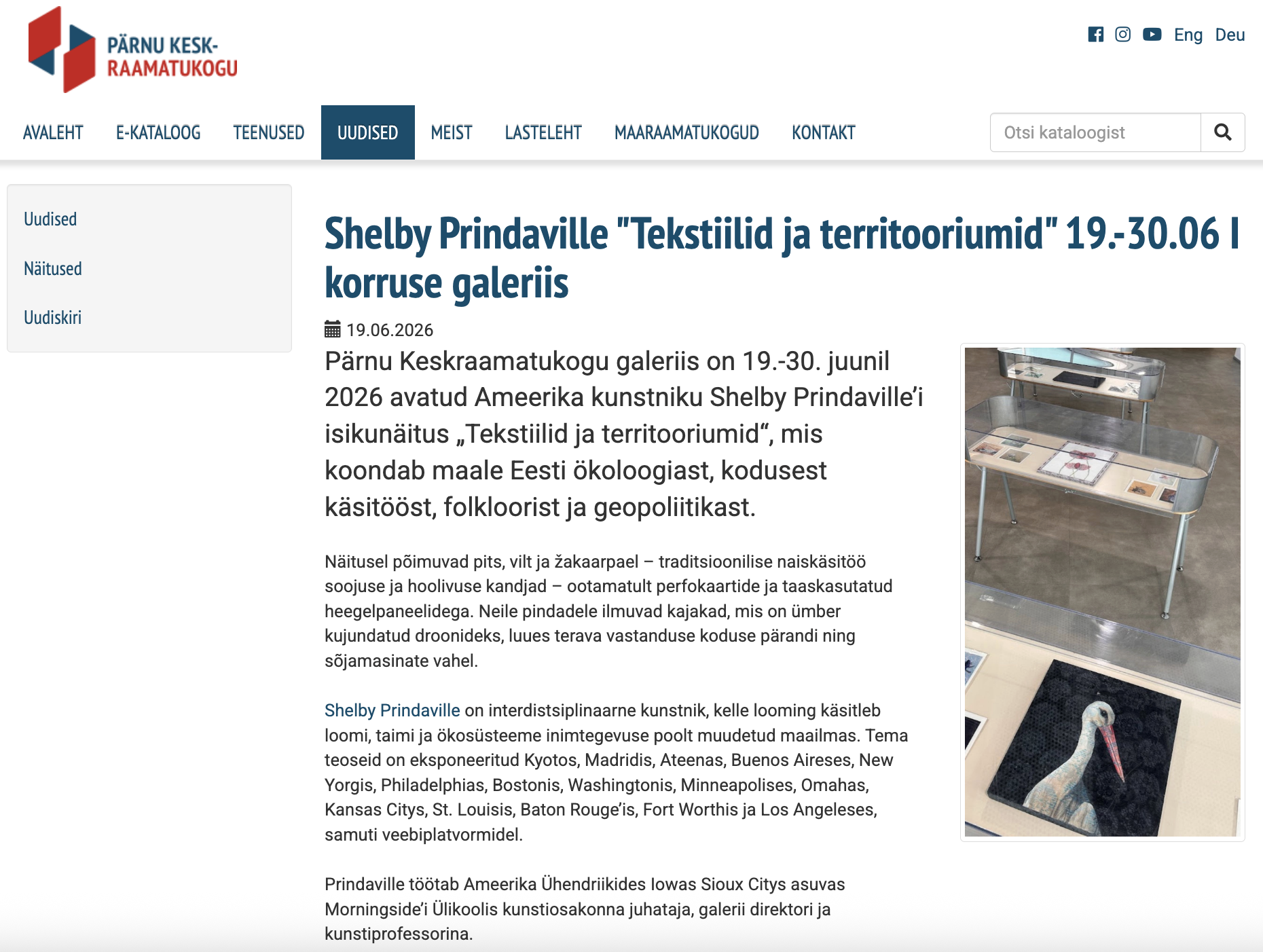
I was also able to swing by again shortly after installation with my new friend and nature guide Marko Poolamets on our way out of town to Soomaa National Park, and library director Krista Visas was checking it out as well! She was so warm and professional - she was pleased with the installation and happy to hear I had already sent her my show information. She sprang into action by putting it on social media immediately: their website homepage, news page, Facebook and Facebook stories were all updated the same day. It was also posted on the Tana Parnus events page and the Pärnu Postimees. Below are some screenshots of that publicity! You can click on any of the images below to see them larger.


Next, some exhibition shots:

New Artwork: Surveillance

I took a departure from my textile mixed-media paintings for this piece. When I arrived at Loovlinnak Creative City Artist Residency, directors Al Padrok and Taje Tross generously gave me access to their tools and supplies, including several stacks of paper. Most of it was unremarkable: construction paper, printer paper, and graph paper. But one small stack caught my eye immediately. I could tell it was old and somehow related to typewriters or early computers, and when I asked, I learned it dated to the Soviet occupation. I adopted all of it, just four sheets, one of which had some math scribbled across it in pen.

Research revealed that it is Soviet-era perfokaart: stiff punch cards with holes in specific positions that fed instructions and data into mainframe computers before modern digital storage existed. From the 1970s through the 1980s, Soviet-bloc computing relied heavily on this technology, running the economic planning, industrial control, and record-keeping systems of the USSR, including in occupied Estonia.

I'd already been planning work that referenced Soviet propaganda posters, so the cards were a natural substrate. I cast a black-headed gull (Chroicocephalus ridibundus) as a drone after photographing many of them in flight. The species' limited, high-contrast palette and missile-like profile suited the graphic style of Soviet propaganda posters.

I sketched a range of compositions that played off the perfokaart's holes and contours while keeping that propaganda energy, and landed on a gull flying high, firing a dotted laser beam down into the punched border. I used the scribbled-on card as a stencil for the laser dots.  I kept the first as-is, and then scaled the rest up so the beam widens from a point near the gull into an even band.

This is Surveillance, acrylic on Soviet-era perfokaart (punch card) c. 1978, 8.2x11.75”, 2026.

Shelby Prindaville's painting of a gull cast as a drone on Soviet-era perfokaart.

New Artwork: Woven Thresholds

I’ve been painting red flowers lately, and I intentionally chose to continue that trend since I was building around a component I planned to use from the start: a jacquard folk pattern trim I picked up at Karnaluks OÜ in Tallinn. Once I saw a stand of vivid tulips, the rest of the composition came together..

The process differed from Between Worlds. Here, I painted the floater panel and tulips first, then laid down plastic and painted the lace pattern on top of it. After removing both those layers, I worked through a wide range of compositional options before settling on this angled, mirrored lace overlay. From there I secured the lace, added the trim, then cleaned up and secured the back. This was the second piece I started, but the third to finish! The delay was due to the sequential steps I needed to complete, each of which involved drying/curing periods.

Iconographically, tulips function as shields, threshold filters, and barriers across multiple traditions, a symbolism rooted in their nyctinasty: they close their petals tightly at night or on cloudy days, sealing their core away from cold, damp, and nocturnal threats. That self-protective habit is part of why tulips are believed to draw in positive energy while keeping poverty, bad luck, and hostility from crossing into the home, and why they carry associations of safety within oppressive environments. The lace adds a further veil over the tulips, while the mirrored, overlapping composition contributes a sense of movement and dissonance.

The outer border carries its own layer of meaning: it is a traditional Baltic woven band steeped in regional folklore and protective symbolism. Its color scheme has historically represented life, fire, and an active shield against negative energy. The pattern combines two ancient Baltic symbols: the Cross of Māra, tied to the Latvian goddess of earth and home and read as a sign of grounding and stability, and the hourglass motif, which represents the rhythm of time and the meeting point of the spiritual and physical worlds.

This is Woven Thresholds, acrylic, lace, and jacquard trim on wooden floater panel, 14x11x.5”, 2026.

Shelby Prindaville’s mixed media lace painting of tulips on a floater panel with Baltic jacquard trim.

New Artwork: Sower's Shadow

Wool is ubiquitous here in the Nordic-Baltic region, appearing in many forms: knitted, crocheted, and felted into clothing, mittens, and gloves; accessories like hats, necklaces, and pins; and home goods like placemats, blankets, and children's stuffed animals.

When I came across a felt letter board at a vintage shop in Pärnu, it spoke to me as a viable substrate. I wanted to incorporate wool in some way into my Estonian body of work given its regional importance, and I also liked the idea of converting a familiar mechanism for rigid text-based communication into artwork that through removal of its frame, rotation, and incorporation of organic form brings new associations.

This second finished mixed media painting depicts a rook (Corvus frugilegus). A member of the corvid family (which also includes crows, ravens, and jackdaws), rooks forage on arable land and nest close to farms and villages.

This is Sower’s Shadow, acrylic, molding paste, and matte medium on felt letter board, 11x14.9x.4”, 2026.

Shelby Prindaville's painting of a rook on a felt letter board.

New Artwork: Between Worlds

My first finished mixed media painting in Estonia depicts a white stork (Ciconia ciconia).

The substrate is antique lace over wood panel. My process involved attaching the lace to the panel, painting the portrait, removing the lace and altering the coloration of the wood panel surface, and then meticulously re-registering and attaching the lace back on top and sealing it down.

These birds are embedded in Estonian rural life: they're associated with summer farms and considered good luck omens. Storks are also important in folklore, as they accompany souls to the underworld and bring newborns into the world as a part of a cycle of death and rebirth in Finno-Ugric mythology.

This is Between Worlds, acrylic and antique lace on wood panel, 14x14x1.5”, 2026.

Shelby Prindaville's mixed media lace painting of a white stork.

Arts Itoya 2025 Residency Artwork 1: Red Spider Lily

I’ve wanted to paint a red spider lily (Lycoris radiata) for some time because of their Asian iconography. In Japanese, this flower is the 彼岸花 (higanbana), and it symbolizes death, farewells, and the afterlife across Asia. It is planted around graveyards due to its toxicity, which discourages animals from disturbing graves. In artwork and storytelling (including anime), higanbana often foreshadows an upcoming fatality. An interesting botanical aside about this plant is that the bulb blooms first; usually only after the flowers die does it send out leaves!

Higanbana blooms between late August through early October, around the autumnal equinox. Due to my teaching schedule, my visits have only been possible in the early summer, so I couldn’t see them bloom in person here in Japan. I also tried and failed to source a bloom in the USA; due to its floriography, florists don’t carry it and if I bought and planted a bulb, it typically takes 4-7 years to flower.

However, a friend and Morningside alumna is relocating soon to Tokyo, and she was visiting Japan last autumn. I asked her if she’d be able to do me the favor of taking a few photos of these flowers and ceding me the copyright. She was willing and accomplished the task, so when I arrived at Takeo-onsen, I began work on this painting right away!

This is Red Spider Lily, acrylic on lattice pattern brass leaf Torinoko paper, 11.6x17.5”, 2025. It’s impossible to simultaneously photograph the painting well and show the reflective sheen of the paper, so just know that this painting is far more regal in person due to the golden metallic luster of the substrate.

New Artwork: Incursion

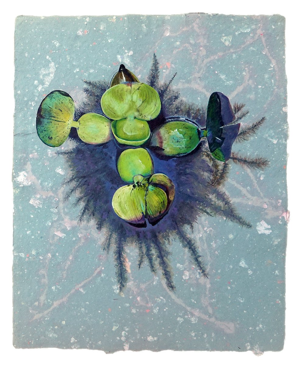
As was the case with my last new artwork, I began this painting while in residency at BROTA and the Buenos Aires Botanical Garden but didn’t finish it until now! It’s another painting of the water hyacinth - an attractive plant that due to human spread is now an invasive menace.

My first painting of this plant, Adrift, is intentionally more flat and graphic. It focuses on shape, color, and contour. In this painting, I wanted to add more realism through volume, depth, detail, and light via water reflection. The substrate is another beautiful handmade paper by Ato Menegazzo Papeles in Buenos Aires, Argentina.

This is Incursion, acrylic on artisanal handmade paper, 19.5x15.5”, 2023.

Shelby Prindaville's second painting of a water hyacinth.

Sioux City Journal Feature!

A screenshot of the beginning of the SCJ feature

I’ve been getting some nice Louisiana press for my summer LSU Vet Med artist residency, and now there’s great local coverage as well - with more in the works! Here’s the Sioux City Journal digital article “Morningside professor participates in first-ever artist residency at LSU vet school” by reporter Dolly Butz, and here’s a PDF of the print version!

LSU Vet Med Artist Residency Artwork 8-19

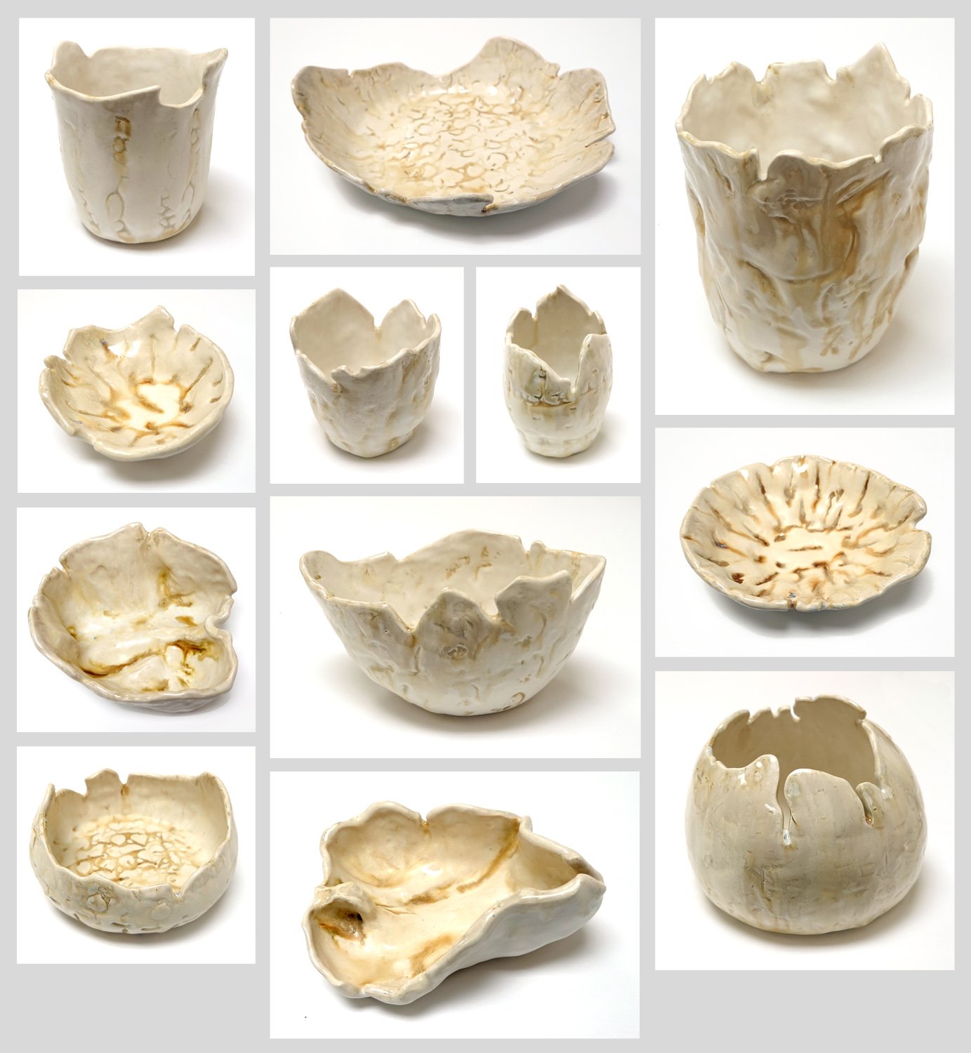
This is Skeletal Ceramics, assorted handmade stoneware vessels imprinted with or formed around various canine, equine, and swine bones from the anatomy lab, 2022.

Shelby Prindaville's Skeletal Ceramics collection

I made this body of ceramics start-to-finish on site at the LSU School of Veterinary Medicine and with purchased supplies and firing assistance from Southern Pottery Equipment. The canine, equine, and swine bones used include skulls, jawbones, various vertebrae, scapula, femurs, and sacra. The glazes used were an Amaco Shino Cacao Matte Cone 5-6 Glaze (SH-32), a Spectrum Satin White Hi-Fire Cone 5 Glaze (1121), and a Spectrum Satin Mottle Hi-Fire Cone 5 Glaze (1122). I applied the Cacao Matte to all the textured/impressed areas and then sponged off the outer surfaces, then put on a generous two coats of the Satin White, and then painted a little of the Satin Mottle on kind of haphazardly and then more carefully at the lips. I fired to Cone 6. I was really happy with how this combination performed, as they do look like bone themselves! Seven of these pieces sold during the exhibition to three different buyers.

The anatomy lab allowed me to take the bones I’ve been using back with me so that I can continue to develop this collection, so stay tuned for more.

LSU Vet Med Artist Residency Artwork 6 Process

Here are process photos from Crèche Chic!

LSU Vet Med Artist Residency Artwork 5

This is actually the first piece I began here at the LSU School of Veterinary Medicine! I never know how to properly answer people as to how long a piece of artwork takes to finish, as my optimal process involves working on several different pieces simultaneously. If you count start to finish, I worked on it for a month and five days - however, there were a number of days in there that I didn’t touch this piece or only worked on it for a couple of hours…

The subject in this piece is a three-day-old baby Nubian goat; she was fully healthy but was brought in to accompany her brother who was failing to thrive and unfortunately didn’t make it.

Singularity, mixed media including Clinical Pathology’s Diff-Quik Eosin Y stain, Clinical Skills' fluorescein, Histology’s light green stain, and acrylic on basswood panel, 12x24x1.5”, 2022.

A mixed media painting of a baby Nubian goat in triplicate.

Ashlar Etching

I was invited to take part in the ART 246 Intaglio and Collograph Printmaking course’s finals etching trade. The end of the semester is always a busy time, but I said yes; I haven’t done an etching in ten years and it’s always good to refresh and grow, plus it’s a nice interaction for all involved. Our talented instructor Stephanie VonderAhe provided me with an already beveled 3x4” copper plate with hard ground applied. The assignment was themed “the view from here.” As I was mulling over the theme and how it might fit into my artistic practice, I decided to do a portrait of Ashlar - I see her every day.

I drew the piece at home, and I just accepted any mistakes I made as I didn’t really have time to re-ground any spots. When I thought it was done, I put the plate into the acid bath for a 40min etch, took it out, and printed it. That first print was pretty good, but the drawing seemed a little flat and there were a number of areas where I wanted to add or deepen shadows and develop a sense of volume. Stephanie added a new layer of hard ground for me, and I went back into the plate a second time. We then put it in the ferric chloride again for 40 more minutes.

I printed an edition of 16, but several of those had print errors (are you supposed to count those? - I’m now thinking you’re not, but I did!). As intended, I gave away 7 to the class. I framed up one for myself, and gifted another to my parents and a third to my sister. I have just a few good prints left, but of course I do still have my plate…

I’m pretty happy with how it turned out! Of course, I see some areas I could improve upon were I to do another plate or had time to fix mistakes prior to etching, but overall it’s a nice representation of Ash.

My Artist For the Earth Opening Reception!

Well, Earth Day 2021 was quite eventful! I’ll do a separate post on the ART 225 Painting I project we took on earlier in the day, but this post is all about how my opening reception went for my Artist for the Earth solo show at The Block Gallery in downtown Sioux City.

First of all, I want to say a big thank you to the Morningside Art Department federal work study studio art assistants Devyn Reilly and Rachel Steinkamp for helping me to install the show. While I’ve installed many a show alone, it is so much nicer to have skilled help working alongside you! I also had Rachel take some nice shots of the show after we installed it, so I might add more to the blog later, but here are a few photos I took tonight.

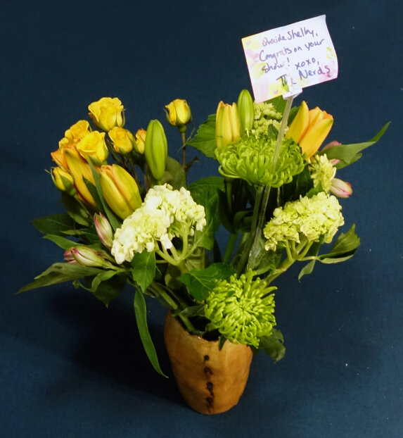
The last photo in the grid is thanks to some of my lovely friends, who not only came out to support me at the reception but also gifted me with a bouquet of flowers and purchased artwork and reproductions. A bunch of wonderful colleagues, students, and community members also came through and many left with various pieces of artwork as well. It was a lovely evening!

New Ceramics!

My latest batch of ceramics has come out of the final firing! I started these pieces around three months ago, but ceramics take time and sequential processing. Though there’s still quite a bit of trial and error, I feel that I am honing my glazing skills! There are several glazing combinations from this go-round that I’m definitely going to be revisiting. There is also a new glaze color in this set - Green Tweed - that we didn’t have on hand before; I glazed it blind (meaning I had no samples of it to see how it’d turn out) so I didn’t use it on too many pieces, but it turns out I really like it both solo and in combination with other colors so I’ll be adding into a more regular rotation.

Above you see three new small dishes or bowls. The photography of ceramics is difficult because they are three-dimensional objects with variance - how many photos do I need to share to truly capture enough of each artwork? For these, I think one photo sufficiently captures each piece, though on the one with the hand-painted rings, there are rings on the exterior of the dish as well which I’m not sure is evident. Maybe I should have taken a side photo too?

However, for the small bowl above, I think at least two photos are needed to understand the glazing; another could provide even more coverage, but I believe only one would be insufficient.

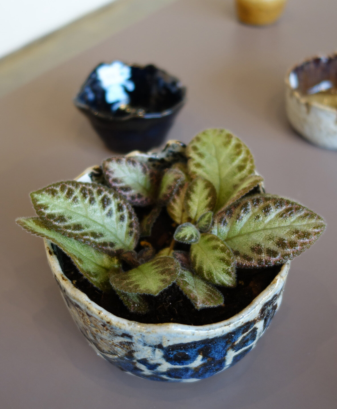
All of the eight pieces immediately above are planters with drainage holes, as demonstrated by the final photo in the grid.

For many of the more complexly glazed pieces, I think my photographs - even multiple - don’t fully capture their totality. I should experiment to see if different photo setups can help, but also I think some artwork is always going to be best suited for in-person appreciation!

New Painting: Velocity

Happy New Year! I’ve been hard at work painting a painted turtle; it was a beast to draw and quite demanding to paint as well because of all of the pattern and detail.

I met this baby painted turtle (Chrysemys picta) while biking the Adams Homestead and Nature Preserve - I felt very lucky to have spotted its dollar-coin-sized stature along the trail!

This is Velocity, acrylic on basswood panel, 14x14x1.5”, 2021.

More Ceramics!

In my last ceramics blog post, I shared a range of planters I’ve created. (When I use the term “planter” for my own ceramic work, I am specifying that I have crafted them with drainage holes. I haven’t done so yet, but if I were to create a piece without drainage holes to house a plant, I’d call it a “cache pot.”)

I am most interested in making planters because of my extensive plant collection, so I’d say that for every non-planter piece I make, I make four planters. But I have made other pieces, including vases and bowls! Here are a few examples. The three vases all make use of my experimental embedding of iron oxide chunks, so they’re glazed in a “clear” that appears as a transparent tan.

Publication in the 2020 Kiosk

I entered artwork into the jury pool for the 2020 issue of the Kiosk, which is published at my own institution of Morningside College in Sioux City, IA. Two of my pieces, Balancing Act and Camelflage, were selected and the magazine’s print edition will be distributed in a few weeks!  If you’d like to see the digital version, you can browse it here. The 2020 issue is Volume 82, which is a testament to the longstanding tenure of this publication - the first issue was released in 1938.

New Artwork: Reclamation

I’m interested in starting a new body of work that involves growing aragonite and/or calcite crystals atop various substrates including sculptures, reliefs, and found objects. I am attracted to the conceptual and aesthetic power of nature overtaking manmade constructions. Additionally, aragonite and calcite are the crystallized form of calcium carbonate, a natural material that is the primary component in seashells and corals. Marine animals with calcium carbonate exoskeletons are particularly susceptible to ocean acidification; in order to grow these crystals, I am immersing limestone (which is a sedimentary rock composed of marine skeletal fragments) in acid, so in some ways the growth of these crystals is also a funerary rite for marine wildlife dying to climate change.

Here is the first completed work I’ve done using this medium. I’ve titled it Reclamation, and it is a mixed media relief including QuickCure Clay, QuickCure Glaze Coating, acrylic, aragonite crystals and salt on birch panel. It’s 12x9.25x2”.

BROTA and Buenos Aires Series "Transmigration Landscapes"

I had my chromatography series Transmigration Landscapes framed right before moving, and so I’ve taken the time to photograph the pieces in their final form! From this Buenos Aires Botanical Garden collection, there are seven framed pieces each containing five loosely grouped chromatography plant portraits. The framed dimensions are 8.875x30”.

These are, in order:
Transmigration Landscapes : Arc
Transmigration Landscapes: Atmosphere
Transmigration Landscapes: Cadence
Transmigration Landscapes: Flare
Transmigration Landscapes: Percussive
Transmigration Landscapes: Reflective
Transmigration Landscapes: Vibration