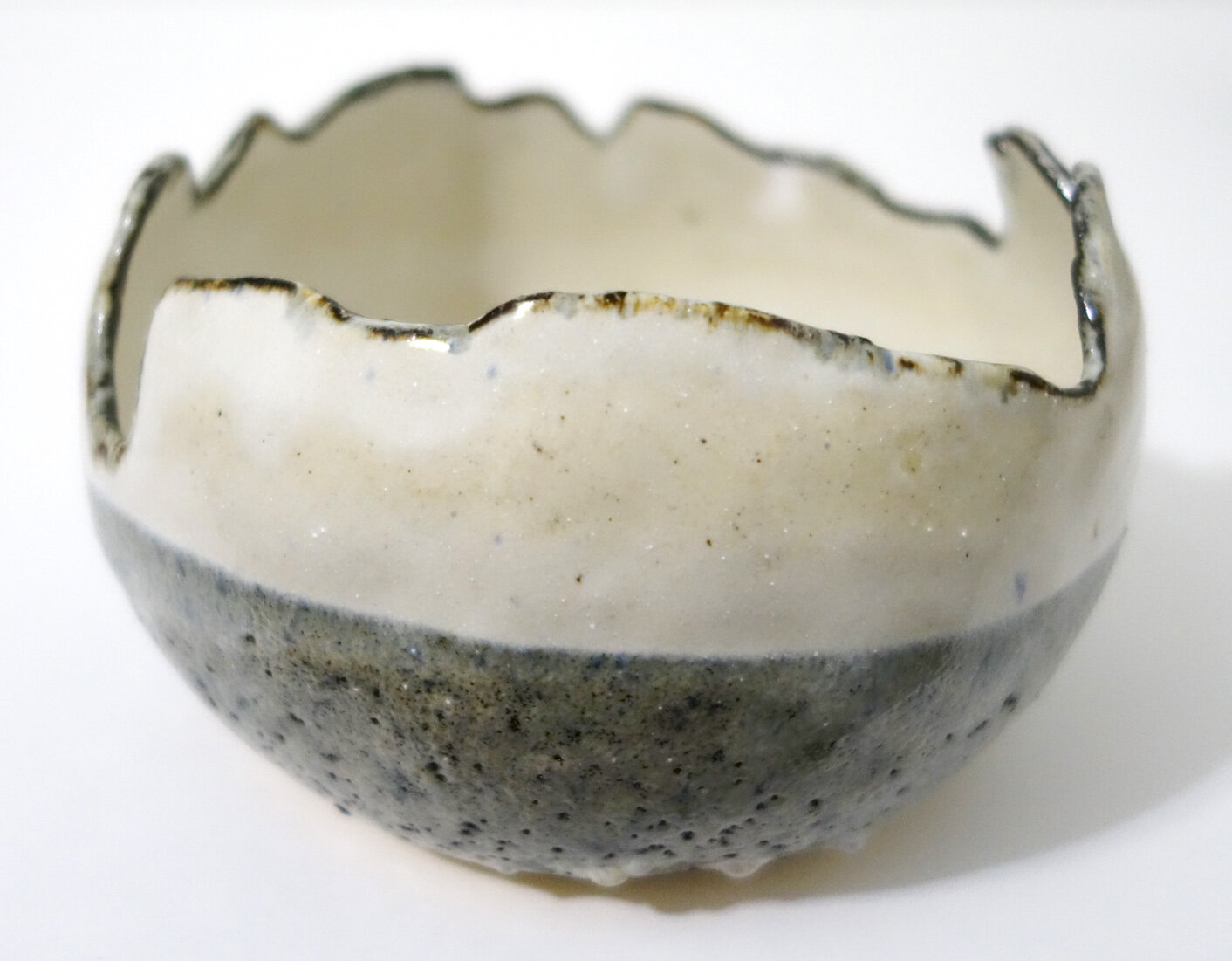
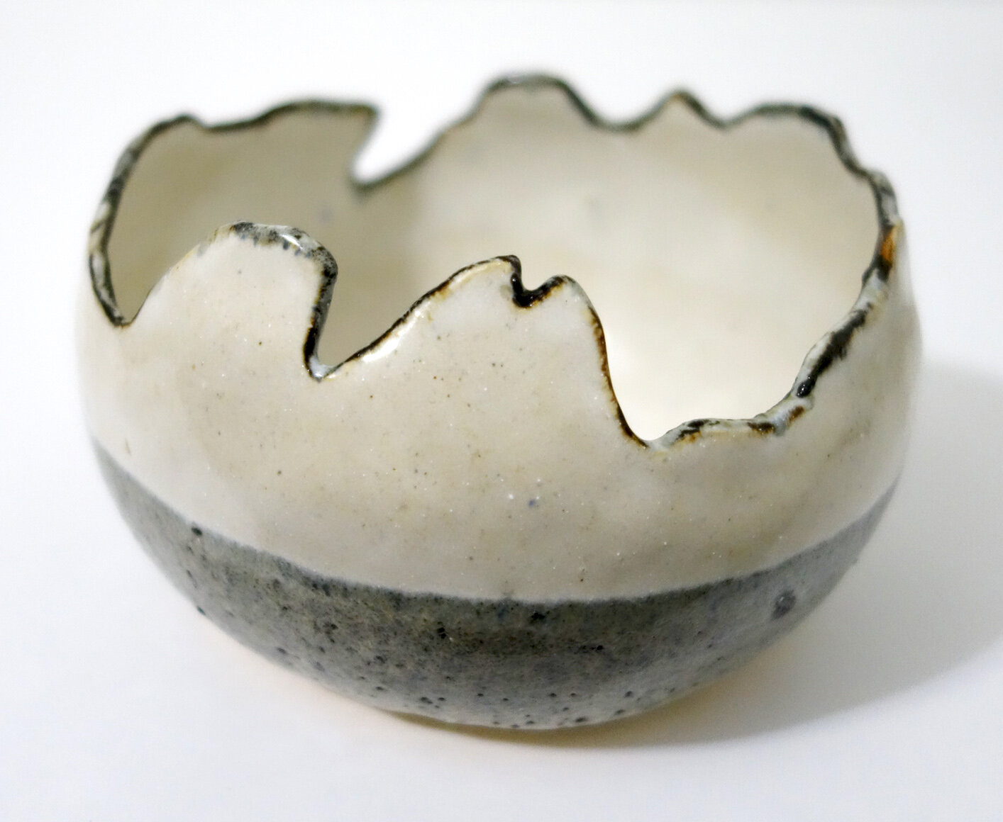
Spring Break in Puerto Rico!

I’ll be visiting Puerto Rico with my friend and colleague Stacey Alex over spring break! As you might imagine, I’m excited to get to soak in the natural beauty of the island. Our planned outdoor itinerary includes kayaking on the Laguna Grande Nature Reserve’s bioluminescent bay, hiking in El Yunque National Forest, a variety of beach visits, and exploring the Rio Camuy Cave Park.

I’ll post some photos when I return!

Title IX Religious Exemptions

Title IX of the Education Amendments of 1972 is a federal civil rights law which reads, “No person in the United States shall, on the basis of sex, be excluded from participation in, be denied the benefits of, or be subjected to discrimination under any education program or activity receiving Federal financial assistance.”

All three of the higher education institutions I have taught at have complied with this law. Up until recently I had believed - mistakenly, it turns out - that any educational institution had to make a choice between adhering to Title IX and receiving federal funding, or opting out of both.

I have now learned that institutions can request religious exemptions to Title IX, receive those exemptions, and then are explicitly allowed to discriminate against their students and employees and still receive federal funding. Furthermore, the Office for Civil Rights has approved every religious exemption Title IX request filed. This includes hundreds of institutions; in late 2016 that number was at 245 and it continues to grow each year. Depending on their religious tenets, institutions can legally discriminate “on the basis of sexual orientation, gender identity, marital status, pregnancy or receipt of abortion while still receiving federal funds.”

Last March, the Religious Exemption Accountability Project (REAP) filed a class action lawsuit seeking to remedy this glaring civil rights loophole. As stated in the legal complaint, the institutional and legally sanctioned discrimination faced by these diverse populations includes “conversion therapy, expulsion, denial of housing and healthcare, sexual and physical abuse and harassment, as well as the less visible, but no less damaging, consequences of institutionalized shame, fear, anxiety and loneliness” on our taxpayer dime.

If you too find this religious exemption to Title IX to be deeply troubling, please consider donating to the REAP team (through their parent organization Soulforce, which received an 89/100 on Charity Navigator).

Rolling with Ceramic Glaze Changes

Speaking of glazes: I’ve been learning that the discipline of ceramics involves many variables, and some of the variables are less constant than I’d expect. In the discipline of painting, when I use up paint and I need to buy replacement tubes, they are very consistent in formulation so they are almost never perceptibly different. In ceramics, due to weight, volume, and cost issues we mix most of our glazes ourselves. This introduces a lot more human error compounded by potential supply line vendor changes in the ingredients and user contamination. To continue the comparison, it’d be like if I switched brands and sometimes even types of paint and expected continuity!

To state it simply: I’ve learned that when a bucket of glaze is gone and we remix it, I cannot expect the same aesthetics or behavior from the new glaze as from the old, even if they are purportedly the same. In some ways this is disconcerting, of course. But it is also a real opportunity, and it adds some exciting pressure and novelty into the glazing process. The novelty is self-explanatory; the pressure comes from if you want consistency since you only have as long as those buckets last for the desired effects to relatively predictably result.

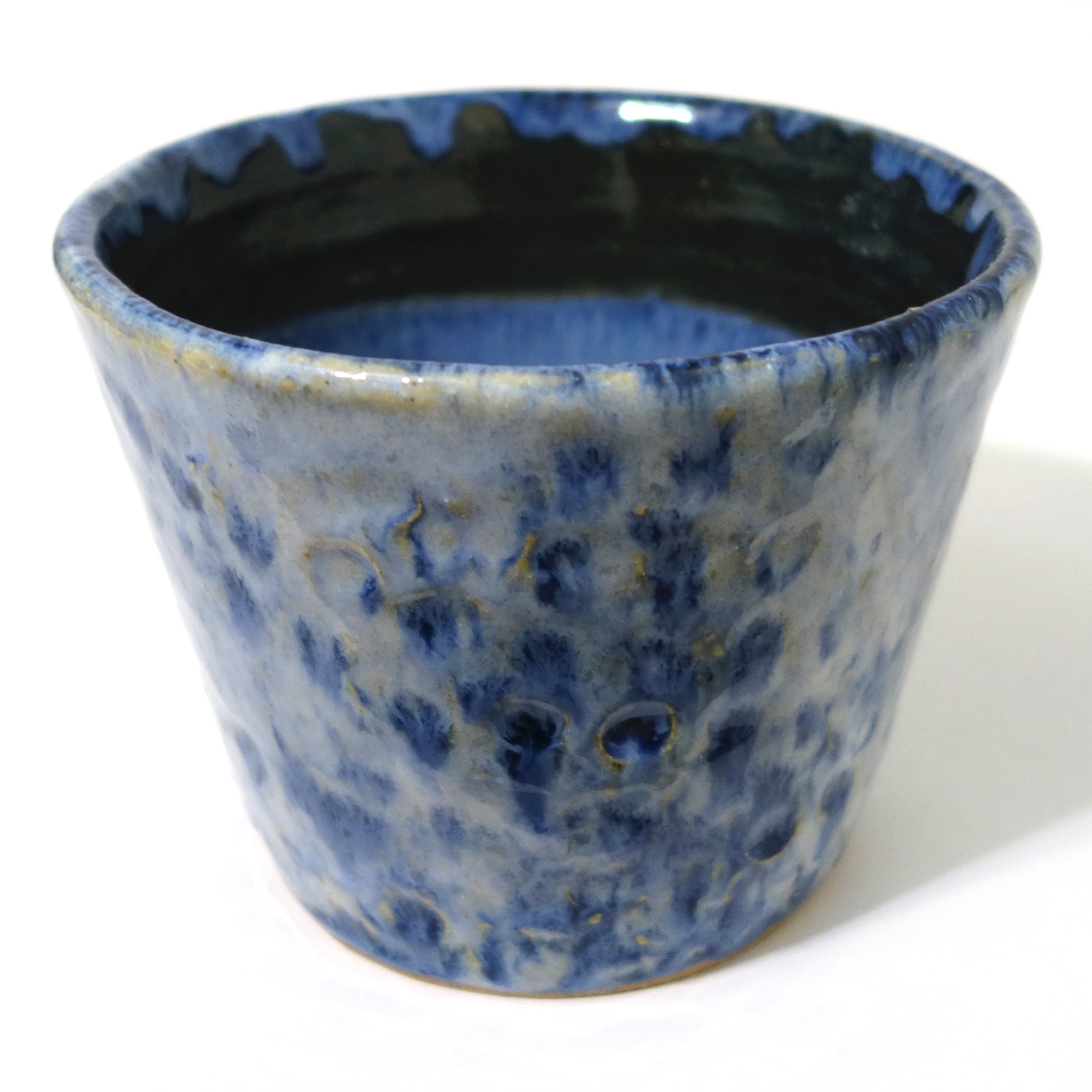
Below is how Cone 6 Larry’s Black under Iron White looked with the bucket of Iron White that we were using last year.

You can see that the Iron White behaved in a very glossy way, was relatively thin at one coat but varied in thickness dependent on number and types of application coats with opacity ranging from translucent to decently opaque. At its most opaque, it was white. The Larry’s Black underneath went to a glossy and stable spectrum of various values of blue dependent on the application thickness of both colors.

We used up that bucket of glaze a few months ago, and the new Cone 6 Iron White appeared. Below are two new pieces that use Green Tweed, Larry’s Black, and the new mix of Iron White.

This Iron White is thicker at one application coat, a little yellower, and more opaque and matte. It also interacts quite differently with Larry’s Black. The matte-over-gloss effect causes the Iron White to crater and blister atop Larry’s Black; you can see it does not do that over Green Tweed as Green Tweed is itself more of a matte glaze.

Cratering and blistering are frequently considered “glaze defects,” but I enjoy the texture that some “glaze defects” provide - if you review my body of stoneware ceramic work you’ll notice that I am drawn to crawling as well.

Since these were my first pieces with the new bucket of Iron White, I didn’t know about this new interaction yet - I was expecting glossy results aligned to that first batch above. Now that I know, I’ve glazed a bunch of new ceramics with this cratering/blistering effect in mind, and they are waiting in the kiln until it’s filled up and ready to fire. I’m excited to see them come out!

New Cone 6 Glaze Combination!

When my parents visited this past fall, my mom tried her hand at ceramics! Then at Thanksgiving, she glazed her first piece. She decided to use four different Cone 6 glazes on the small dish - she overlapped Green Tweed, Red Earth and Iron White around the sides, and then filled in the bare central triangle left in the middle with Baby Blue.

Red Earth was a new-to-the-studio glaze that we had recently acquired; it was an old recipe our ceramics faculty Paul Adamson unearthed and wanted to try again. I didn’t imagine it would look very good in combination with Green Tweed, but the overlap on my mom’s dish was small so I figured it wouldn’t matter.

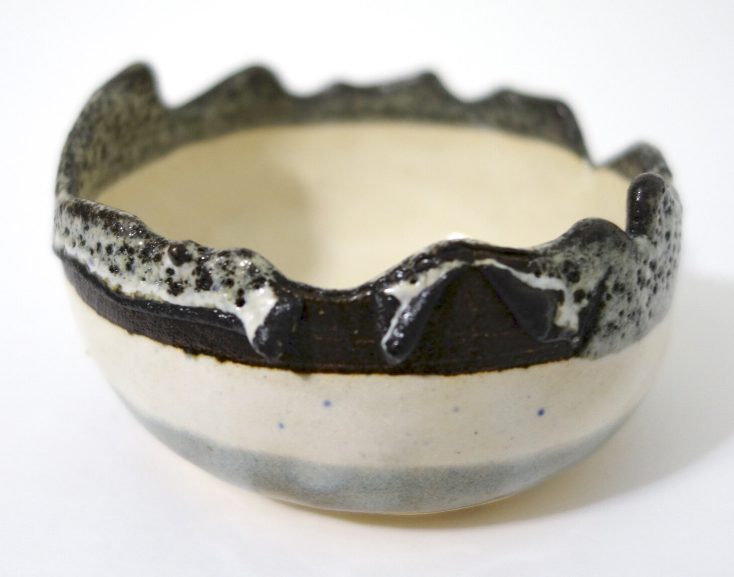
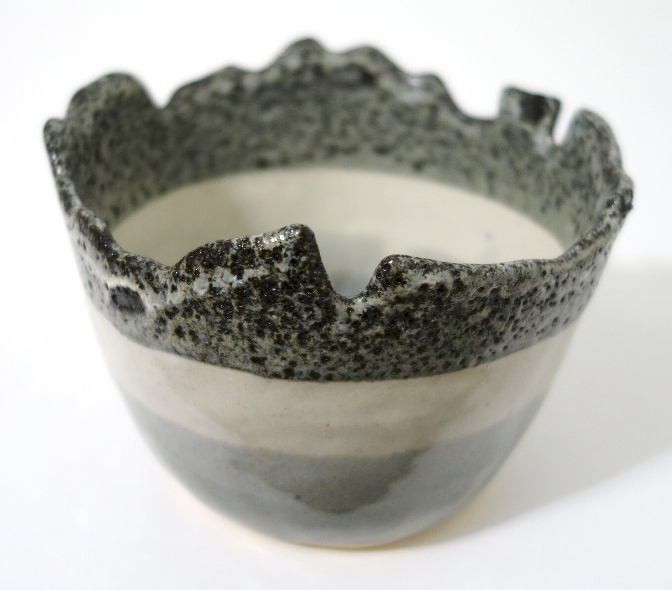
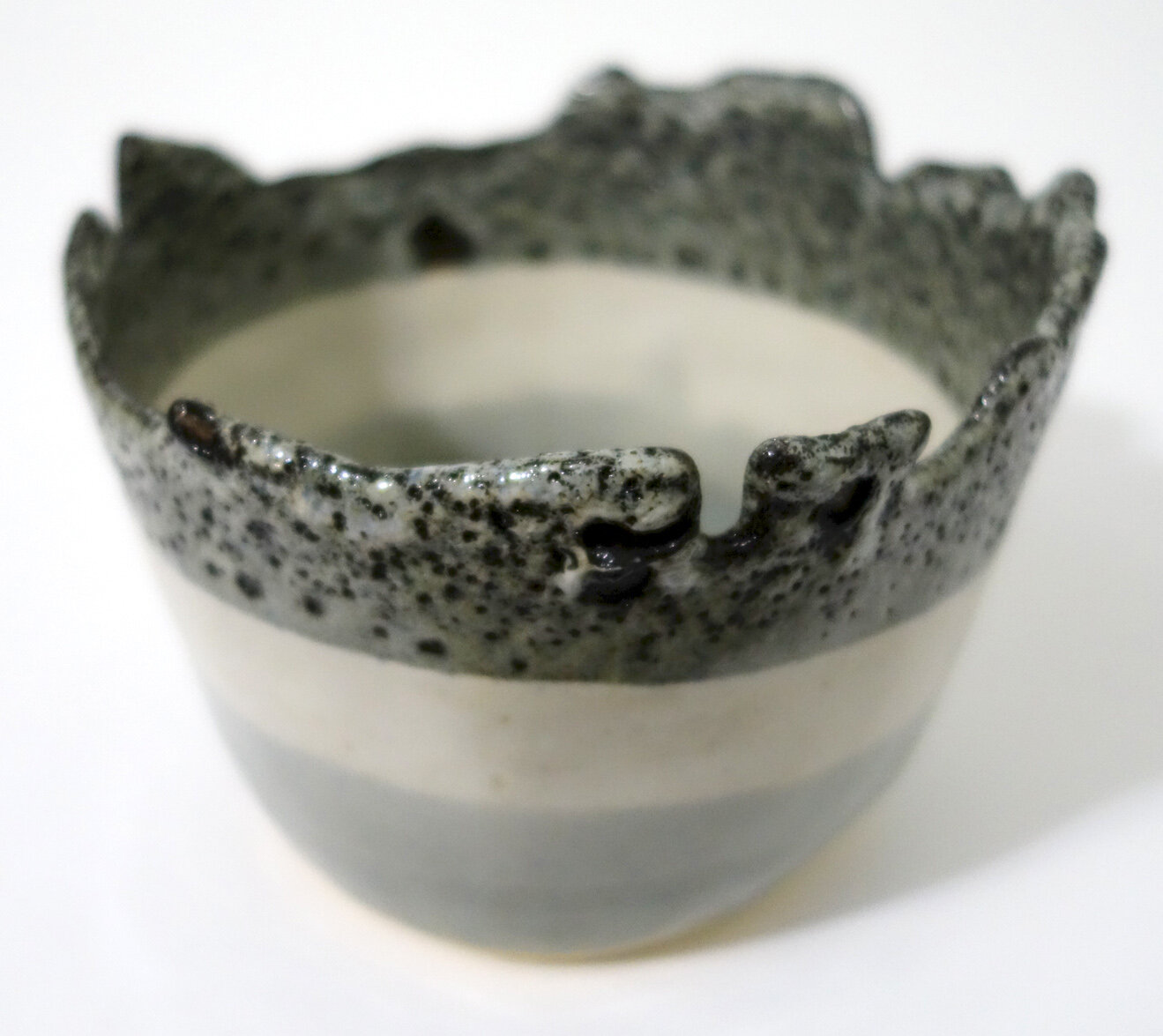
When my mom’s first piece of ceramics came out of the glaze firing, I was really surprised - the overlapped spot of Red Earth over Green Tweed looked metallic and reflective! So far, I’ve only seen that kind of glaze result from raku, and those are somewhat unstable and decorative (not watertight). I was excited to see what this new food-safe stoneware glaze combination would look like on a larger scale, so I tried it out on several pieces! This glaze combination seems somewhat chaotic in terms of its uniformity, density, and reflectiveness, but I’ve always enjoyed the balance that natural chaos can bring to my tight artistic hand.

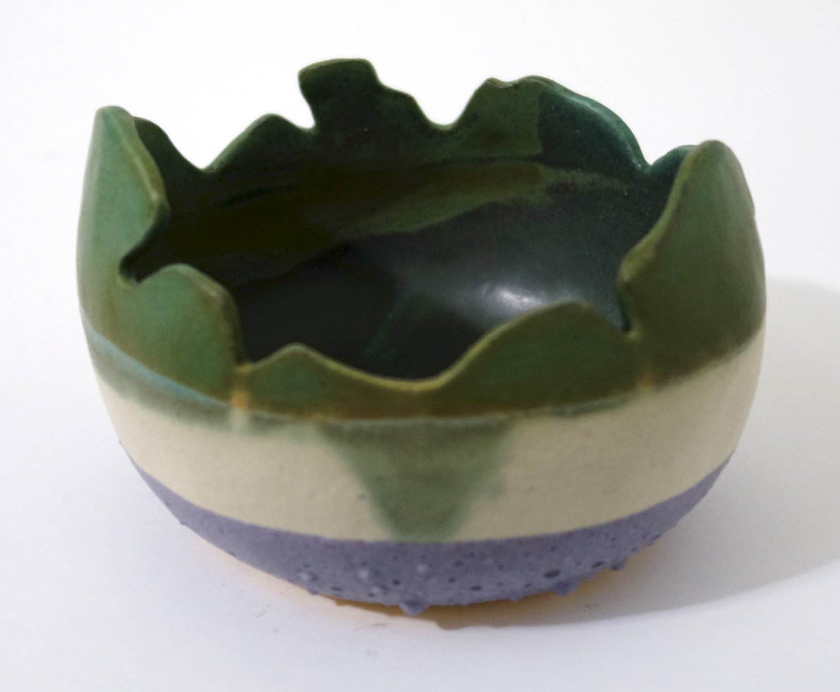
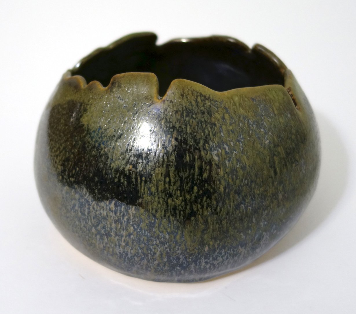
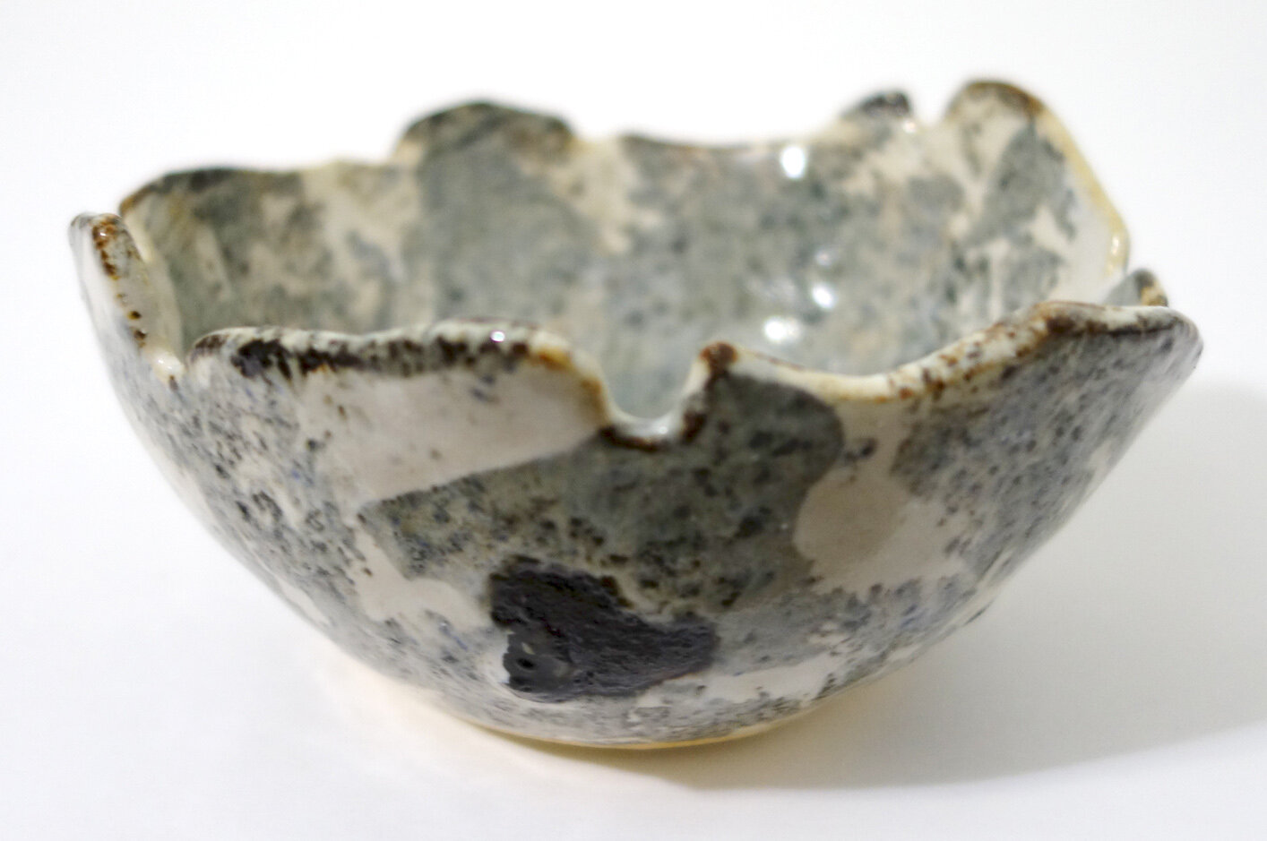
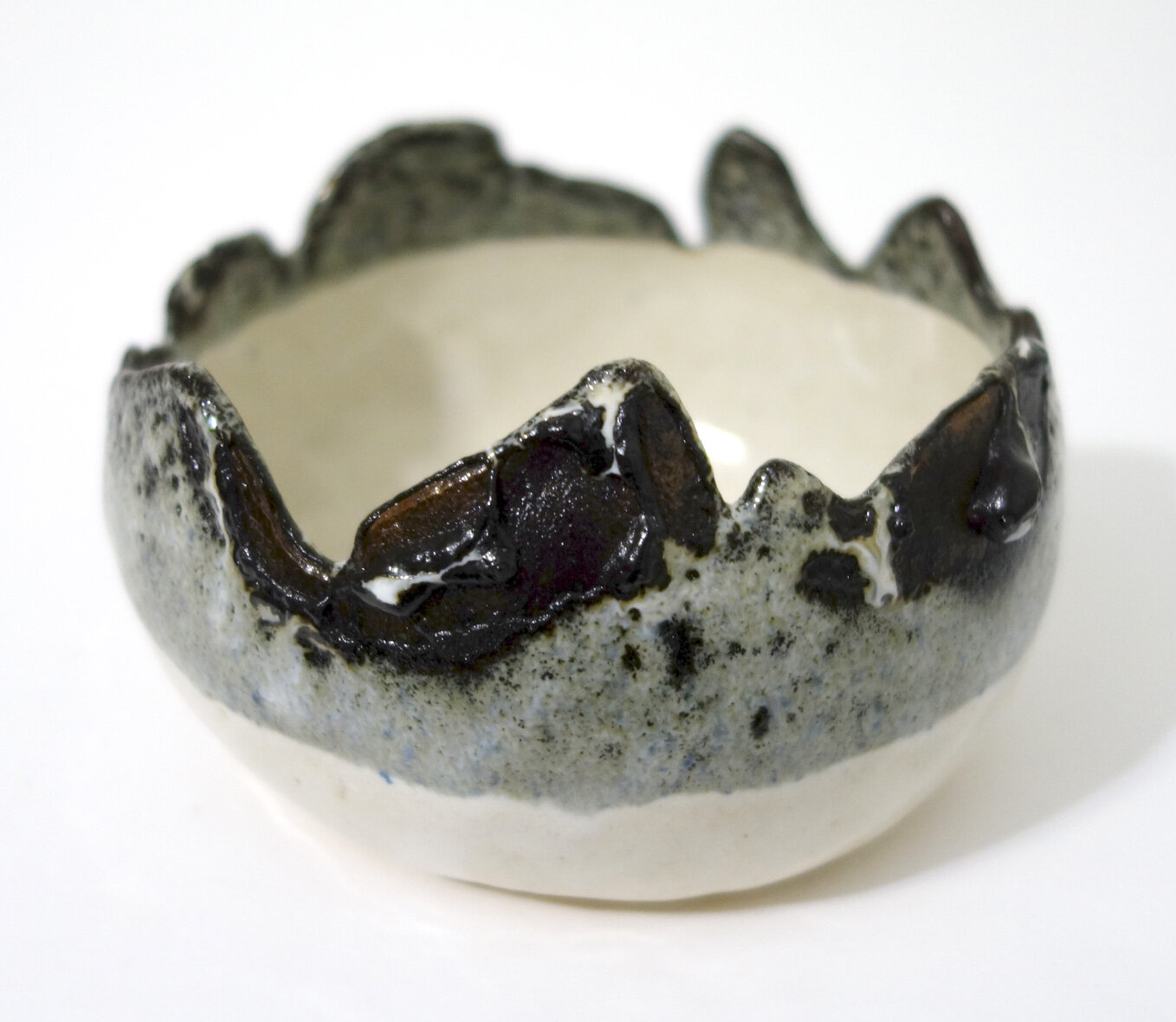
There are two views of each of the three pieces above. The bowl and egg-shaped vase both use Green Tweed as the base and then have Red Earth applied to most of the top. The striped planter combines Iron White, Green Tweed, and Red Earth in different layers.

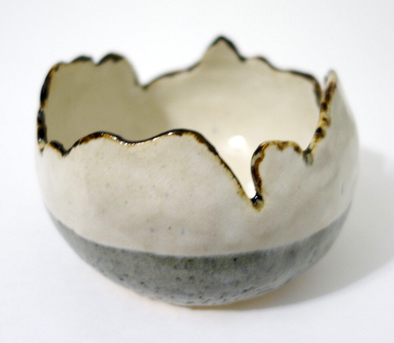
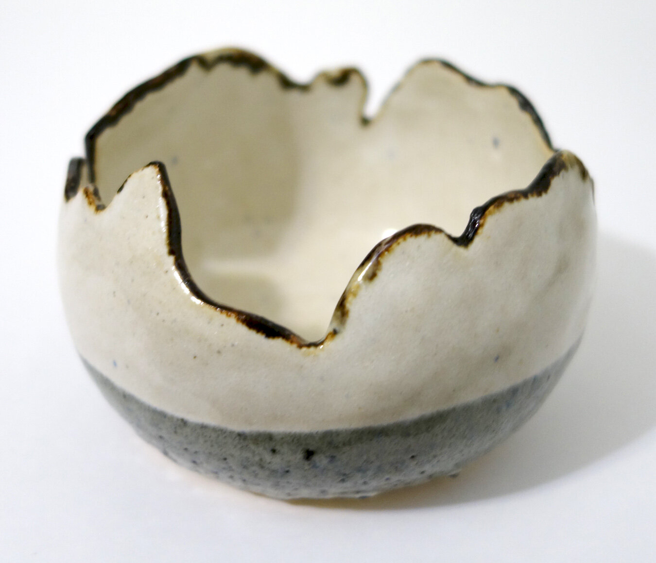
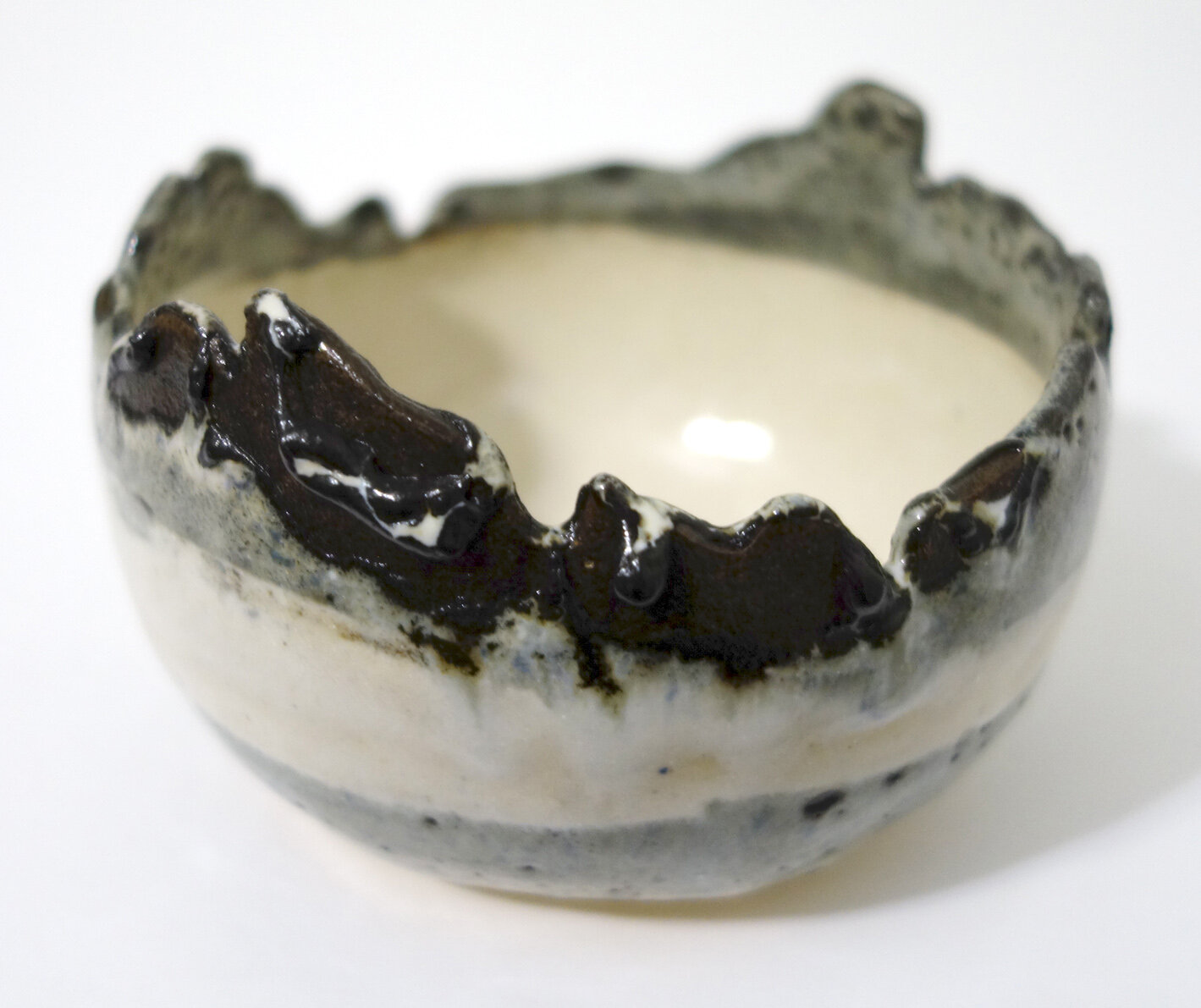
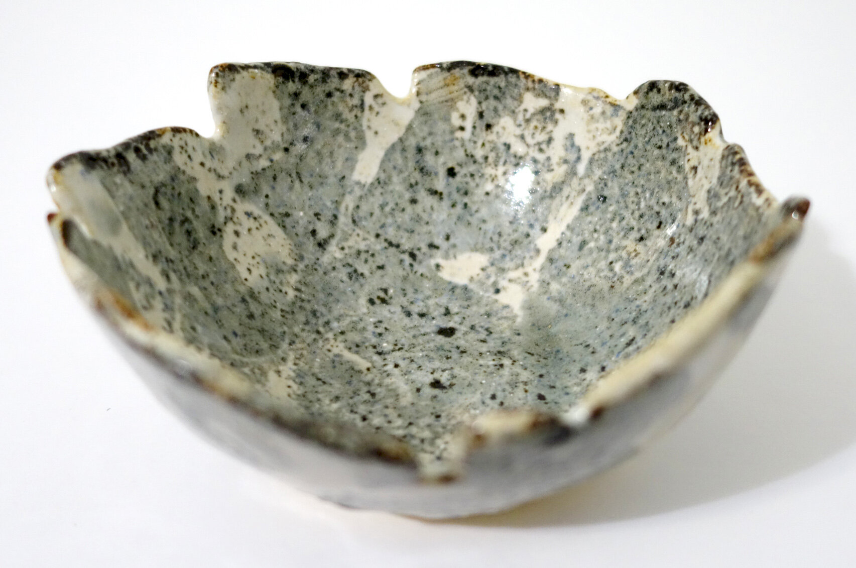
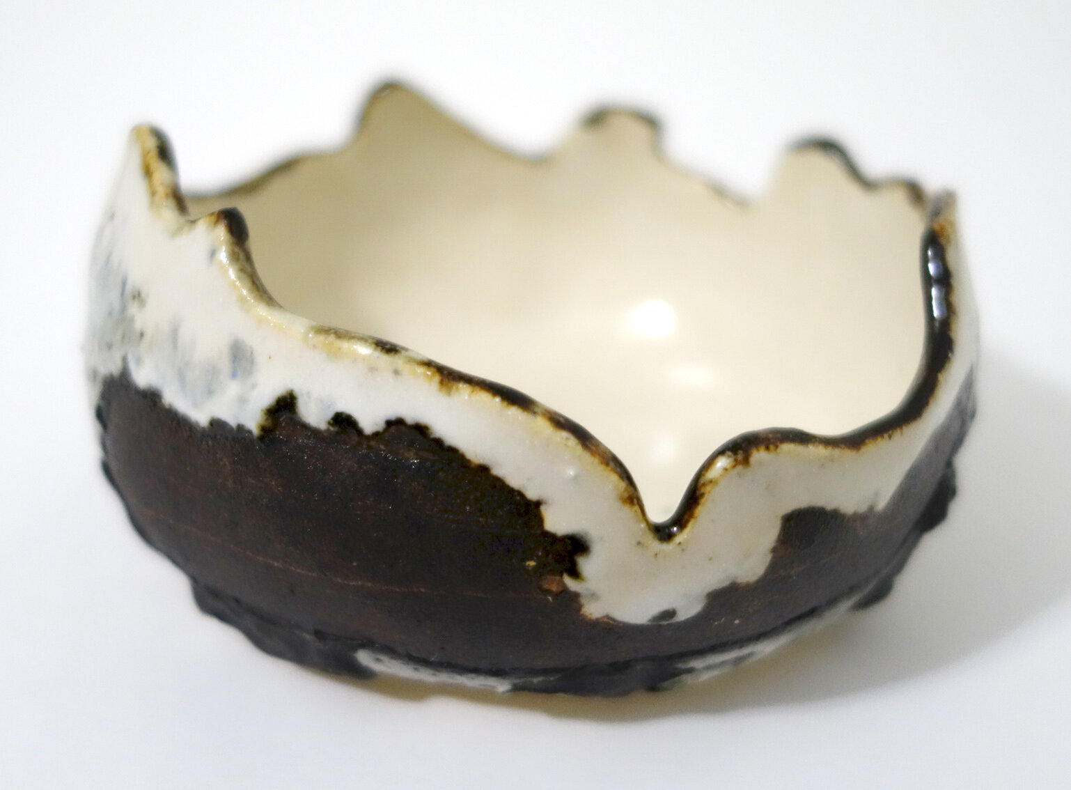
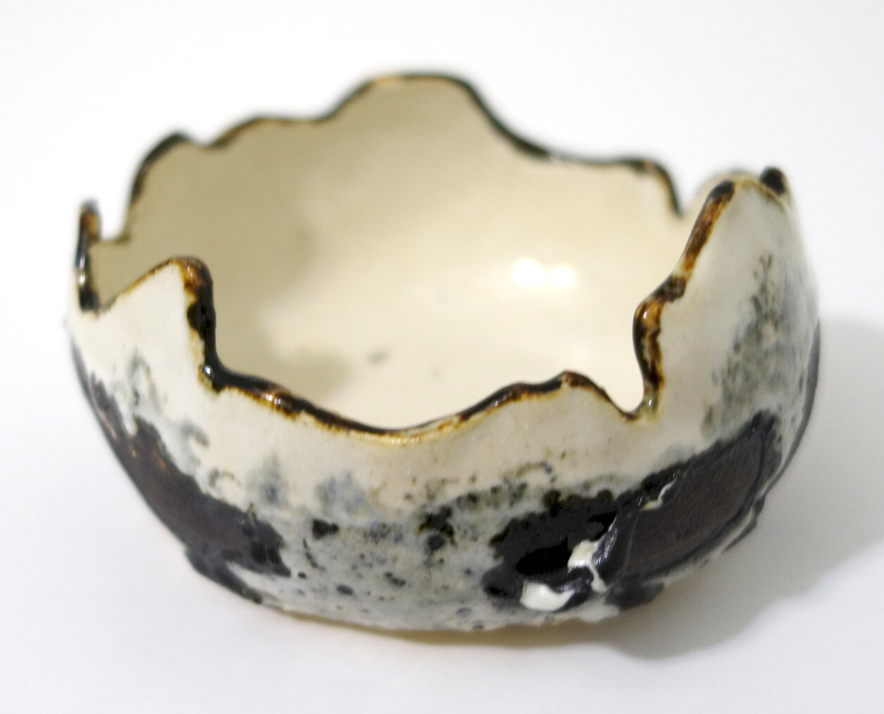
Here are three more pieces - two more broken-eggshell vessels and another planter! These also experimented with Iron White, Green Tweed, and Red Earth in different ways. I need to take better notes on my processes, as I no longer remember the order of layering on each of these and I didn’t write it down, but more testing will reveal all such secrets in time.

Overall, I’m really pleased with how these all turned out and plan to continue experimenting with these glaze combinations more in the future!

Hot Water

My travel through artist residencies to different parts of the world has contributed a lot to my artistic oeuvre and practice. But its impact surpasses professional rewards; it has materially changed the ways in which I see and operate within the world both big and small. One of the smaller persistent changes is that every time I have a hot shower, I really appreciate it.

I took hot water in the shower - and out of the shower! - for granted growing up. I liked it, but I don’t remember truly feeling grateful for it until after I lived without it for weeks at a time. I’ve probably only lived a cumulative of around three months without hot water. It is somewhat surprising to me that such a short period of deprivation or negative novelty can have this lasting an impact. I’m so happy it has, though! Because again, every time I step into a hot shower now, I’m impressed and thankful. I just finished a hot shower, in fact, and was marveling at it which led to my writing this post.

I recognize that this story reflects my privilege; that I was able to take hot water for granted growing up and that travel, rather than economic hardship, has led to my reevaluation of hot showers are both very fortunate circumstances. But now I am additionally fortunate for my gratitude, this transformation of an expectation into an abiding appreciation.

Do you have any “hot water” transformations?

Speaking Of Ashlar...!

I always provide Ash with a water bowl in addition to misting. I know she drinks from the misted droplets and the water in her food rather than standing water, but I like providing her with a spot to soak if she wishes. She somewhat regularly drags coconut fiber bedding into the dish, and that’s her prerogative!

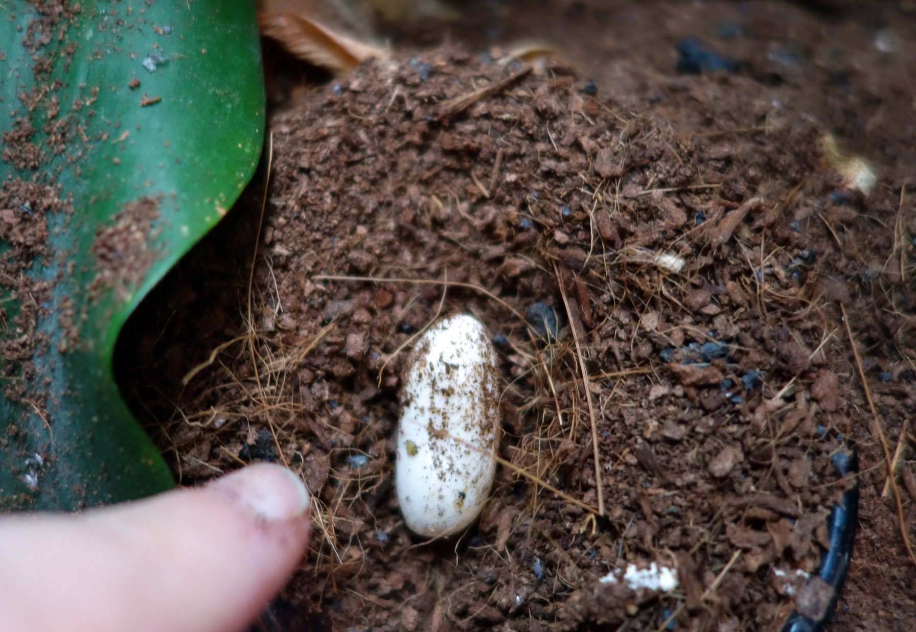
Recently, though, I saw her sitting protectively atop the wet coir in the dish one evening - a behavior I’ve not witnessed before - and I thought I spotted a bit of white that looked suspicious. I took a photo and then the next morning when she’d moved off to sleep, I investigated! Sure enough, I unearthed an egg. I’m not sure if it’s her first egg or not, but it’s the first I’ve spotted from her! She created her own lay site and ensured the right humidity - what a clever gecko she is.

Since Ash has been a solitary gecko since around eight months old, she is very likely laying infertile eggs. There is an ever so small - microscopically tiny! - chance that she could successfully undergo parthenogenesis, but I’m not holding my breath. However, this is a maturity milestone! I left the egg in the dish as she might want to circle back and eat it to reclaim some of the nutrients.

Ashlar Etching

I was invited to take part in the ART 246 Intaglio and Collograph Printmaking course’s finals etching trade. The end of the semester is always a busy time, but I said yes; I haven’t done an etching in ten years and it’s always good to refresh and grow, plus it’s a nice interaction for all involved. Our talented instructor Stephanie VonderAhe provided me with an already beveled 3x4” copper plate with hard ground applied. The assignment was themed “the view from here.” As I was mulling over the theme and how it might fit into my artistic practice, I decided to do a portrait of Ashlar - I see her every day.

I drew the piece at home, and I just accepted any mistakes I made as I didn’t really have time to re-ground any spots. When I thought it was done, I put the plate into the acid bath for a 40min etch, took it out, and printed it. That first print was pretty good, but the drawing seemed a little flat and there were a number of areas where I wanted to add or deepen shadows and develop a sense of volume. Stephanie added a new layer of hard ground for me, and I went back into the plate a second time. We then put it in the ferric chloride again for 40 more minutes.

I printed an edition of 16, but several of those had print errors (are you supposed to count those? - I’m now thinking you’re not, but I did!). As intended, I gave away 7 to the class. I framed up one for myself, and gifted another to my parents and a third to my sister. I have just a few good prints left, but of course I do still have my plate…

I’m pretty happy with how it turned out! Of course, I see some areas I could improve upon were I to do another plate or had time to fix mistakes prior to etching, but overall it’s a nice representation of Ash.

DASH Special Edition 2021 Publication

Back in mid-2018, DASH Literary Journal published my painting All Out. DASH editors recently reached back out to me to request my permission to republish it in their best-of retrospective DASH Special Edition 2021 to be published in December. I said yes, and provided updated contact information for the new contributor copies they kindly send out. Those just arrived in the mail!

Spring 2022 Classes

Well, last week we wrapped up the Fall 2021 semester, and next up is Spring 2022! I will be teaching Graphic Design I, Painting I, Painting II, Graphic Design Internship, Advanced Studies in Drawing, Graphic Design, and Sculpture, and Senior Art Seminar.

And He Might Have Gotten Away With It Too - Photoshop Edition

As we were critiquing all the student animations turned in for my ART 210 Graphic Design I final, one piece prominently displayed the Photoshop twirl filter.

I commented to the class that when I see that filter, I recall how it was used by an infamous pedophile to hide his identity online, but international police managed to reverse it enough to allow for identification which then led to his capture.

My students were like, “huh,” and then we moved on with the critique.

The twirl filter applied to my most recent "baked potato" raku-fired bowl.

The twirl filter applied to my most recent “baked potato” raku-fired bowl. Scroll down to see it unaltered.

More Raku!

You got a sneak peek at some of my recent raku work in my exhibition shots from Functional Aesthetic, but here is the full reveal!

Above are three photos of one “baked potato” bowl. I used my own hair again as well as sugar for the carbonized marks on this piece.

This vase is very difficult to photograph well; it’s currently on exhibit, but once it comes back I’m going to see if I can capture it a bit better digitally. A couple of my friends who viewed the show said this was their favorite piece of mine. The way the glaze dots turned out reminds me of inset abalone shell.

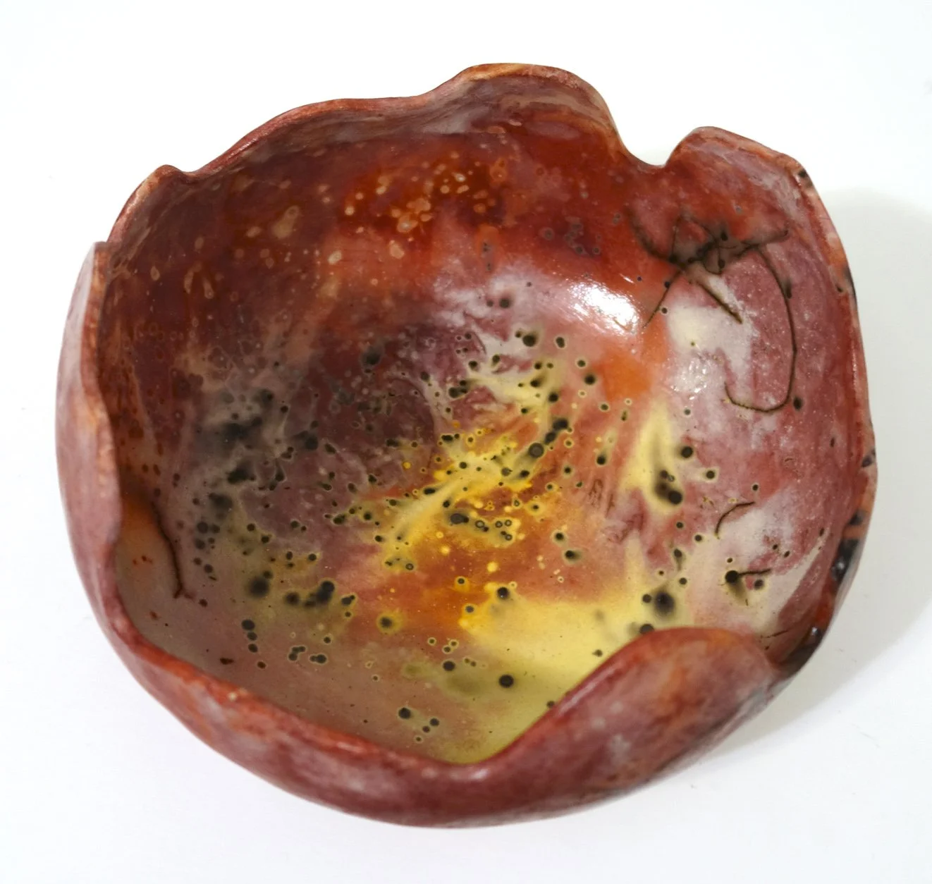
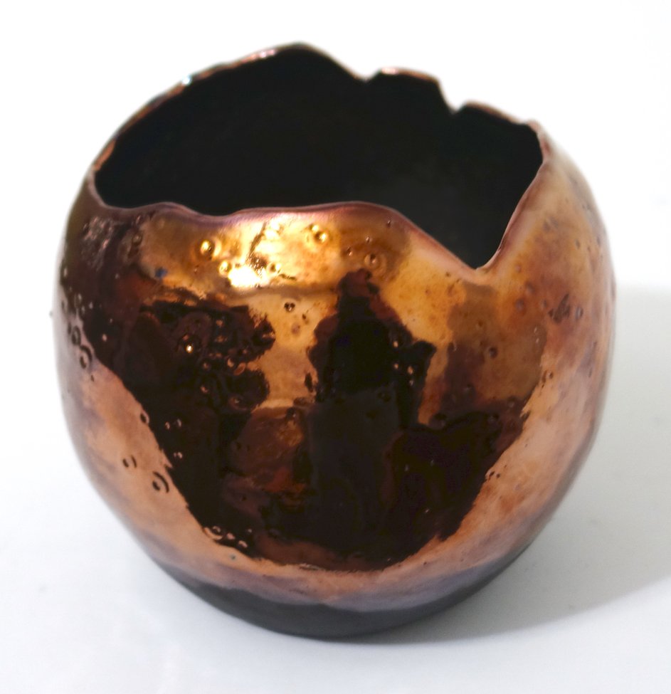
This piece certainly didn’t turn out as planned; I experimented with a turquoise crackle glaze, but I really did not like the way the color came out, so we went ahead and re-fired it. I much prefer this hammered copper look!

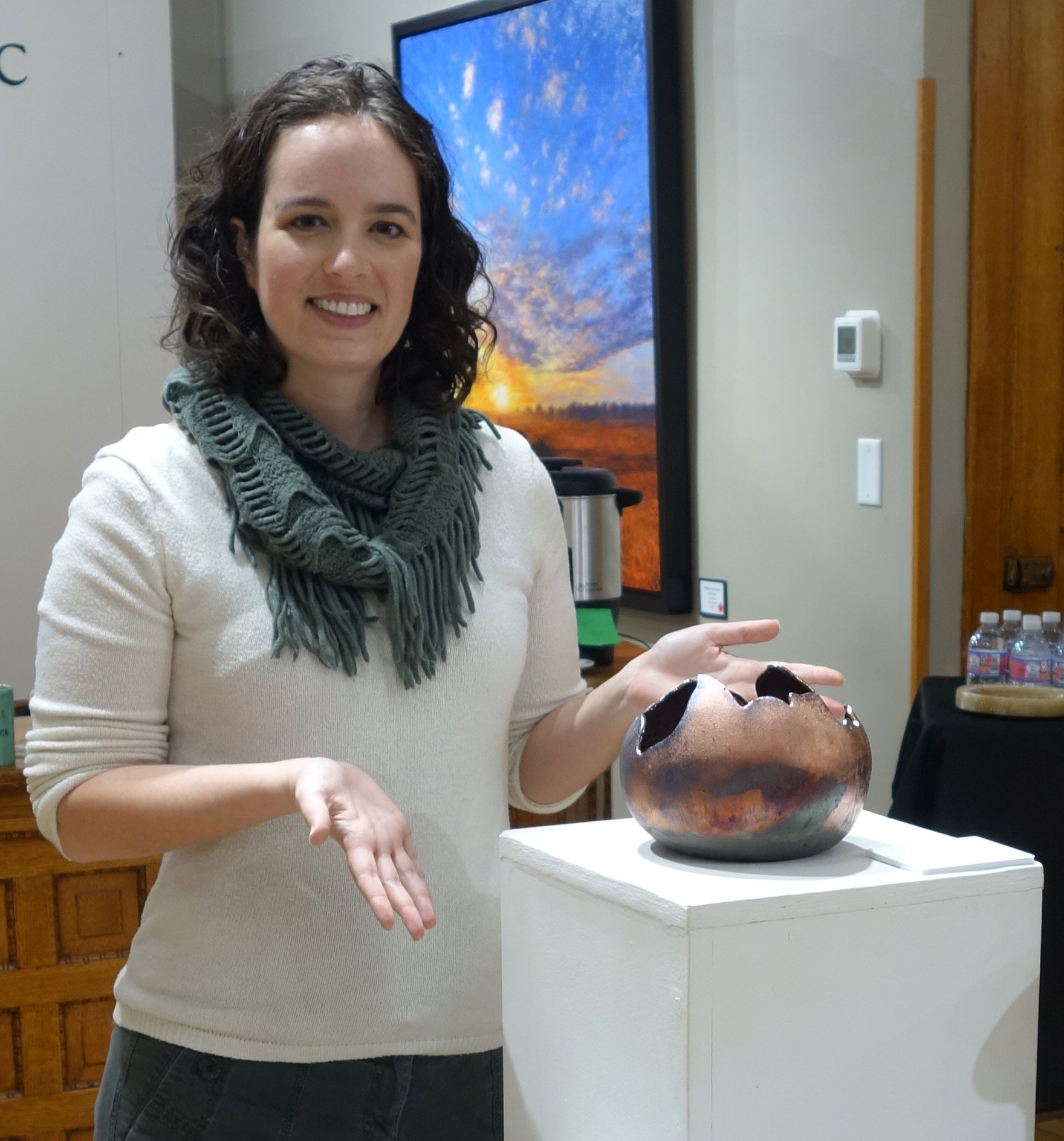
This above bowl is decently large, and I chose to do the outside in a relatively matte glaze while the inside is a high gloss. It gives me dragon egg vibes. The Functional Aesthetic curator placed this piece in the choicest display spot, and I learned today that it was sold! I did see a viewer admiring it and gesturing to and around it at the reception, so I wonder if she’ll be providing its new home or if a different patron snapped it up.

This above vessel is kind of football-shaped, and its surface reminds me of a somewhat aged/stained city map. It has my own hair and sugar burned into the white crackle surface. I am quite into this piece.

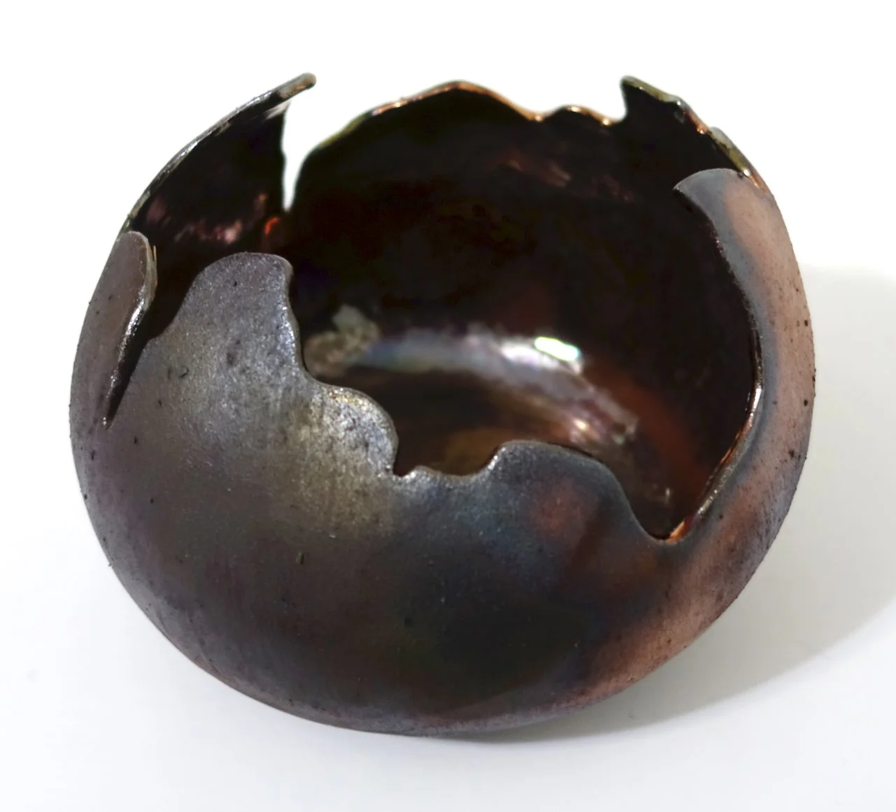
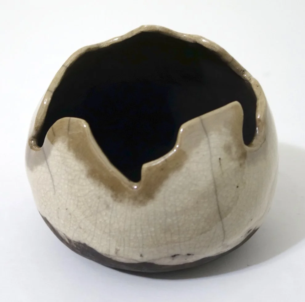
I was really excited about how this piece turned out, as it’s adding into the “broken egg” series of clear crackle pieces I’m developing. The shape is hard to convey in photo, but it leans in a way that feels quite anthropomorphic - at least to me!

This bowl was intended to be another in the “broken egg” series, but it cracked coming out of the kiln due to the thermal shock and my thin walls. That’s more literal than I’d like for the “broken eggs” to be. It is still in one piece, but even after I epoxy over the crack (which I plan to do to bolster its structural integrity), it will have that weakness as it’s a fairly sizeable crack. I’m not sure if given the severity of the crack if I’ll want to display this piece, but if I do I plan to list it as NFS (not for sale).

And here is yet another casualty; however, this football-shaped vessel’s crack is more minor.

Ashlar Update!

I haven’t updated you on Ashlar - my pet gargoyle gecko - in a while, but she’s doing very well! Ash is a little over three years old, has a strong preference for the Fig & Insects Pangea Gecko Diet, changes color regularly, and makes full use of her vivarium. Here are a few new photos of her!

"Functional Aesthetic" Reception Photos

The reception for my Functional Aesthetic juried group show at the Le Mars Arts Center was really nice! I met some of the other exhibiting artists, and a group of my friends attended as well - then afterwards, we went out to dinner!

Here is an exhibition advertisement and a few photos of my five pieces in the show. In both the ad and the show design, my ceramics earned center stage! I was pretty pleased about that, since this is my first professional juried exhibition of ceramics; I only began working in the discipline in 2020 so it’s fulfilling to have my work in this field be received well so quickly. I haven’t even finished editing my portfolio images of all of my newest raku ceramics, so these pictures give you a sneak peek at some of my most recent ones.

Functional Aesthetic is still up for another couple of weeks, so please check it out if you’re in the area!

Red Bluff Gallery's Vibrant Landscapes Exhibition

My chromatogram “Literal Landscapes - Whiterock Conservancy 7, Fig Ave” was accepted into the juried online group exhibition Vibrant Landscapes hosted by Red Bluff Art Gallery (which is located in Red Bluff, CA).

You can check the virtual exhibition out here! For anyone who finds that virtual exhibition format hard to use, I’ve included a screenshot of my own “wall” in the Lovely Landscapes room of the Vibrant Landscapes exhibition below.

Upcoming: "Functional Aesthetic" at the Le Mars Arts Center

This is a milestone - I have my first ever juried ceramics exhibition which will be at the Le Mars Arts Center later this month. I only began working with the discipline of ceramics in 2020, and so this is an exciting development. I will have five handbuilt pieces from my raku firings in July and October 2021 on display in this Functional Aesthetic group show.

Functional Aesthetic will be open from November 9 - December 18th, 2021. The opening reception will be Friday, November 12th from 5-7pm.

The Le Mars Arts Center is located at 200 Central Ave SE, Le Mars, IA 51031. Contact info: 712-546-7476, lemarsarts@gmail.com, www.lemarsarts.com. Hours: Tuesday, Wednesday, and Friday 1-5pm, Thursday 1-7pm, Saturday 10am-4pm.

More Stoneware Ceramics!

I’ve been posting about my raku productivity of late, but I have also continued to make stoneware pottery too!

I really like the combination of two glazes - standard Cone 6 recipes for a white and “smoky brown.” I particularly like the crawling that frequently results. I sometimes add in a complementing lighter grey glaze which is a discard mix of my own creation and therefore likely very difficult to reproduce once gone.

Below are eight different pieces. They include, respectively, a bowl, two images of a planter, two more of a second bowl, a third bowl, two images of a dish, a fourth bowl, two images of a fifth smaller bowl, and two images of a sixth bowl.

I Earned Tenure at Morningside University!

I am extremely happy and honored to announce that I have earned tenure at Morningside University. I came in on a shortened tenure clock due to having already earned tenure and promotion at my previous institution, so this news comes in my third year here at Morningside University as Art Department Chair and Associate Professor of Art!

In that time - even in a pandemic - I have experienced the professionalism, academic excellence, support, and warmth of the Morningside community in an abundance of ways. I look forward to continuing my work and service as I join the ranks of the tenured Morningside faculty!

Upcoming: "Haunted" at the Washington Street Arts Center

I have artwork in the upcoming group exhibition Haunted, hosted by the Vermillion Area Arts Council at the Washington Street Arts Center (located at 202 N Washington St, Vermillion, South Dakota).

This show will run from October 24-31, 2021 from 6:30-8:00pm, if you’d like to stop by and check it out! Entry fee to the exhibition will be $2 for VAAC members or $5 for non-VAAC members. Masks will be required.