New Artwork

Second Raku Workshop - Crackle Edition

I only did one crackle piece (and this time, I went with the natural crackle as opposed to the white) this go-round, but it is my favorite of all of the pieces from either raku workshop. In fact, in a sense I think this might be my first professional piece of ceramic artwork. Or perhaps ceramic object.

What I mean by that is that so far, my ceramic studio practice has involved experimentation and learning, but my primary design purpose has been functional. The aesthetics matter, of course, but don’t take primacy over the form. I’ve been making pottery. That’s a completely valid ceramic arena!

However, in this piece, the function took a backseat to conceptual and aesthetic goals. I’m really pleased with how it turned out!

Second Raku Workshop - Copper Glazes Edition

I decided to try copper glazes again, but with some wild cards thrown in - I experimented more with unglazed negative spaces, and tested out some different types of glaze.

This first piece has “Midnight Luster” glaze on the interior and a lithium carbonate glaze on the exterior. It’s quite attractive in photo, but it did suffer from a bit of pitting, meaning the glaze pooled in some spots and it bubbled and hardened in ways that are suboptimal; instead of a smooth surface, there are rougher points within.

This next piece is interesting in that I had intended it to be a more standard bowl, but in the bisque firing process its sidewall accidentally got damaged and it was involuntarily edited into the shape it has now. I sanded it down a bit and decided to move forward with it; I can imagine that the cavity might improve accessibility to whatever is stored within!

I was pretty proud of this platter as a handbuilt piece, but unfortunately though it made it through the bisque firing unscathed it was unable to handle the temperature fluctuations of the raku firing and it sustained a crack across about 2/3 of its base. It is not salable now, but I still wanted to share the piece with you!

Finally, here is the most experimental piece of the metallic batch - I used both “Emerald Copper” glaze and a thinned out crackle glaze to create the exterior dripping decoration, and used “Midnight Luster” on the interior. The bottom of the exterior is just the result of carbon trapping in unglazed raku clay.

Second Raku Workshop - Horsehair Edition!

I attended a second raku workshop at Dakota Potters Supply in July! I brought eight pieces along, but this time unfortunately two of them did crack during the process as the wild temperature swings were too much for them. Thus only six pieces made it through.

At this workshop, I decided to try one of the techniques that I hadn’t yet attempted - horsehair and/or feather application! I had two twists in mind, though.

The first is that I had just had over seven inches of hair cut off in a summer chop, and my hairdresser kindly collected it for me upon my request to use in this raku process! I like the conceptual power of it being my own hair, plus human hair results in a more delicate line (though I do have pretty thick hair).

The second is that I had gathered in my ceramics research that sprinkling sugar is a possibility as well and decided to request giving that a simultaneous try. Dakota Potters had never heard of using sugar in this way, so Wanda was really curious to see the results too! She helped me add my decorations as there’s only a short window of time where the piece is at the right temperature to trap the carbonized additions.

Wanda and I adding the hair and sugar to my just-out-of-the-kiln, blisteringly hot bowl.

This above bowl turned out really nicely!

This vase was even more of a showstopper, as it is the tallest piece I’ve handbuilt thus far and the height lends drama to the overall impact.

I made three “horsehair” (my hair) pieces, but the third one cracked so these two are the ones that got through without issue!

Whiterock Conservancy New Artwork: Surface

I just finished my second relief from my Whiterock Conservancy residency earlier this summer! This piece depicts an American bullfrog, Rana catesbeiana syn. Lithobates catesbeianus, floating on the surface of one of Whiterock’s turtle ponds.

Here are a couple of process pictures of the underlying QuickCure Clay relief. I began by sculpting the above-water portions of the bullfrog, and then added patches of algae as well.

After I finished the relief elements, I began to paint! I’m pretty pleased with the end result. I finished this piece with two coats of gloss varnish to contribute to a wet appearance.

This is Surface, 12x16x2”, QuickCure Clay relief and acrylic on basswood panel, 2021.

First Raku Workshop Pieces - White Crackle Edition

I’m just going to call it how I see it; the white crackle pieces I got out of this first round of raku firing were by and large underwhelming. The instructions say to put three coats of the white crackle glaze on; I think my interpretation of what three coats should be was thinner than the intended result. Next time, I plan to do at least five coats. However, it is also the case that in order to deter cracking, we did not plunge these pieces into water upon removing them from the kiln. Though dunking into cold water does increase the chances the whole piece shatters, it will also increase the crackle effect in any survivors. Not doing so may have also limited the resulting crackle in these ceramics.

I did apply and rinse off India ink on all the below pieces in a post-process attempt to heighten the crackle’s contrast; this did have a very slight effect, but it didn’t do nearly as much as I’d hoped.

Below is the first piece; it’s a small dish, and honestly, the crackle is more impactful in these photos than it is in person. To me, it’s not that interesting of a piece, which is a shame as the costs of the process make it more expensive than I think its aesthetics merit.

The second piece has a similar aesthetic; it is perhaps a bit stronger, but still not as powerful in the crackle as I’d like. This one is a planter; raku is not watertight, so I plan to coat the interior with Thompson's WaterSeal to hopefully increase longevity before planting inside.

The third piece is much the same as the second, including it being a planter. The India ink soaked into the general glaze body more on this one, though, in a kind of pitting or freckling effect.

I had completed all of my white crackle glazing on these pieces before I fired any of them, which I now realize was a mistake; I should have glazed and fired one and then adjusted my process for the subsequent pieces. Admittedly, that is only somewhat possible as there are a limited number of firings per workshop, but it is a strategy that I plan to consider moving forward.

Finally, I present to you the only white crackle piece from this workshop that I consider to be successful! A combination of luck and possibly forgetting how many coats of glaze I applied and thus erring on the side of adding another contributed to this result. The brownish tinge near the top rim is an artifact of the smoke staining the surface; it is easily removable in the first 24 hours of the ceramic’s post-glazing life but then settles in. I somewhat thoughtlessly removed it from all the above pieces, but with this one I realized I could use it as a design element and didn’t remove it all. The strong black at the base is an artifact of the burning substrate (newspaper, in this case); it too could have been readily removed early on in the process but I again thought it added a dynamism to the piece. This one, too, is a planter, and will be receiving the Thompson’s WaterSeal on the interior.

I am still intrigued by the possibilities the crackle glazes (white and clear are the most standard options; turquoise is a rarer possibility as well) offer, but I will be more conservative moving forward with this glaze type due to this overall turnout on my first batch of attempts.

First Raku Workshop Pieces - Copper Glazes Edition

Here are my copper glaze pieces! These all turned out beautifully, but let me tell you - I learned that I cannot control what I’m going to get, at least not with all the variables that were at play at this raku workshop! The local temperature and humidity, the time in transferring from kiln to reduction, the organics used, the timing and duration of any burps (adding oxygen back into the reduction environment) - each and every factor influences the final color, shine, and character.

Amusingly enough, from having surveyed some sample pieces in advance of glazing, I determined I quite liked lithium carbonate as the interior glaze and used it on the inside of all four of my copper pieces. For the lips and exteriors, I tried out a few different options - some more lithium carbonate with a touch of Molly’s banding purple, emerald copper, golden rainbow, midnight luster… and a couple of the exteriors look almost identical despite or perhaps because of my experimentation, in concert with the rest of the environmental factors! (Because the exterior glazes didn’t align with my expectations of them, I don’t remember which specific bowls got which exterior glazes.)

In this first bowl, the lithium carbonate interior is matte and relatively dull, and it provides a stark contrast to the dark shiny rainbow lip and exterior of the bowl.

This second, smaller bowl - like every bowl here - has lithium carbonate on the inside, but this time it resulted in a satin, coppery base and a high gloss, pink-and-rainbow interior side. The exterior is also high gloss but contrasts the interior with silvers, golds, and aqua hues, accented by some sooty squiggles. This is perhaps the loudest bowl, and it gives me a unicorn cupcake vibe.

Here is the third bowl! In many ways it’s the most subtle of the four, but it is nevertheless quite rich. The lithium carbonate here developed a semi-gloss interior that has a lot of variation, rings, and finely-detailed contrast. The exterior reflects some of the same color palette of the interior, but it adds some turquoise and blue into the mix and has a higher gloss.

Finally, we come to my favorite piece from the whole day! This bowl is really nice. The lithium carbonate interior here has a high gloss and is very coppery with splashes of blue and purple and finely detailed contrast. It is complemented by a high gloss dark rainbow exterior that is very reminiscent of the first bowl and pretty reminiscent of the third bowl in this post.

Though much of the reason this last bowl is so powerful is its glazing, another consideration is that it is the largest of the pieces I brought. With that in mind, I plan to bring mostly large pieces to my next raku workshop.

Which copper glaze bowl is your favorite?

First Raku Workshop Pieces - Baked Potato Edition

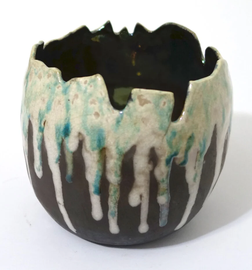
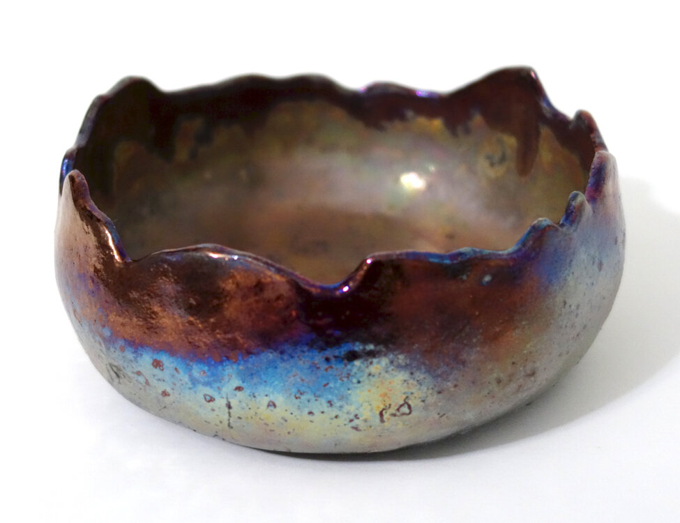
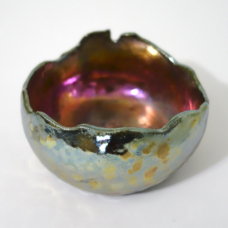
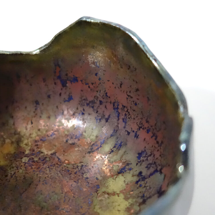
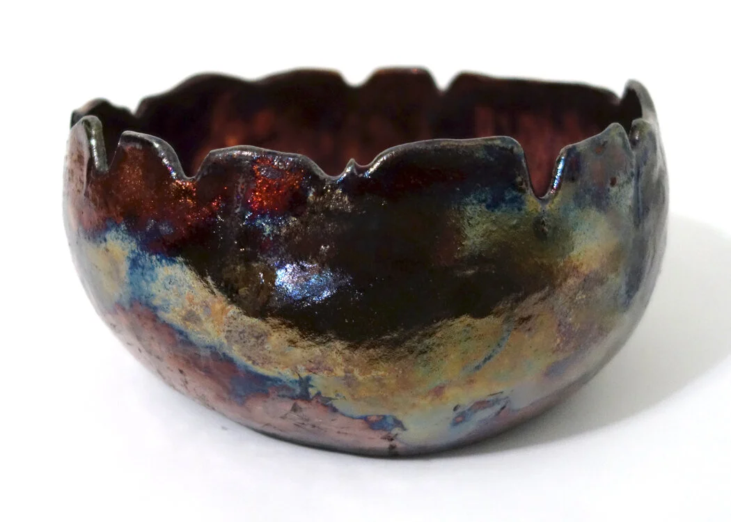
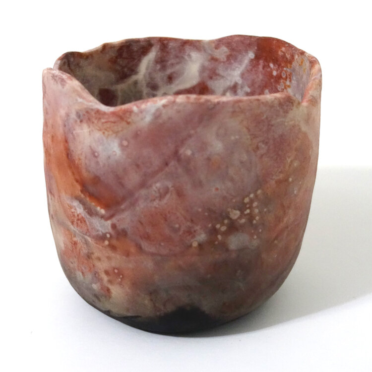
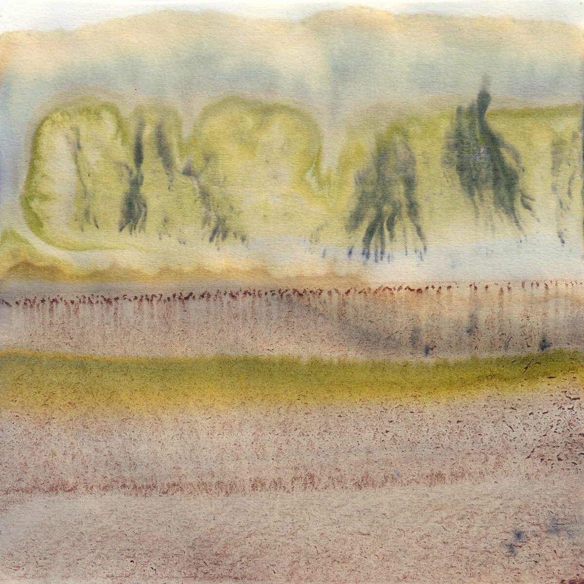
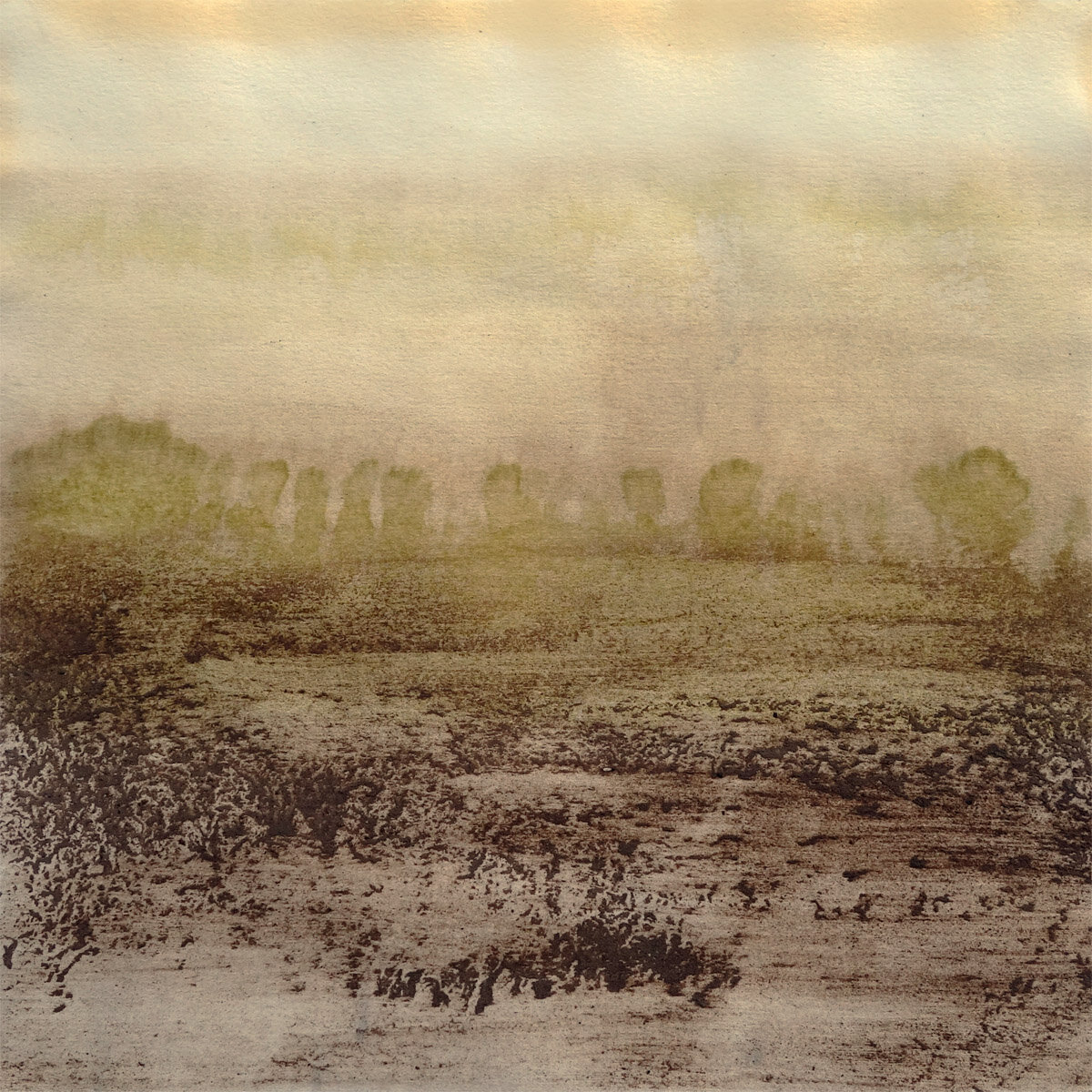
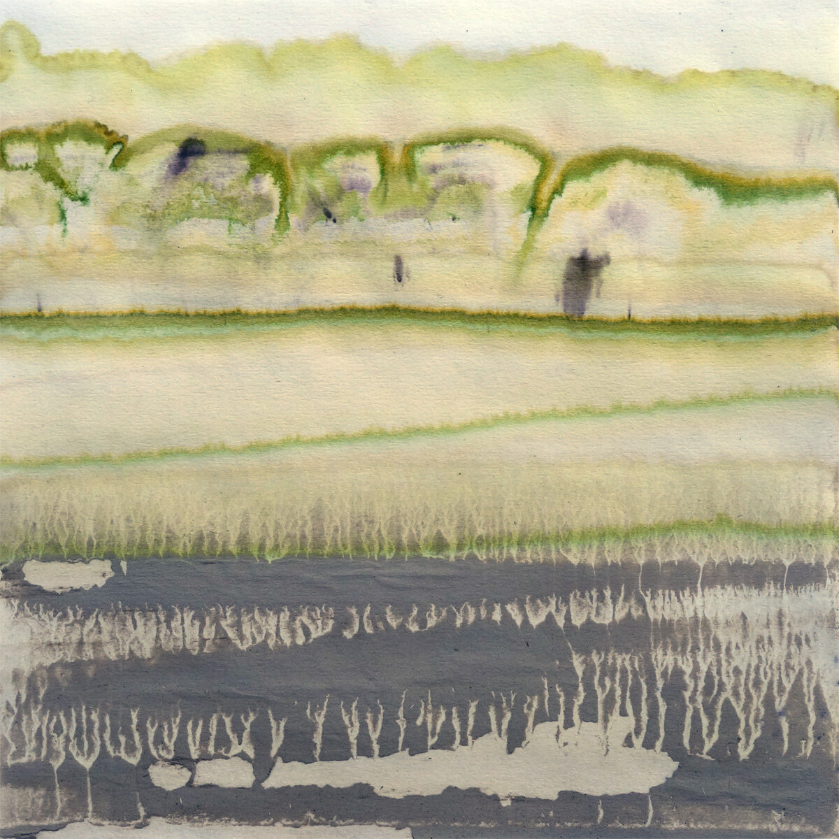
As I mentioned in my first raku post, the “baked potato” technique involves coating the bisqueware in ferric chloride, sprinkling it with sugar, salt, and/or horsehair, and then bundling it up in aluminum foil like a baked potato before firing it. The one example piece we were shown of this technique was interesting but not super compelling, so I just tried two “baked potatoes” out in the form of a couple cache pots.

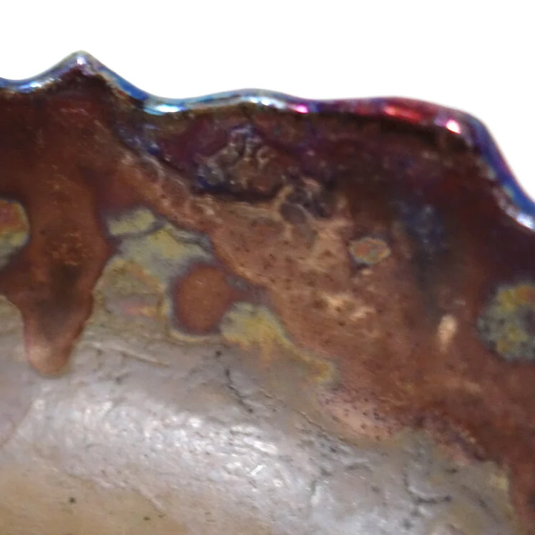
Interestingly, the resultant pieces did not come out as advertised, but I do really like how they ended up. I was told the sugar and horsehair spots would turn black, but on my piece they are mostly white with some grays. This could be for a couple reasons: A) all the environmental variables at play - the local temperature and humidity outside, the ferric chloride purity and concentration, the thickness and tightness of aluminum foil, etc. B) at the time I understood I was to put one bundling of aluminum foil on, but afterwards I heard that perhaps the instructions called for two. Reason B is all the more interesting because some of my foil burned off in the kiln, exposing part of the pottery inside. The kilns did not have organics inside beyond what was in the “baked potatoes” and had vents providing air flow, so maybe the burning of the foil resulted in less carbon trapping than would otherwise have occurred?

Due to the general inconsistencies and vagaries of raku firing and the complicating factor of my still not being sure how many layers of aluminum foil is advisable, I’m very unclear on if I can replicate the appearance of my “baked potatoes” in the future.

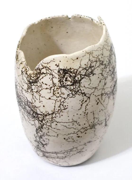
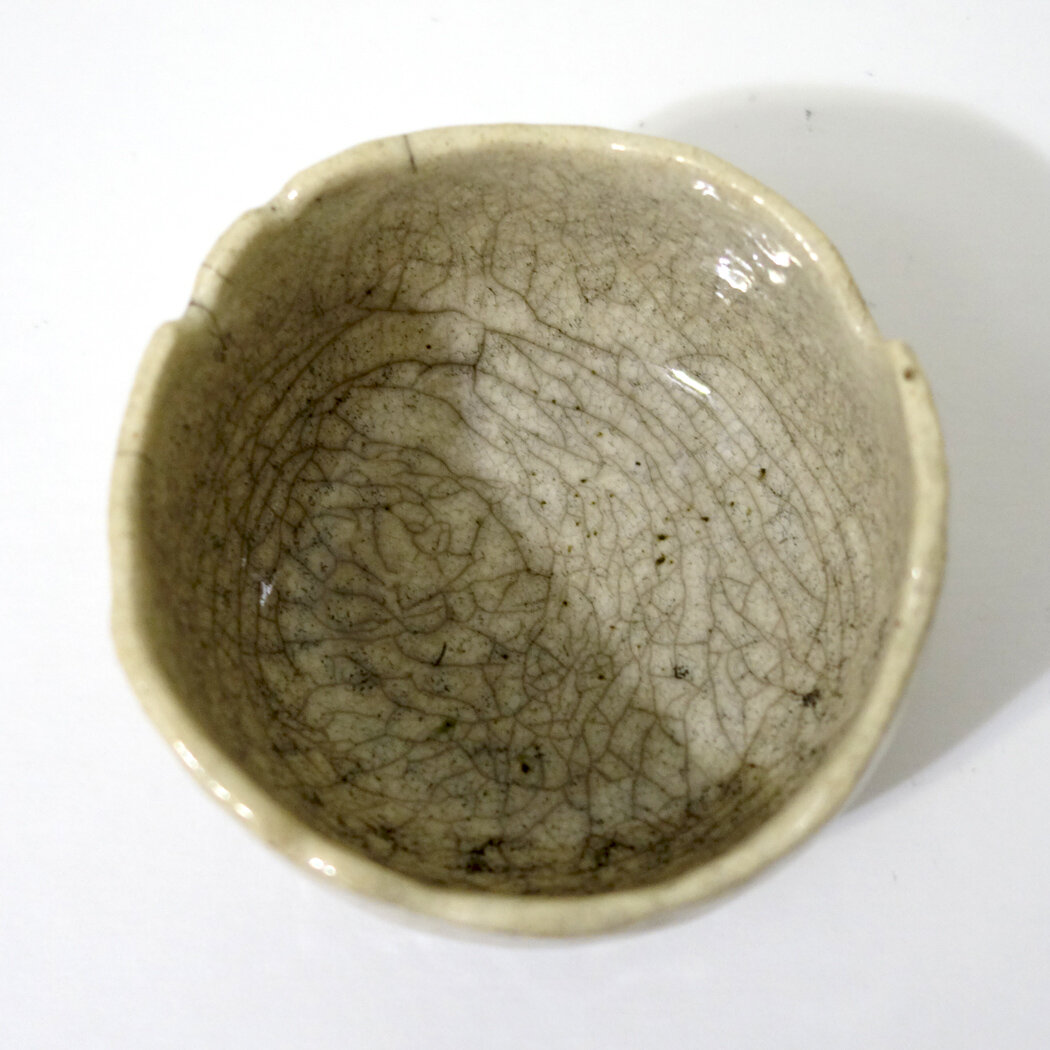
Here is my first “baked potato” cache pot. As you can see, it kind of looks like red marble or agate. I had the choice of sealing these pots with a gloss or matte coat. I chose the matte, which I stand by.

And this is my second “baked potato,” which was fired in the same round as the first. I do really like the appearance of these, but I’m not as convinced that it’s best suited to cache pots though it certainly will look nice as such. I’d like to try a large bowl or two with this technique next time, as I think that could be even more gorgeous - though it’s all dependent on how the firing goes!

Whiterock Conservancy New Artwork: Attuned

This is the first figurative piece I worked on at Whiterock Conservancy - a relief portrait of a small species of frog I found in abundance at the river shoreline. The Blanchard’s cricket frog, Acris blanchardi, is an endangered or threatened species in three states so far and is listed as a "Species of Greatest Conservation Need." It is considered a type of chorus frog, and is one of the smallest species of frogs in Iowa. Surprisingly (to me, at any rate) it is also considered a type of tree frog despite being semiaquatic and therefore not having the toe pads of their arboreal brethren.

As always, I began with a contour line drawing. My goal with this piece was a stylized, squashed relief reminiscent of antique bronze relief doors, so after finishing the drawing I began laying in the QuickCure Clay relief. Here are two process photos showing the beginning of that QCC work.

At this point, I got too involved in the actual creation to pause, so we’ll skip ahead to the finished work! This is Attuned, 14x11x1.35", QuickCure Clay relief and acrylic on basswood panel, 2021.

Attuned by Shelby Prindaville, Whiterock Conservancy 2021 artist in residence.

New Artwork: Whiterock Conservancy 8x8" Chromatograms

I and my friends gathered many natural materials while on my Whiterock Conservancy artist residency - plant, flower, fungus, bark, lichen, soil, water, rock, and mineral samples - which I then processed into a pigment solution and “printed” on filter paper through chromatography.

I’ve done a version of this before on my BROTA residency with the Buenos Aires Botanical Garden; that time, I used fairly standard scientific 4” rounds and only used one plant species per round for individual portraits that also captured differing seasons within the botanical garden. This time, I sized up to 8x8” squares, and additionally made a handful of larger 23x18” pieces; with these my chromatography features entire ecosystems. This post will display my new 8x8” pieces! The first photo is just a process pic, followed by 19 different chromatograms. (I donated three others to the conservancy, Liz Garst, and the groundskeeper Amanda who shared the tree frog with me.)

I’m really excited by this series and am interested to see how these pieces age in terms of pigmentation going fugitive; I have sealed them and hope they retain their coloration for many years to come, but their likely degradation over time certainly fits with themes in my broader bodies of work about ecological conservation and loss. My Buenos Aires pieces do appear to have lost a little saturation over the past two years, but they still display a good range of color. In that case, each round made use of only one plant species; in this case, since there are mineral and soil components as well, I have hopes that those sections will endure even longer than the plant pigmentation.

More Ceramics!

Here are some more of my ceramic pieces! The first two are of a lovely little bowl; it’s so varied and hard to photograph that unless I uploaded seven photos and a video I think you’ll miss out on some of its detail, but trust me when I say it’s really nice in person and is one of my best pieces thus far. All the rest are, as you can often expect of me, planters with drainage holes. I like all of these a lot and am particularly into the new white/blue/brown and deep brown/white glaze combinations.

The final image in the grid is wheel-thrown from an earlier cycle but has since been planted with an Episcia or “flame violet” cultivar! I am reminded by that planter that I should really make time to wheel throw again at some point, but then again I really like the personality and handcrafted appearance of my pinch pot practice…

New Ceramics!

My latest batch of ceramics has come out of the final firing! I started these pieces around three months ago, but ceramics take time and sequential processing. Though there’s still quite a bit of trial and error, I feel that I am honing my glazing skills! There are several glazing combinations from this go-round that I’m definitely going to be revisiting. There is also a new glaze color in this set - Green Tweed - that we didn’t have on hand before; I glazed it blind (meaning I had no samples of it to see how it’d turn out) so I didn’t use it on too many pieces, but it turns out I really like it both solo and in combination with other colors so I’ll be adding into a more regular rotation.

Above you see three new small dishes or bowls. The photography of ceramics is difficult because they are three-dimensional objects with variance - how many photos do I need to share to truly capture enough of each artwork? For these, I think one photo sufficiently captures each piece, though on the one with the hand-painted rings, there are rings on the exterior of the dish as well which I’m not sure is evident. Maybe I should have taken a side photo too?

However, for the small bowl above, I think at least two photos are needed to understand the glazing; another could provide even more coverage, but I believe only one would be insufficient.

All of the eight pieces immediately above are planters with drainage holes, as demonstrated by the final photo in the grid.

For many of the more complexly glazed pieces, I think my photographs - even multiple - don’t fully capture their totality. I should experiment to see if different photo setups can help, but also I think some artwork is always going to be best suited for in-person appreciation!

New Artwork: Displacement

I just finished the second piece in my crystal series, which I’m titling Displacement. It is a companion piece to Reclamation. This series explores ocean acidification as well as natural reclamation of manmade constructions and catastrophes.

Displacement is a mixed media relief including driftwood, aragonite, calcite, and salt crystals, acrylic, and QuickCure Glaze on a wood panel, 7.25x6.75x3.25”, 2021.

Shelby Prindaville, Displacement, mixed media relief including driftwood, aragonite, calcite, and salt crystals, acrylic, and QuickCure Glaze on a wood panel, 7.25x6.75x3.25”, 2021.

New Artwork: Synthesis, and Upcoming Invitational Exibition

In late December I was invited to participate in an upcoming exhibition and fundraising support event called The Maskuerade for local art gallery Vangarde Arts which has, as is unfortunately the case with many arts organizations, suffered during the pandemic.

Vangarde Arts has been a great supporter of the arts in Sioux City as well as of Morningside College, so I happily agreed to participate. Vangarde provided each invited artist with a white cotton 3-ply face mask, and asked that each mask be made into a unique artwork. The pieces are then to be auctioned off with the proceeds going to support their organization.

This was more of a challenge than I think many viewers might realize for several reasons:

  • The substrate (the face mask) is rather small and of a defined form already, so there’s limited room to work.

  • As an artist, I think you want to embrace the media you’re working with - so making it unrecognizable as a face mask to me ends up defeating the purpose of the challenge.

  • While I think one could pretty easily paint on a cotton mask as a canvas, I question whether viewers will easily differentiate an original painting from an existing fabric print. This meant I felt I needed to get somewhat sculptural while still embracing the substrate and its intended function in order to really make it transform identifiably into an original artwork.

  • I didn’t want to lose my own artistic focus and hand - I wanted to make this piece work within my oeuvre rather than existing outside of it.

I mentally wrestled for weeks just in trying to develop a concept, and then with only a vague starting point in mind I then physically wrestled with the mask itself for a couple weeks to try to see if that manipulation would inspire me to come up with an artistic solution. Finally all the reflection and experimentation paid off, and with an idea in mind all I then had to do was execute it!

This is Synthesis, a wearable mixed media artwork including a white cotton mask, thread, acrylic, gel, Cladonia rangiferina “reindeer lichen,” Tillandsia usneoides “Spanish moss,” pine needles, and bark. Its dimensions are 7x13x4.5”.

Synthesis, a wearable mixed media artwork including a white cotton mask, thread, acrylic, gel, Cladonia rangiferina, Tillandsia usneoides, pine needles, and bark; 7x13x4.5”, Shelby Prindaville, 2021.

The Maskuerade exhibition will have open house hours on February 11, 12, and 18 from 6-7pm in Vangarde Arts which is located at 416 Pierce St, Sioux City, IA 51101. An online auction will be open from February 15-18, and a silent auction and Fat Tuesday on Friday celebration will be held February 19 at 6pm with a live auction following at 7pm.

Behind The Scenes of Velocity

Sometimes viewers want to know how a piece of artwork was made, and if there are any in-progress pictures to show the process. I often don’t take as many photos of that as I could; I’m more focused on the creation than pausing for documentation, and I also think that too many process photos can slightly tarnish the magic of the completed piece.

Nevertheless, here’s a photo of the drawing in development of Velocity which underpins the painting! Usually I can get away with mostly only doing a contour and then painting the rest freehand, but this piece is so reliant on form, pattern, and detail that I needed a stronger blueprint for this one.

New Painting: Velocity

Happy New Year! I’ve been hard at work painting a painted turtle; it was a beast to draw and quite demanding to paint as well because of all of the pattern and detail.

I met this baby painted turtle (Chrysemys picta) while biking the Adams Homestead and Nature Preserve - I felt very lucky to have spotted its dollar-coin-sized stature along the trail!

This is Velocity, acrylic on basswood panel, 14x14x1.5”, 2021.

More Ceramics!

In my last ceramics blog post, I shared a range of planters I’ve created. (When I use the term “planter” for my own ceramic work, I am specifying that I have crafted them with drainage holes. I haven’t done so yet, but if I were to create a piece without drainage holes to house a plant, I’d call it a “cache pot.”)

I am most interested in making planters because of my extensive plant collection, so I’d say that for every non-planter piece I make, I make four planters. But I have made other pieces, including vases and bowls! Here are a few examples. The three vases all make use of my experimental embedding of iron oxide chunks, so they’re glazed in a “clear” that appears as a transparent tan.

New Artwork: Emerging

An overhead shot of a Humphrey in the garden.

An overhead shot of a Humphrey in the garden.

Since I don’t get to do an artist residency this summer due to the pandemic, I’m planning on producing from home! Sioux City is rabbit central - the Eastern cottontail, to be specific. Sometimes on neighborhood walks here I see just as many rabbits as I do squirrels. In my former town of Leavenworth, seeing a rabbit was notable and relatively rare. Earlier this spring, I noticed a juvenile rabbit made a home partially in my backyard (he also hops through the fence to my neighbors’ garden as well).

I named him Humphrey and began to try to acclimate him to my presence, so that I could take some nice reference photos for paintings. I talked about him to family and friends, and at one point joked with my parents that I supposed there might be several rabbits all being called Humphrey… and wouldn’t you know it, the very next day I saw two simultaneously! Since I can’t really distinguish them individually, giving them more names seemed unhelpful, so they’re now the Humphreys, plural. It appears there’s a nest/burrow under my deck, and I have now seen three Humphreys at the same time so there are at least that many but probably more. There do appear to be two different sizes of Humphrey, both juvenile but one small and one even tinier. My neighbor says she’s seen the parents, but I don’t know if I have; I’ve not seen an adult rabbit in my backyard at all this spring but I have seen one in my front yard once. And again, rabbits are ubiquitous here.

I plan to do several rabbit paintings, but here’s the first! It’s tentatively titled Emerging, though the title Under the Deck is also in consideration. It’s a 16x12x1.5” acrylic on basswood panel.

BROTA and Buenos Aires Series "Gardens of Memory" Wabi-Sabi

I know, I know… I made so much new work on this past summer’s BROTA residency in the Buenos Aires Botanical Garden that I still haven’t posted it all online yet - so here’s another reveal!

This piece is titled Wabi-Sabi because I think it’s reminiscent of Japanese wabi-sabi aesthetics. It is a mixed media piece including a NOID dried leaf collected from the Buenos Aires Botanical Garden, methylcellulose and toner photographic transfer, and matte medium on artisanal handmade paper, 14x11”, 2019. 

BROTA and Buenos Aires Series "Gardens of Memory" Dried Sweetgum Leaf

This is one of my favorite new pieces from this summer’s BROTA residency in the Buenos Aires Botanical Gardens! It’s a mixed media piece including a methylcellulose transfer of a photograph I took of a Monstera deliciosa collaged atop a dried sweetgum leaf (Liquidambar styraciflua). The support is handmade artisanal paper from Ato Menegazzo Papeles.

BROTA and Buenos Aires Series "Gardens of Memory" NOID Leaf Skeleton

Information is power. I try to ID all of the species I work with, as each species is important and adds layers of meaning and interest to my pieces. Accuracy is equally important however - randomly guessing at species IDs does more harm than good, in my opinion. The first leaf skeleton piece I shared with you, which incorporated a sacred fig or Ficus religiosa leaf skeleton, was identifiable due to its very specific and unusual shape. In this NOID leaf skeleton, however, the shape alone does not sufficiently distinguish the leaf from other trees in the Buenos Aires Botanical Garden. Since it is a skeleton, I also cannot use leaf color, texture, weight, and/or attached branches or flowers to contribute more identification information. Though I researched for some time hoping to find a conclusive match, I eventually had to concede that I cannot definitively identify the leaf species which is what makes it a NOID (a term we use in plant identification that - perhaps obviously - stands for no identification).

This artwork is mixed media including a NOID skeleton leaf, matte medium, and handmade artisanal paper and is 12.5x9.75” (unframed dimensions).