New Artwork

April 2023 Raku Copper-Glazed Ceramics

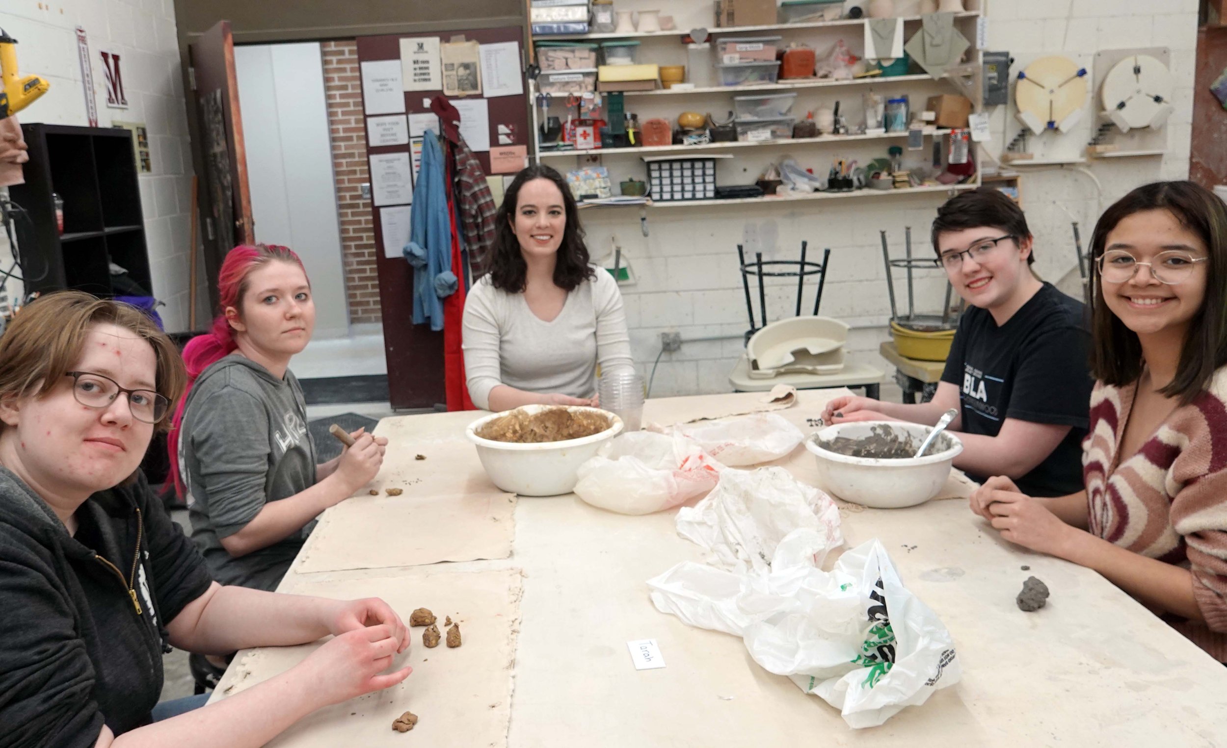
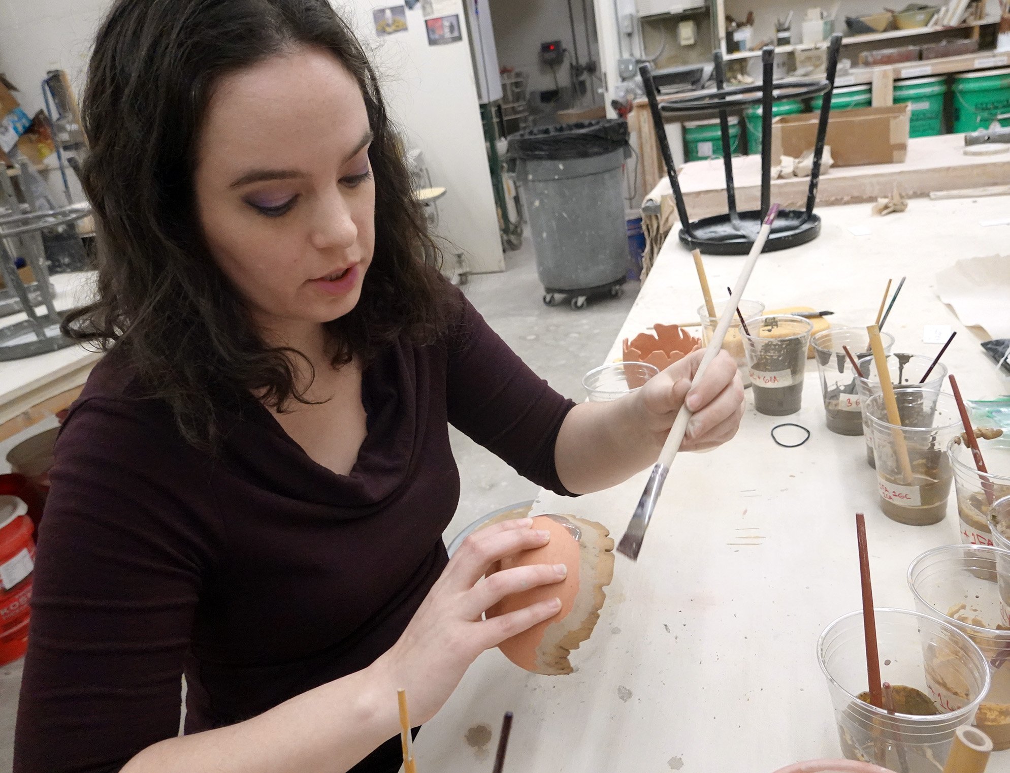
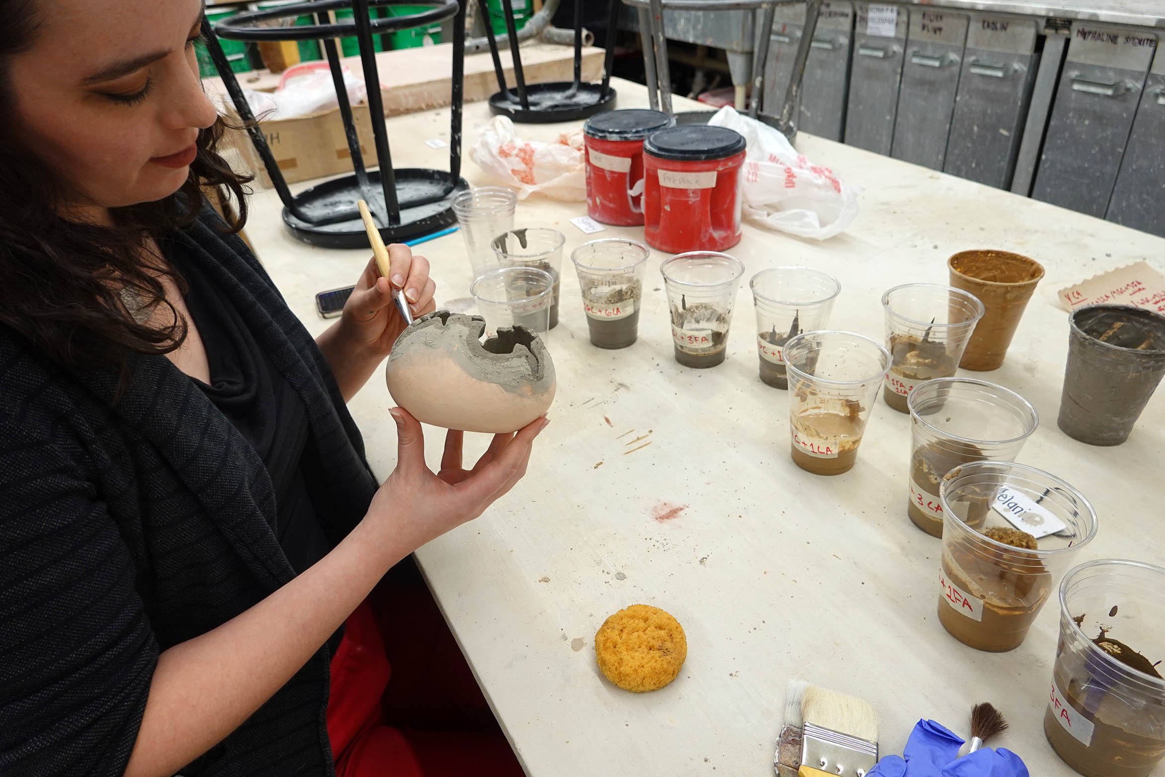
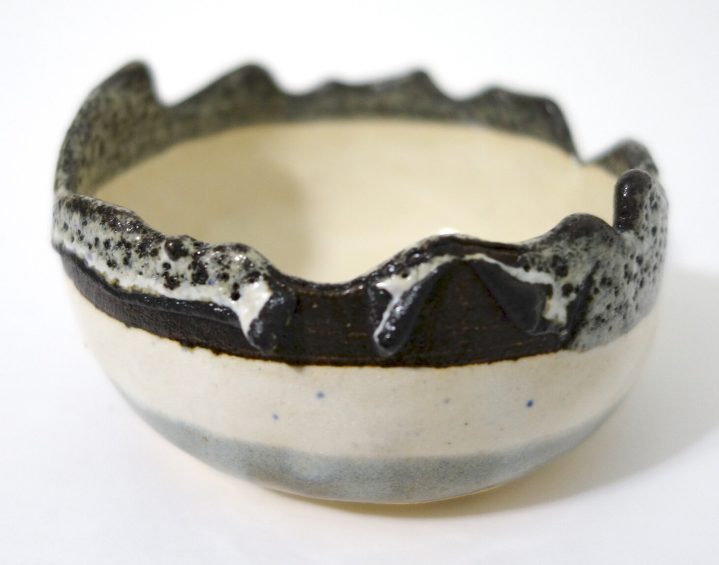
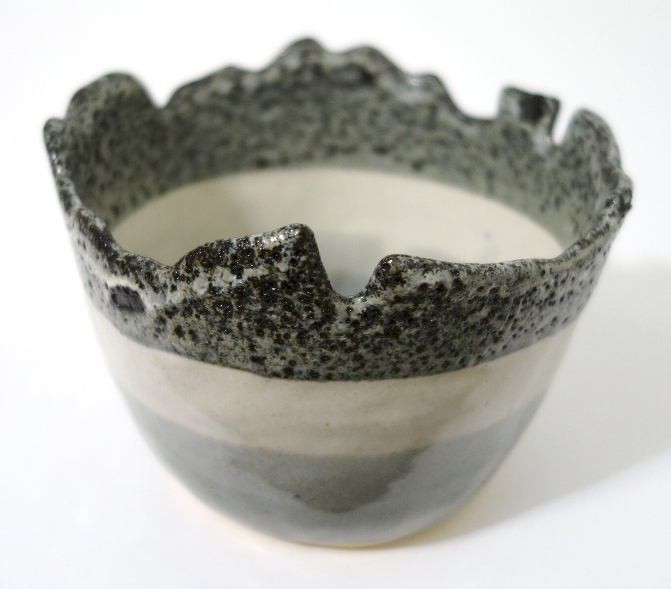
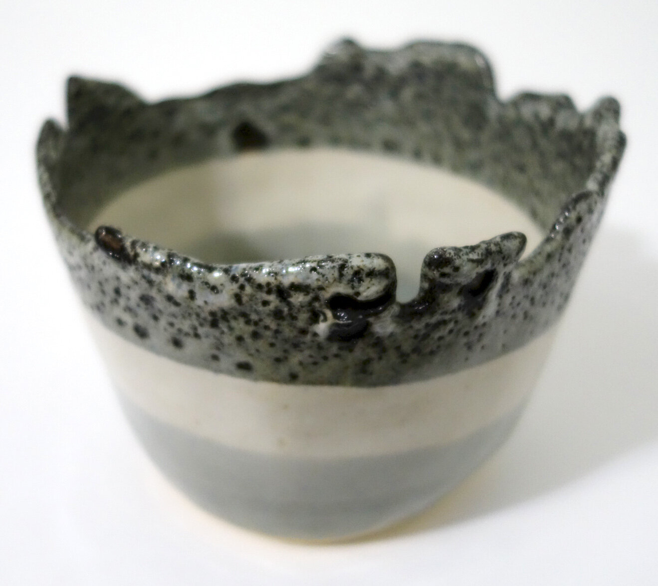
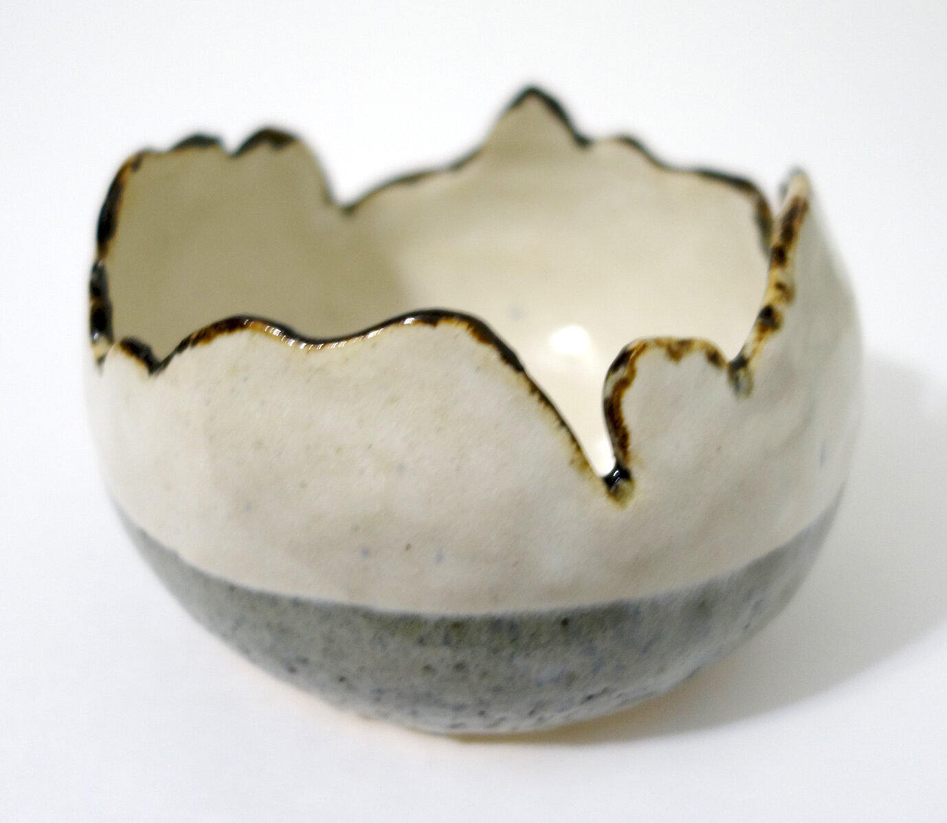
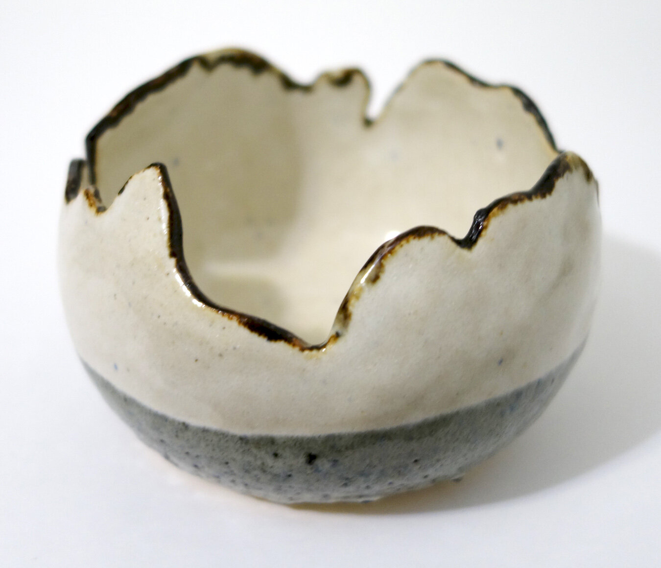
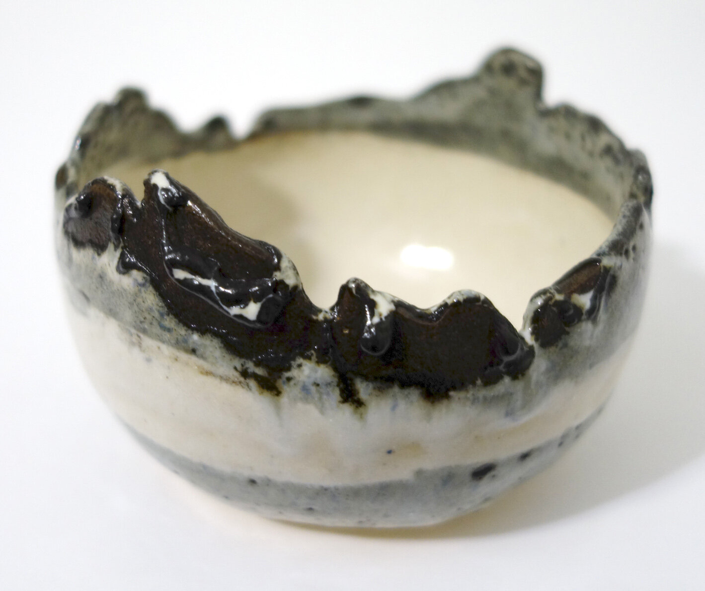
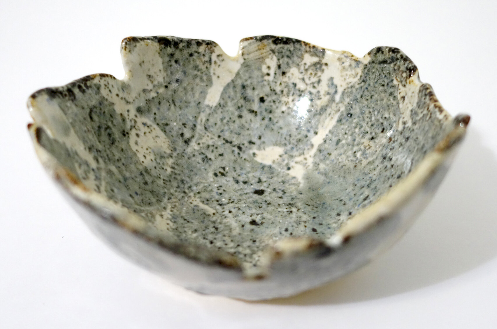
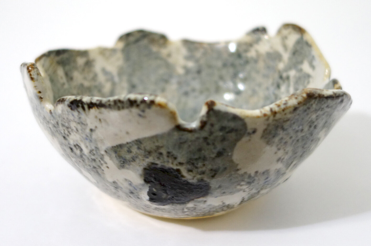
I’m going to do a few different posts about my April 2023 raku workshop pieces because there’s a lot of good work to share. In this first one, I will review my copper-glazed pieces!

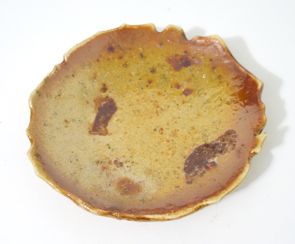
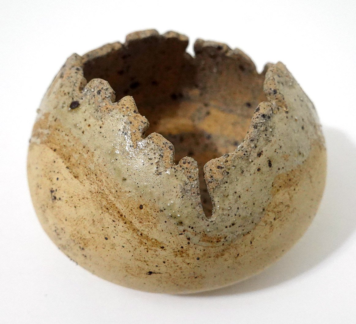
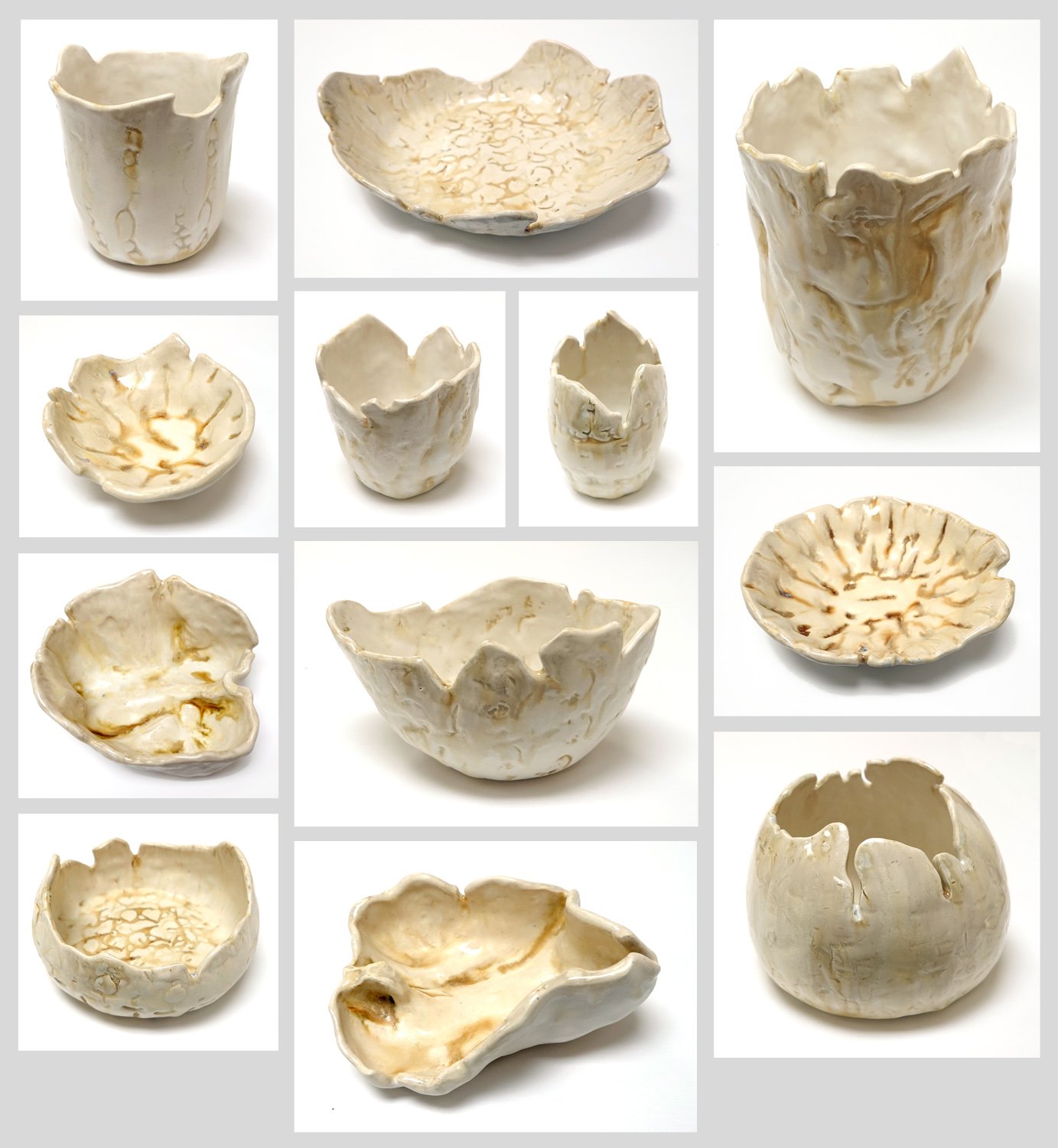
Below is a platter, which has some texture on its surface; I imprinted an equine femur into the clay body thanks to bones I was allowed to keep using from the LSU SVM anatomy lab. I first glazed it with White Crackle, then wiped the white crackle back down so that it stayed in the impressions, and also applied it to the rim. Then I glazed over the top with Copper Sand. I thought this would impact the coloration, but the white crackle (at least at that thickness) only really affected the sheen; where it was applied the glaze is glossy rather than matte. Though it’s not precisely what I envisioned, it’s a strong piece.

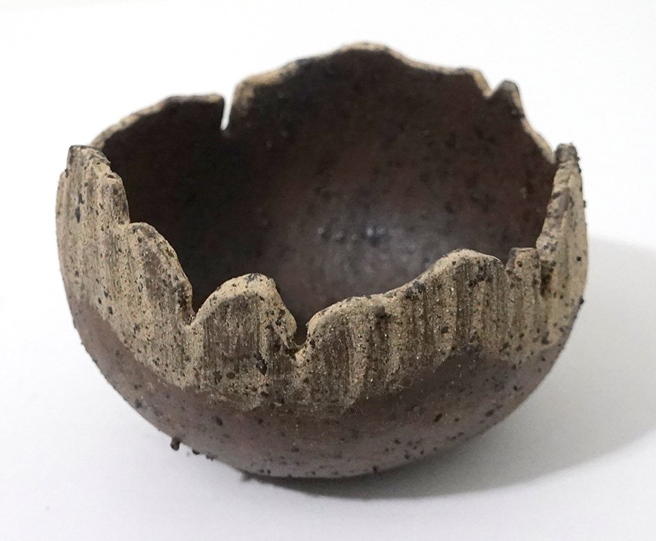
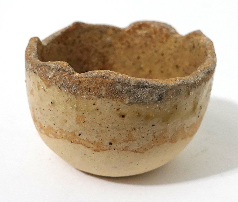
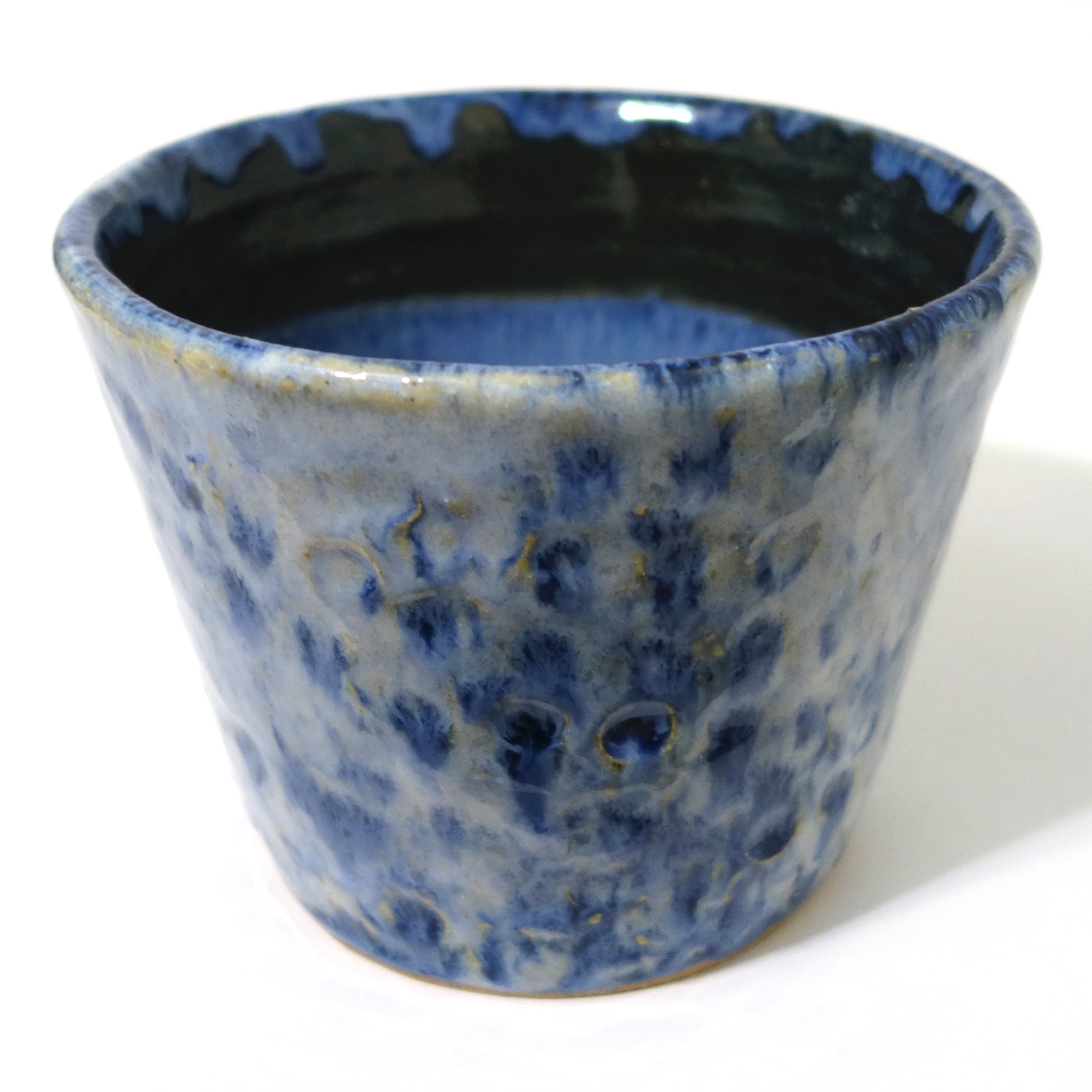
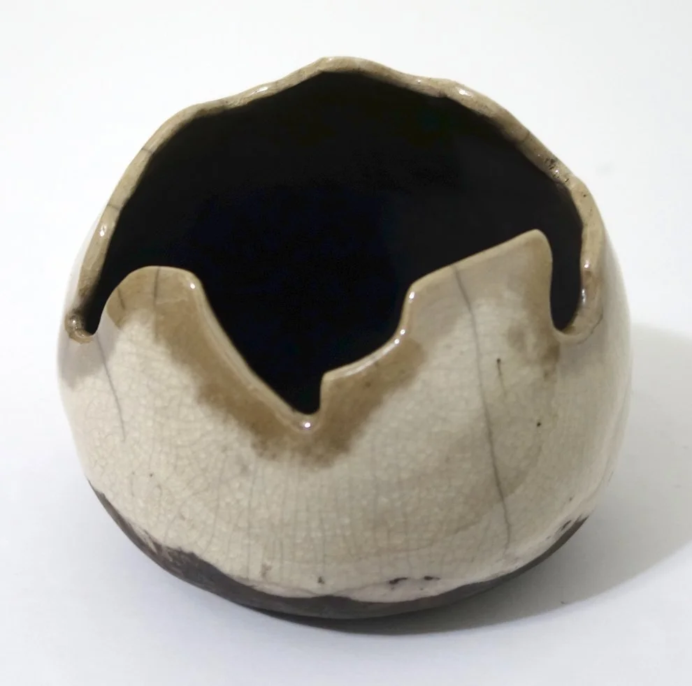
Next, we have a small, leaning vase. I chose to apply wax to the rim and throat. Then I glazed the exterior with Copper Sand, keeping in mind that the glaze doesn’t stick to the waxed areas. In the kiln the wax then burns off, allowing the unglazed clay body to carbon trap the smoke from the reduction afterwards. I was planning on staining the raw clay, but I ended up holding off as the variably smoky surface is interesting in its own right. I need to actually decide, as I will want to wax the raw surface if I don’t stain it.

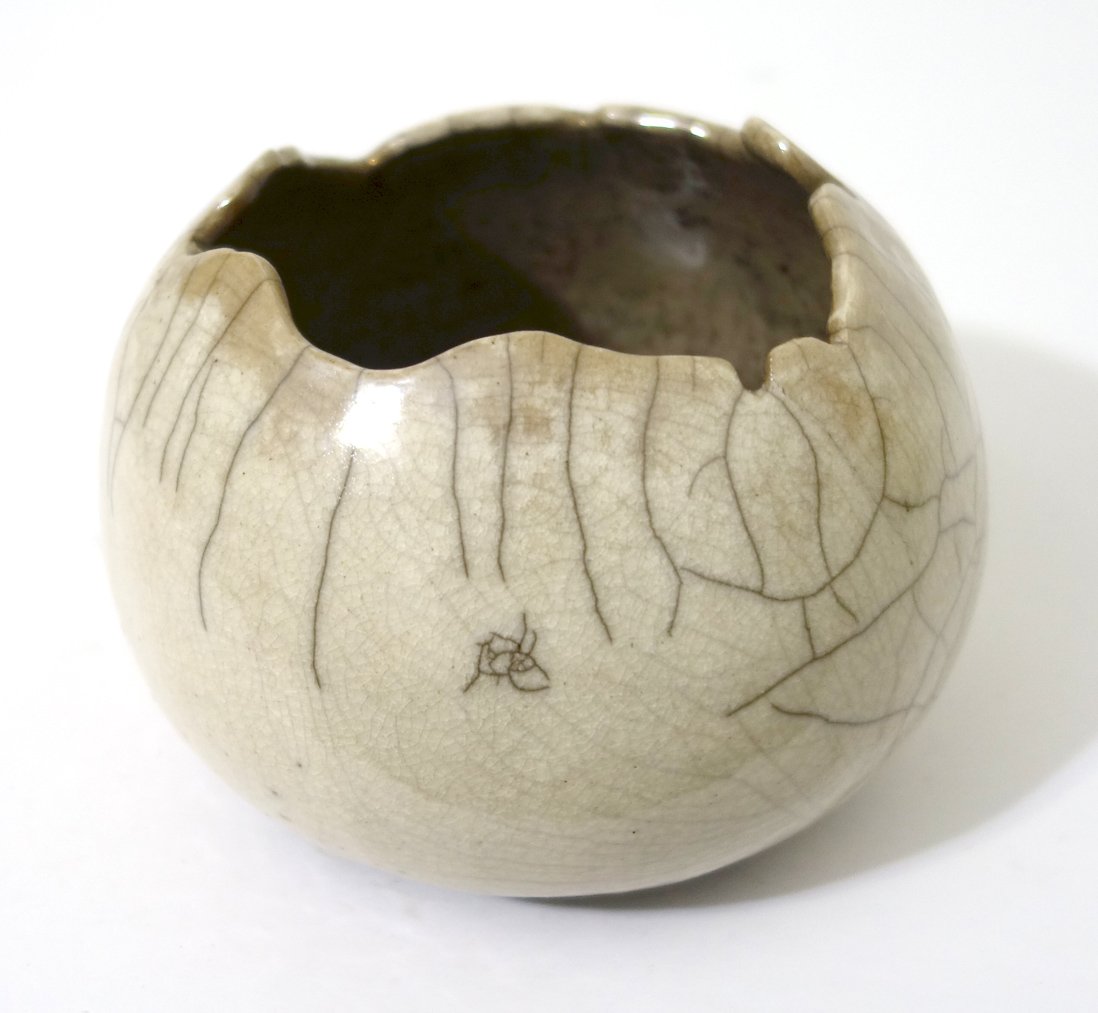
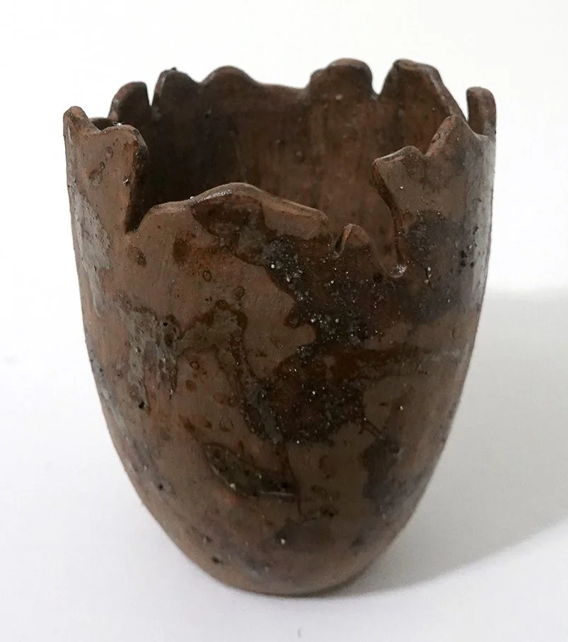
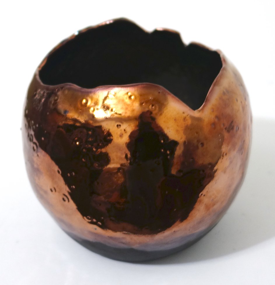
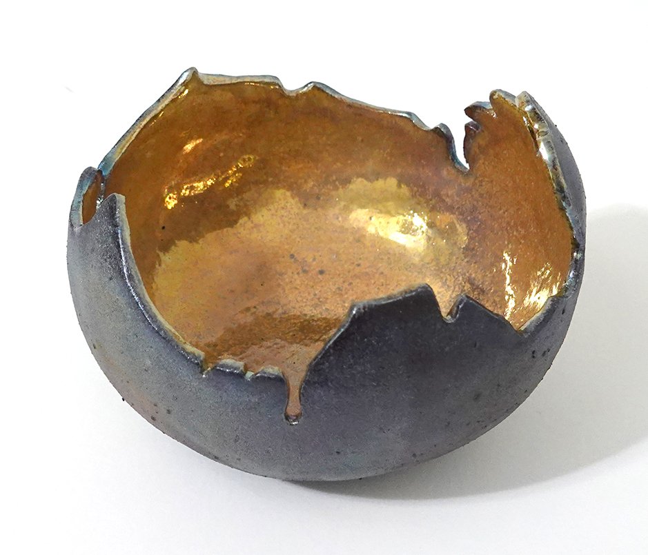
This is probably the biggest of my raku pieces this go-round. This vase vessel has Litho Carb on the inside and Copper Sands on the outside. (I really like Copper Sand as it’s pretty predictable in its behavior for me, which is a rarity when doing raku.) The interior lip has an abalone-like appearance!

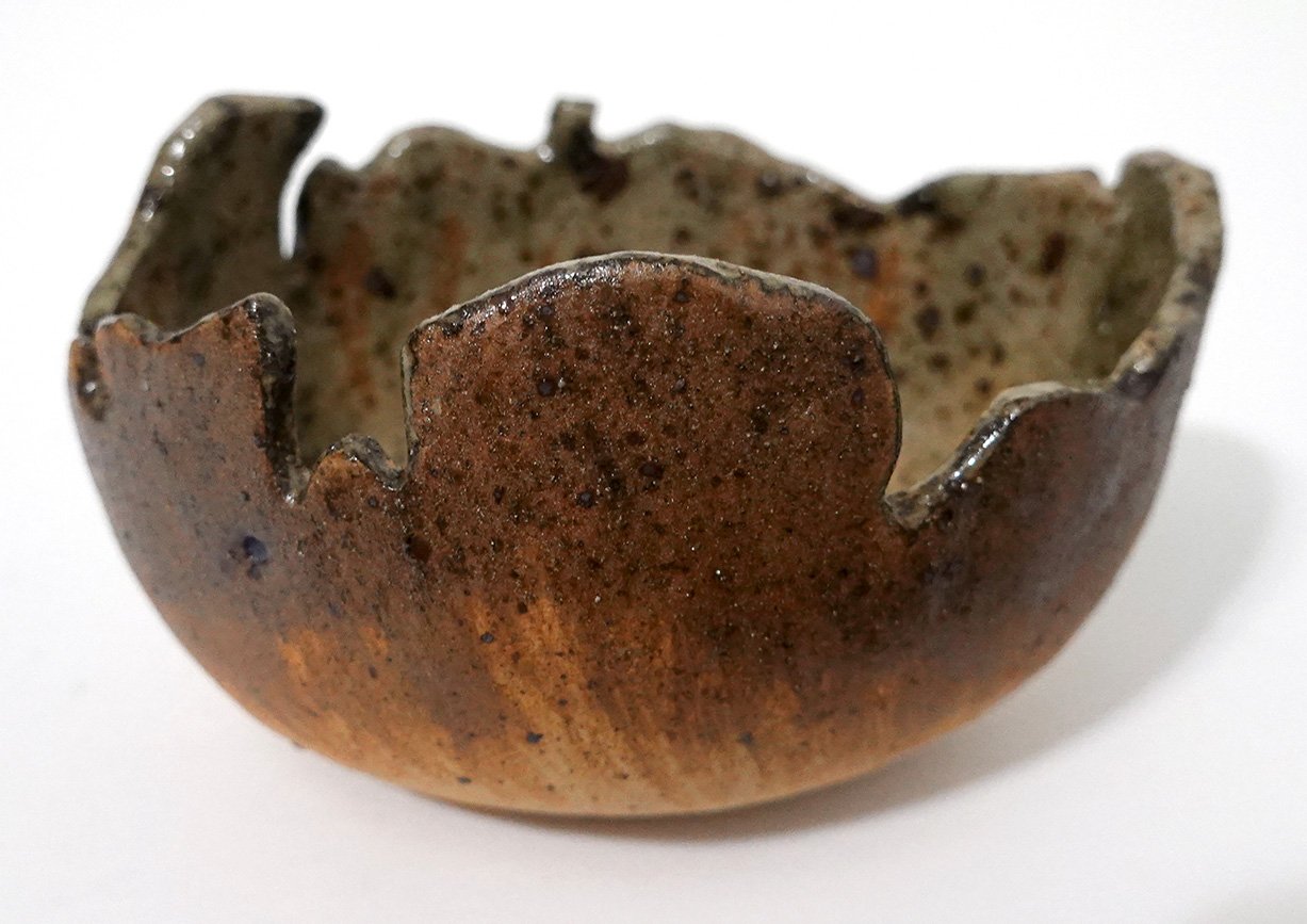
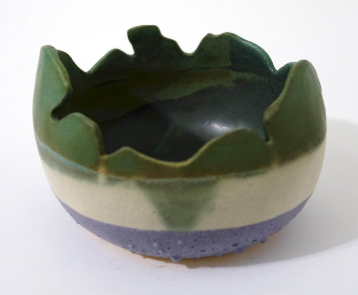
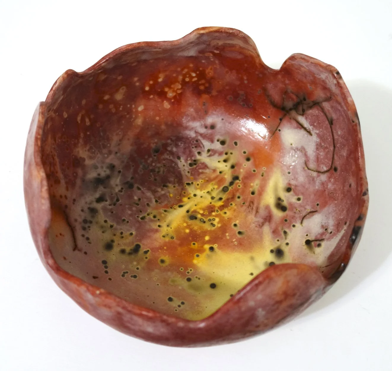
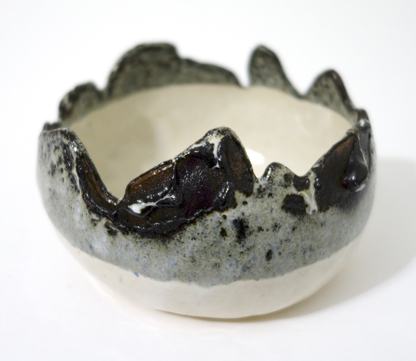
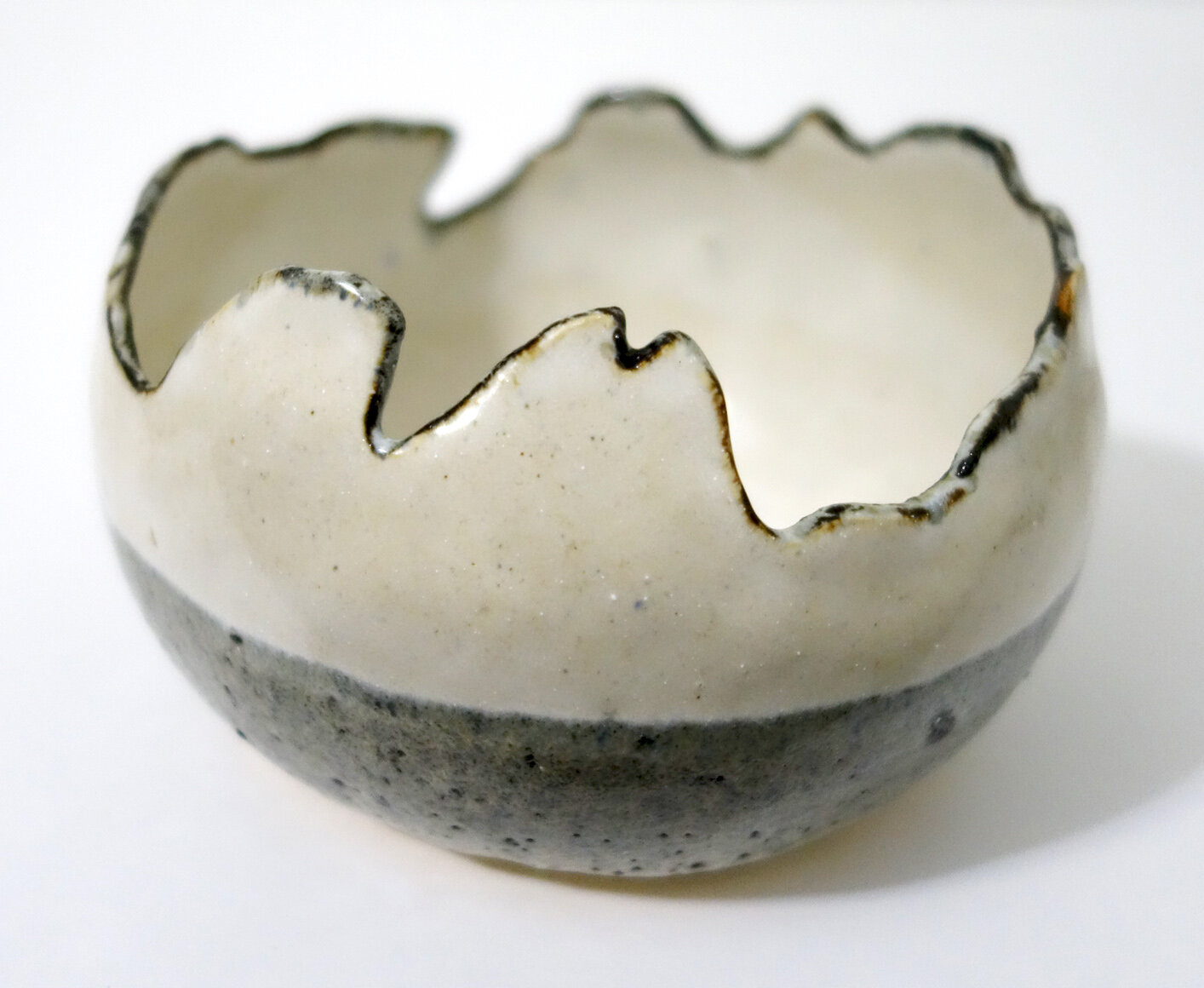
Next, we have my “golden bowl.” This piece is glazed with Dakota Potter’s new Peacock on the interior, and once again uses Copper Sand on the exterior. One of my students kept hovering her hands above it and singing reverential “aaah” noises!

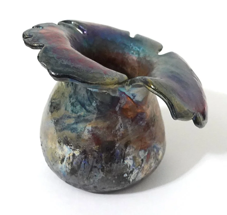
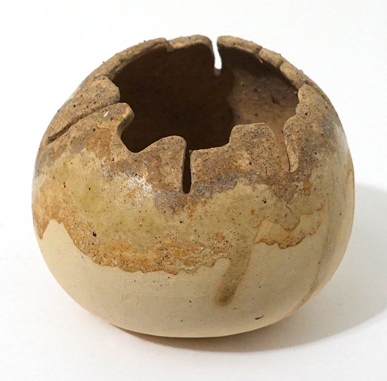
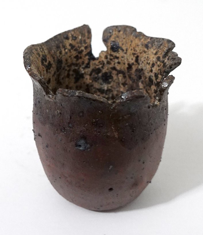
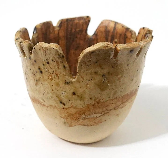
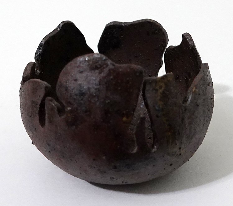
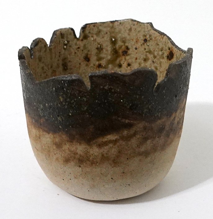
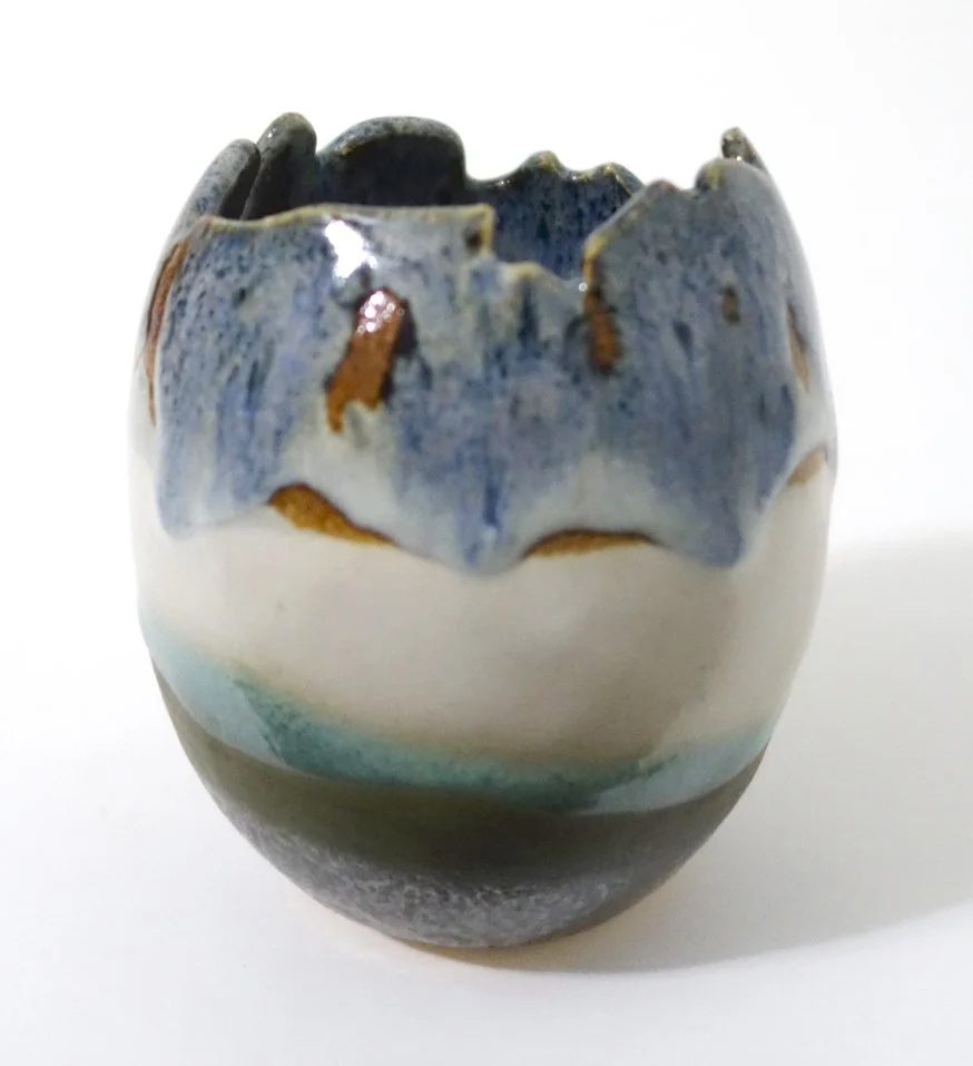
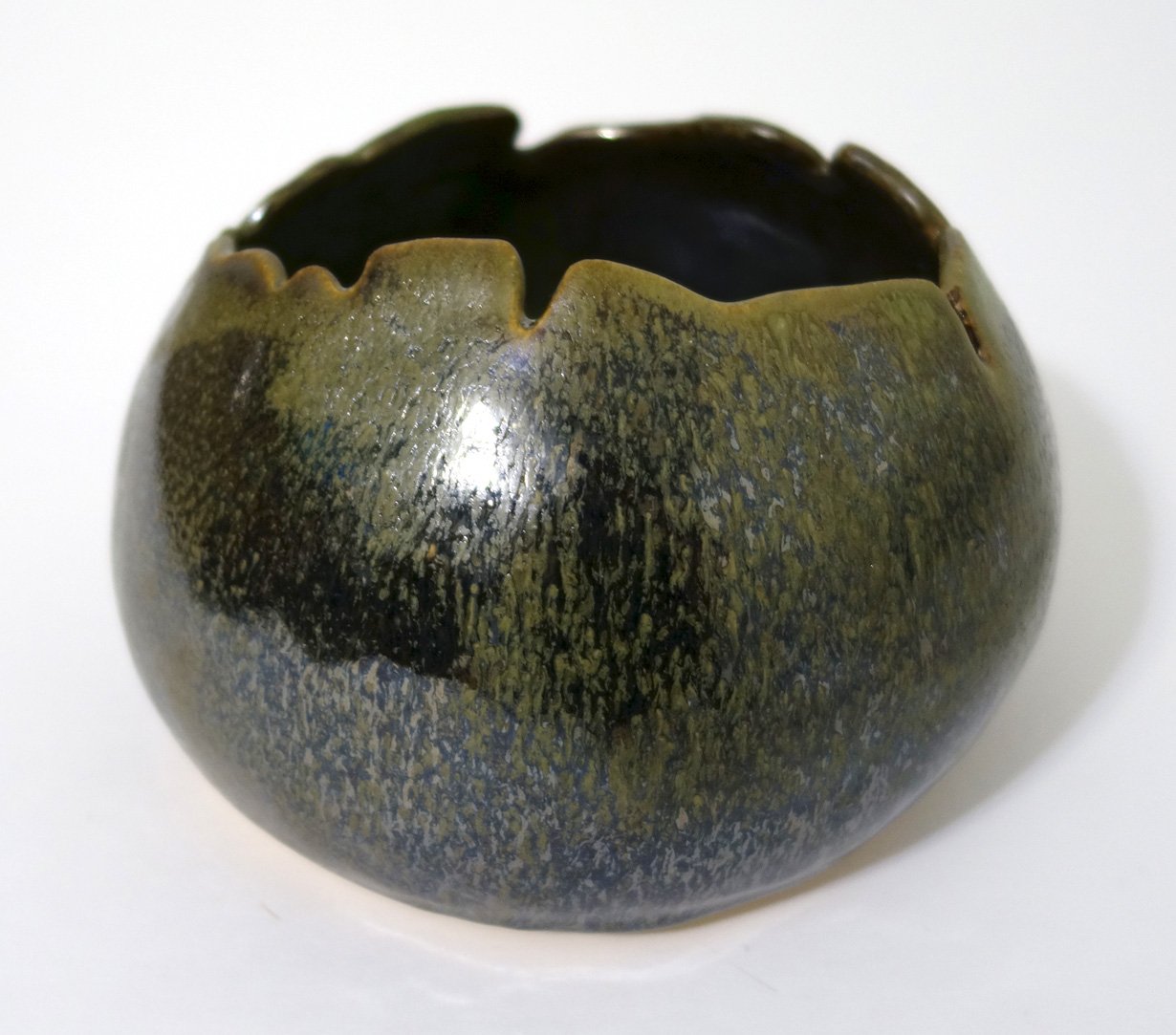
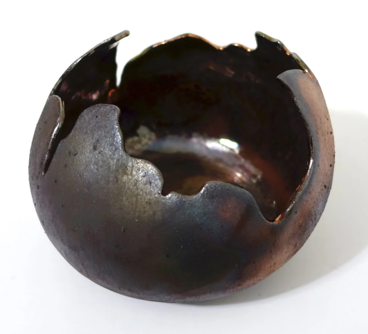
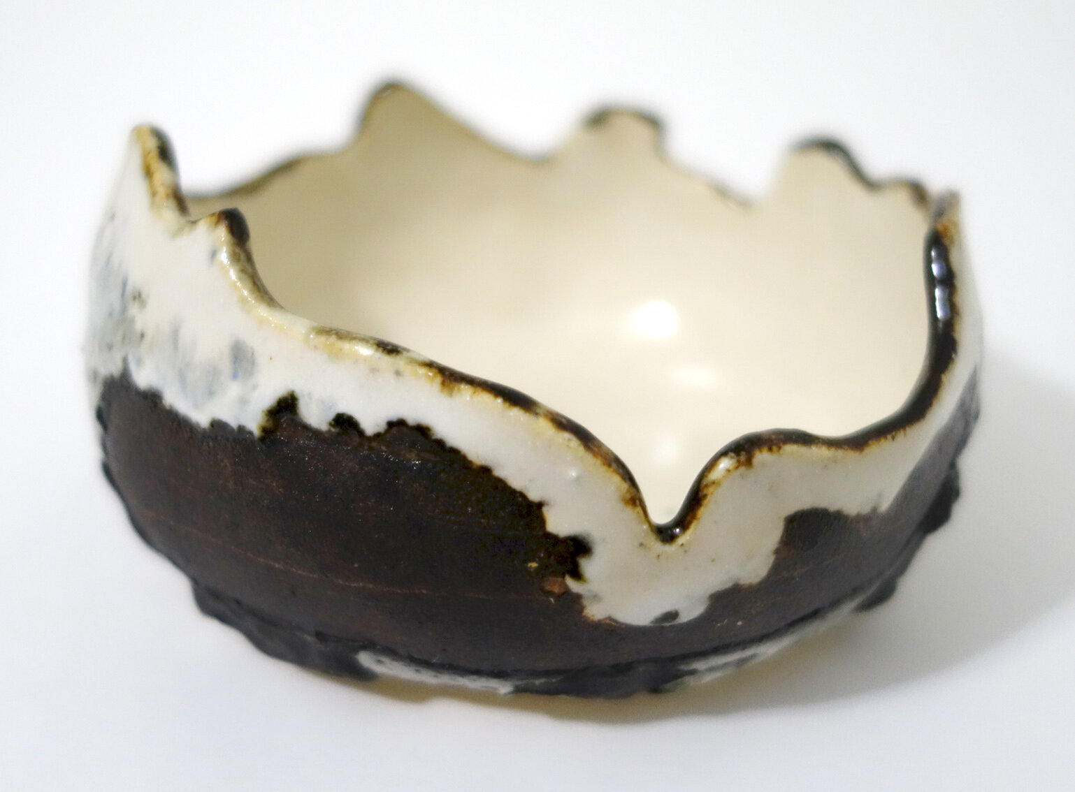
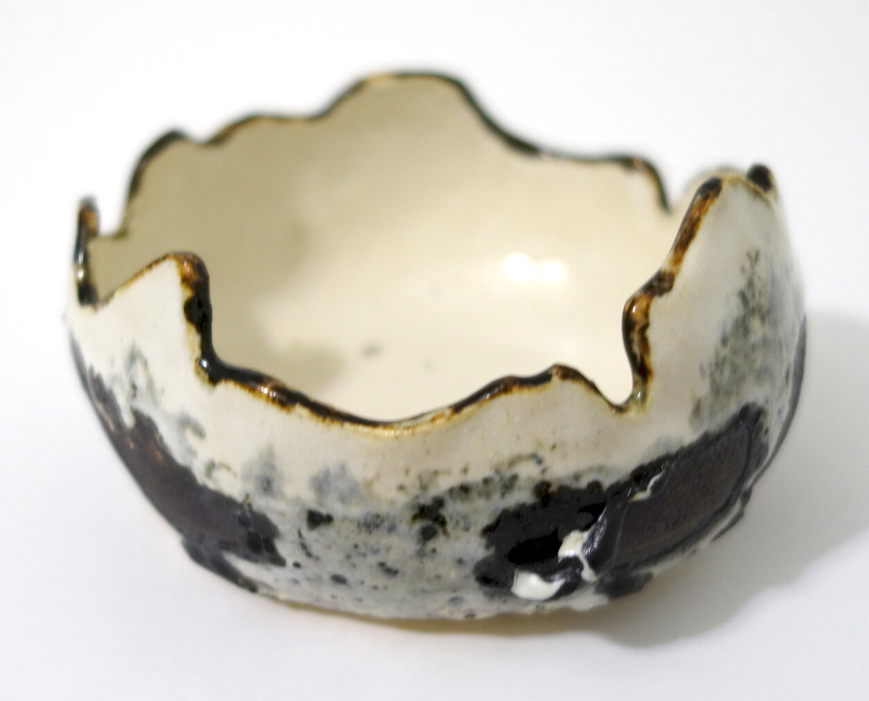
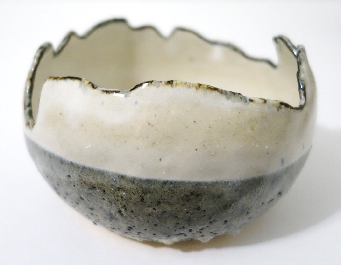
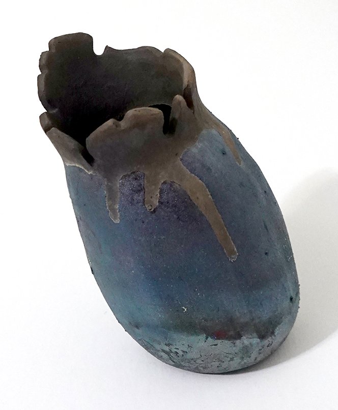
And below is my final copper raku piece of the workshop! This one is an oddball shape; I wanted to push myself to make some handbuilt, necked vessels and in doing so created this flora-inspired vessel. I glazed it with Litho Carb on the inside and Midnight Luster on the outside.

My April 2022 Raku Ceramics

I just completed another raku workshop this past weekend, and as I was looking through my files I realized I’ve not yet published the raku pieces I made at my last one in April 2022. Clearly I should do that before sharing my latest workshop photos and products!

On my April 2022 raku workshop, I wanted to try to carbonize various plant fronds or leaves onto the surface of my pieces. This was a complete experiment, and it was mostly a failure. I tried a variety of ferns and tropicals out, and one after another, they burned away without leaving a trace. Here are some plates that I attempted to salvage after that didn’t work out. With the first, I pivoted to a sugar and horsehair application. With the second, I tried to use ferric chloride to stain the surface with plant leaves that weren’t carbonizing, but they just left those not-terribly-appealing ferric chloride splotches.

Once I realized those techniques were not working, I tried etching fern fronds onto a plate in a “baked potato” aluminum foil saggar firing; it kind of worked, but I think it’s underwhelming. Since none of those plant techniques were doing super well, I just put a litho carb copper glaze onto my final plate.

I also made a rounded crackle vessel and the glaze turned out really well, but the ceramic physically cracked due to thermal shock so it’s got that permanent asterisk associated with it.

I glazed this spherical vessel with copper glazes (Copper Sand is on the exterior and I think that’s Midnight Luster on the interior), and it came out looking like a little planet! This one’s a definite favorite.

And finally, the one plant piece that turned out beautifully and justified all the failures: this is another “baked potato” saggar firing, and the Muehlenbeckia axillaris vines I used carbonized perfectly into this vase’s surface.

I also lost a large platter-like vessel (it broke into quite a few pieces and was not salvageable) and had another plate fuse with a kiln brick and lose part of its bottom. I eventually recycled that broken platter-like piece in my rock tumbler!

My 39.57, -97.66 Ceramics

After I made my 100% wild, site-specific Whiterock Conservancy ceramic collection entitled 41.816, -94.646 Ceramics, I knew I wanted to add other geographic coordinates to my oeuvre. Upon discussing this wish with family and friends, my father suggested that I might be able to get some wild clay from the brick plant Cloud Ceramics in my hometown of Concordia, Kansas. We brainstormed different supplies of ash for me to create custom ash glazes with, and settled on ash from my parents’ Republican River Valley firewood and the local Cloud County landfill (they burn organics like fallen tree limbs).

Several calls and trips my dad took to fetch the requisite media later, I had two different colors of native clay as well as the two aforementioned sources of ash. The clay from the brick plant arrived in dry chunks, and it had a lot of rocks and different densities of clays embedded in the pieces. After trying a couple of other methods (sifting and straining), I ended up going back to my tried-and-true, low-tech solution for cleaning the clay: meticulously smushing little pieces of it by hand to remove the debris and equalize consistencies.

I began working on this series in late November. I had a deadline of mid-February if I wanted to include 100% site-specific ceramics in my solo show in the Frank Carlson Design Room. That’s a turnaround of less than three months! I tasked my studio assistant work study students with helping me clean the clay, which helped speed up the process. I also tried to keep the pieces relatively small to maximize the number of pieces I’d be able to complete.

Here are some photos of the process!

As you can see above, after we cleaned the clay I handbuilt 30 ceramic pieces (15 out of each clay color) and bisque fired them. I then separated them into two different firings: half went into a cone 8 electric kiln firing and half went into a cone 9 gas reduction firing. After sifting the ash and removing all the larger chunks, I created 9 different custom ash glazes: 8 using all possible combinations of yellow clay, grey clay, landfill ash, and fireplace ash in 1:3 ratios, and 1 hybrid glaze with 1:1:1:1 proportions of each. I wasn’t sure what any of the glazes would look like, so I ensured each color of clay and kiln setting had the full range of options and asked my work study students to take copious notes so that we could learn from the results.

Here are my 39.57, -97.66 Ceramics! I managed to finish these in time to include in my Frank Carlson Design Room solo show. I like them all, but I am particularly in love with the ones that came out of the cone 9 gas reduction firing. I’ve only fired a few times in gas kilns so far, and this is the first time I’ve gotten really good reduction - it’s gorgeous! I like them so much that I want to make more (and larger) pieces to add into this collection, and glaze with a little more intention now that I know what the custom glazes I created will do. The clay cleaning process is tedious enough that there is a limit to how long I’ll want to keep working with each wild batch of clay, but my interest hasn’t waned in the Concordia series yet.

New Artwork: Earth Measurer

An in-progress photo showing my contour drawing which underpins the finished painting!

I made the acquaintance of this inchworm at Whiterock Conservancy, and began the contour drawing over a year ago. I picked it back up this winter break!

The title of the piece, Earth Measurer, is the English translation of the Ancient-Greek-derived “geometer.” Geometridae is the scientific name for the family of caterpillars (and moths) that make use of the distinctive method of locomotion that is not only described in the family’s scientific name but also in many of their common names: inchworm, spanworm, looper, and measuring worm.

After spending a lot of time really looking at inchworm anatomy and learning terminology (FYI, they have true legs and prolegs), I am again impressed with the variety and richness of animal forms in the world; there’s plenty of alien to explore right here. This past summer, while painting mosquitoes from LSU Vet Med’s epidemiology department, I was surprised by how hairy they are upon examination. Similarly, on this so-called hairless caterpillar, there’s still a fair amount of hair, called setae! I included it in the painting as well, though you’ve got to get close to the painting or zoom in quite a bit to see it.

This is Earth Measurer, acrylic on basswood panel, 6x12x1.5”, 2023.

Landscape Ceramics

I’ve been working on a series of landscape ceramics for some time now, and I plan to continue to add pieces! Here are some I completed in early 2022; these are all stoneware fired to Cone 6. The first three are vases, and then there’s a bowl, an egg-shaped vessel, and six small planters.

My 41.816, -94.646 Ceramics

In my three-person show Whiterock Art at the Betty Strong Center here in Sioux City, IA, I have 37 pieces on display! There are 2 painted reliefs, 20 8x8” chromatograms, and 15 handmade ceramics. I’ll post photos from the show and reception shortly, but right now I want to focus on those 15 ceramic pieces in detail.

My Whiterock Conservancy ceramic body of work is special in that it is 100% site-specific in every component. I dug my own clay out of the Middle Raccoon river beach cliff, cleansed it of rocks, roots, and other debris, and then I did not amend it (often potters mix additives into their harvested clay to improve elasticity or other desirable characteristics, but I thought that would weaken this collection’s conceptual power). Below are images documenting my clay collection!

I handbuilt 15 different vessels, and as I was doing so, I thought about if I should glaze them at all, and if so, would transparent glaze from non-local sources taint the project…? I shared this quandary with friends, including my wonderful former colleague and master ceramist Susan Nelson.

After a couple of weeks mulling it over, Susan arrived at a different solution: ash glazing. I learned from her that ash can be used as a glaze, often in combination with clay to lower its melting point and smooth out the finish. I reached out to Whiterock Conservancy co-founder Liz Garst to see if I could collect some of the ash they generate, and she was kind enough to collect me a gallon bag of ash from a slash pile burn primarily composed of invasive honeysuckle bushes.

I inter-library-loaned a book on natural and ash glazes and conducted a variety of tests to determine the best ash glaze mixtures, application methods, and firing temperatures - but I also had deadlines to meet that meant I couldn’t dally too long in the experimentation phase. I eventually settled on using three ash glaze mixtures that used different proportions of clay to ash mixed with water and put 6 pieces in a Cone 8 electric kiln firing and 9 pieces in a Cone 9 gas kiln firing. Below (respectively from left to right) is a still wet raw ware handbuilt bowl, bisque-fired pieces, my work study students and I experimenting with ash glaze recipes in the ceramics studio, and ash-glazed bisque ware awaiting its glaze firing.

Below are are the finished pieces in the 41.816, -94.646 collection. Those title numbers are the latitude and longitude of the artworks’ origin, and if you input them into a map application you’ll see a pin drop on Whiterock Conservancy near the river beach! I love that these ceramics are made of the land itself, and are glazed with the conservation efforts of people today trying to restore what we’ve lost in ecosystem health and diversity. The colors, texture, and variation resonate in this body of work, and I look forward to comparing these pieces with future geographic coordinate collections, as I plan to create site-specific ceramics from other localities as well.

LSU Vet Med Artist Residency Artwork 20

This is the final piece of artwork I completed on-site at LSU Vet Med during my two-month summer 2022 residency! I think finishing 20 exhibitable pieces including mixed media paintings, a relief, ceramics, and a sculpture in 7 weeks is a remarkable feat, so I am very happy with my productivity.

I worked right up until the day of the exhibition opening on this piece, but I managed to get it “finished” in time - I put that in quotes as I still needed to briefly borrow it back from the exhibition midway through to put a protective varnish on top!

I had wanted to do a sculpture this whole time because A) I’ve always liked putting on exhibitions that have multiple disciplines and media on display to more deeply engage a broad viewership, B) I wanted to really highlight QuickCure Clay, as I’d helped create it with Dr. John Pojman at LSU a decade ago and it felt right to use it in at least a couple of pieces this summer, and C) I had been given a couple pieces of artificial turf from the wildlife hospital that I wanted to incorporate into artwork in some way, and relatively early on I had a lightbulb moment wherein I thought the astroturf had vulture neck-feather vibes! It worked very well, in that a lot of people couldn’t figure out where the artificial turf was used and at least one viewer told me she thought I thought the gravel I used as an installation aid was astroturf. Another viewer asked me if this was a taxidermied piece, which made me feel really good about the likeness!

I titled this piece Vulture Sculpture mostly because I didn’t have time to think about titling it when I had to make the show labels (I didn’t even think it was likely to get finished for it!), but I also do like the rhyme and the clear identification of the species of the bird. I sold this sculpture that same evening to the fabulous Dr. Mark Mitchell from Wildlife and ZooMed and his partner Dr. Lorrie Hale Mitchell from Integrative Medicine! They very kindly were willing to let me take it on exhibit first (as I’m doing with the rest of the sold paintings), but I made some delicate choices with this piece - the claws, the beak tip - that meant I thought it best to let them just take it after my LSU Vet Med solo show came down instead of potentially injuring the piece in shipping.

This is Vulture Sculpture, a mixed media sculpture of a black vulture including QuickCure Clay and ZooMed’s artificial turf, 13.5" x 7.5" x 20.5", 2022.

LSU Vet Med Artist Residency Artwork 8-19

This is Skeletal Ceramics, assorted handmade stoneware vessels imprinted with or formed around various canine, equine, and swine bones from the anatomy lab, 2022.

Shelby Prindaville's Skeletal Ceramics collection

I made this body of ceramics start-to-finish on site at the LSU School of Veterinary Medicine and with purchased supplies and firing assistance from Southern Pottery Equipment. The canine, equine, and swine bones used include skulls, jawbones, various vertebrae, scapula, femurs, and sacra. The glazes used were an Amaco Shino Cacao Matte Cone 5-6 Glaze (SH-32), a Spectrum Satin White Hi-Fire Cone 5 Glaze (1121), and a Spectrum Satin Mottle Hi-Fire Cone 5 Glaze (1122). I applied the Cacao Matte to all the textured/impressed areas and then sponged off the outer surfaces, then put on a generous two coats of the Satin White, and then painted a little of the Satin Mottle on kind of haphazardly and then more carefully at the lips. I fired to Cone 6. I was really happy with how this combination performed, as they do look like bone themselves! Seven of these pieces sold during the exhibition to three different buyers.

The anatomy lab allowed me to take the bones I’ve been using back with me so that I can continue to develop this collection, so stay tuned for more.

LSU Vet Med Artist Residency Artwork 7

Artist Shelby Prindaville holding Tigger the Kunekune pig.

My seventh artwork almost didn’t get made on site - I knew what I wanted to do, but tried in vain to get my hands on a necessary component until Dr. Clare Scully came to the rescue!

Let me back up and explain it from the beginning. A very cute Kunekune pig named Tigger came in for observation and diagnosis and he left the next day feeling much better (and after I gave him a quick cuddle). With his owners’ permission, I decided I’d like to feature him in a painting or two! As I always do when I see a new species here at LSU Vet Med, I started asking about what veterinary materials they use specifically with that species - in this case, pigs. After hearing about a handful of items, the ones that seemed the most useful for my purposes were the pig sorting panels or “pig boards” and Dremel rotary tools (used to sand down hooves). I had brought a rotary tool with me as a sculpting aid already, so that was easy - but the pig sorting panel was a harder acquisition. This is because all the ones they had on hand were made out of plastic, and were pretty clearly intended to be easy to clean in a way that would make it harder to work archivally on top of and they were also obnoxiously colored. Wooden ones are regularly used, too, but there weren’t any in the large animal hospital as typically the wooden ones are just created on demand in a farm woodshop to save money and time.

two small wooden pig sorting panels or pig boards

I started asking all the large animal veterinarians, residents, and students if they knew of a source, put word out via my communications liaison Sandy Sarr, and posted a Craigslist ad… but a week had passed and my show exhibition was drawing closer so I thought I’d need to wait until I could ask my agricultural colleagues back in Iowa. And then Clare came into the room, we chatted, she said she’d see what she could do, and a couple of days later, she had done it! She had found two wooden pig boards for me that were the dimensions I had been looking for from another LSU site and said they were sufficiently used as to be destined for the scrap heap, so this was a much better use for them.

I happily adopted them both and gave them a light sanding and heavy cleaning. For the first composition I had in mind, the slightly smaller and more “standard” board worked better, so that’s what I went with! I would like to photograph it again when I get back home and have access to a large white background, but this image will do for now.

This is Seeing Double, a mixed media relief including Dremel counter relief, QuickCure Clay, PVP Prep Solution (betadine), and acrylic on a used pig board / sorting panel, 29.75x19.25x1.25”, 2022.

Seeing Double painting by Shelby Prindaville

LSU Vet Med Artist Residency Artwork 6

As I may have shared before, I have met a bunch of amazing animals while here and there are a handful with whom I’ve really connected. This little fellow tops the list - you may recognize this brown thrasher from Wild Card, but here he is in his natural color palette and two different poses! I was fortunate enough to get to see pretty much his entire journey at the vet school in ZooMed’s wildlife hospital - from coming in as an abandoned nestling whose two siblings didn’t make it to his fledging and becoming a young adult, to his release! I will share his release photos in a different post.

The whole background is non-traditional veterinary media - namely, herbal treatments from Integrative Medicine! They created a really cool surface but were water-soluble and organic so I sealed over them several times with acrylic medium before painting the baby birds.

This is Crèche Chic, a mixed media painting including Integrative Medicine’s Jing Tang Herbal Concentrated Red Lung and Concentrated Prostate Invigorator and acrylic on panel, 18x24x1.5”, 2022.

A mixed media painting incorporating non-traditional veterinary herbs of two baby brown thrasher nestlings.

LSU Vet Med Artist Residency Artwork 5

This is actually the first piece I began here at the LSU School of Veterinary Medicine! I never know how to properly answer people as to how long a piece of artwork takes to finish, as my optimal process involves working on several different pieces simultaneously. If you count start to finish, I worked on it for a month and five days - however, there were a number of days in there that I didn’t touch this piece or only worked on it for a couple of hours…

The subject in this piece is a three-day-old baby Nubian goat; she was fully healthy but was brought in to accompany her brother who was failing to thrive and unfortunately didn’t make it.

Singularity, mixed media including Clinical Pathology’s Diff-Quik Eosin Y stain, Clinical Skills' fluorescein, Histology’s light green stain, and acrylic on basswood panel, 12x24x1.5”, 2022.

A mixed media painting of a baby Nubian goat in triplicate.

LSU Vet Med Artist Residency Artwork 4

This painting originated in the Epidemiology Department here at the LSU School of Veterinary Medicine! I met with a number of researchers in various departments, but Dr. Rebecca Christofferson’s lab offered me a very cool substrate that I wanted to use: mosquito ovipositioning paper! This paper, as its name suggests, is used by researchers to hatch mosquito eggs for research purposes. It’s an interestingly textured paper, and it has aqua lines on it in two configurations; on each 15x10” piece of paper, there are either two vertical lines 1” and 1.25” inside the border, or there is one line 4” inside (or 6”, depending on your perspective).

I asked what purpose the lines serve (they clearly serve some purpose, whether that be for researchers or as an artifact of the production process), and no one at LSU SVM has been able to tell me. I think that’s pretty funny, as it was my first question and the first question out of several of my artist friends’ mouths as well! Dr. Christofferson did just follow up with me to share the mosquito ovipositioning paper is apparently a repurposed seed germination paper, so I will try to follow that thread to see if I can figure out why the aqua lines exist!

As I shared in a previous journal, I took the photos of these mosquitoes myself. This composition includes two female Aedes aegypti mosquitoes, both after a bovine blood meal, and three mosquito eggs to scale with the mosquito depictions. I purposefully integrated cool tones and aqua shadows to tie in the aqua margin lines.

This is Hosts, acrylic on mosquito ovipositioning paper, 15x10”, 2022. It will be window-matted with an overlay of mosquito netting from the epidemiology lab on top of the matboard and framed. I’ll be assembling the frame with the help of my host Rob Carpenter, so I’m excited to see how it all comes together!

LSU Vet Med Artist Residency Artwork 3

The adorable Nigerian Dwarf goat model is named Morticia, and she came into the large animal area in need of a Caesarean section. While she has been waiting for her labor to commence, she posed for me. The ways in which humans and animals coexist in domesticated relationships were inspiration for this piece.

Lineage is a mixed media painting incorporating goat halter rope, debudding tool marks, and acrylic on panel, 13.5x13.5x1.5", 2022.


LSU Vet Med Artist Residency Artwork 2

Here’s my second finished piece from my LSU Vet Med artist residency! I’m still mulling over the title - my current tentative selection is Wild Card, but I’m open to other suggestions.

I’ve met a lot of very cool animals here already, so this is high praise indeed - this is my favorite animal I’ve met thus far. ZooMed has a superstition they observe: you cannot name a wildlife patient, or its health will go downhill. This little fellow therefore doesn’t have a name, but he’s a real character. He has charisma and attitude in spades. When I arrived, he was a nestling and still had these “Einstein” feathers he’s rocking in the below image, but he’s now a fledgling and is getting closer to release every day!

I specifically chose the elongated landscape aspect ratio of this panel as mimicking the dimensions of the pathology slides. The coloration of the background comes from my novel usage of veterinary stains and medicine as art media, and I continued that color palette into the subject as well. However, as you’ll understand more clearly in the process post I’ll make soon, there was a lot of trial and error in the creation of the background, and a cyan coloration that was produced ended up quickly going almost entirely fugitive (bleached out). I reinforced it with acrylic droplets as a final step.

This is a mixed media painting of a wild brown thrasher nestling including Clinical Pathology's Diff-Quik methylene blue counter stain, Histology's light green stain, ZooMed's chlorhexidine antiseptic, and acrylic on basswood panel, 10x20x1.5", 2022.


LSU Vet Med Artist Residency Artwork 1

I always aim to capture a sense of place or atmosphere in my residencies, and in this artist residency at the LSU School of Veterinary Medicine I have decided to incorporate medicines, pathology and histology stains, as well as veterinary chemicals, tools, and resources into each of my pieces as art media. (I have no idea how archival some will be - particularly how lightfast and stable the pigmentation of the medicines, stains, and chemicals is - but the evolution of how the artworks age will be interesting to witness and document, too!)

As you may already know, I work on multiple pieces of artwork simultaneously, so the first piece I start isn’t always the first to finish. This piece is actually the second one I began! It is of a Mississippi kite which is a beautiful raptor, and there were three here upon my arrival - two wild kites and one that has been habituated as an ambassador or resident raptor. The depicted wild bird is in a defensive stress posture, trying to look as big as possible so as to protect itself from predators.

This artwork incorporates ZooMed's PVP Prep Solution: povidone-iodine 10% topical antiseptic (also known as Betadine) and Integrative Medicine's AcuZone smokeless moxa-rolls for both the background and feet.  There’s also a bit of the Betadine on the eyes over a base of acrylic.

I have titled this piece Fortification, and it is a mixed media painting including the aforementioned veterinary materials as well as acrylic and cornstarch on basswood panel, 20x20x1.5”, 2022.

Rolling with Ceramic Glaze Changes

Speaking of glazes: I’ve been learning that the discipline of ceramics involves many variables, and some of the variables are less constant than I’d expect. In the discipline of painting, when I use up paint and I need to buy replacement tubes, they are very consistent in formulation so they are almost never perceptibly different. In ceramics, due to weight, volume, and cost issues we mix most of our glazes ourselves. This introduces a lot more human error compounded by potential supply line vendor changes in the ingredients and user contamination. To continue the comparison, it’d be like if I switched brands and sometimes even types of paint and expected continuity!

To state it simply: I’ve learned that when a bucket of glaze is gone and we remix it, I cannot expect the same aesthetics or behavior from the new glaze as from the old, even if they are purportedly the same. In some ways this is disconcerting, of course. But it is also a real opportunity, and it adds some exciting pressure and novelty into the glazing process. The novelty is self-explanatory; the pressure comes from if you want consistency since you only have as long as those buckets last for the desired effects to relatively predictably result.

Below is how Cone 6 Larry’s Black under Iron White looked with the bucket of Iron White that we were using last year.

You can see that the Iron White behaved in a very glossy way, was relatively thin at one coat but varied in thickness dependent on number and types of application coats with opacity ranging from translucent to decently opaque. At its most opaque, it was white. The Larry’s Black underneath went to a glossy and stable spectrum of various values of blue dependent on the application thickness of both colors.

We used up that bucket of glaze a few months ago, and the new Cone 6 Iron White appeared. Below are two new pieces that use Green Tweed, Larry’s Black, and the new mix of Iron White.

This Iron White is thicker at one application coat, a little yellower, and more opaque and matte. It also interacts quite differently with Larry’s Black. The matte-over-gloss effect causes the Iron White to crater and blister atop Larry’s Black; you can see it does not do that over Green Tweed as Green Tweed is itself more of a matte glaze.

Cratering and blistering are frequently considered “glaze defects,” but I enjoy the texture that some “glaze defects” provide - if you review my body of stoneware ceramic work you’ll notice that I am drawn to crawling as well.

Since these were my first pieces with the new bucket of Iron White, I didn’t know about this new interaction yet - I was expecting glossy results aligned to that first batch above. Now that I know, I’ve glazed a bunch of new ceramics with this cratering/blistering effect in mind, and they are waiting in the kiln until it’s filled up and ready to fire. I’m excited to see them come out!

New Cone 6 Glaze Combination!

When my parents visited this past fall, my mom tried her hand at ceramics! Then at Thanksgiving, she glazed her first piece. She decided to use four different Cone 6 glazes on the small dish - she overlapped Green Tweed, Red Earth and Iron White around the sides, and then filled in the bare central triangle left in the middle with Baby Blue.

Red Earth was a new-to-the-studio glaze that we had recently acquired; it was an old recipe our ceramics faculty Paul Adamson unearthed and wanted to try again. I didn’t imagine it would look very good in combination with Green Tweed, but the overlap on my mom’s dish was small so I figured it wouldn’t matter.

When my mom’s first piece of ceramics came out of the glaze firing, I was really surprised - the overlapped spot of Red Earth over Green Tweed looked metallic and reflective! So far, I’ve only seen that kind of glaze result from raku, and those are somewhat unstable and decorative (not watertight). I was excited to see what this new food-safe stoneware glaze combination would look like on a larger scale, so I tried it out on several pieces! This glaze combination seems somewhat chaotic in terms of its uniformity, density, and reflectiveness, but I’ve always enjoyed the balance that natural chaos can bring to my tight artistic hand.

There are two views of each of the three pieces above. The bowl and egg-shaped vase both use Green Tweed as the base and then have Red Earth applied to most of the top. The striped planter combines Iron White, Green Tweed, and Red Earth in different layers.

Here are three more pieces - two more broken-eggshell vessels and another planter! These also experimented with Iron White, Green Tweed, and Red Earth in different ways. I need to take better notes on my processes, as I no longer remember the order of layering on each of these and I didn’t write it down, but more testing will reveal all such secrets in time.

Overall, I’m really pleased with how these all turned out and plan to continue experimenting with these glaze combinations more in the future!

Ashlar Etching

I was invited to take part in the ART 246 Intaglio and Collograph Printmaking course’s finals etching trade. The end of the semester is always a busy time, but I said yes; I haven’t done an etching in ten years and it’s always good to refresh and grow, plus it’s a nice interaction for all involved. Our talented instructor Stephanie VonderAhe provided me with an already beveled 3x4” copper plate with hard ground applied. The assignment was themed “the view from here.” As I was mulling over the theme and how it might fit into my artistic practice, I decided to do a portrait of Ashlar - I see her every day.

I drew the piece at home, and I just accepted any mistakes I made as I didn’t really have time to re-ground any spots. When I thought it was done, I put the plate into the acid bath for a 40min etch, took it out, and printed it. That first print was pretty good, but the drawing seemed a little flat and there were a number of areas where I wanted to add or deepen shadows and develop a sense of volume. Stephanie added a new layer of hard ground for me, and I went back into the plate a second time. We then put it in the ferric chloride again for 40 more minutes.

I printed an edition of 16, but several of those had print errors (are you supposed to count those? - I’m now thinking you’re not, but I did!). As intended, I gave away 7 to the class. I framed up one for myself, and gifted another to my parents and a third to my sister. I have just a few good prints left, but of course I do still have my plate…

I’m pretty happy with how it turned out! Of course, I see some areas I could improve upon were I to do another plate or had time to fix mistakes prior to etching, but overall it’s a nice representation of Ash.

More Raku!

You got a sneak peek at some of my recent raku work in my exhibition shots from Functional Aesthetic, but here is the full reveal!

Above are three photos of one “baked potato” bowl. I used my own hair again as well as sugar for the carbonized marks on this piece.

This vase is very difficult to photograph well; it’s currently on exhibit, but once it comes back I’m going to see if I can capture it a bit better digitally. A couple of my friends who viewed the show said this was their favorite piece of mine. The way the glaze dots turned out reminds me of inset abalone shell.

This piece certainly didn’t turn out as planned; I experimented with a turquoise crackle glaze, but I really did not like the way the color came out, so we went ahead and re-fired it. I much prefer this hammered copper look!

This above bowl is decently large, and I chose to do the outside in a relatively matte glaze while the inside is a high gloss. It gives me dragon egg vibes. The Functional Aesthetic curator placed this piece in the choicest display spot, and I learned today that it was sold! I did see a viewer admiring it and gesturing to and around it at the reception, so I wonder if she’ll be providing its new home or if a different patron snapped it up.

This above vessel is kind of football-shaped, and its surface reminds me of a somewhat aged/stained city map. It has my own hair and sugar burned into the white crackle surface. I am quite into this piece.

I was really excited about how this piece turned out, as it’s adding into the “broken egg” series of clear crackle pieces I’m developing. The shape is hard to convey in photo, but it leans in a way that feels quite anthropomorphic - at least to me!

This bowl was intended to be another in the “broken egg” series, but it cracked coming out of the kiln due to the thermal shock and my thin walls. That’s more literal than I’d like for the “broken eggs” to be. It is still in one piece, but even after I epoxy over the crack (which I plan to do to bolster its structural integrity), it will have that weakness as it’s a fairly sizeable crack. I’m not sure if given the severity of the crack if I’ll want to display this piece, but if I do I plan to list it as NFS (not for sale).

And here is yet another casualty; however, this football-shaped vessel’s crack is more minor.

More Stoneware Ceramics!

I’ve been posting about my raku productivity of late, but I have also continued to make stoneware pottery too!

I really like the combination of two glazes - standard Cone 6 recipes for a white and “smoky brown.” I particularly like the crawling that frequently results. I sometimes add in a complementing lighter grey glaze which is a discard mix of my own creation and therefore likely very difficult to reproduce once gone.

Below are eight different pieces. They include, respectively, a bowl, two images of a planter, two more of a second bowl, a third bowl, two images of a dish, a fourth bowl, two images of a fifth smaller bowl, and two images of a sixth bowl.