artist

My Favorite Ceramic I've Made Yet: My Last April 2023 Raku Saggar Piece

I have a lot of my own ceramic pieces that I love, and there are a number of those that I plan to keep for myself for the foreseeable future! I’m pleased with each of the ceramics that came out of my recent April 2023 raku workshop; that work spans the realm between good to fantastic. One piece I made is my favorite ceramic I’ve made yet, though, which is a hurdle that was relatively easy to pass when I was a beginner back in early 2020, but is now a much rarer event.

This piece, like the others in this series I’ve made, was dipped in three coats of ferric chloride, wrapped in Muehlenbeckia axillaris or Creeping Wire Vine and then aluminum foil, and saggar-fired in a raku kiln. It is finished with kitchen wax.

Ceramic glazing in general is a lottery; there are a lot of variables and some are outside of your control. I think I won that lottery with this vessel!

I'm A Geoselenic Artist!

An image of one of my paintings (Velocity, if you’re curious, as I went with my most recent work to date) is going to be sent to the Moon on a shielded microSD card in a 'Moonbox' from NASA contractor Astrobotic, so my work will be in a lunar digital archive! (Until radiation breaks through and wipes it away.)

A fellow space enthusiast who purchased a Moonbox to send microSD cards up and had extra storage available shared this opportunity with me (and others) and I excitedly submitted and was approved. I wanted to know what kind of exhibiting artist this will make me since international is no longer enough (and galactic seemed too broad), so I asked a bunch of friends and students what adjective means the Earth and Moon together.

There was a lot of speculation - interstellar also seems too broad, and the offerings of stratospheric, universal, lunatic (haha), and interplanetary didn’t fit the bill either. But my friend Bernie Langer came through with "geoselenic,” which is exactly the term I was looking for! (Apparently it’s of Hellenic derivation; Bernie also followed up with the Latin-derived “terralunar” which I like even better but which sadly hasn’t yet made it into a dictionary.)

Also, I can’t mention being a geoselenic artist without linking some relevant forefathers.

New Painting: Velocity

Happy New Year! I’ve been hard at work painting a painted turtle; it was a beast to draw and quite demanding to paint as well because of all of the pattern and detail.

I met this baby painted turtle (Chrysemys picta) while biking the Adams Homestead and Nature Preserve - I felt very lucky to have spotted its dollar-coin-sized stature along the trail!

This is Velocity, acrylic on basswood panel, 14x14x1.5”, 2021.

Finished Ceramics Are Finally Here!

Back in January, I began to try to learn about the discipline of ceramics for professional development as an administrator and artist (and maybe even further down the line it’ll be a course I feel capable of teaching, too)! Of course, the pandemic descended right after we had begun to kiln fire and we went remote mid-spring so then there was no more firing for a time which was a barrier to progress.

You may remember my blog post titled Pandemic Productivity which I wrote toward the end of March discussing this topic, and over the spring and summer I generated a number of pinch pot raw ware from home - and an end-of-summer bisque firing was done, so all of those pieces were ready for glazing in early August.

(If you’re unfamiliar with how to make ceramics, you take clay and shape it which when ready is called raw ware. That raw ware is then bisque fired in a kiln. Once bisqued, you typically glaze your pieces and fire them again at a higher temperature. The pieces that come out of that second firing are usually finished, though you can do additional treatments beyond that as well.)

My very limited previous ceramics glazing (I believe one finished cycle only?) had been with Cone 9 glazes, which our gas kiln is theoretically capable of… but the first set of pieces that came out were not only experimental in terms of learning how to glaze but also very underfired due to the gas kiln needing repairs. The underfiring negatively affected their watertightness and texture. We have since fixed the gas kiln, and I do have some pieces from January through March that had been prepared with Cone 9 glazes for my second glazing attempt and are presently still waiting for whenever we next fire the gas kiln.

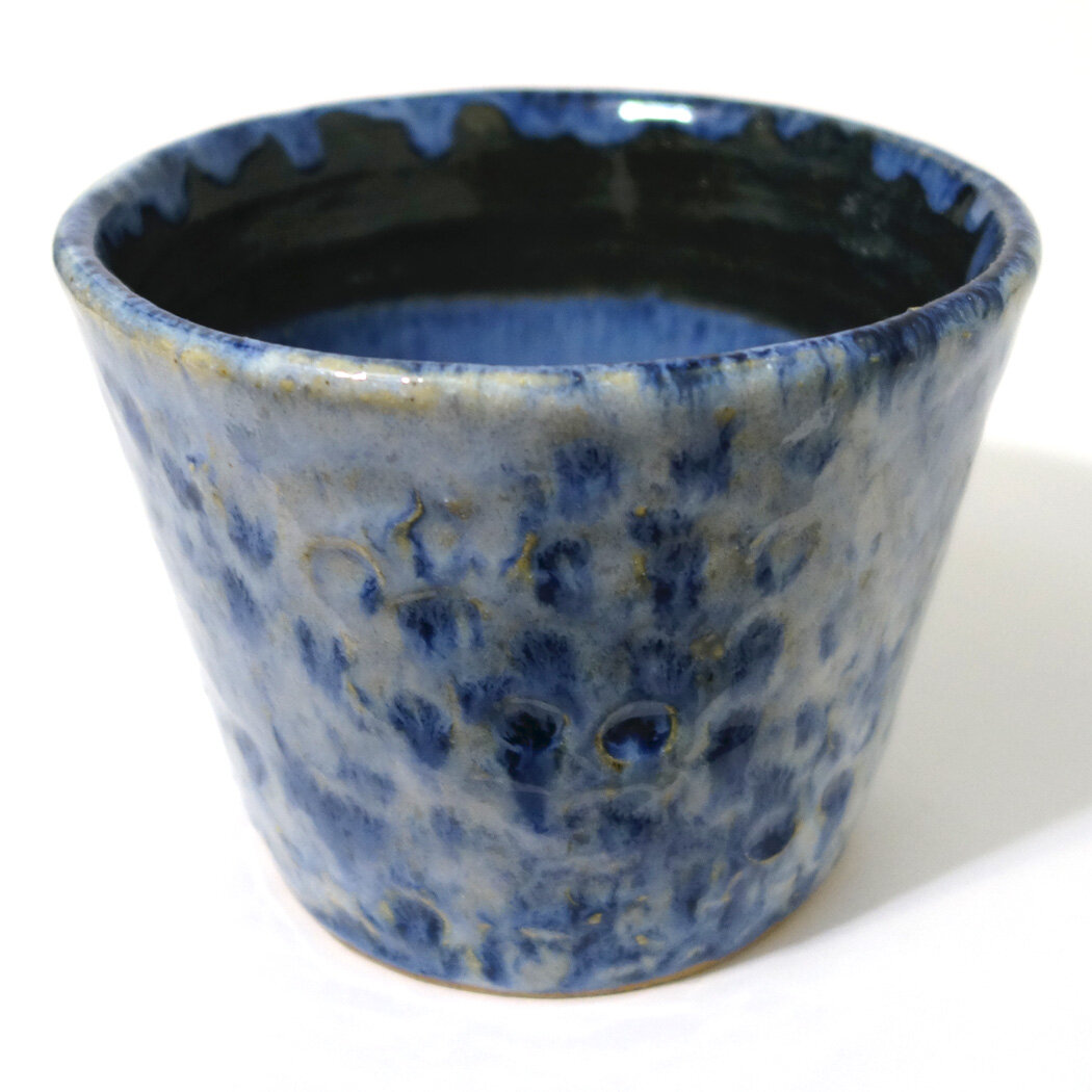
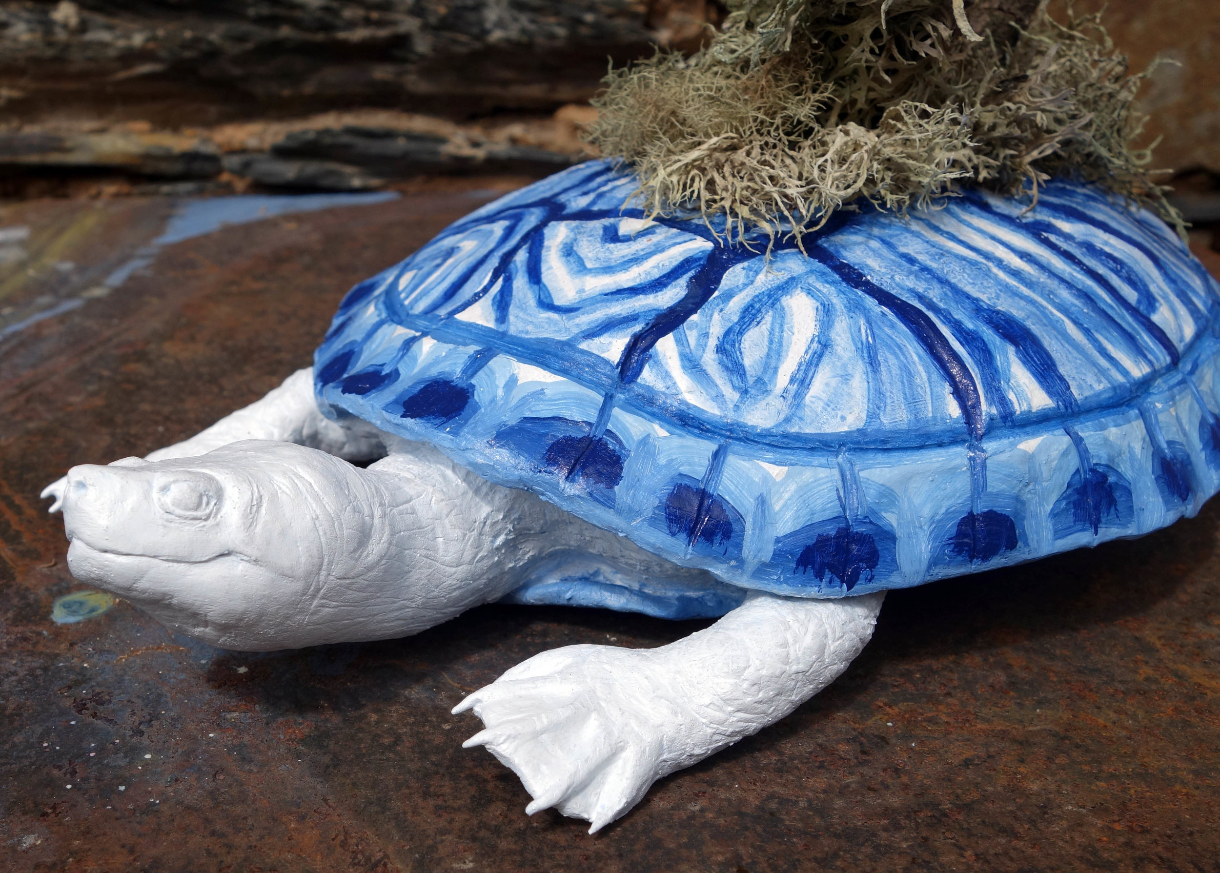
This fall we reopened Morningside College in person, and our ceramics course began again. It takes several weeks of creation before class bisque firing begins, and then once a decent stockpile of bisque pieces build up students begin glazing. Midway through this fall, I was able to rejoin the cycle by beginning to glaze my pandemic pinchware! The instructor teaching now prefers to fire at Cone 6 with our electric kilns. This meant any color mixing knowledge I had about our existing Cone 9 glazes - minimal anyway - was out the window, and I was starting from square one with the new Cone 6 glazes, many of which didn’t even have sample swatches yet. Again, there was a lot of experimentation and not a lot of control - but in only a few cycles I’m starting to develop some preferences! It’s also nice that these finished pieces have reached the proper temperature and their surfaces are, in contrast to the underfired pieces I’d done before, behaving as intended.

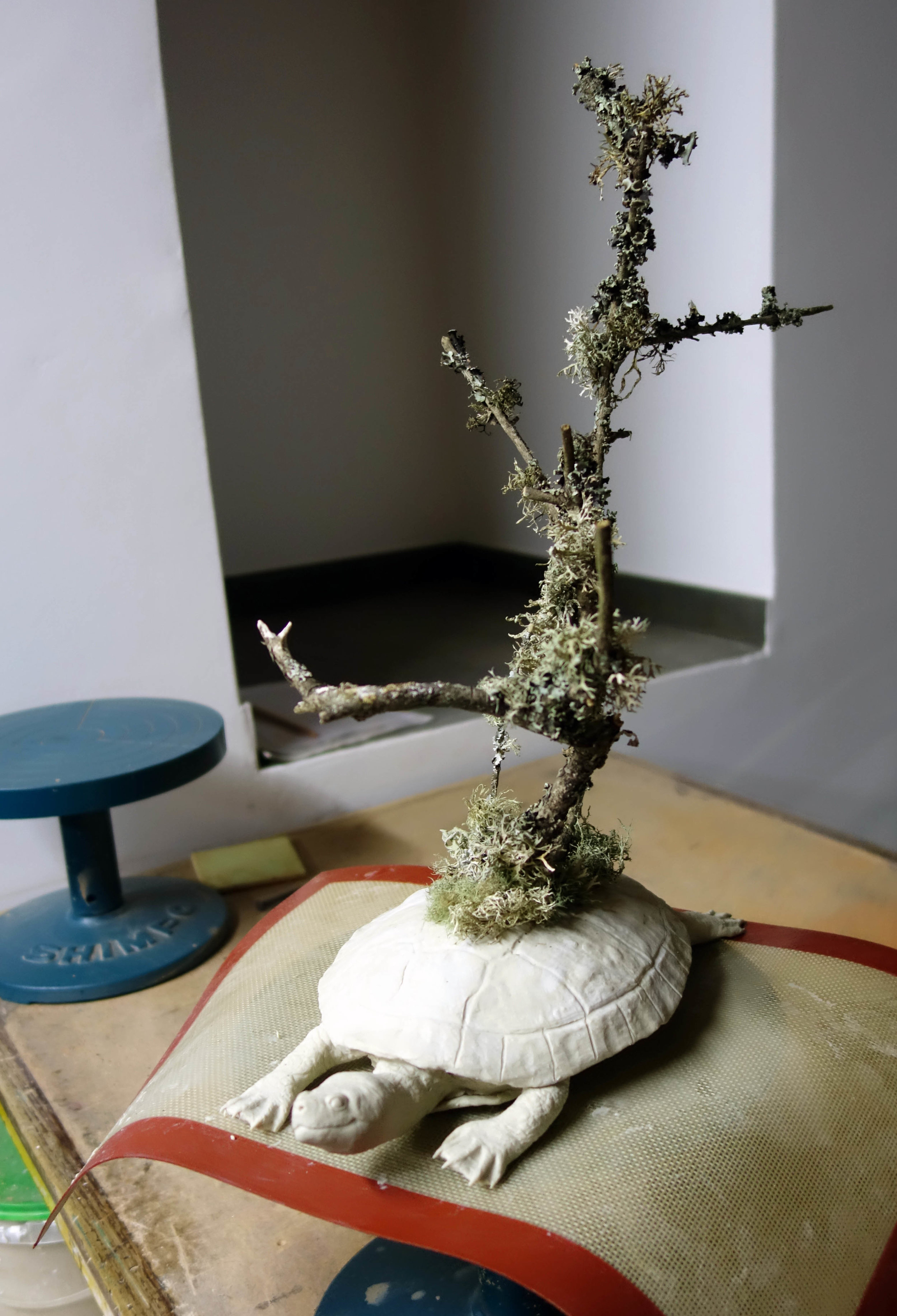
So, here are the first of my finished ceramics after almost a full year of work! All of these are planters with drainage holes, as the last three photos demonstrate. A couple are wheel thrown, and the rest are pinchware. They vary in size but most are relatively small - they’re all approximately 2-5” in diameter. Bigger pots are more time- and material-consuming to make and take up more room in the kiln so I’ve been sticking with smaller ones for now. I’ve made a few bowls (with no drainage holes) and vases, too, which I’ll share in a later post!

As you might imagine, making planters brings my interest in art and plants together nicely in that I can start to house my plants in my own pots! Transplanting during winter isn’t optimal so I’ve only done so where necessary, but here you can see a young Chlorophytum comosum - colloquially referred to as a spider plant - who desperately needed more space and has therefore been upgraded into a Shelby Prindaville planter with a top dressing to complement!

Upcoming: Small Works Juried All-Media Exhibition at the Northville Art House

Three of my pieces have been accepted into the biennial international juried exhibition SMALL WORKS at the Northville Art House in Northville, MI. They are: Gardens of Memory: London Planetree and Maidenhair, Failed Test 1, and Failed Test 3. According to the exhibits committee, 140 works of art created by 60 artists were selected from 395 entries and 81 artists. All works had to be under 12” in length and width.

Exhibition Dates: November 1 – November 30
Location: Northville Art House, 215 W. Cady Street, Northville, MI 48167
Website: www.northvillearthouse.org
Reception: Friday, November 1 5:30 PM - 8:30 PM

BROTA and Buenos Aires Series "Transmigration Landscapes"

I had my chromatography series Transmigration Landscapes framed right before moving, and so I’ve taken the time to photograph the pieces in their final form! From this Buenos Aires Botanical Garden collection, there are seven framed pieces each containing five loosely grouped chromatography plant portraits. The framed dimensions are 8.875x30”.

These are, in order:
Transmigration Landscapes : Arc
Transmigration Landscapes: Atmosphere
Transmigration Landscapes: Cadence
Transmigration Landscapes: Flare
Transmigration Landscapes: Percussive
Transmigration Landscapes: Reflective
Transmigration Landscapes: Vibration

Upcoming: BROTA Artist Residency with the Buenos Aires Botanical Garden!

Screen Shot 2019-04-10 at 12.33.10 PM.png

I am very excited to share that I was invited to be the second artist in residence ever at the BROTA International Residency Program in collaboration with the Buenos Aires Botanical Garden (Jardín Botánico Carlos Thays) this summer!

I will be at BROTA for a month-long residency spanning May 15 - June 15, 2019. I’m slated to have two exhibitions, one in the Buenos Aires Botanical Garden and one in the BROTA exhibition space. It’s a fantastic opportunity to focus a new body of work on botanical subject matter and I’m also looking forward to getting a chance to experience Argentina for the first time!

Estoy muy emocionada de compartir que voy a atender el programa de residencia internacional BROTA con el Jardín Botánico Carlos Thays de Buenos Aires este verano. Voy a quedar allí un mes - desde el 15 de mayo hasta el 15 de junio de 2019. El plan es tener dos exposiciones, una en el Jardín Botánico y otra en el espacio de exhibición de BROTA. ¡Es una oportunidad fantástica para enfocarme en un nuevo cuerpo de trabajo sobre un tema botánico, y también voy a experimentar la cultura argentina por primera vez!

Screen Shot 2019-04-10 at 12.35.16 PM copy.jpg

Upcoming Exhibition: Two-Person Show at the R.G. Endres Gallery in Prairie Village, KS

I am excited to share that I was selected to exhibit at the R.G. Endres Gallery in the Prairie Village City Hall for the month of February in a large two-person show - I’m exhibiting 35 pieces, if that gives you a sense of the scale of the space!

(If you took a look at this post when I first published it, you’ll notice it has changed - it was initially scheduled to be a three-person show but one of the artists dropped out so I’ve edited it accordingly!)

Here’s the (revised) press release the Prairie Village Arts Council sent out:

February Exhibition at R.G. Endres Gallery

Wildlife and the beauty of the natural world will be the dominant theme of the February Exhibit at the R.G. Endres Gallery in the Prairie Village City Hall, 7700 Mission Road, Prairie Village, KS 66208. Regional artists Kathleen Kirch of Gardner and Shelby Prindaville of Leavenworth will display their works in oils, acrylics, and watercolors.

Kathleen Kirch, an avid hiker and outdoors enthusiast, relates that her paintings of wildlife are inspired by her spiritual connection to the places she has visited.  Complimenting these works, Shelby Prindaville, the Art Program Director and Assistant Professor of Art at the University of St. Mary in Leavenworth, expresses the ethereal beauty of nature in her watercolors, acrylics, and mixed media. 

The exhibit will run from February 4 through February 27 at the R.G. Endres Gallery during business hours of the City Hall.  A reception with the artists will be held on Friday, February 8; 6:00-7:00 PM.

Publication in the Tulane Review

Two of my pieces of artwork, Balancing Act and Camelflage, were selected at the end of November for inclusion in the Fall 2018 edition of the Tulane Review. I was waiting to post about it until I could share some pictures of the actual magazine since they mentioned sending me a contributor’s copy, but it’s been a little while without seeing it in the mail and I wanted to share the news so I’ll just update if/when I receive it!

New Artwork: Convergence

Here's a new painting I just finished; I started it during my La Pedrada de Noemi residency, but I didn't get a chance to finish it there so I've been working on it since arriving back home.  It's actually the first painting I began while on residency, so given that you might wonder why it took so long to complete - the answer is that the support is an aluminum panel, and I've never worked on aluminum before.  What I wanted to do on the aluminum kind of clashed with what the aluminum wanted me to do with it, so we had a prolonged battle.  I didn't want to prime or even sand the aluminum, because I feel like the whole point of painting on aluminum is the luminosity of the material.  But not priming it meant that the paint wouldn't evenly stick.  I feel like I eventually came out the victor, though!

The painting is acrylic on aluminum panel, 18x14", and is titled Convergence.  It features a luna moth (Actias luna) atop a barrel jellyfish (Rhizostoma pulmo).

La Pedrada de Noemi Artwork 5

And another one - I've done a piece on a very similar frog in relief before (The Slightest Disturbance), and now here's a painting from a different angle of a marsh frog, Rana ridibunda and/or Pelophylax ridibundus, from the Jardín Botánico Canario Viera y Clavijo.  This piece is acrylic on gessobord, 5x7", and is titled Comfort Zone.

La Pedrada de Noemi Artwork 3

This piece is rather quiet, even though it features a loud subject - the Ornate Wrasse, Thalassoma pavo.  I am particularly pleased with the background, which is in keeping with my overall style but also references the refraction patterns of the ocean.  I also think this painting shows that though the Ornate Wrasse is brightly colored, it can blend in surprisingly well.

It is acrylic on pastelbord, 9x12", and I'm still wrestling with the title.

Intercambiador ACART Residency Journal 5 - New Artwork!

Here's my first painting featuring a fox kit I met while in Portugal.  City Solstice, acrylic on canvas, 14 5/8 x 22 5/8".  I'm not 100% certain, but given the very thin margin I left, I think I'll be framing it (ugh, the cost though!).

Cerdeira Village Residency Journal 3 - New Artwork!

When I woke up for my first morning in Cerdeira Village, I was still a little tired and quite sneezy - I thought I would escape from my Kansas allergies but there are apparently still plenty of plants I'm allergic to in Portugal!  I soon shook it off, though, and Julia and I made breakfast and started to get to know each other.  Next I went to set up my studio space; the atelier is downstairs and next door from the residency housing.  I took over two small pottery tables and a bigger workshop table and began working on my first piece.  

When I proposed my project for this very competitive residency, I took note of how ceramics-oriented the website was and my proposal was to make some fully 3D pieces out of QCC since of late I've been doing only relief work with QCC.  For my first sculpture, I decided I would create a slider turtle with branches growing atop its back supporting a nest.  I picked a turtle for a few reasons - 1) I'd sculpted two turtles a few years ago out of QCC but never felt I fully resolved their form and wanted to improve upon that work; 2) there is a multicultural myth that the world is supported on the back of a great turtle; 3) I hadn't seen very many animals in Portugal yet given that I'd only been there a couple days, but I had seen at least two different species of slider (red-eared and yellow-bellied) at the Estufa Fria in Lisbon.

I started the sculpture by carving a rough approximation of the shell out of styrofoam.  This was mostly to save on clay usage - I can only carry one bucket of it at a time due to the size and weight it occupies in my luggage, so I want to be smart in how I use it up - but also helps with the weight of the piece, which is important because I will have to ship my artworks back to the US and weight sharply increases the shipping costs.

Then I applied QCC in a relatively thin layer around the styrofoam and began to shape and detail it (hacking out bits of styrofoam as well if I needed to).  The shell took a lot longer than I thought it would to really shape properly; I did not finish it the first day.

I continued work the second and third days on the turtle.  After finally detailing the shell, I moved on to the head and feet.  I did them all separately so I could be very considered in my markmaking, and finally I assembled all the pieces and added a tail and other final detailing by the end of the third day.  I had planned to make the branches and nest out of the QCC as well, but I became enchanted by the local lichens that grow on the trees here and ended up pushing real branches into the turtle's back before curing the whole piece.

 Afterwards, I did add a nest and two eggs made out of QCC into the branches.

On the fourth and fifth days, I painted the turtle, nest, and eggs white.  I had got it into my head to reference the azulejos tiles so common to Portugal in the painting of the sculpture; the starting point was turning the natural light tan of the clay the bright white of the glazed tiles.  I had only brought one type of paint with me - my Golden OPEN Acrylics - which are great for normal painting needs but are really poor as a base coat due to their long dry time.  Here in Cerdeira Village, they seem to dry even slower - in fact, barely at all - and I ended up just going ahead and painting the turtle shell with an azulejos-inspired, painted-turtle-shell-based design on the sixth day here despite the shell still being faintly wet.  I also painted the eggs with a small decorative motif seen in the corners of some azulejos tiles.  The turtle and eggs took almost a week to dry, but aided by my eventual realization that I needed to put them outside in the sun to assist, they were handle-able by the time I needed to install them in their exhibition space the morning of June 2.

So here's the piece!  I haven't measured it yet, nor titled it (I've got some ideas mulling), but that will come.  It is a mixed media ceramic sculpture including 3P QuickCure Clay, acrylic, and found branches and lichens.

My New Mixed Media Relief of a Sloth

This is either finished or close to finished - I have a tendency to tweak works slightly for a number of days after the piece is "done."  

I'm naming it the closest English translation of the sloth's name: Pilgrim (Peregrina).

Pilgrim is 3P QuickCure Clay and acrylic on a 6x12" basswood panel.

Pilgrim.jpg

KCKPL South Branch Gallery Exhibition Press Release

I installed my solo exhibition at the KCKPL South Branch Gallery yesterday evening!  USM's Marketing Department was kind enough to issue a press release on it (as well as on other recent shows).  Unfortunately, I forgot to bring my digital camera along at installation so all I have is crappy cell phone imagery, but I'll definitely take some better photos before I deinstall.

New Business Cards!

I just redesigned my business cards and ordered a new set from Moo.  Since Moo allows printing of multiple back designs with a fixed front, I printed two different options.  I was concerned that the one with the Balancing Act snails detail might be too much, as it can look it when you see both sides at once, but in person it works quite well.  I'm liking both types enough that I may continue to order the mix... until I decide to redesign the card all over again, of course!