New Stoneware!

I’ve been steadily, slowly making food-safe, high-fire stoneware ceramics as well. Here are some pieces I produced this past year which I hadn’t gotten around to publishing until now!

First we have small plates - I’ve been using them as dessert or appetizer dishes!

Next, I’ve been continuing my landscape vase series! These are “rainy” versions.

My Temporal Artwork: Chromatograms

Some artists primarily work in transitory media - their artwork dissolves, melts, is eaten, is a performance, and so on. Often the documentation of this sort of artwork in many ways supplants the original; suddenly the photograph or video is the primary way that audiences engage with the piece. Andy Goldsworthy’s work is a good example.

Most of my artwork is intended to be of archival quality - I want it to endure for centuries, if not millennia! However, some of my pieces do have a more limited lifespan, at least in terms of continuing to match the photo documentation I took when I created the original artwork. My chromatography series are in that category, and I discussed this in the artist statement I published in this summer’s Annals of Iowa journal (Volume 82, Number 3). Here’s the pertinent excerpt:

“Over time and exposure to sunlight, the less stable plant pigments in these chromatograms (the greens, blues, purples, and reds) degrade, while the more stable colors (the yellows, browns, and blacks) remain; my Literal Landscapes become more and more sepia as they age.  To me, this is a reminder that our natural world is vibrant but vulnerable, and that we should relish what we have while stepping up our interventions to improve our ecological balance for future generations… or the living earth around us will continue to dull.”

What does that change actually look like, you might ask? I thought it would be interesting to rephotograph one of the chromatograms to show you! Here is a side-by-side comparison of Literal Landscapes: Whiterock Conservancy 1, mixed media chromatogram including natural ecosystem pigments, alcohol, and gel medium on filter paper, 8x8", 2021; the first image was taken immediately after making the piece, while the second was taken over two years later.

To be clear, I still find the current versions compelling! The aging process of these chromatograms unsurprisingly mirrors what happens in nature as plants progress through seasons. They’re currently evoking autumn to me, while their original versions were more spring/summer. I bet a photo taken further down the line would show continued movement towards the monochromatic, so I might repeat this experiment again in a couple more years to try to determine when they will achieve their final evolution.

New Artwork: Incursion

As was the case with my last new artwork, I began this painting while in residency at BROTA and the Buenos Aires Botanical Garden but didn’t finish it until now! It’s another painting of the water hyacinth - an attractive plant that due to human spread is now an invasive menace.

My first painting of this plant, Adrift, is intentionally more flat and graphic. It focuses on shape, color, and contour. In this painting, I wanted to add more realism through volume, depth, detail, and light via water reflection. The substrate is another beautiful handmade paper by Ato Menegazzo Papeles in Buenos Aires, Argentina.

This is Incursion, acrylic on artisanal handmade paper, 19.5x15.5”, 2023.

Shelby Prindaville's second painting of a water hyacinth.

Upcoming: 29th Arts North International 2024 Exhibition

In more good news, I’ve also been juried into the upcoming 29th Arts North International 2024 exhibition which is hosted in Hopkins, Minnesota! My veterinary epidemiology painting Hosts was selected for inclusion. This international opportunity garnered 1060 entries, from which the jurors chose 160 for exhibition.

Exhibition dates and location: 
Saturday, January 13 – Saturday, February 24, 2024
Reception: Saturday, January 13, 2024, 6:00 – 8:00 pm
Hopkins Center for the Arts, 1111 Mainstreet, Hopkins, MN 55343

Website: http://www.hopkinsartscenter.com/

There are awards for this exhibition as well, which will presumably be announced at the opening reception!
.

Upcoming: 2024 Arizona Aqueous XXXVIII Exhibition

My artwork was juried into the upcoming national 2024 Arizona Aqueous XXXVIII exhibition! Juror Tracy Lynn Ross selected my sparrowhawk mother and child papyrus paintings Syncretism and Potential.

The show will be on display from January 5 - February 25, 2024 in the Tubac Center of the Arts located at 9 Plaza Road, Tubac, AZ 85646. There are awards, so I’ll look forward to the announcement of those - presumably at the opening reception on Friday, January 5th from 5-7pm.

New Artwork: Adrift

Every artist has a few pieces they’ve started but not yet finished… and then time passes. Some of them kick around for months or years before they get picked back up again - if they ever do!

This painting is a piece I began during my 2019 Argentinian artist residency at BROTA and the Buenos Aires Botanical Garden. I got it quite close to being finished at the time, but there were a few touches left to add… and upon my return to the US, I shifted focus to moving houses and beginning the next school year, then COVID hit… and I just never returned to it until recently!

This is a painting of a water hyacinth, which is simultaneously a beautiful tropical aquatic plant native to South America and also a globally invasive scourge. In places where it can withstand the winters, it quickly multiplies until it covers all the available surface area of bodies of water. In doing so, it not only crowds out other, native surface plants and can make surface transportation difficult (for both people and wildlife), but it also shades out the underwater ecosystem. Along with many other territories, it is an invasive plant in the US Southeast, and at one point the US Congress considered but ultimately didn’t pass a bill to introduce hippopotamus to Louisiana to help manage the water hyacinth population.

This is Adrift, acrylic on artisanal handmade paper, 19.25x14.5”, 2023.

"Adrift" water hyacinth painting by artist Shelby Prindaville.

My Obvara Raku Vases

And here’s the last batch of obvara raku ceramics from my recent workshop at Dakota Potters Supply - these are the burnished vases!

This first oblong vase was the only one that I saw and heard crack during the sequential baths. It is still usable decoratively, but it does have that asterisk about it so I likely won’t exhibit or sell it. (Note, I purposely selected photos of it that don’t draw attention to the relatively large crack.)

While at the workshop, I thought that was my only casualty - but when I was applying kitchen wax to the surfaces at home, I noticed this next squat vase has a small hairline crack as well. It’s not nearly as apparent as the above piece’s flaw as it requires close examination to spot. While a crack is never ideal, in a low-fired piece like these which was always going to be decorative (not water-tight nor food-safe), it’s far less problematic than it would be in a piece intended for that kind of usage. I’ll probably keep this one myself!

The rest of the below vases are completely unblemished. This little bud vase is the smallest of the bunch.

Next we have a larger, somewhat soft rectangular vase!

And finally, a somewhat flared cylindrical vase.

I hope you’re as into the obvara pieces as I am. I really like the aesthetics this process produces - but more than that, from a conceptual standpoint I love the organic chaos that creates those aesthetics.

My Obvara Raku Plates and Platters

In my previous post, I shared the obvara raku bowls I made on my October 21, 2023 workshop at Dakota Potters Supply. I also made some plates and platters! As always, you can click on any of the photos below to see them larger.

This first burnished plate depicts a bear, and you can’t convince me otherwise.

This next burnished plate is smaller than the first - it’d be good to hold jewelry or other small items.

A small obvara raku plate by artist Shelby Prindaville.

This final piece is the largest - it’s a platter or tray, and it has some light texture on its inside surface.

My Obvara Raku Bowls

Here is the first batch of my obvara raku pieces from my Dakota Potters Supply workshop on October 21, 2023 - I made enough that I plan to publish three posts covering the artwork! This post shares my obvara bowls and bowl-like vessels.

Again, as background, obvara is a low-fire scalding-and-sealing process wherein you create a fermented sourdough/beer bath, plunge approximately 980°C naked ceramics fresh out of the kiln into it, wait for them to start to bloom with different tan-to-brown markings, and then arrest the surface carbonization process by rinsing the pieces off in a water bath.

The obvara process itself scalds and somewhat seals the surface of the pottery, but I went ahead and added a thin layer of kitchen wax to these pieces as well for extra protection and sheen unification. All of the below images in each gallery row are of the same artwork from different angles.

This first open bowl has a smooth surface!

This second piece is another open bowl, but this time the surface has some light texture as well as a more variable form.

This third piece is smooth and a bit more closed, though there’s a quite variable lip. All of the pieces I’ll be showing you are handbuilt, pinch-pot designs.

Next we have another smooth and even more closed vessel! This one was a favorite of my fellow workshop attendees; they loved how the obvara surface turned out.

While you can click into each of the above images to see them larger, I want to close this post out with just one large image of the last smooth bowl I made!

An obvara raku handbuilt bowl by artist Shelby Prindaville.

An Obvara Raku Workshop!

After asking about it repeatedly for three years, I successfully convinced the lovely folks over at Dakota Potters Supply to allow us to do an obvara raku workshop on October 21, 2023! Obvara is a low-fire scalding-and-sealing process wherein you create a fermented sourdough/beer bath, plunge approximately 980°C naked ceramics fresh out of the kiln into it, wait for them to start to bloom with different tan-to-brown markings, and then arrest the surface carbonization process by rinsing the pieces off in a water bath. Obvara has an even higher chance of cracking due to the extreme thermal shocks involved than non-bath raku processes.

Getting the chance to do raku is relatively rare, and many ceramists haven’t even heard of obvara, let alone had the opportunity to do it - so I’m really grateful for the experience! Joining me on the trip were Morningside faculty Paul Adamson, alumni Calissa Hanson and Deb Murakami, and students Laura Greene, Taylor Greene, and Lauren Hedlund.

In addition, I learned about honey raku from a ceramist at this year’s ArtSplash festival - it’s basically like horsehair, feather, or sugar raku surface carbonization, but with honey! I brought some along and we tried it out too - though I want to experiment with it some more at future workshops as I was so excited about the obvara opportunity that I only kept one textured plate aside for honey raku.

Here are some photos from the workshop itself, soon to be followed by pictures of my finished pieces! I applied for and was granted funding from our Faculty Development Committee to help with my costs, so I made and brought 18 pieces along this go-round - both to make up for any thermal shock victims, and because I didn’t need to apply glaze to my obvara or honey raku ceramics so I could get more processed compared to when I need to apply 1-8 layers of glaze to each piece on-site before firing (for crackle and copper glazes or ferric chloride dips). If you’ve been following my raku workshop production, 18 is about double the number of ceramics I typically aim to bring.

Photos of My Solo Show "Materiality"

Whew, it’s a busy fall! My solo show Materiality has closed, and I’ve been hard at work with the aim of getting all the sold pieces from it into the hands of the buyers. Here are some photos of the exhibition and reception! I was very pleased with the show installation and flow, which was due to our amazing preparator Shannon Sargent. There was great community turnout for the reception - it was a fantastic event.

2023 Annals of Iowa Cover Art Contest Winner!

I was chosen as a 2023 Iowa Department of Cultural Affairs' Annals of Iowa cover art contest winner! Annals of Iowa is a quarterly journal from the State Historical Society of Iowa. Mine is the Summer 2023 edition, which is Volume 82, Number 3.

This is a competitive opportunity facilitated through the Iowa Arts Council. The cover artist not only has their artwork reproduced on the cover, but also writes an artist statement that “speaks to the artist's overall work, in addition to specifically referencing the featured work and its connection to Iowa history” which serves as the introduction to that editions’ contents.

“Founded in 1863, the Annals examines the deeds, misdeeds, and accomplishments of our predecessors and shows how those actions fit into the larger mosaic of Iowa's history. It is distributed to hundreds of subscribers throughout the United States and Canada, and its digital footprint is even larger, with with over 3.1 million downloads from readers throughout the globe, including over 850,000 downloads in 2022 (State Historical Society of Iowa).”

The digital issues are published online after a year, presumably to encourage subscription and/or individual volume purchases for more timely consumption. Below are a couple of photos of my print volume for now, and then next year I should be able to share the full digital version!

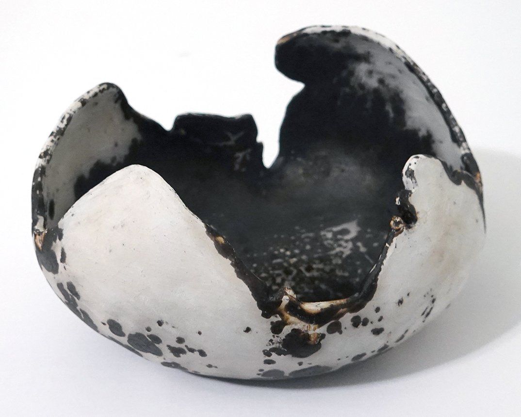
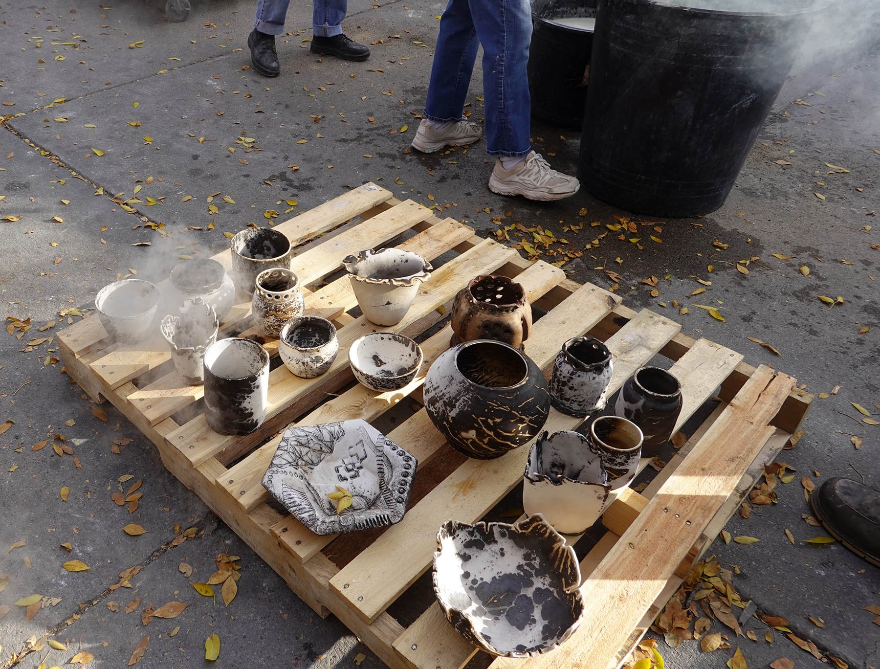
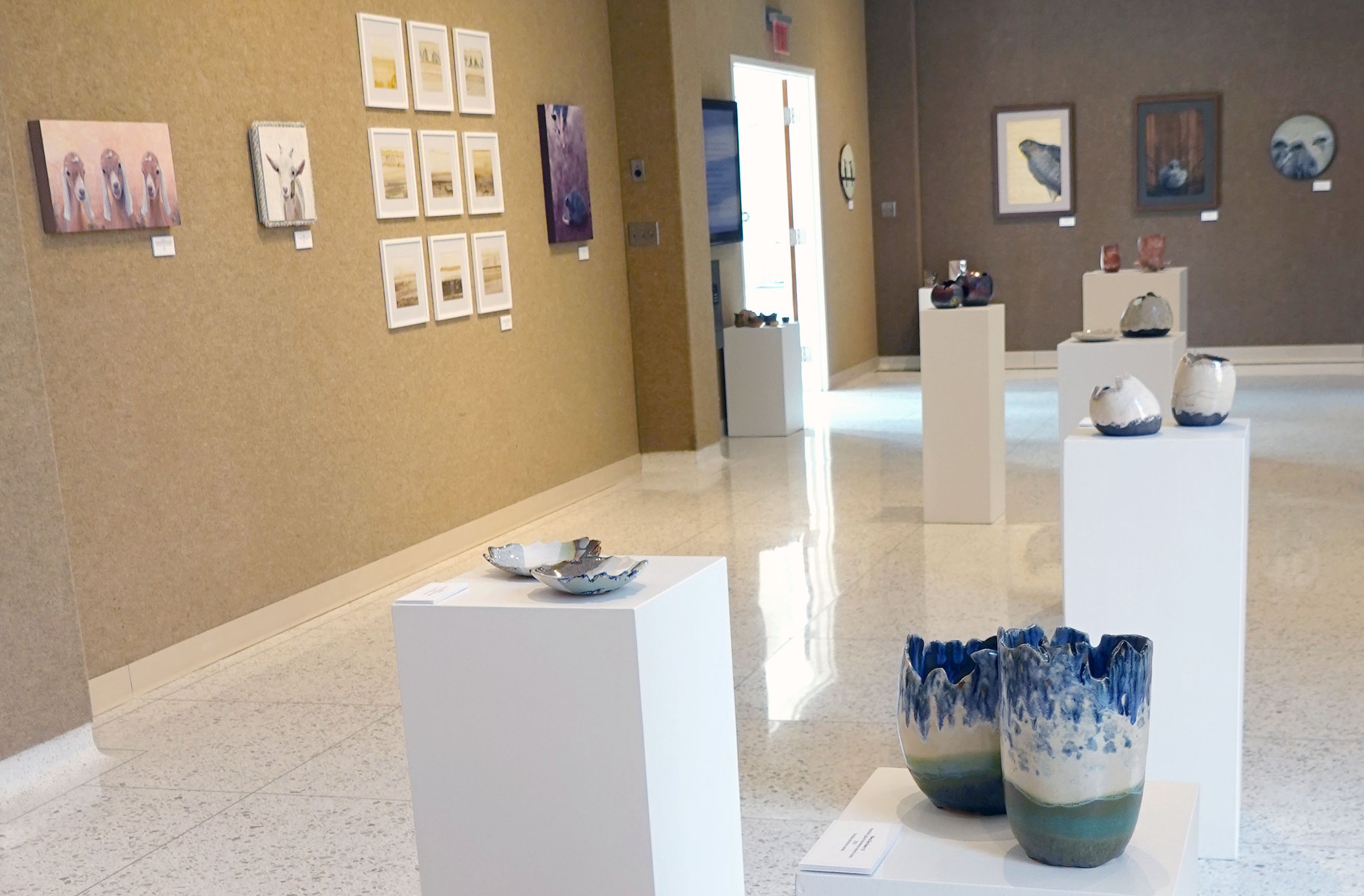
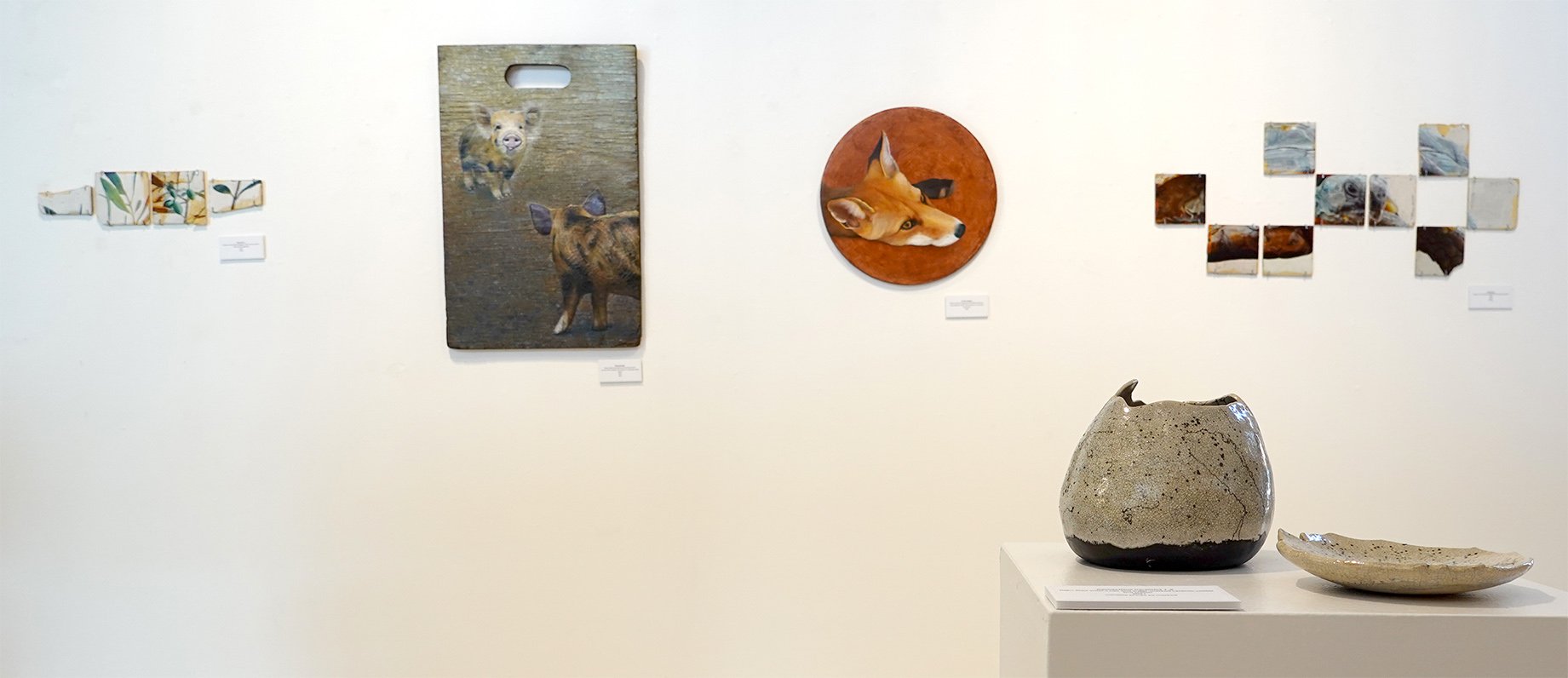
If you’d like to read my artist statement now, I’ve reproduced it here for you:

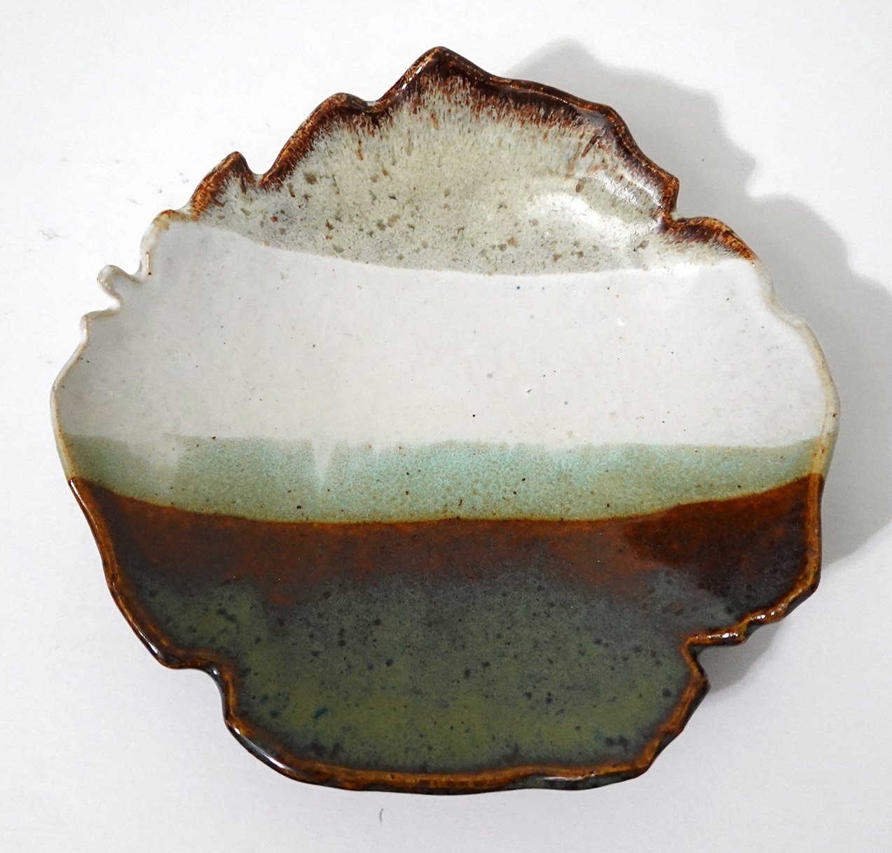
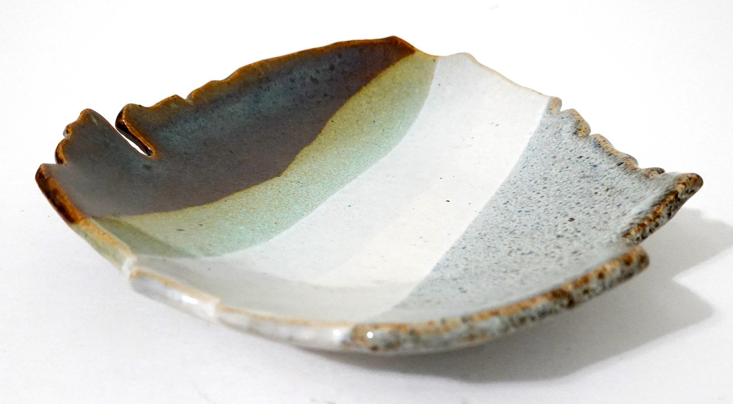
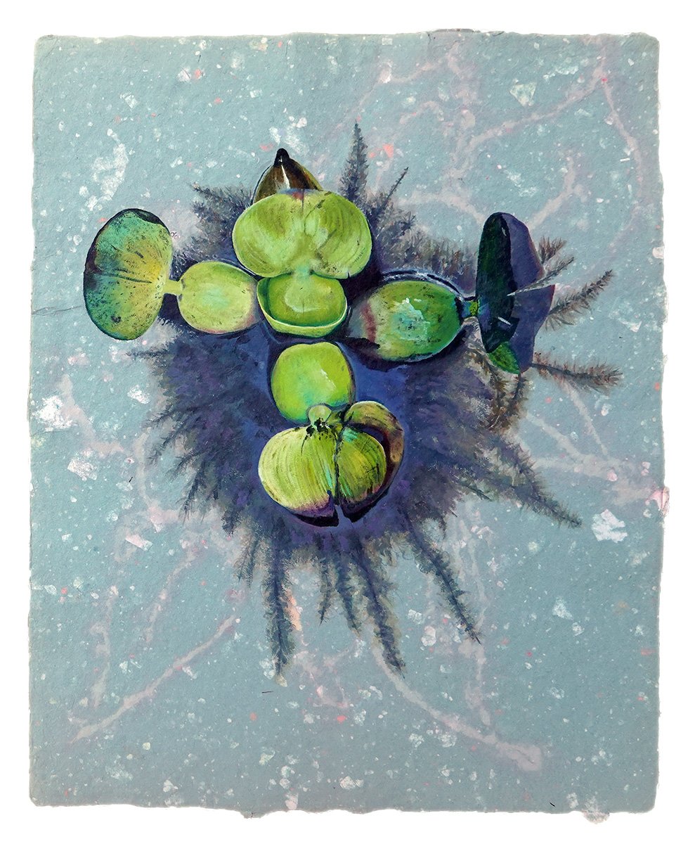
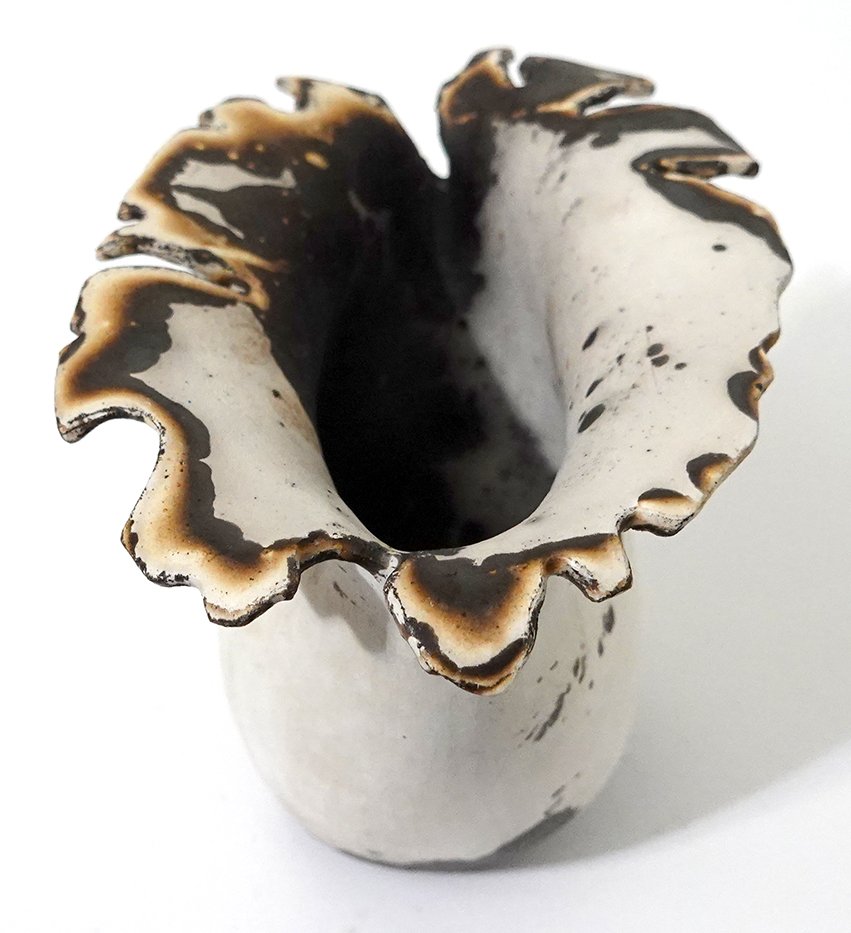
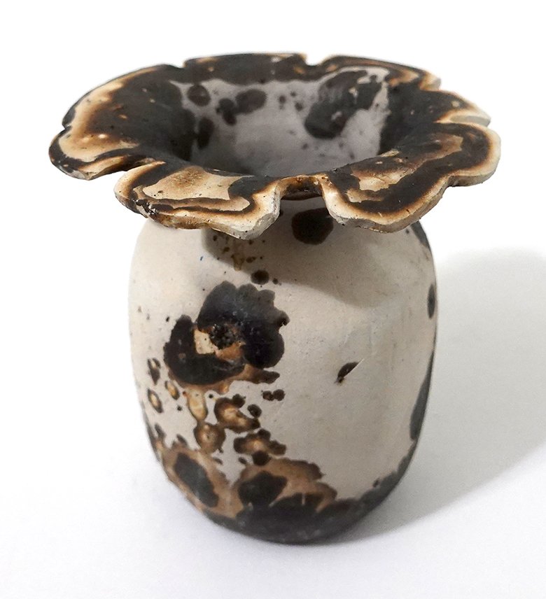
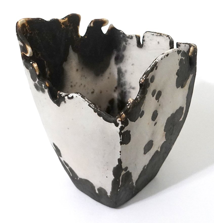
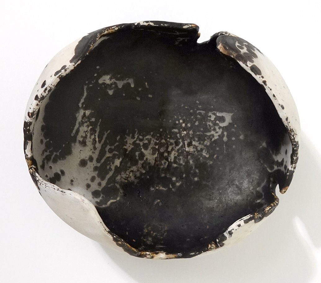
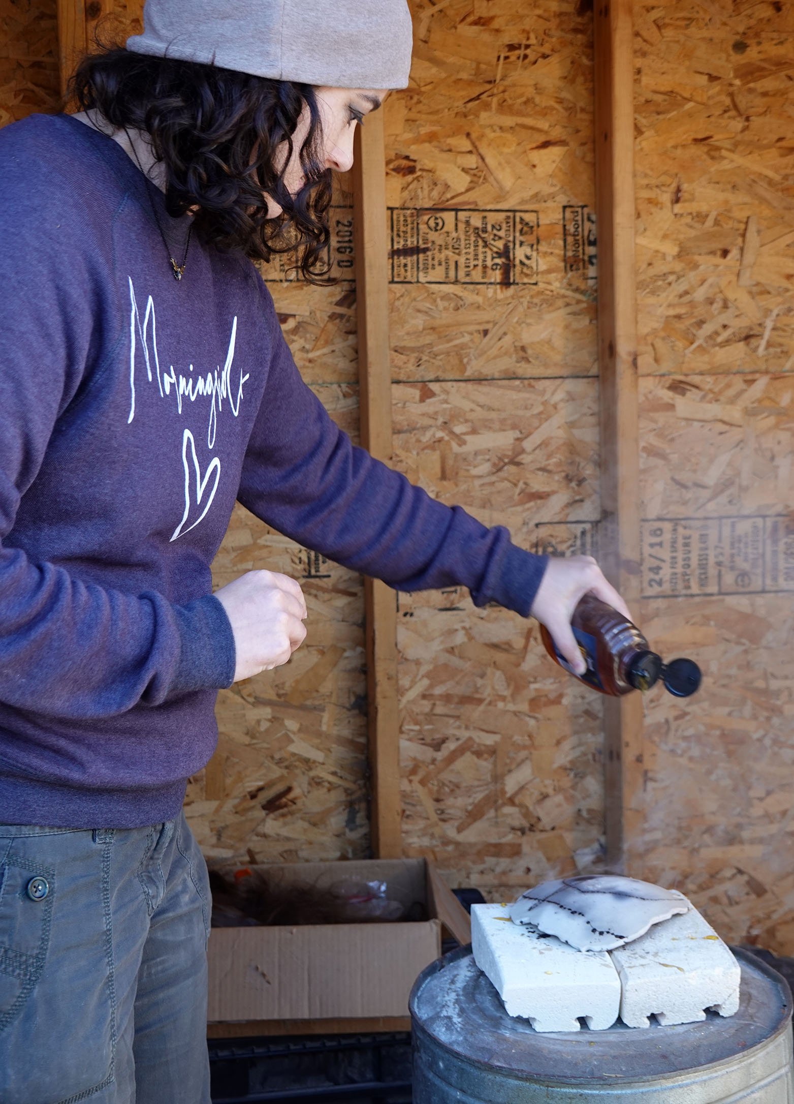
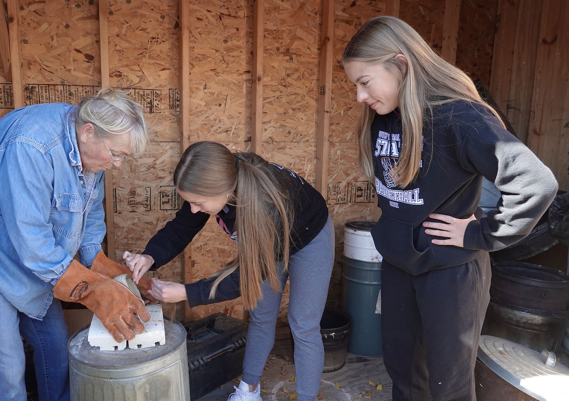
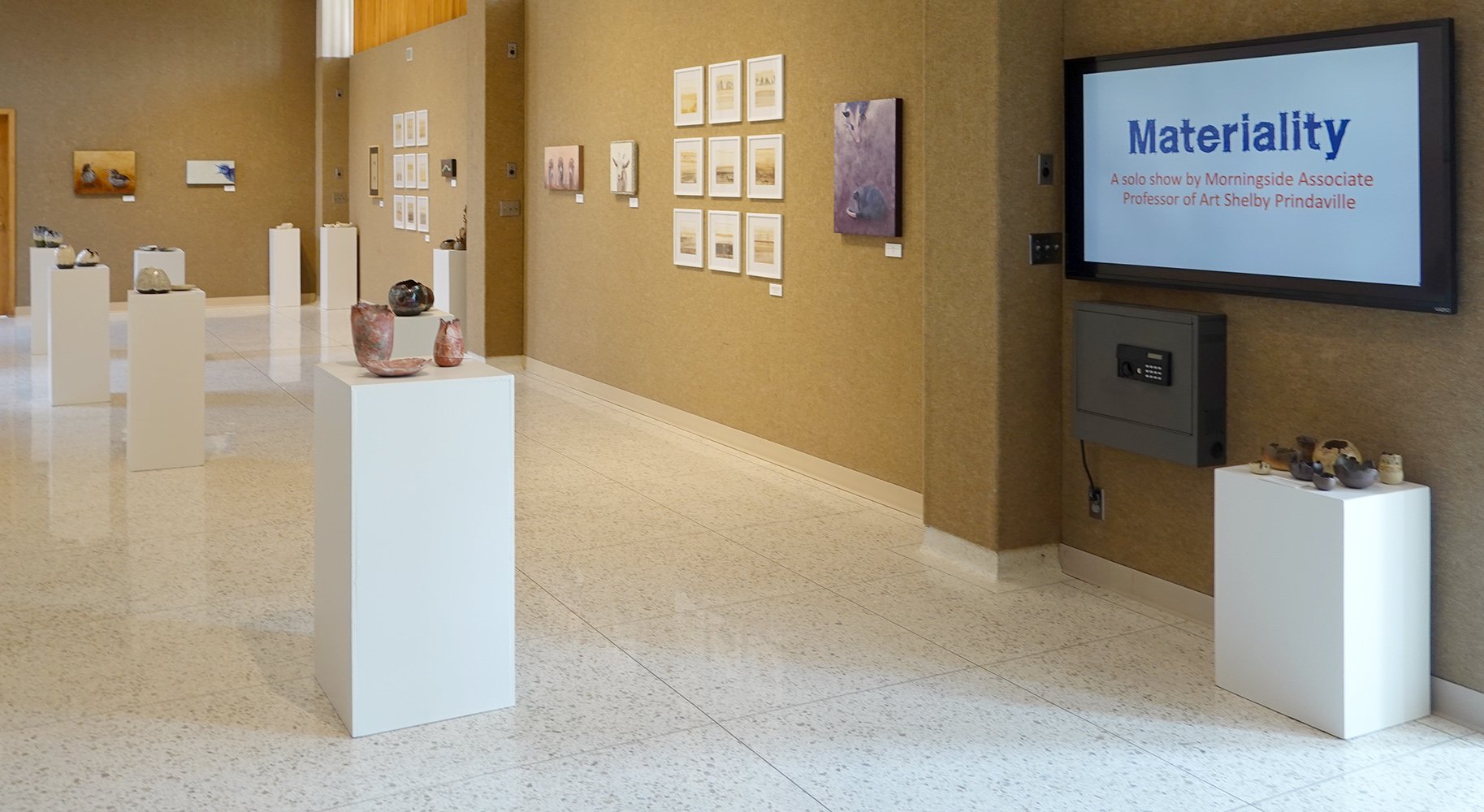
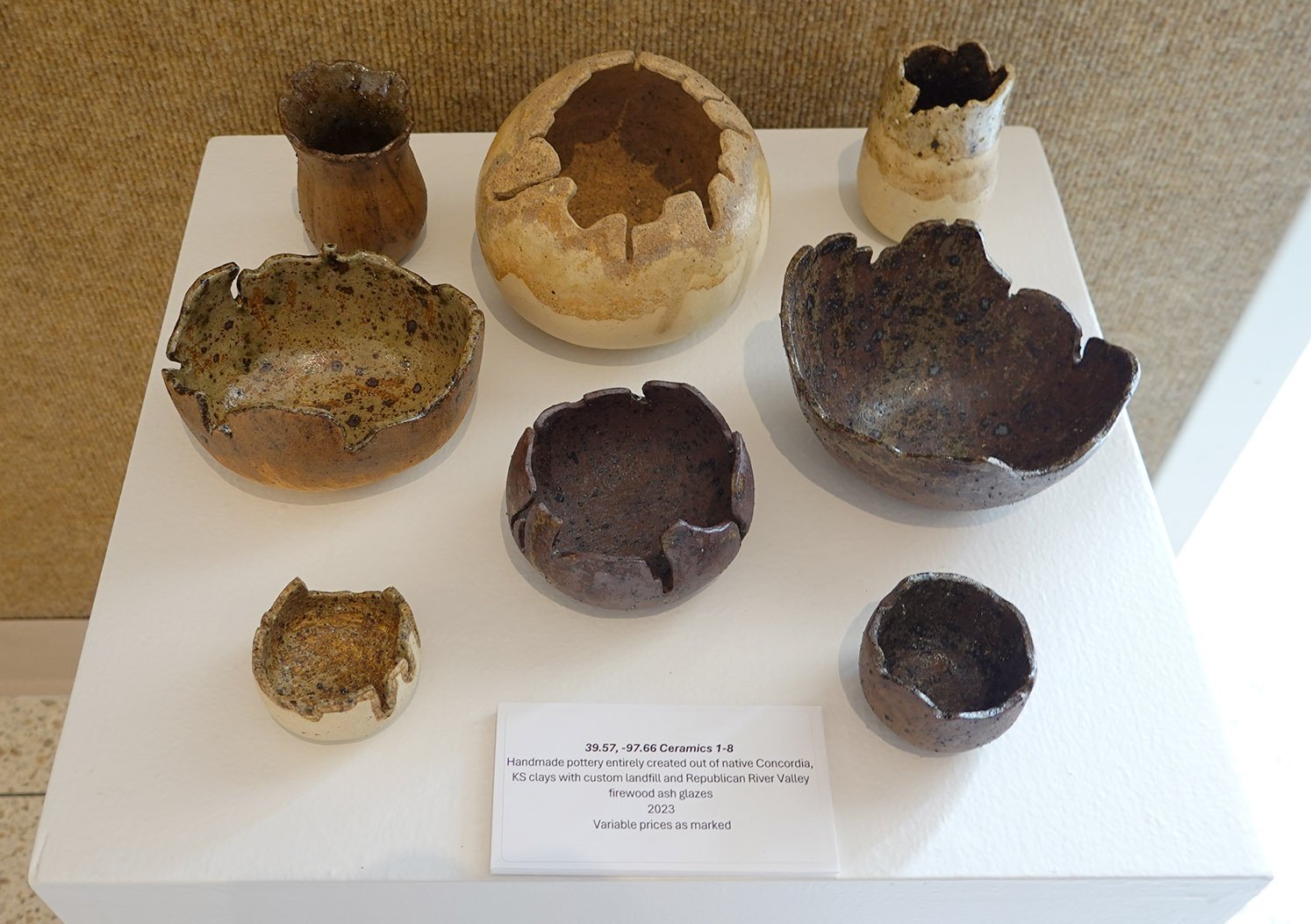
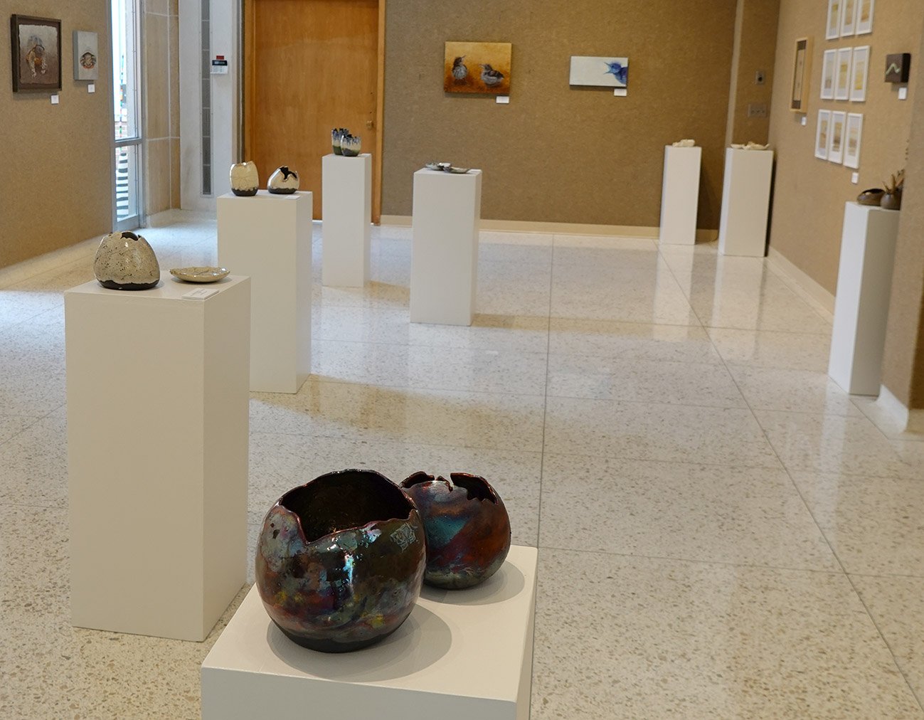
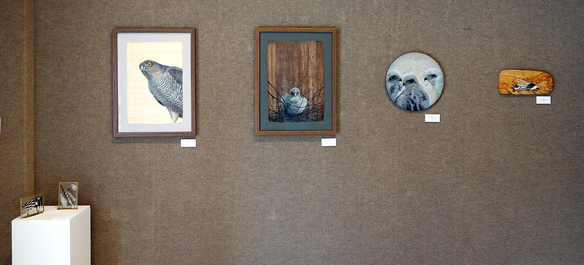
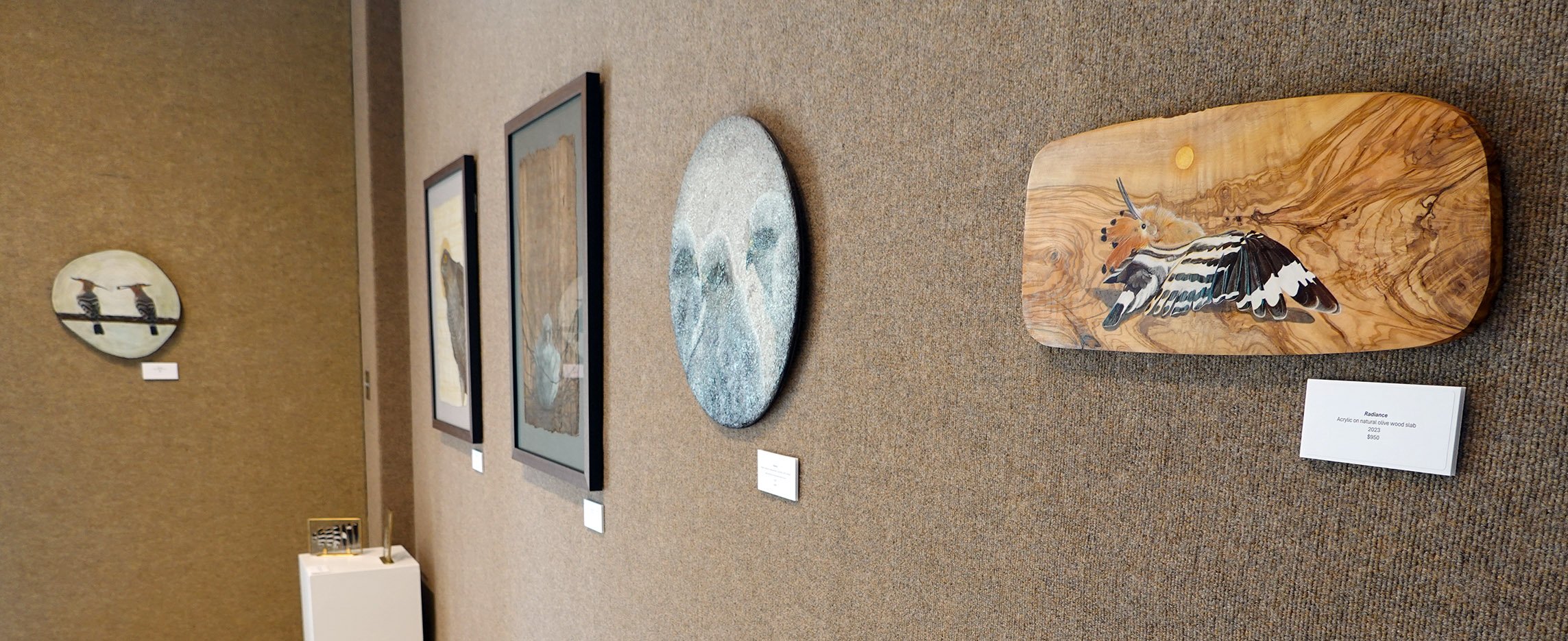
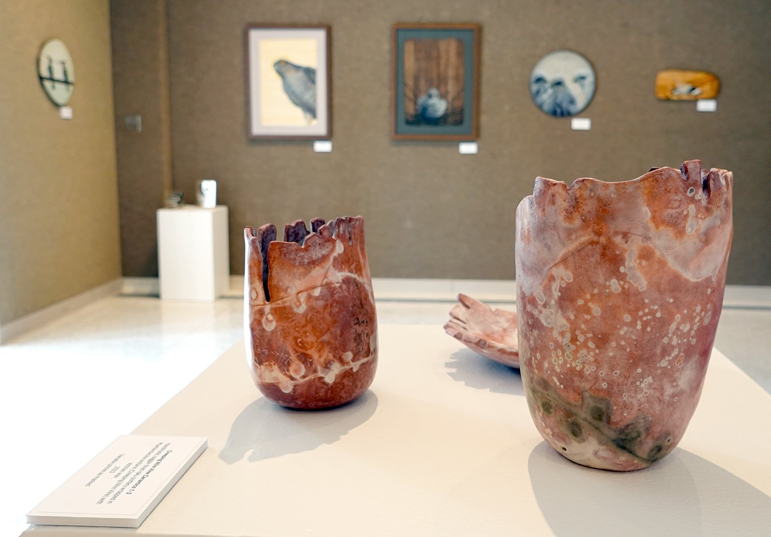
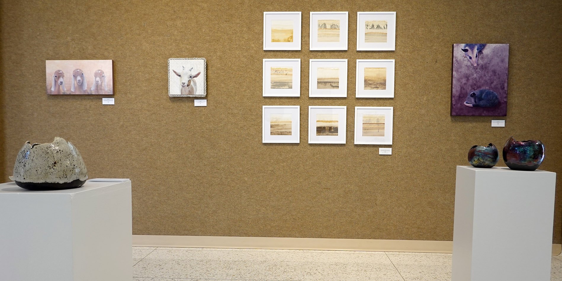
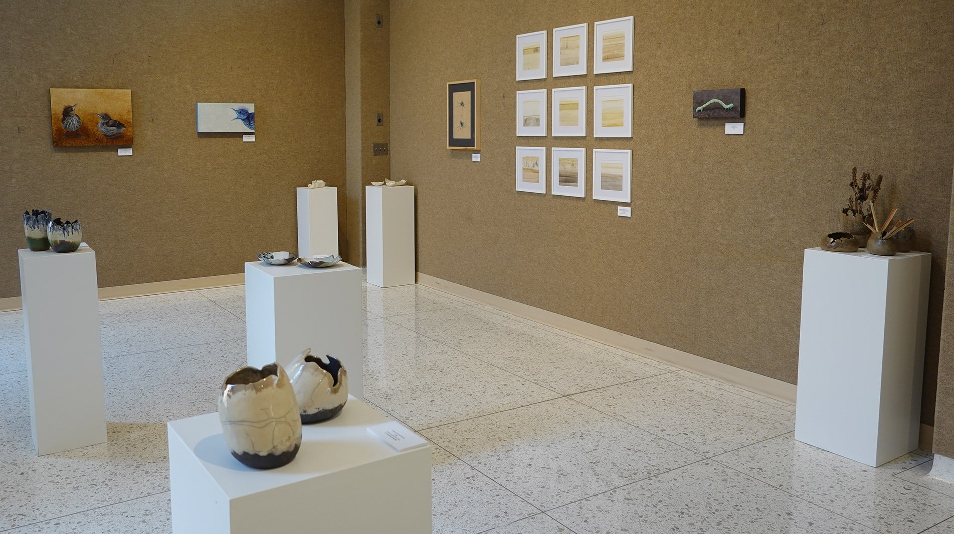
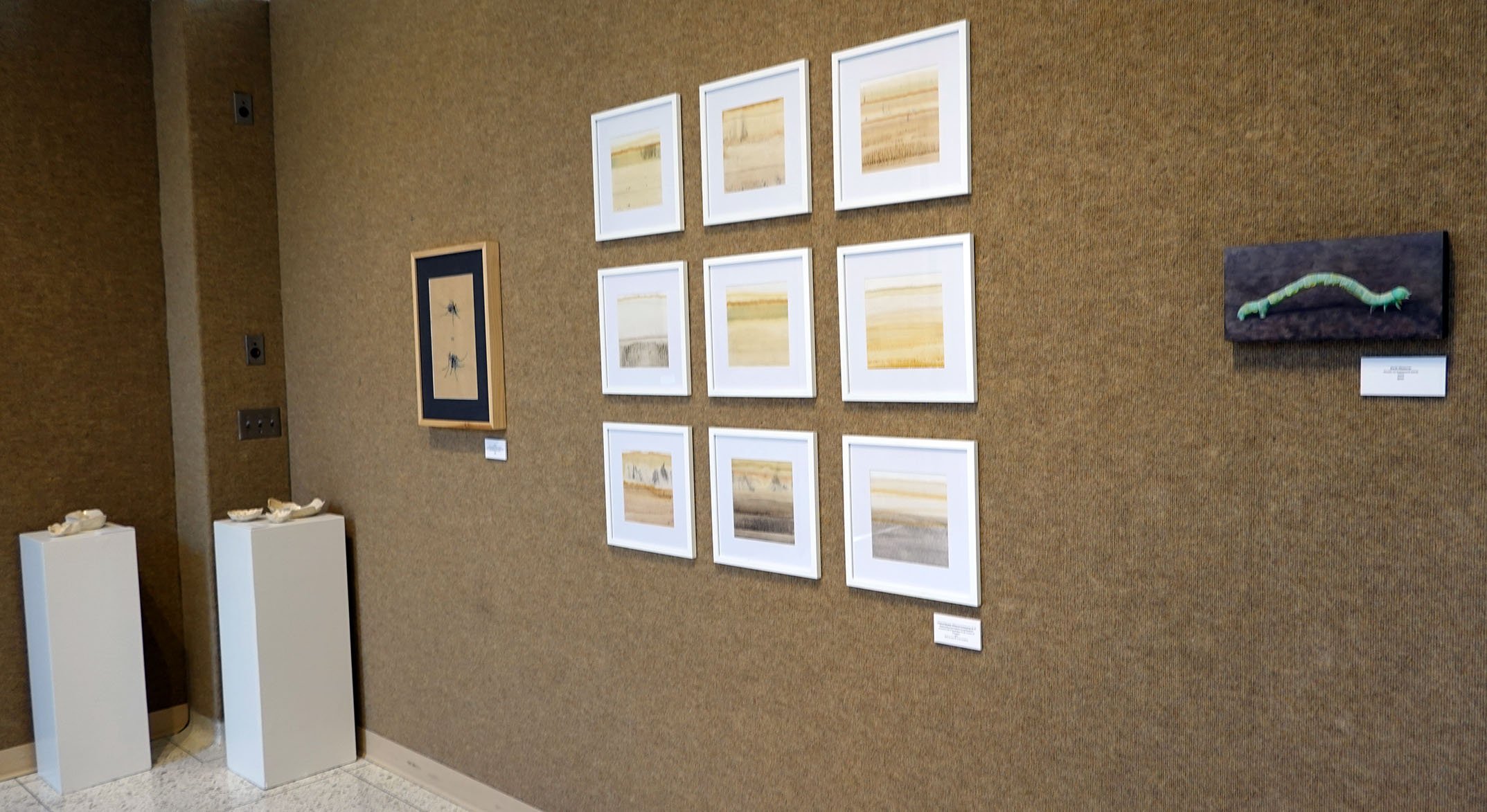
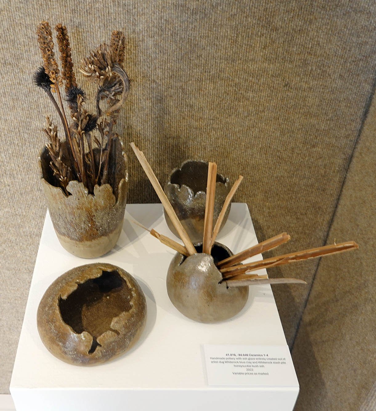
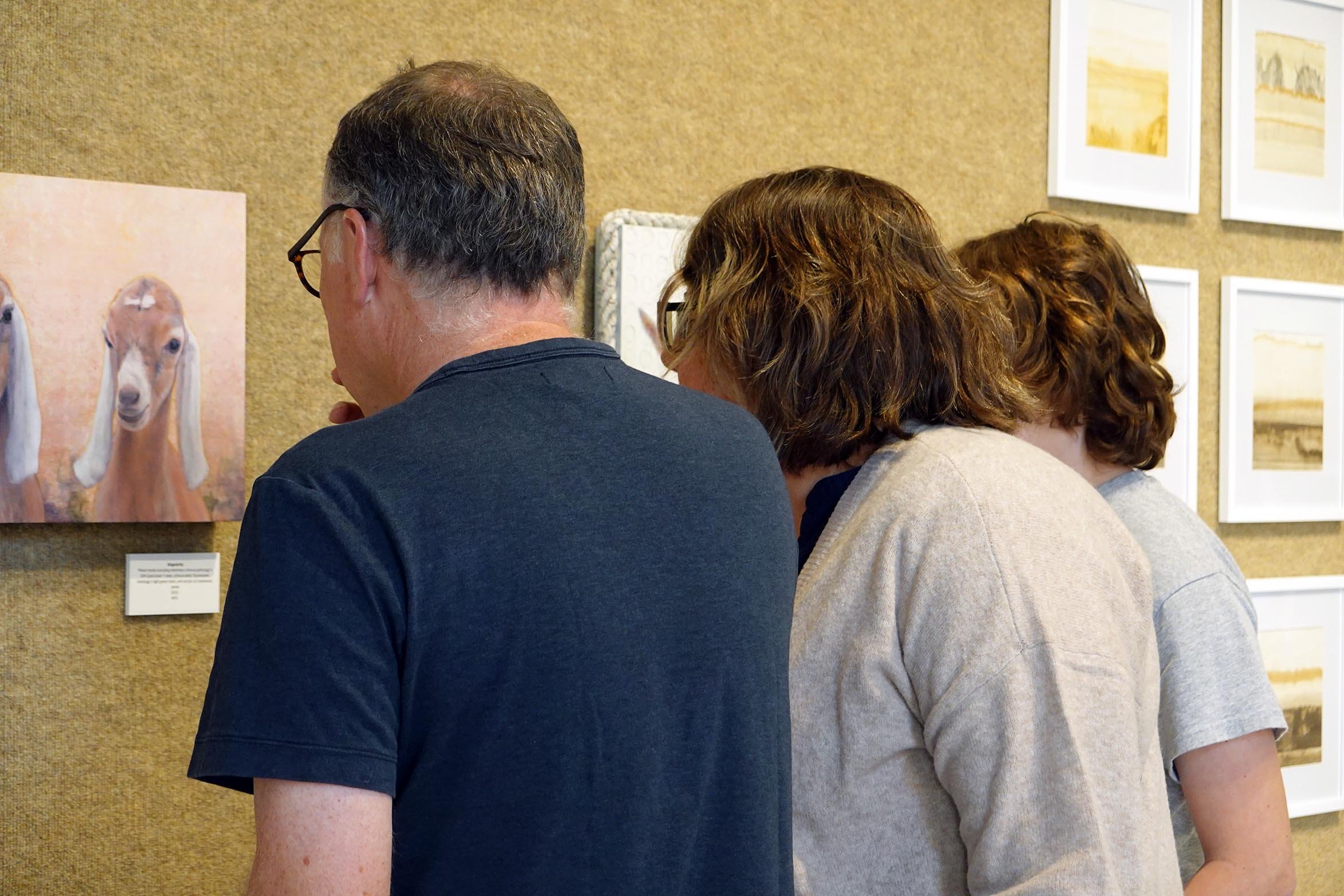
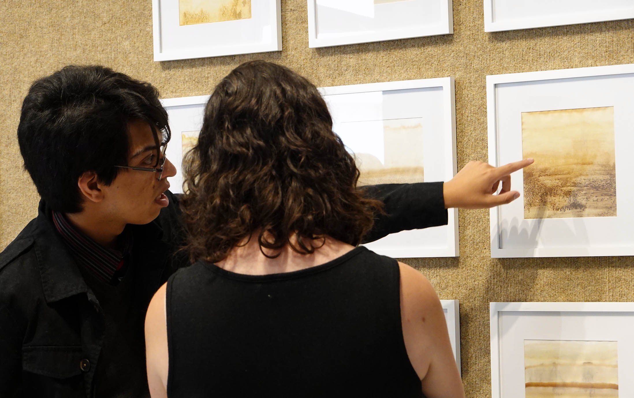
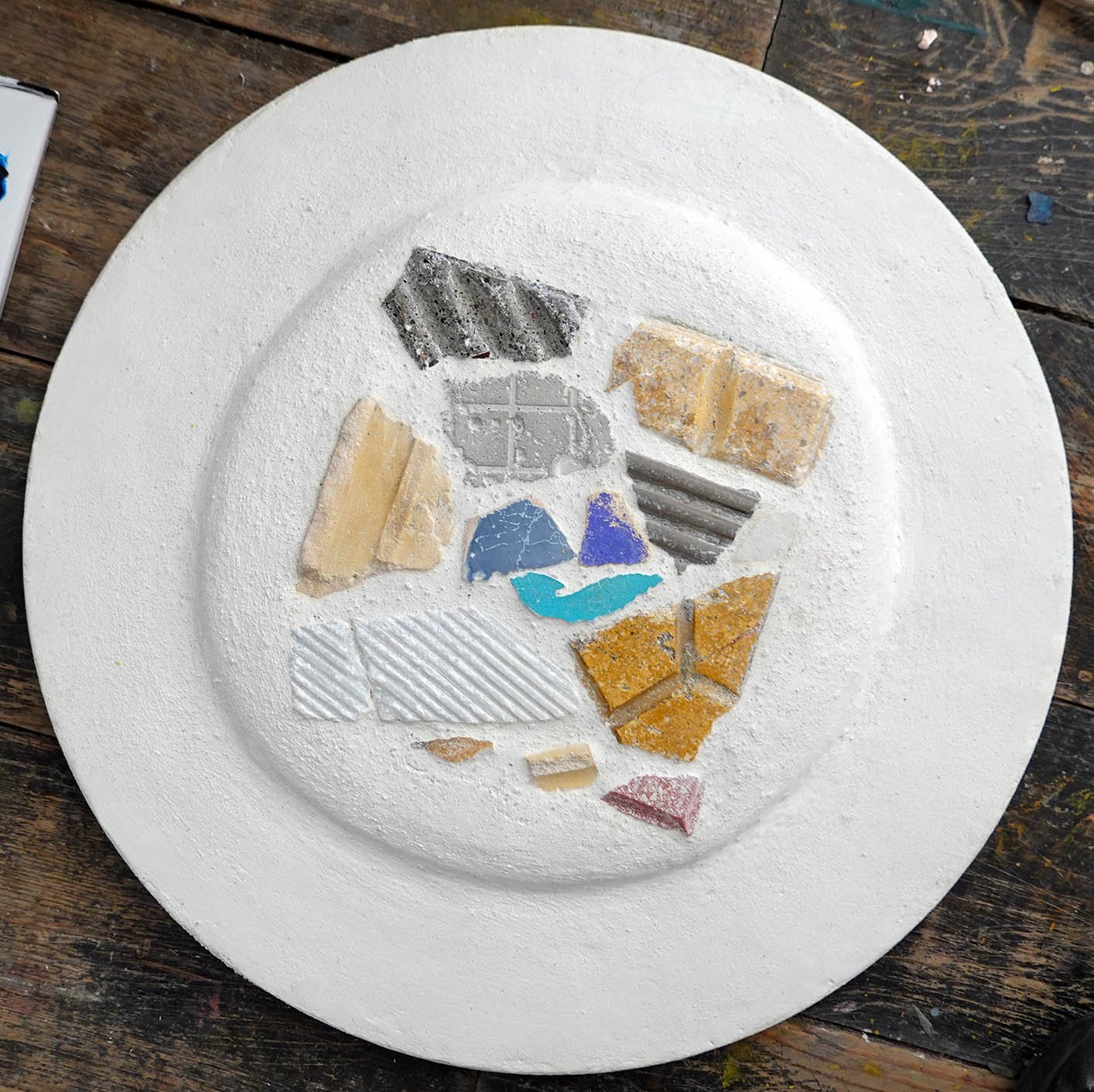
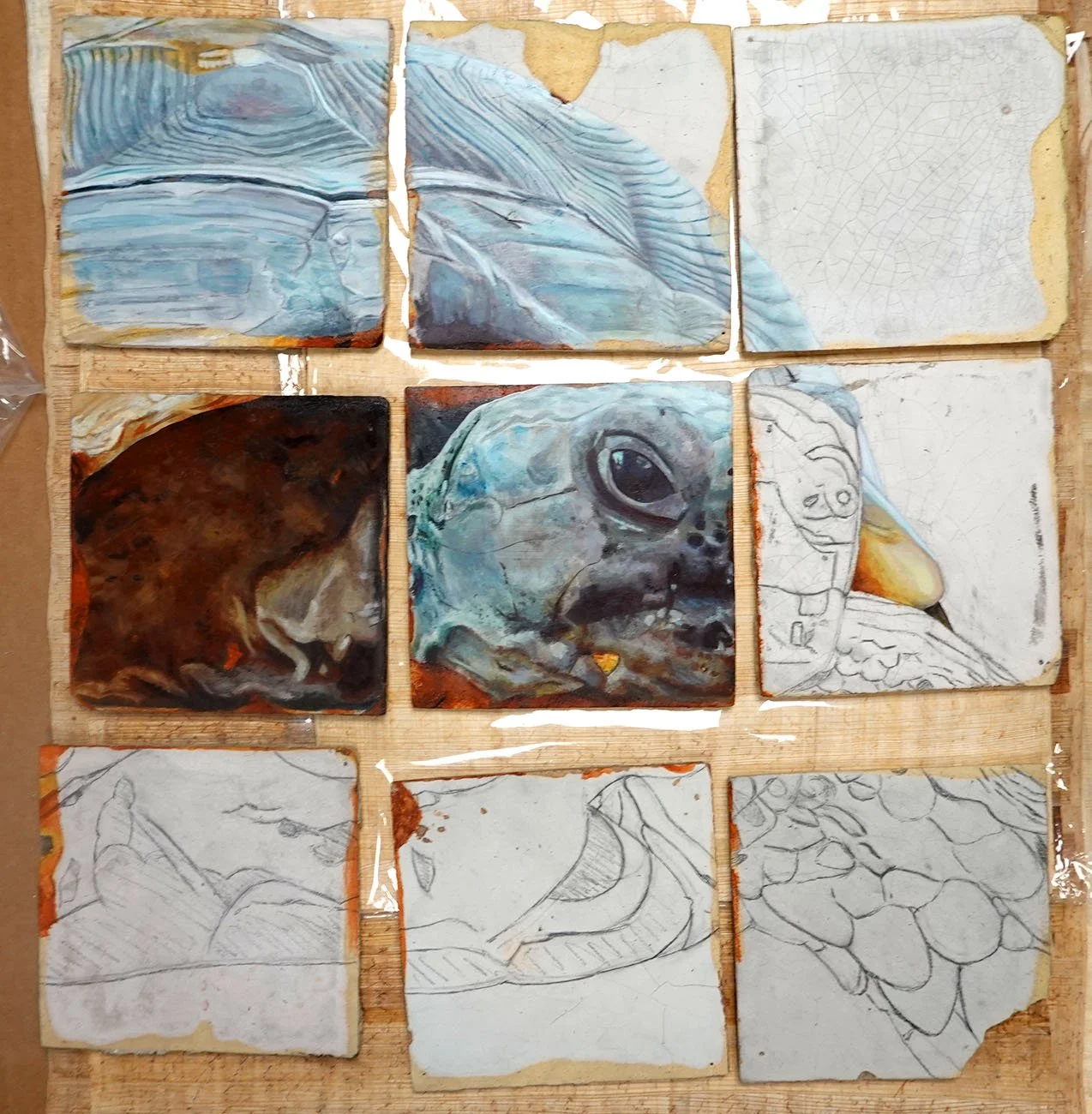
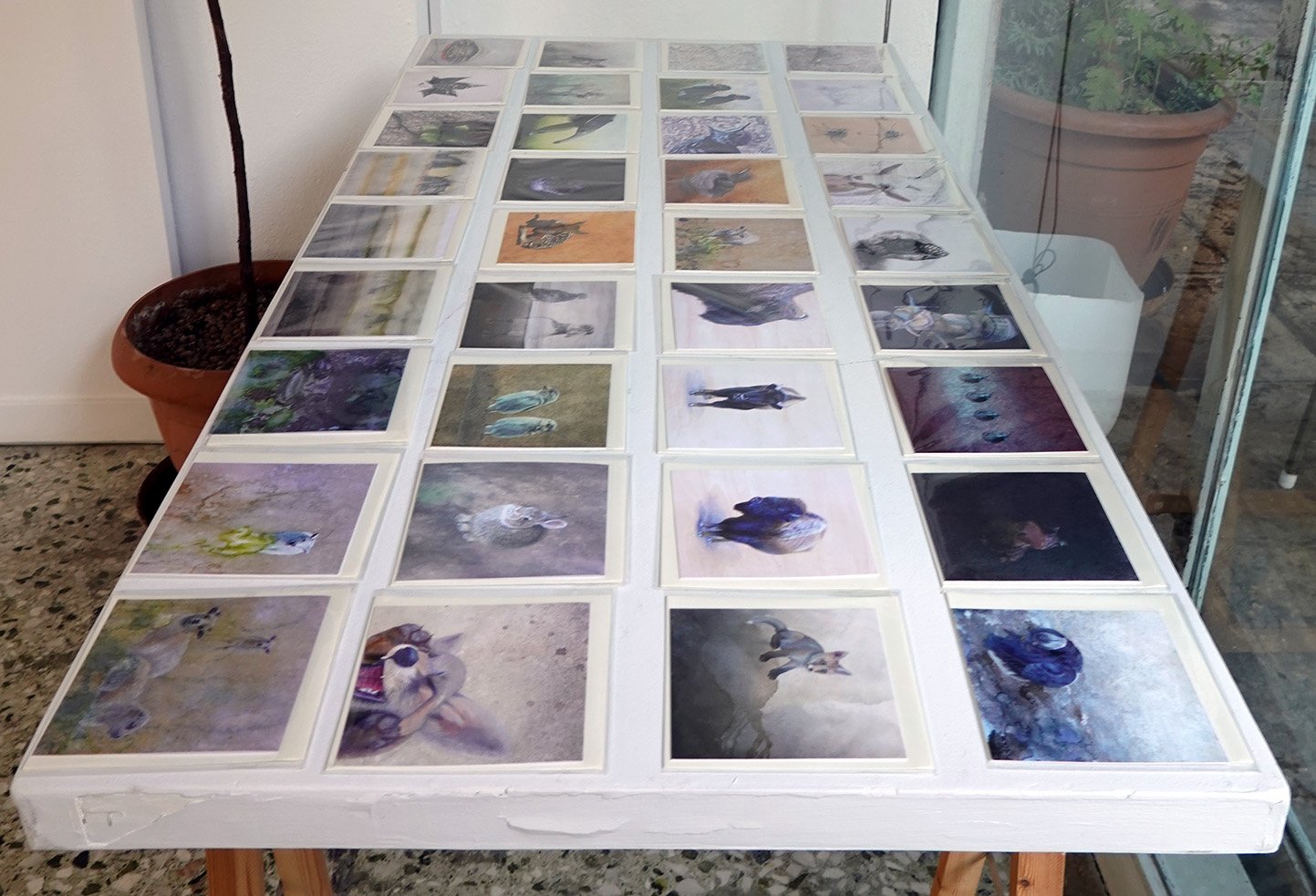
I am an interdisciplinary artist combining science and a wide range of art disciplines to examine the human role in shaping an ecological balance and encourage a more connected and conservation-focused approach.  I served as the artist in residence at Whiterock Conservancy, located outside of Coon Rapids, IA, for a couple of weeks in the summer of 2021.  While there, I began (and continued to work on post-residency) a body of work including painted reliefs, ceramics, and chromatograms.  For my series Literal Landscapes: Whiterock Conservancy, I explored and documented this 5,500-acre non-profit land trust through ecosystem samples I collected – including plants, fungi, soils, ash, minerals, and water – and ground up into a slurry with denatured alcohol in a mortar and pestle.  I then "printed" a variety of blends from different Whiterock locations onto filter paper using chromatography.  

Chromatography is a technique for separating out the individual components of a mixture.  For example, let’s imagine you have two different black inks.  In the first, the black was created through mixture of red, yellow, and blue pigments, while the second uses only a true black pigment.  If you made chromatograms with each of these black inks, in the first you would begin with black ink but end up with individual red, yellow, and blue sections; in the second you would start and end with black.

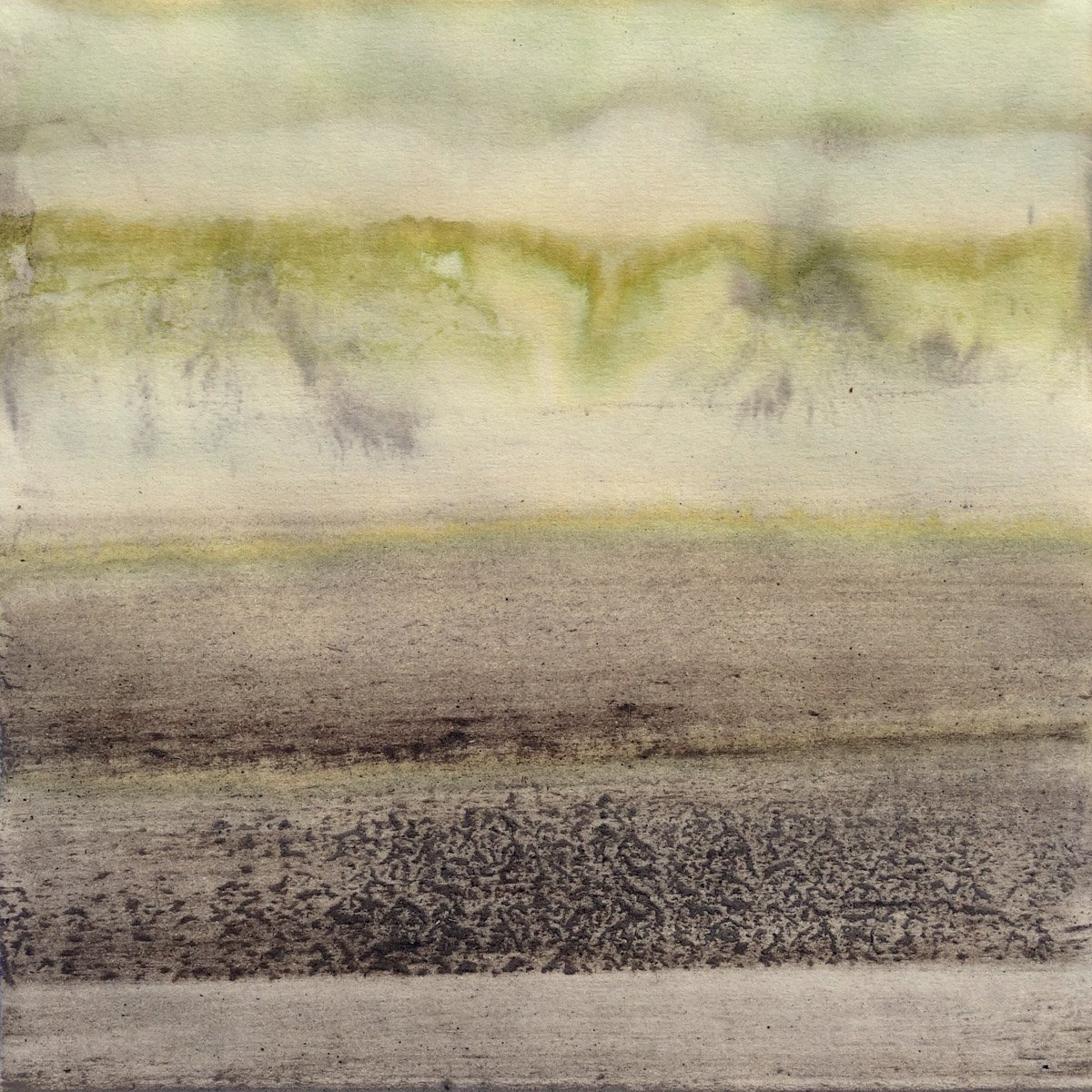
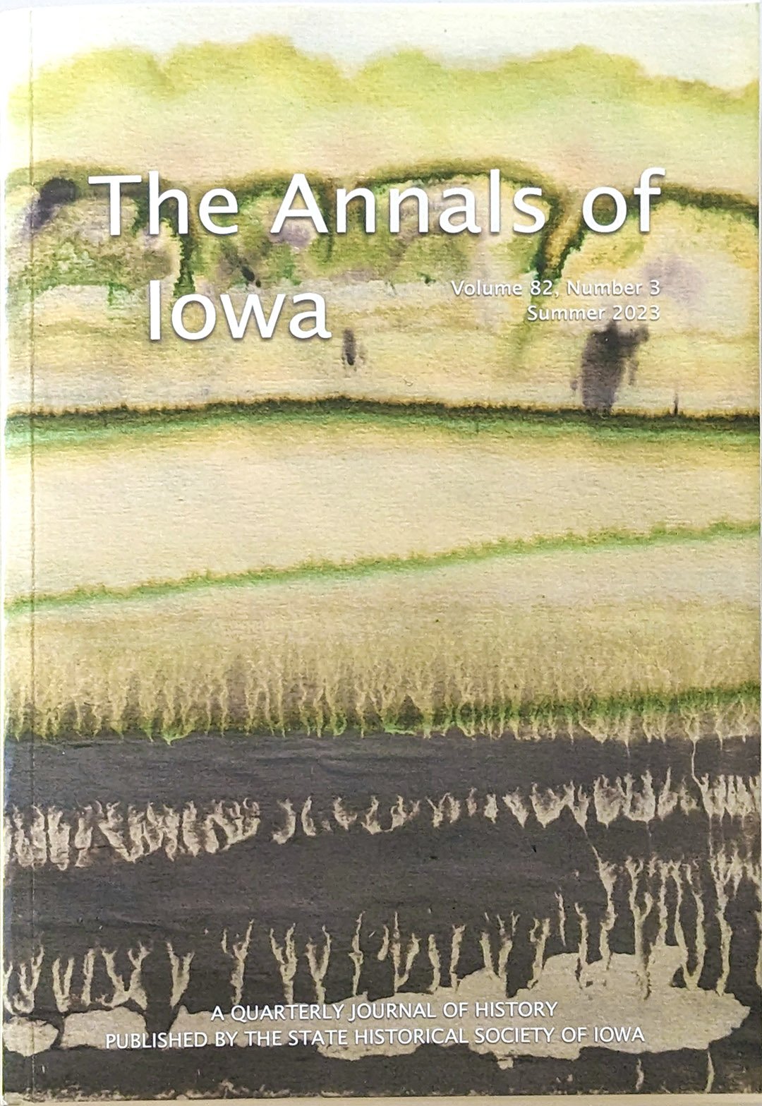
Each of my Whiterock chromatograms looks like an abstracted landscape and is literally composed from the landscape.  They contain organic and inorganic pigment layers including chlorophyll A and B, carotenoids, anthocyanins, flavonoids, and metal oxides and hydroxides.  This issue’s cover artwork’s ecosystem samples came from Whiterock’s Middle Raccoon River beach and Fig Avenue.  The bottom of the piece beautifully displays the native blue clay and capillary action trails which reference Whiterock’s riparian habitats, while the top evokes prairie and oak savanna.  Fittingly, Whiterock Conservancy is restoring one of the largest areas of native oak savanna remaining in Iowa.

Over time and exposure to sunlight, the less stable plant pigments in these chromatograms (the greens, blues, purples, and reds) degrade, while the more stable colors (the yellows, browns, and blacks) remain; my Literal Landscapes become more and more sepia as they age.  To me, this is a reminder that our natural world is vibrant but vulnerable, and that we should relish what we have while stepping up our interventions to improve our ecological balance for future generations… or the living earth around us will continue to dull.


Shelby Prindaville

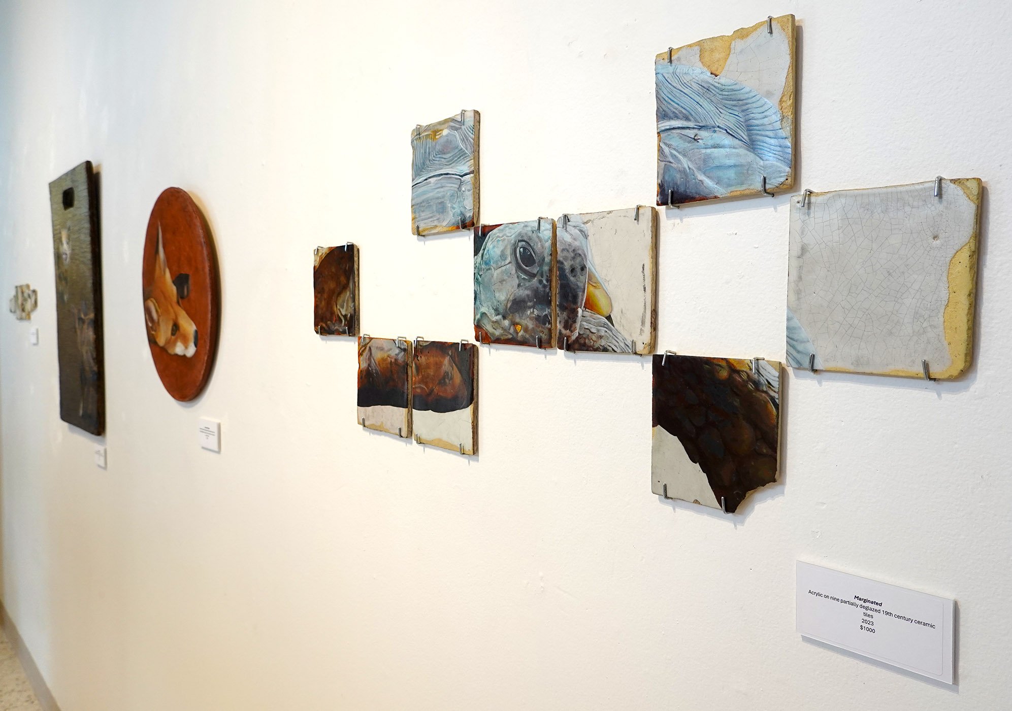
Literal Landscapes: Whiterock Conservancy 12 - Beach and Fig Ave, 2021, mixed media chromatogram

Phoenix Athens Residency Artwork Progress Photos Set 2 of 2

Here are the rest of the progress photo sets from my Phoenix Athens residency body of artwork!

Realms:

Heritage:

Pathways:

Radiance:

Ancient Origins:

Phoenix Athens Residency Artwork Progress Photos Set 1 of 2

I’m not always good about taking as many in-process photos as I could, but I do try to remember to do so! Here are the ones I took from my first half of Phoenix Athens residency artwork. Keep in mind the overall lighting, angles, flatness of papyrus, color accuracy, and so on are not that important to me when taking progress pictures; there are sometimes big jumps in the overall quality between them and the finished portfolio image, where I take great care with all of those factors. You can click into any of the images to see them larger and page through them.

Potential:

Syncretism:

The Seed:

Marginated:

Symbolism:

Phoenix Athens Residency Artwork 10

A photo of a section of a cave wall near where I harvested my pigment - this spot had just a couple of red ochre ribbons, but deeper into the cave there was a bigger deposit.

I started making the substrate for this piece in Athens, but I continued it after my return home and painted it here! The background is special - the substrate is made of white concrete mixed with natural cave pigment I harvested at in an abandoned silver mine tunnel on my friend’s monastery grounds and then processed into powder. I believe it is red ochre, which is one of the original archaic pigments used in ancient cave paintings. I also applied the red ochre to the surface for extra pigmentation.

The subject matter is a wild adult male red fox (Vulpes vulpes) which I got to observe on Mount Lycabettus due to the kindness of my field biologist friend Dimitris! He discovered that this fox shifts dens around 8am when the sun begins to infiltrate his early morning den; the one he moves into a narrow cave tunnel with two openings in a cliff face. Watching him navigate an almost sheer rock wall to get to that second den was witnessing a truly skilled athlete in action.

I like that the substrate and the subject both have caves in common, and though I glazed the whole of the fox irises with gold, a portion of them beneath the glaze are just the raw red ochre. I managed to finish this piece in time to install it in my Materiality show in Eppley Art Gallery, so it’s on display there through October 7th if you’d like to see it in person!

This is Ancient Origins, acrylic, artist-harvested red ochre natural cave pigment, and concrete on recycled wood round, 17.5x17.5x.75”, 2023.

Shelby Prindaville's acrylic painting of a red fox atop artist-harvested natural red ochre cave pigment and concrete on a recycled wood round.

My Phoenix Athens Solo Show: Athenian Habitat

The below gallery of images is from my Phoenix Athens Gallery solo show!

Athenian Habitat by Shelby Prindaville
Exhibition dates: 15 – 22 July 2023 at Phoenix Athens Gallery, Asklipiou 89, Athens, Greece
Reception: Thursday 20 July 2023 19:00-22:00

I am really happy with this body of work; everything installed on the walls was created in five weeks, and I even managed to complete the piece displayed on a small easel in the front window before the reception.

Materiality Solo Show in Morningside's Eppley Art Gallery!

I’ve been fortunate enough to receive Morningside University Ver Steeg and Morningside Experience Grant funding to support my research through my summer artist residencies at the LSU School of Veterinary Medicine and Phoenix Athens these past couple of years - and now, I am exhibiting that artwork (as well as artwork from my Whiterock Conservancy residency, raku workshops, and general studio practice) in a solo show on campus in Eppley Art Gallery!

I titled this show Materiality because of the wide variety of media on exhibit; for artwork in this show, I dug my own wild clays, made my own ash glazes and saggar-fired plant vines onto pottery, built substrates out of recycled wood and concrete, worked atop unusual surfaces including antique ceramic tiles and papyrus, incorporated a wide range of veterinary materials, harvested natural cave pigment, and made use of scientific processes including chromatography and frontal polymerization.

Materiality is on display August 23-October 7, 2023. It’s open to the public on weekdays during business hours, which will be 8am-5pm once we have student workers begin their shifts, but until then it’ll be 8am-4pm. The show reception will be Wednesday, September 26th from 3-4pm - I’ll give a short artist talk, we’ll serve refreshments, and the event is free and open to the public!

Shelby Prindaville's Eppley Art Gallery Fall 2023 "Materiality" show poster.

Phoenix Athens Residency Artwork 9

Having that one hoopoe sunbathe in what felt pointedly for me was a genuinely amazing experience, and even though I think the pose is somewhat challenging for viewers, I knew I needed to paint it.

Each time I’d walked past or into olive wood stores, I considered if I wanted to purchase an olive wood slab to use as a substrate. There were a lot of slabs that had been made into cutting boards, complete with runoff depressions and handles, but several stores offered flush slabs (I imagine with the intended usage being cheese and serving boards). One day, I was in another olive wood shop and I decided to sift through all of their flush slabs, and I found one with a really compelling wood grain design that in my mind referenced the hot summer Mount Lycabettus landscape, and I could envision putting the sunbathing hoopoe atop it. It was a smaller slab than I ideally wanted, but then again, whatever I acquired would have to fit in my luggage… and size was important but so was the wood grain design - and this one was pretty perfect. I dithered about it for a little bit, and then decided to take the plunge and get it. Post-purchase, I went into another olive wood store to see if I’d immediately regret my choice by finding a better slab, but they did not have one that positively compared with mine so I took that as a win and stopped second-guessing it.

The hoopoe’s distinctive, high-contrast plumage is particular enough that on this and the previous hoopoe painting I needed to do a full shaded drawing first (rather than merely a contour drawing, which is what I typically can get away with). As I tell my students, time management is crucial to being a productive, well-compensated artist - the faster you can finish a piece while keeping high standards, the sooner you can begin the next. The only other painting in recent memory that I’ve done a full shaded drawing for is Velocity, my painted turtle painting.

The underlying drawing, which I think gives you some insight into the difficulties I faced working atop this high-contrast substrate.

Drawing my sunbathing hoopoe on top of the olive wood was really difficult. Not in terms of making marks - that was fine! - but in terms of accurately putting a competing design on top of the loud wood grain already present. Even the placement and size itself was difficult to determine! Then once I began, sometimes the drawing perfectly aligned with the wood grain, which itself was startling and caused me to second-guess my work, but other times I had to dismiss what the wood grain was doing and superimpose a different line.

The painting was also tedious, in that the smaller-than-desired size of the slab meant the artwork too was a bit smaller than I wanted and I had to use my three smallest brushes to paint the whole piece. I also needed to layer the paint and build it up, as the high-contrast wood grain design bled through my first few layers of paint (particularly the white areas). I’d guess the white areas have at least six applications of white paint to achieve my desired opacity.

After I added the sun, it looked too anemic; a simple gold circle in the olive wood sky blended in too much. I slept on it, and the next day I decided to add a darker gradient halo to the sun. This detail was instrumental; I am really pleased with how much it enhanced the artwork.

I managed to finish this piece just before my show reception, so I snuck it into the show by placing it on a small stand on the gallery display counter. A number of viewers remarked at how natural and easy the piece looks in that it all flows and sits exactly where it should. Given how difficult it was to execute, that was rewarding to hear.

The field biologist who had taken me on a couple Mount Lycabettus hikes and knew I was painting hoopoes arrived and brought with him some sparrowhawk and hoopoe feathers he’d found. One of the wing feathers he brought perfectly aligns with my painting, which is really cool. I toyed with the idea of incorporating it into the painting, but decided not to do so (yet, anyway!).

This is Radiance, acrylic on natural olive wood slab, 7.5x16.5x.75", 2023.

Shelby Prindaville's acrylic on olive wood slab painting of a sunbathing hoopoe.

Phoenix Athens Residency Artwork 8

The wooden spool end before the mosaic and concrete.

I’m always interested in manmade constructions altered by the environment and time, and when I kept finding broken fragments of marble paving stones, concrete pathing, ceramic tiles, and so forth, I started picking them up. After amassing quite a collection, I decided I’d make a mosaic that referenced some of the artifact displays I’d seen in Athenian museums, so I took the angle grinder with a diamond blade to them to cut them down to at or below my desired height.

I then put one unique piece per type into the second recycled wood round from the electrical spool - this one had the upraised interior wooden frame with a circular outside and a square inside. (To block the holes, I had already cut and glued down a piece of masonite to the back - see the image to the left.) Once I found the layout I wanted, I put a smoother white concrete (compared to the previous large-grogged grey type I used in Realms) in and around it. I thought I probably wanted to paint it, but by this point my show installation was the next day so we just installed it in that mid-way state.

Once installed, my show was up until my last day in Athens, so I then took it down and brought it back to the US. Then I began to test out different possible compositions in Photoshop, and I settled on painting a couple rings of color - the inner gold and the outer blue - around the central composition in a design that references the mati aka evil eye charms. The three cool-colored mosaic fragments in the center are intentionally reminiscent of an eye as well.

After I painted the two rings, they looked too new, so I weathered them a little and made the blue border bleed into the white band inside to soften that edge.

This is Pathways, found marble, concrete, and ceramic paver fragments with acrylic and concrete on recycled wood round, 17.5x17.5x.1.3, 2023.

Shelby Prindaville's Greek pathways mosaic relief.