Shelby Prindaville

Advance to Gogh Show is Up - With My Scra-baa Junior Piece!

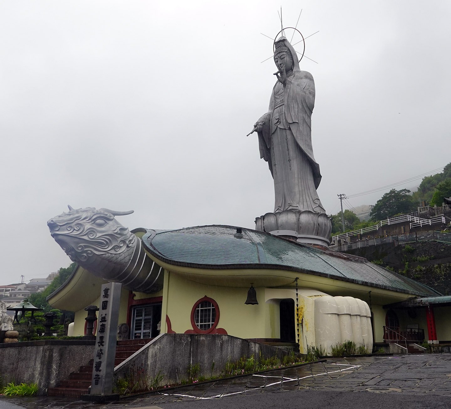
KTIV chose to use footage of me looking at artwork to illustrate their article about the Advance to Gogh event.

Just a reminder that I’m participating in a large group exhibition of over 40 Siouxland artists: Advance to Gogh. The opening artwalk receptions for this event (held at the Sioux City Art Center, Gallery 103, Three Rivers Gallery, Art SUX, and Vangarde Arts) was on Thursday, July 11th. I’m unclear on exactly when each of the participating venues will take down the show, but I believe it’s up at least through mid-August.

To the right, you can see an image of me looking at some of the exhibited artworks which was published by KTIV, and if you check the article and video out there’s more footage of me at the reception as well as their own event description and interviews.

In case you can’t make it, though, I’d like to share with you some images of what I did! In the random lottery, I drew the gameboard Scrabble Junior.

The original Scrabble Junior game board.

I decided to keep the illustration and prompt for “sheep” and then painted over all the rest of the illustrations and prompts, color matching with paint to “restore” the rest of the board to a clean, new appearance. Next, I painted a lamb at the base, added the words “& Shelby” to the wordmark, and carefully redrew the grid lines with marker.

Shelby Prindaville's repainted and drawn-over game board.

Finally, I added words for sheep in many languages to illustrate how one plays Scra-baa Junior!

This is Scra-baa Junior (“A ewe-nique edition!”), mixed media including acrylic, marker, varnish, and glue on Scrabble Junior game board with game tiles, 2024.

Shelby Prindaville's finished "Scra-baa Junior" artwork.

Week 4 of the Arts Itoya Residency

In my last week, our shows and artist talks were scheduled to take place on Wednesday, June 26th from 2-6pm. I was completely studio-focused in the days leading up to the reception, and I managed to get six paintings up for display; however, the sixth one wasn’t quite finished yet so I planned to continue to work on it at home. I’m pretty pleased with this amount of production in a four-week residency, though I definitely bolstered it by coming a week in advance to get over my jet lag while purchasing art materials and gathering reference experiences and imagery!

We had already packed up everything in the studio aside from the displayed artwork in order to host the reception on the 26th. I was departing on the morning of the 29th for Kyoto, and needed to ship my luggage to Tokyo before that. It seemed silly to me to revive my studio practice given all those details, so after the show ended, I deinstalled my artwork and took it and all my studio materials back to the house.

Then on the 27th, Emily and I visited Arita! Takeo-onsen, the town which hosts the Arts Itoya residency, is located in Saga prefecture in Kyushu (the southwestern Japanese main island). Saga prefecture has three particularly famous porcelain towns: Arita, Imari, and Karatsu, and I wanted to visit at least one of them! In terms of the porcelain produced, I like both Arita and Karatsu in terms of aesthetics (Imari porcelain is a little too ostentatious for my taste). Arita is much closer to Takeo than Karatsu, so it was the better choice for a day trip in terms of both time and cost. We first stopped at their ceramic museum, and then walked to a famous studio called Kouraku Kiln. After that, we walked to the major porcelain shop center Arita Sera and ate lunch. We then visited a LOT of porcelain stores (we probably visited about 50, but I think there might’ve been 100 there). I’ve never seen such a large, single-subject shopping district before and I am pretty confident it’s impossible to take in all at once; there’s too much to look at and our feet were also voicing complaints. There was so much to see that we barely bought anything due to the mental overload, the very real luggage size/weight limitations, difficulties in transporting fragile ceramics, and the fact that we’d already bought some ceramics from a store in Takeo; we stuck to small items only. I bought a gift and four pieces, and Emily bought two gifts and two pieces.

On the 28th, we visited Nagasaki. My former colleague Masa Watanabe had urged me to do so, and Hiro seconded the recommendation. We made our first stop at their prefectural art museum, and then went to lunch before checking out their very small Chinatown and then wrapping up at a Buddhist temple, Fukusaiji. That evening, Hiro helped me ship my two large pieces of luggage to my Tokyo hotel with Yamato Transport. And with that, my last week at the Arts Itoya residency came to a close!

Arts Itoya Painting 5: Messenger

My fifth painting is of a sika deer (Cervus nippon), painted atop a decorative camellia metal leaf washi paper. I applied the paint atop the gilding in a thin, translucent layer so that the metal leaf is still visible. In areas where the paint colors are similar to that of the metal, it’s difficult to see much difference head-on - but in darker coloration spots, you can discern it. However, if you stand at an angle or due to the light environment when reflections are apparent, the gilded decoration is visible throughout the whole painting. Below are two photos of the same painting, visually demonstrating what I describe above!

I encountered wild sika deer in Yakushima (the subspecies C. nippon yakushimae) and in Nara as well as saw them in zoos in Fukuoka and Yamanashi City. They are famous in Nara, as more than 1,200 roam freely around Nara Park and the grounds of several temples and shrines due to the deer serving as sacred messengers to the gods in the Shinto religion.

This is Messenger, acrylic on gilded washi mulberry paper, 26x18”, 2024.

Shelby Prindaville's acrylic painting of a sika deer on gilded washi paper.

Shelby Prindaville's acrylic painting of a sika deer on gilded washi paper, with the metal leaf visible throughout.

Arts Itoya Painting 4: Shingling

My fourth painting is of a shingling plant I documented in Yakushima, in this case Ficus pumila. Ficus pumila is a native species in Japan (and other East Asian countries). I’m always attracted to epiphytic shingling plants (plants that climb up trees or rocks vertically such that their leaves look like lush shingles atop their substrate). This was a very time-consuming painting in both the drawing and painting stages, but I think it was well worth the effort!

Yakushima Island was not as fertile for rice production as other areas of Japan, so during the Edo period, Yakushima paid for its shoganate taxes by logging sugi trees and producing wooden shingles rather than in the more customary rice. This deforestation had negative environmental impacts. Reforestation and conservation efforts including declaring the island a UNESCO World Heritage site have since tried to rebalance the important island forest ecosystem. This painting’s title references both the plant’s growth habit and common grouping name as well as Yakushima’s ecological history.

This is Shingling, acrylic on round wooden panel, 12x12x.875”, 2024.

Shelby Prindaville's "Shingling" acrylic painting of Ficus pumila on a round wooden panel.

Arts Itoya Painting 3: Lifelong Renter

My third painting is of a little hermit crab I met in Yakushima who was determined to be on his way. While I was working on the painting, a local Japanese man who stopped in at the studio shared with me that the name for hermit crabs in Japanese is ヤドカリ(yadokari), which means “borrowing lodging” or tenant. This painting is meticulously detailed and somewhat pointillistic.

The title is tentative, but for now: this is Lifelong Renter, acrylic on wood panel, 14x14 x.875”, 2024.

Shelby Prindaville's acrylic painting of a hermit crab, Lifelong Renter.

Arts Itoya Painting 2: Pursuit (Ichi-go ichi-e)

My second painting is atop an aluminum leaf paper. This paper was hard to work with, as the paint doesn’t grip to it as well as I’d like (and my new Holbein metal primer did not help), and the tape I used to anchor the paper to a board ended up removing the foil off the corners. However, I persevered! The subject is a male Japanese rhinoceros beetle, called kabutomushi here in Japan: Allomyrina dichotoma. The adults only live for 2-3 months after pupating.

I plan to carefully varnish the beetle before framing this piece, but I’ll do that at home - so for here, it’s done! All of the metal leaf papers are hard to photograph, but I’m pretty happy with the below image.

This is Pursuit (Ichi-go ichi-e), acrylic on aluminum leaf paper, 11.5x17”, 2024. The Japanese romaji in the title, ichi-go ichi-e or 一期一会 in kanji, is a four-character Japanese proverb that means “one time, one meeting” and is about embracing the present.

Shelby Prindaville’s acrylic painting of a kabutomushi or Japanese rhinoceros beetle (Allomyrina dichotoma) on aluminum leaf paper.

Arts Itoya Painting 1: Duality

The first painting I completed at Arts Itoya is of two backlit hibiscus flowers from Yakushima. The substrate is a gold and silver leaf flecked Torinoko paper; I added the translucent green coloration. I was inspired by the dark fantasy iconography of flowers in anime, particularly in Hell’s Paradise as well in Demon Slayer and Suzume.

This is Duality, acrylic on gold and silver leaf flecked Torinoko paper, 14.37x11.6”, 2024.

Shelby Prindaville's acrylic painting, “Duality,” of two hibiscus flowers on decorative washi paper.

Slip Resist Naked Raku Ceramics

This was my first time doing slip resist naked raku ceramics, and it was definitely a learning process for everyone at the workshop, with more experimentation still needed moving forward! I did a fair amount of research the night before the workshop, and I was really glad I did. When we arrived the plan was just to do a one-step slip resist, but I had discovered David Roberts’ ceramics and wanted to try his technique. That required a two-step process (step one: dip into the slip resist, then let dry and step two: dip in clear glaze), which I convinced Wanda to let me do as well.

We began with the one-step system, but it was producing very low-contrast results for everyone. Some of them are still very cool, but I really wanted some full value finishes! As we fired the first of the two-step pieces, we saw that it was garnering better results. We’d already gotten through the majority of the slip resist pottery by then, but we pivoted the last third entirely to the two-step process regardless of whether folks wanted to carve through it. You may recall my last two pieces didn’t get fully fired, so I left them with Dakota Potters to refire another day. I recently got them back and in my opinion they’re the best of the bunch!

I put ten ceramics through the slip resist process; three were one-step and seven were two-step pieces. Unfortunately, we did find the two-step pottery were more likely to suffer casualties in the kiln. One of my two-step ceramics shattered so fully that it was just trashed there. Another blew a chunk of its side out, but is otherwise actually pretty cool so I plan to use a rotary tool to sand down the jagged edge and keep it.

Below I’ll show my eight undamaged pieces! First, two views of my first David Roberts inspired dish wherein I carved through the two-step surface to leave black lines:

Next, one view each of a one-step vase and bowl:

The below orb was also a one-step piece, but I added wax resist to the rim before dipping into the slip resist. Despite its low contrast, I think the pure black rim, the high burnish, and the shape contribute to making this one of my favorite pieces from this workshop. Here are three different angles of it:

Next, we have one image of the largest piece I fired at this workshop, and two views of another attempt at carving through the two-step surface on a small tray.

Here is the first of the two pieces I left behind to get refired - a large two-step orb!

And finally, the second of those two, an oblong vase:

Overall, I’m quite happy with these results so far, though I’d like to figure out how to regularly preserve larger white areas for even higher contrast. My burnishing was more successful on some pieces than others, but I do think it was worth the effort and I plan to continue to burnish for naked raku ware.

I was the ArtWorks 2024 Judge for the Sioux City Community School District

On May 2, 2024, I was honored to serve as the ArtWorks 2024 judge for the Sioux City Community School District. This was a massive show with 1,000 student pieces from elementary, middle, and high school students! It was a lot of fun to soak in all of the varied artwork on display, and it was very difficult to award only ten prize placements. I was really wowed by the students’ hard work and talent, and also by the teachers’ creative assignments and support!

I returned that evening to see the show’s opening night, and it was packed with admiring folks of all ages. Here are a few photos of parts of the exhibition - it was so big that these only capture a portion of it!

Obvara Orbs & Bowl

I only fired four pieces with the obvara process this go-round, as I had run through a lot last time and I mostly wanted to learn the slip resist methods at this workshop. However, I wanted some obvara burnished pottery to compare to my previous unburnished works, and I’ve also decided my spherical handbuilt pots are a somewhat signature decorative form and so I wanted to have some obvara orbs. I did a smallish bowl as well.

The burnish was a mixed success with obvara - it delaminated in a few spots on two of the orbs during the dunking, which to my eye is kind of unsightly as the revealed clay layer beneath is bright white, so I color-matched and painted those in with acrylic. However, one orb and the bowl had no delamination accidents, and the resultant sheen on all four pieces is beautiful. Overall, I am happy with these and would be willing to burnish for obvara again.

Below are one photo of each of my three new obvara orbs and three photos of my new obvara bowl from my April 2024 Dakota Potters Supply workshop!


New Platters!

I’ve been increasing my production of platters and plates as rolling out slabs is faster than making pinch pots. I can make two or three in the time it makes me to create one pinch pot vessel.

Here are new platters / serving dishes / display plates! As a reminder, you can click into any of the images below to see them larger, and can then page through them all in that view as well.

New Planters!

I’ve been making quite a few planters for my own personal usage; it’d be cool to someday have my full plant collection in ceramic planters (rather than plastic)! I have hundreds of plants, so it’s a lofty goal. In addition, there’s always some amount of ceramic planter attrition due to storm/squirrel breakages so I regularly need to make replacements as well.

Here are my newest batch of planters! They all have between 2 to 4 drainage holes in their bases and the diameters range from 2-5”.

Upcoming: Nature Homage Juried National Exhibition

I was juried into a national exhibition in Norfolk, Virginia, at the Norfolk d'Art Center! The show is called Nature Homage: A Juried National Exhibition of Animal and Insect Artworks. Juror Tonya Hopson selected two of my paintings, The Seed and Camelflage. If you’re interested in the statistics: 57 works made it into the show out of 396 submissions.

Nature Homage will be on display from March 16 - April 13, 2024. The reception will be held on Friday, March 22, 2024, from 5:30-7:30pm and the d’Art Center will do a Facebook Live of the reception awards as well as upload the award video to YouTube and upload the exhibition online on their archive site.

The d’Art Center’s address is 740 Boush St., Norfolk, VA 23510, if you are in the area and want to check the show out!

Upcoming: 2024 ARTcetera Juried Exhibition and Fundraising Auction

One of my obvara raku vessels was juried into the 2024 ARTcetera exhibition and fundraising auction at the Sioux City Art Center! This exibition opens with a reception on Thursday, March 21, 2024, from 5-7pm. Artworks will be made available for sale at “Buy It Now” prices on March 22, and the exhibition continues through April 18 when the auction is held as a part of a ticketed event evening.

The opening reception will be free to attend, and if you’re interested in buying tickets to attend the auction, you can do so here.

The Sioux City Art Center is located at 225 Nebraska Street in Sioux City, IA, 51101.

Current Group Exhibitions

Just a reminder that I have artwork in two different group shows right now if you happen to be in these areas: the 29th Arts North International 2024 exhibition in Hopkins, Minnesota through February 24 and the 2024 Arizona Aqueous XXXVIII exhibition in Tubac, Arizona through February 25.

As you can see below, the folks at the Tubac Center for the Arts used my painting Syncretism as an advertisement of the show on their Instagram, which is cool!

Sioux City Art Center Board of Trustees Renewal

I was appointed to the Sioux City Art Center’s Board of Trustees in January 2021, and subsequently elected and reelected as President of the Board of Trustees in 2022 and 2023. City board appointments are for two-year terms, so my term was ending in December 2023. The Sioux City Art Center’s director and board asked me to seek to renew my appointment in October 2023, so I reapplied and waited for City Council to deliberate. They sent out my renewal letter and certificate recently!

"Art Under Review" Regional High School Exhibition Judge

The head art teacher for the Sioux City Community School District reached out to me last year and asked if we would be willing to host a competitive art show in Morningside’s Eppley Art Gallery for three regional high schools’ artists: North, East, and West High Schools. Each high school’s art teacher would select the entries, and then I was asked to judge the pieces and award prizes as well as provide a critique of the artwork for the students.

I enthusiastically agreed! The show, Art Under Review, has been on exhibition in Eppley Art Gallery from the beginning of the spring semester on January 10. I will be announcing awards and critique feedback on January 31. The visiting student artists will also get to attend an art workshop and take a campus tour. The show will continue through February 2, 2024.

New Stoneware!

I’ve been steadily, slowly making food-safe, high-fire stoneware ceramics as well. Here are some pieces I produced this past year which I hadn’t gotten around to publishing until now!

First we have small plates - I’ve been using them as dessert or appetizer dishes!

Next, I’ve been continuing my landscape vase series! These are “rainy” versions.

My Temporal Artwork: Chromatograms

Some artists primarily work in transitory media - their artwork dissolves, melts, is eaten, is a performance, and so on. Often the documentation of this sort of artwork in many ways supplants the original; suddenly the photograph or video is the primary way that audiences engage with the piece. Andy Goldsworthy’s work is a good example.

Most of my artwork is intended to be of archival quality - I want it to endure for centuries, if not millennia! However, some of my pieces do have a more limited lifespan, at least in terms of continuing to match the photo documentation I took when I created the original artwork. My chromatography series are in that category, and I discussed this in the artist statement I published in this summer’s Annals of Iowa journal (Volume 82, Number 3). Here’s the pertinent excerpt:

“Over time and exposure to sunlight, the less stable plant pigments in these chromatograms (the greens, blues, purples, and reds) degrade, while the more stable colors (the yellows, browns, and blacks) remain; my Literal Landscapes become more and more sepia as they age.  To me, this is a reminder that our natural world is vibrant but vulnerable, and that we should relish what we have while stepping up our interventions to improve our ecological balance for future generations… or the living earth around us will continue to dull.”

What does that change actually look like, you might ask? I thought it would be interesting to rephotograph one of the chromatograms to show you! Here is a side-by-side comparison of Literal Landscapes: Whiterock Conservancy 1, mixed media chromatogram including natural ecosystem pigments, alcohol, and gel medium on filter paper, 8x8", 2021; the first image was taken immediately after making the piece, while the second was taken over two years later.

To be clear, I still find the current versions compelling! The aging process of these chromatograms unsurprisingly mirrors what happens in nature as plants progress through seasons. They’re currently evoking autumn to me, while their original versions were more spring/summer. I bet a photo taken further down the line would show continued movement towards the monochromatic, so I might repeat this experiment again in a couple more years to try to determine when they will achieve their final evolution.

New Artwork: Incursion

As was the case with my last new artwork, I began this painting while in residency at BROTA and the Buenos Aires Botanical Garden but didn’t finish it until now! It’s another painting of the water hyacinth - an attractive plant that due to human spread is now an invasive menace.

My first painting of this plant, Adrift, is intentionally more flat and graphic. It focuses on shape, color, and contour. In this painting, I wanted to add more realism through volume, depth, detail, and light via water reflection. The substrate is another beautiful handmade paper by Ato Menegazzo Papeles in Buenos Aires, Argentina.

This is Incursion, acrylic on artisanal handmade paper, 19.5x15.5”, 2023.

Shelby Prindaville's second painting of a water hyacinth.